Hello from PaperArtsy HQ,
We're here looking back on the blog topics of 2022, and tonight it's time to pay tribute to our fantastic designers. How lucky are we to work with such an inspirational group of creatives! They never cease to amaze me with the ideas they come up with, and it is the most exciting part of our jobs to see new products come to life!
They have been chomping at the bit to get out teaching this year. Many have dipped toes into the face to face classroom experience, if you have been able to take a class in the flesh then yahoo!! I happen to know there are lots more planned for 2023, and some international trips on the horizon too! How totally fabulous!
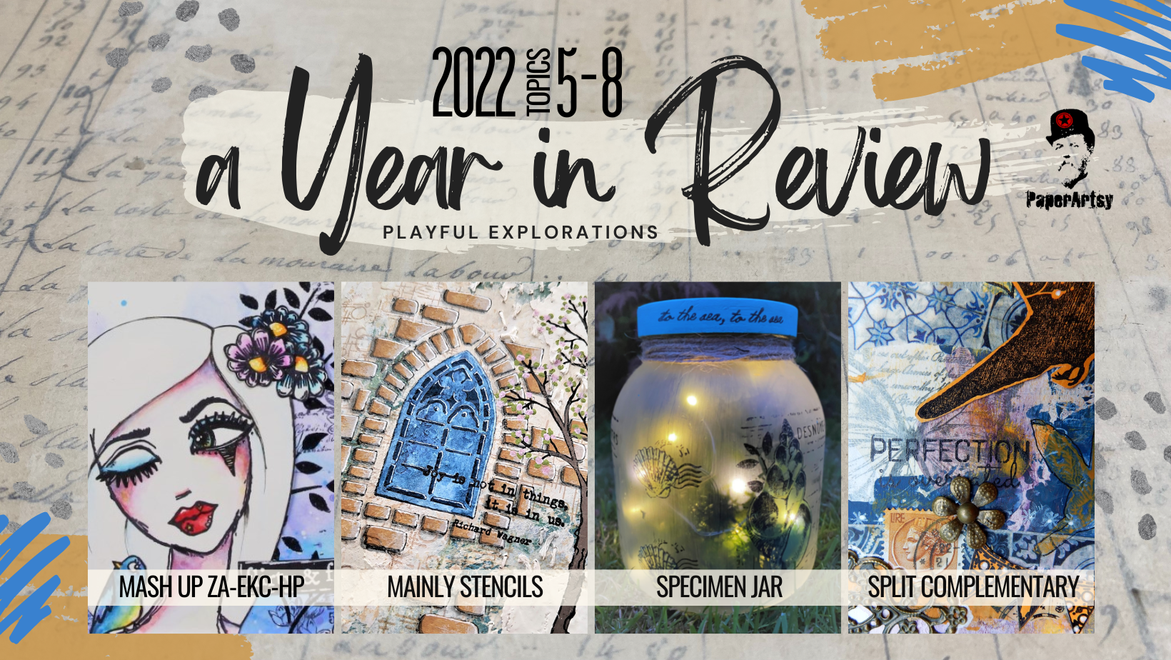
Today Dounia has her selection for you from Topic 5: Mash-up with Zinski Art, Kay Carley and Hot Picks, Topic 6: Mainly Stencils, Topic 7: Specimen Jar, and Topic 8: Split Complementary colours.
Today Dounia has her selection for you from Topic 5: Mash-up with Zinski Art, Kay Carley and Hot Picks, Topic 6: Mainly Stencils, Topic 7: Specimen Jar, and Topic 8: Split Complementary colours.
Are you ready??!
Leandra

Mash ups were introduced last year and proved quite popular so they came back for a season 2! This time we are mixing three distinct universes, better presented in Keren's intro post.
Elena Zinski Art's world is full of expressive critters, weird plants and witty quotes. Kay Carley is the queen of meadows, fulls of realistic or imaginary flowers, buzzing insects and whimsical fairy houses. Hot Picks is both the newest PaperArtsy in House collection, and the oldest of the three mashed here. Numerous themes have been explored over the years, with masculine and feminine imagery, background and focal stamps, pictures and words... but always with a vintage collage feel. It was a delight seen how our bloggers went about incorporating these different styles, with quite a few surprises!
My first pick is this gorgeous journal page by Renata Peley, full of soft colours and bold images. Renata was quick to notice that flowers are a staple here at PaperArtsy, and a great way to unify the 3 mashed collections. The Zinski pretty face certainly is the focus of this project! As you can see in her original blog post, Renata initially gave her lady a flowery hair but chose simplicity in the end. I love the use of white space and how it your eye to the face.

For her lovely accordion booklet, Liesbeth Fidder de Vos had fun experimenting with Infusions for an intricate background. Sprintzing, stamping, painting... the techniques are detailed in her original blog post. The focal stamps are singled out with her signature bleaching and brought to life with only a few touches of colour. I love how she blended the collections. The Hot Picks Shrek lady really looks at home in the middle of Zinski's flower girls!

Now for something completely different: Nikki Acton took a look at those flowers and fishes and saw... A geometric pattern play piece! I love how the layering completely redirect your attention, making you forget the initial stamps. You can make it a game to spot the original images or head to her original blog post for a closer look at all the gorgeous and ingenious layers! (Have you noticed it is another example of complementary colours?)


They are the unsung heroes of crafting, often discreetly doing heavy lifting in the background... not this time! This topic is all about bringing stencils to the foreground and letting them shine!
Nowadays, all themes and styles have stencil representatives, from bold geometric figures to intricate filigrees, from abstract texture to realistic features, from organic patterns to architectural inspiration, you can find one (or two, or ten) that suits your creativity. This topic was an invitation to take a look at these humble members of your stash and realise all the ways you could use them, then invent new ones! The list of techniques involving stencils is probably endless: colour, texture, paper, doodling... pretty much everything can go through! Do not hesitate to look at Keren's into post and our bloggers projects for ideas...

Jenny Marples' blog post truly is a mini master class using the latest PaperArtsy mini stencils. In total, you can admire 6 different pages, each with its own atmosphere and focus. A true feast for the eyes. And so many techniques! Classic stenciling, texturing, embossing, parchment craft, embroidery... She also shares lots of little tricks to cleverly use leftovers, to make you work appear more dimensional, or to integrate your designs easily into the page.

With these beautifully layered tags, Riikka Kovasin really makes stencils the focal images with Tracy Scott's bold leaves! But every step of her creative journey also includes some stencil use so check her original blog post to follow along! I had forgotten about rubbing but here it provides a subtle texture to the background. I love how Riikka truly mixes media and substrates but still achieves a harmonious cohesive look through her limited use of colour.

In her blog post, Laurie Case did a two for one with a bright summer bag and a funky pouch. She reminds us that sometimes, simple is best! A canvas bag, a delicious colour palette, some colour blocs and straightforward stenciling and you have a unique and distinctive accessory. The pouch took a bit longer, as she embroidered each cross by hand. A true labor of love, accessible even for novice stitchers and with garanted impact!


Art is already a display, of emotion, of beauty, of opinion but for this topic we are going literal and exploring what we consider worth preserving and the ways to exhibit it.
The title is just a indication, think further! From vintage curiosity cabinets, to natural museum displays or modern trinket shelves: would you shadow boxes be full of butterflies pinned on silk pillows or aligned rusted keys?, what is under your cloche, rare plants or collector toys?, are your vials full of mysterious critters suspended in strange liquids or a rainbow of glitter and gems? As shown in Keren's intro post, this type of project does not have to be 3D, we also have lots of stamps and stencils perfect for you to build your own flat displays, evoking beautiful containers with beloved contents and quirky or cryptic labels.
Claire Snowdon chose to stick very close to the topic title with this beach themed jar. However her specimens are on the outside of the jar rather than inside! I love how she played with transparency and opacity, pairing Frosting Glaze with translucent Fresco acrylic paints. The delicate design and colours are beautifully emphasized by the addition of fairy lights. Go to her original blog post to see the jar in different lightnings!

Etsuko Noguchi went the flat(ish) road for this wall hanging with a circus freak show feel. The cat doll hybrid is articulated and swings around went you shake the piece, so much fun! I love how she blended several collections, originally with different styles, and subverted some stamps, for example making hearts and decorations out of bones! Be sure to check her original blog post as she also made an actual, 3D cloche housing the little cousin of the cat ballerina. (choose image)


Claudia Neubacher was inspired by vintage museum displays, and in particular the one in Salzburg's "House of Nature" and presented 3 bioluminescent fishes from the abysses. She played around with mini led lights and the fishes actually glow! Her original blog post has a lot more pictures, in different lights to get the full effect. I love hw she played with layers and transparency to recreate that underwater look.

Victoria Wilding chose flora over fauna with this delicate and feminine flower hoop. I love the use of 'white' space that give the composition movement and character. Victoria is the queen of fussy cutting and precise details. Have you noticed the dainty leaves or the cheeky bluebells peaking from behind the bigger flowers? Go to get original blog post for a better look and appreciate all the little steps that really pull this project together.


In round 2 of our colour wheel play, the focus is on split complimentary colour combinations or using one colour from any position on the wheel buddied up with the two colours either side of its direct opposite, liked as a Y or a thin rectangle. But an picture is worth a thousand words so...

Compared to just using complementary colours, obviously we are adding a third colour, allowing more variations and nuances to build complexity. While not as high-contrast, this colour scheme still packs great impact, check the example in Keren's intro post. It's a slightly subtler version and an easy way to get colours that will match without looking like you've tried too hard. It is also interesting because the colours generally work together even when varying the ratios: you can use all three of them in equal amounts or make the tail of the Y the main colour with two tonally closed accents, or use the split colours as one main colour block, with accents of the third. And you get 12 different combinations on one wheel! Considering we have also been pushing you to experiment with unusual colour wheels, the possibilities are endless!
Let's start with the classics! Using the three bright Magenta/Yellow/Blue primary colours for her wheel, Martha Ponsanesi made a series of ATCs that truly demonstrate the possibilities of a split-complementary scheme. While all of them pop, changing the colour repartition directs the eye differently and gives each of these cat a unique personality! Check her original blog post to see all the layers of these deceptively simple look project.


Now, while she kept classic Red/Yellow/Blue primary colours as the base of her wheel, Liesbeth Fidder-de Vos went for a darker, more rustic atmosphere. Look at how the orange pops against the rich blues and purples. Her original blog post particularly details the creation of her background, playing colour contrast but also with opacity and transparency as well as the push and pull between light and dark layers.


Floss Nicholls chose to add a twist to her colour wheel: the blue primary has disappeared and been replaced by a neutral, completely altering the range of colours. The resulting split-complementaries are much tonally closer than usual, making for subtler contrast in her tags. Floss built most of her background on her gel plate, pulling all the layers in one print, including black stamping, so be sure to check her original blog post for her technique.


Dounia