Monday, 30 January 2017

2017 #1 Bookmarks {by Darcy Wilkinson}

TOPIC 2017 #1: Pink and Orange


Hi everyone, Darcy here with a super quick project employing the combined colours of pink and orange. Neither of these are colours that I would use on their own but together I think they are quite magical in their ability to transform a project, especially if they have lime green added to the mix. Some of you may know that I have gone back to university, and my current assignment requires me to read and illustrate parts of a book. Well for that I would need a new bookmark of course!


As you can see the substrate is simple white satin ribbon, upon which i built up my stamping using pink and orange archival inks. 

EDY18


Not content with one I decided to make three. 

EDY09
EDY10

These are not just simple ribbons to lay between two pages, these will wrap around the page and fasten, so they needed 'bits' on either end. One end has coloured felt and elastic. 


and the other end has a button. 


They looked a little plain still, so I wanted to add something else, not just for added interest but also for dimension.. and strokability, you know where you just can't help but touch!


These flowers are stamped onto sheer fabric, stitched together and then gently heated at the edges, as the fabric is synthetic it curls with the heat and shrinks and shrivels, giving great texture. They were stitched onto the ribbons just above the first lot of buttons. 


All that was left to do was try them out on my books. As you can see the ribbon lies flat inside the book. 


But then wraps around to the front and fastens, the elastic means that these will fit a variety of book sizes. 


Although I used my sewing machine to 'hem' the ends of the ribbons (to avoid fraying) and to add the felt, you could very easily do this by hand as it really is just a few stitches. The buttons of course ares stitched on by hand too. I found that the ink on the ribbon wanted to spread a little, making my first attempts blurry. I remedied this by stamping 3-4 images and then drying quickly with a heat gun before stamping the next 3-4.This meant they weren't starting to spread by the time I got to the end. 
I hope you enjoyed that and have a go, it really is a simple and quick project. 
Darcy 

Blog: Art and Sole
We hope that you  learn something interesting from our blog. Our bloggers deeply appreciate your comments so much, so please take time to let them know you've been inspired! Why not join our challenge by blogging your interpretation of the current topic and link it HERE?

The current topic link will close 17:00 (London Time) Sunday, February 5th, 2017, and the winner will be announced 2 hours later at 19:00.

All links go in the draw to win a £50 voucher to spend on products of your choice from the PaperArtsy online store.

Sunday, 29 January 2017

2017 #1 Pocket Letters {by Wendy Mallas}


TOPIC 2017 #1: PINK and ORANGE


Tonight we have Wendy joining us, her style is fun and quirky and she loves to work with colour so this is the perfect theme for her, follow along as she takes you on a monster adventure. 

Hello PaperArtsy Blog followers, it’s Wendy here, sharing with you a post about pink and orange. I love colour but pink and orange aren't my usual choice. I'm more drawn to blues and greens. I love a challenge though and pink and orange do pop, so I made a pocket letter. I'm not content with one item - this time it's nine. 


Pocket letters are destined for fellow crafters. Nine ATCs in a plastic 'swap card' holder, with small gifts of materials popped in the back. Then a secret letter about you and your art hidden in one of them.


I started with a masterboard (always a good starting point) using the square and rectangle mini Gelli plates and Tracy Scott's new, limited edition paints in Tangerine Twist and Butternut. I simply wanted to get some colour down on 12 x 12" Heavyweight Smoothy Card. 

I added some interest using stencils (Including PS031) and some Prawn. Then I couldn't resist doodling into the circles with a selection of gel pens.


I felt the masterboard needed some dimension so I continued doodling, but used Liquid Pearls and Nuvo Drops in different shades of pink and orange. Sometimes it's good to go where your muse takes you. It was only after the dimensional additions had dried that I decided to go for a pocket letter. 

It was difficult cutting the masterboard into pieces of 2.5 x 3.5" with a paper trimmer. Mine didn't much like the chewy dimensional bits. I should have cut the masterboard before adding them, but hindsight is a wonderful thing... 

ZA01
Available now from your local PaperArtsy stockist
 Available now from your local Paperartsy stockist

 Available now from your local PaperArtsy stockist

Available now from your local PaperArtsy stockist


I stamped lots of monsters and flowers from ElenaZinskiArt and coloured them with many different pens and pencils, but always pink and orange. The best way to fit large images onto small pieces of substrate is to chop them up into moveable elements.


Some of the flowers have holes in so they were for the chop too...


Lots of doodling and glossy accents later, and my pocket letter was almost done...


The back of the pockets contain lots of crafty bits and bobs.


It is always fun to just go with the flow with no particular plan, but be prepared for obstacles. I should have trimmed the masterboard immediately after I'd finished with the Fresco Paints. I now have quite a chunky pocket letter. Elena's stamps look amazing all together. It's like a big, fat house party. Pocket letters are such a nice thing to be involved with. Why not look for a group that participates in them? 
Love and peace,
Wendy x
For more detail about this project, please visit my blog


Aww they look fabulous all in their little cubicles, just waiting to jump out and party. These seems to be a really fun version of ATC's, with all the extra goodies stuffed in the back. The dimensional bits and the glossy accents really make all the elements pop. ~Darcy


We hope that you  learn something interesting from our blog. Our bloggers deeply appreciate your comments so much, so please take time to let them know you've been inspired! Why not join our challenge by blogging your interpretation of the current topic and link it HERE?

The current topic link will close 17:00 (London Time) Sunday, February 5th, 2017, and the winner will be announced 2 hours later at 19:00.

All links go in the draw to win a £50 voucher to spend on products of your choice from the PaperArtsy online store.

Saturday, 28 January 2017

2017 #1 Feathers and Fans {Lucy Edmondson}

 2017 Topic 1: Pink and Orange

Lucy has weaved her magic with Lynne Perrella stamps tonight; one of her favourite collections. Weaving old with new, the detail on these stamps is always astonishing, and allows you to bring them to life with the various colouring options out there.

Hi everyone, it's Lucy from Lucy's True Colours here.

Great to be here on the PA blog. I've chosen to share with you a fan which was inspired by two of the brand new Lynne Perrella new releases. Lynne has brought out three new sets, each one telling a different story, but all in her trademark eclectic style. Each set spoke to me in a different way, but for this post I have chosen to concentrate on LPC035 and LPC037 which immediately brought to mind the era of masquerade balls and 'Les Liaisons Dangereuses' and the idea of a fan being held to the face whilst dancing, as part of the outfit and, perhaps, the flirtation.

I always love the new releases part of the PaperArtsy year the most. The anticipation, and then the sharing with friends of the 'Ooohs' and 'Aaahs' when it's big reveal time. But for me the best bit is letting my mind wander into where the stamp designers' ideas will lead me; perhaps in a completely different direction to what they had imagined themselves. It's this daydreaming that I had as a child and lost for a long time as an adult, and found again through rubber stamping and mixed media, that I find such a wonderful place to lose myself, and it's a pleasure to be given this 'place to go'.


Here's the finished fan with its orange, pink, and gold colour scheme.


LPC035
  (this brand new stamp is now available from your local PaperArtsy retailer)

Tissue paper is great for getting into the folds of the fan, and I love seeing the design pop through the tissue from underneath as you press it on the inked stamp.


This was a fun mash-up! Isn't it great when you get new stamps and you look through your collection to see what 'goes'. Like getting a new top and pulling everything else out of your wardrobe onto the bed! I did some 'doctoring' of this lady with the ship on her head stamp as I didn't want a seaside theme this time. But her outfit was perfect! She's from LPC 001.


LPC01
LPC037
(This brand new stamp is now available from your local PaperArtsy retailer)
I considered using feathers from some of the other Lynne Perrella sets down the folds of the fan but decided it would be too busy and would detract from the main images.


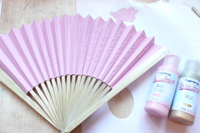
I just love pink and gold together, and I love Fresco Gold!


These are the Fresco colours I used, painting from behind. I did some playing around with positioning before gluing the pieces down once I was happy. I love to use a little Fresco Pearl Glaze on faces to lift them.


Brass Treasure Gold was a perfect match around the edge for the Gold Fresco.


As a finishing touch, it was fun to find in my stash that I had a tassel in pink and orange; just right for the theme! All it needed was a fleur de lys brad with a touch of alcohol ink, to hold it in place.

I really enjoyed making this fan and I'm looking forward to getting stuck into the third new release Lynne Perrella set now, LPC036. I actually had a idea for this set which immediately came into my head as soon as I saw it but lost my nerve that it would make any sense! I will enjoy my daydreams though, and playing around with my ideas. Thanks for looking, and for your comments.

Lucy


Blog: Lucy's True Colours
Twitter @CraftyLuce

So lovely Lucy as you have echoed the delicate nature of the fan and the images by using more muted tones of pink and orange, this would perfectly compliment a similarly decorated room. ~Darcy


We hope that you  learn something interesting from our blog. Our bloggers deeply appreciate your comments so much, so please take time to let them know you've been inspired! Why not join our challenge by blogging your interpretation of the current topic and link it HERE?

The current topic link will close 17:00 (London Time) Sunday, Feb 5th 2017, and the winner will be announced 2 hours later at 19:00.

All links go in the draw to win a £50 voucher to spend on products of your choice from the PaperArtsy online store.

Friday, 27 January 2017

2017 #1 Vibrant Chances {by Keren Baker}

 2017 Topic 1: Pink and Orange

Keren is one of those super-clever people who does minimalist in a maximum way! Well she is super-clever IMO, probably as I am rubbish at white space and the 'less-is-more' style of crafting, so I watch Keren with my green eyes glowing! She keep things super-simple, yet there is actually so many incredible details that are really not as simple as the first glance might suggest.  In this post, Keren allows the focal point to be the star of the show. It is a very clever acetate feature that steals the (I was going to say limelight) but its Pink and Orange light today! 

~ Leandra

Hi everyone, Keren here.

It's great to be here on the PA blog tonight. I've chosen to share with you a post incorporating pink and orange in lots of different ways and using acetate to add a different texture yet trying to keep a clean and simple vibe.

To be honest, I got quite stumped with this topic. I sat and mused about how I could use a clever technique to springboard the colours from and then couldn't really come up with anything. It made me think of when I was a teen and turned up to a friends house wearing a similar colour combo..and I won't go into what he said ;-) but actually the colours are so vibrant! I wanted to focus on the stunning new JOFY stamps so went back to basics using an acetate frame in a different way.


I began by painting some stamped acetate using the centre of JOFY51


I've used a mix of translucent and opaque colours to create the combo with Tango, Rose, Sherbet, Prawn & Bougainvillea


Once I'd painted 3 inner flowers on the reverse of the stamped acetate, I used the left over paint sitting on my large acrylic block to smoosh onto some Smoothy Heavyweight cardstock


You can see the height of the acetate frameless frame (ha!) positioned over the seedhead flower from JOFY49

I simply added some very tiny squares of stacked foam pads so the focus is on the flower and not the frame. I thought about putting a diecut frame around the flower, but it would have looked too heavy and the project would lose some of its lightness.


I trimmed out more of the painted inner circles and used them as glossy 'pollen' falling from the flower. I added in some sequins and if you look closely, you'll see some tiny x's made from fineliners in matching colours. 

The leaves had a thin layer of Cheesecake Fresco painted before I added Limelight Fresco on top as I needed something more opaque to help stop the base colours from showing through.


After finishing off the details with some gel pen I added two of the painted acetate circles jutting out from the sides and mounted it onto a base card layer. 

Using these JOFY stamp sets is easy- the hard bit is deciding which ideas to leave behind! The details that you find in the images make designing projects really simple. Adding surprising 'off the page' elements keeps drawing the eye around the project. I want next to create a focused area of colour and using the centre of the flower to make a shaker card with the mini circles cut out and made into shaker movable elements. Do give the colour combination a go, it's such a lively palette and I doubt you'll fail to be uplifted when creating with it! 

Thanks for joining me tonight, hope to see you again soon, 
Keren xx

My Blog
Facebook
Twitter
Instagram
Pinterest


See! She never fails to disappoint does our Keren! I love the fallen pollen detail and the sneaky peeks of circles at the edges. Frameless Frames! Who knew! ~ Leandra


We hope that you  learn something interesting from our blog. Our bloggers deeply appreciate your comments so much, so please take time to let them know you've been inspired! Why not join our challenge by blogging your interpretation of the current topic and link it HERE?

The current topic link will close 17:00 (London Time) Sunday, February 5th, 2017, and the winner will be announced 2 hours later at 19:00.

All links go in the draw to win a £50 voucher to spend on products of your choice from the PaperArtsy online store.


PS. It's the Newbury PaperCraft Show tomorrow, and Kay Carley will be demonstrating with secret things on the Stamps and Memories stand, so if you are heading to the show, make sure to drop by and say hello to Kay and Wendy!

Wednesday, 25 January 2017

2017 #1 Found Object {by Jennie Atkinson}

 2017 Topic 1: Pink and Orange

Hello PaperArtsy Blog followers

We are starting 2017 with a colour palette designed to kick you out of the winter blues and into the warmth of summer! For those of you in the Sothern Hemisphere, you are there already, but we have been having a nasty winter up here in the Northern zones, so any excuse to forget the cold is most welcome.

Not only are we using this feature to look back at Stampington's historic milestone publication True Colours (a Lynne Perrella initiative), but Jennie is also looking back at our own stamps of the same era, Ink and the Dog Collection.

Hello everyone Jennie here with you on the PA blog tonight.

I have chosen to share with you a vintage canvas panel for this fabulous Pink and Orange Challenge. Yes this IS the pink and orange challenge which for those of you who know me is WAY out of my comfort zone! Normally I'm a very soft vintage browns crafter with perhaps a hint of pink!

It really is good to stretch yourself but by having the boundaries set makes for a much more enjoyable experience.  So I chose to share with you these wonderful Ink and the Dog stamps in a more unusual setting of colours!


I can honestly say that my crafting has changed considerably following the introduction of Infusions last year. I didn't think that I would take to them so readily given their very bright colours, but I find I reach for them all the time as I love the total unpredictability of creating with them.


I primed my canvas with gesso and then added some texture using the Mini Art stencil and Grunge Paste. Once this had fully dried I applied a coat of Fresco Finish Nougat over the whole canvas. Experimenting over the last few weeks I have discovered that the addition of the chalk finish paint softens the Infusions colour slightly and allows me to go in with a lot of water. I love how the three colours mingle together with the walnut stain pulling them all together.


I used the same colours to paint my flower embellishments - another great look from those fabulous little pots of colour!  I applied the watery Infusions to one of my own Vintage Roses mixing the colours around the petals, and then gave the smaller petals a lighter coat for a bit of contrast. Again I used plenty of water to blend the colours. I love the rich mahogany colour on the main flower!


What I love about PaperArtsy stamp sets is the numerous little bits and pieces you can find either on a single stamp or within the set. The At Home 3 stamp greatly appealed to me for that reason.


The other stamp set I have used is Ephemera 2 - one of my favourites for the same reasons.


See how many pieces for layering I stamped from two of the stamps! Torn edges and Archival Potting Soil blended around the edges gives an old vintage feel to these wonderful stamps.


And then of course the fun is always in the design of the layering on the canvas.


These layers were stuck on top of each other - just a little glue in the middle of each piece so the edges are floating completely free. It looks layered but without adding bulk.


I added foam pads to the vintage lady and also the found object sentiment - I think this adds enough interest without the whole piece being stuck up on foam pads!


Although I have added in some metal embellishments I have painted them with gesso and Fresco Finish Gold to give a more co-ordinated look and as I prefer a non-brassy look. Finally I splattered a bit of watered down gesso here and there.


I actually had no idea where this was going when I started as I wasn't sure how the colours would work with the vintage stamps. I really did stretch myself but I am SO glad that I did, as I  love the way the really colourful Infusions act as the perfect backdrop for the vintage brown embellishments. 

Breaking away from your own boundaries, or stepping outside your comfort zone, is a great way to unlocking what might be holding you back. And it can be so exciting! I hope reading this has inspired you to give it a go too! And if pink and orange are not your colours, then even better!

Jennie x

Jennie Atkinson
Live the Dream


I love that this colour palette challenged you Jennie, but as ever, you win with gorgeous composition and elegant use of colour! Those stamps are as delightful today as they were when we released them back in 2004! Thanks for the beautiful reminder!

~ Leandra


We hope that you  learn something interesting from our blog. Our bloggers deeply appreciate your comments so much, so please take time to let them know you've been inspired! Why not join our challenge by blogging your interpretation of the current topic and link it HERE?

The current topic link will close 17:00 (London Time) Sunday, Feb 5th 2017, and the winner will be announced 2 hours later at 19:00.

All links go in the draw to win a £50 voucher to spend on products of your choice from the PaperArtsy online store.