Showing posts with label 2022 Topic 6. Show all posts

Sunday, 1 May 2022

2020 Topic 07: Specimen Jar - Topic introduction


Our regular blog topic introductions contain a variety of samples all displaying an aspect of what we're concentrating on; curated collections of beautiful art. This topic is no different - a curation of specimens focusing on both the containers and the contained. Which is more aesthetically pleasing? Which has greater importance? What is the relationship between the two and how symbiotic are they? What do we value and why should we contain or protect it? Hopefully these questions will have you starting to think about the topic and how you might artistically respond to them.

Specimen jars can simply be receptacles that contain anything. Gwen Lafleur has designed stamps that you can mix and match so many different elements and of course she's created some wonderful art pages incorporating them.


Alison Bomber created a wonderful specimen box. Why use curved lines when straight lines can work!


Has it all got a little too reflective? We need some fun! Tracey Springer used the ever fun loving Zinski creatures to simulate a creative laboratory. It would be fun researching in there!


Sometimes we want to capture that which scares us. Do we face it or do we avoid it? Preserve or conquer? Our art can be the vehicle in which we explore our fears, face what threatens to destroy our peace and what defines us.


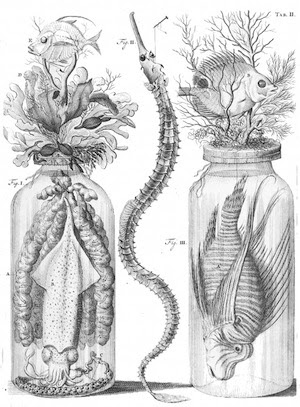
The next two pictures are from Frederick Ruysch who was a Dutch botanist and created unique embalming jars. They were part of a pair of juxtaposed jars with the collars crocheted with Frederick's daughter.


You will find lots of specimen jars with items or animals that are preserved. Some preservation was a curiosity but many others were for scientific study. Continuing to protect in order to conserve is vital. These wings below are ethically sourced and sold to raise conservation funds. Can our art speak about protecting what is important to us and to our planet?


Are specimens trapped or saved? What's the correlation between outside and inside? Which is reality? This jar makes perfect use of both the outer and inner.


Whilst hunting for specimen, there was a lot of the creepy and disgusting so it was refreshing to see a little calm amongst the frenzied. A beautiful forest carefully crafted from paper.


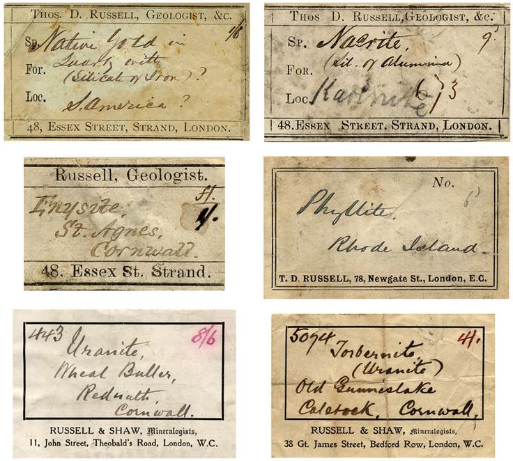
Who doesn't love a beautiful vintage label? Specimen jars are awash with them. Are the labels meant to invite you to gaze...capture your imagination first? Are they a false labelling of whatever is contained, allowing you to wonder what you're actually viewing?

These specimen labels are from a famous collector and microscopist called Thomas Russell. He was once described as a geologist who created many microscope slides. These descriptions are intriguing...how might you label your art creatively?


If you're asked for a 'specimen' - you may have to produce one medically. Years ago they'd have been contained within these type of jars and an artist with a sense of humour added flowers and coloured the water to give a nod to the containers original use!


What we regard as specimens worth containing and preserving speaks of our priorities and goals. Is the daily worth remembering? The ordinary worthy of capturing? Maybe this might inspire us to art journal about those things we do and see everyday that can be encapsulated in our art.


Another artistic avenue to explore could be what we collect and how we display it. This beautiful collection folio would be a great place to start and record what you choose to gather around you.


You could go the whole hog and create your very own miniature museum inspired display case capturing your precious things.


If we're talking about items that contain collections, would we be stretching the topic too far to argue that our art journals are the very containers of our thoughts and feelings? Creatively ordered collections.


Weaving our way back to the PaperArtsy blog, there are many different jars and items perfectly suited to storing items. Here's but a few. First Kate Yetter using a JOFY cloche.


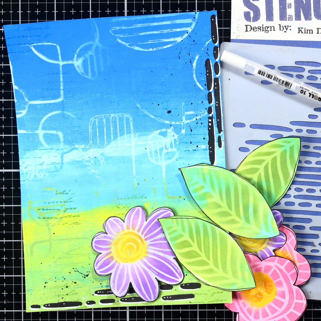
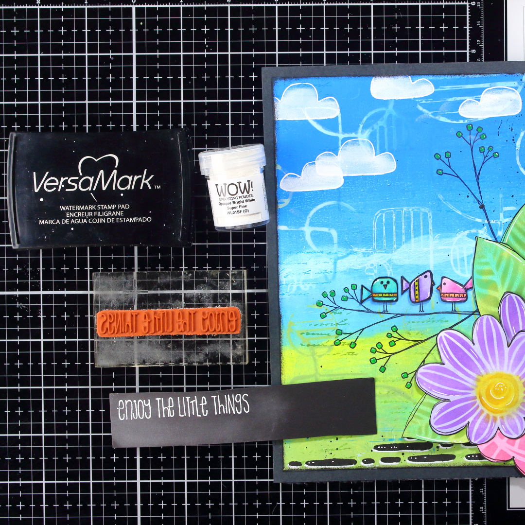
Kay Carley drew this beautiful jar to contain some of her gorgeous bloom stamps.


Lastly, how about considering Assemblage. Isn't it simply another artistic collection of items. Alison Bomber made this gorgeous assemblage piece.

As you collect your thoughts, why not transfer them into the physical world and create alongside our thoughtful bloggers who will transport you over the next few weeks to many different ways of viewing specimen jars.

Does this topic push your creative buttons? We would LOVE you to share what you get up to with us! A great place is tagging us on Instagram @paperartsy or why not join us and post in the PaperArtsy People Group on Facebook. We love to see what you make!  

Sunday, 24 April 2022

2022 Topic 06: Mainly Stencils {by Renata Peley} with Kim Dellow Stamps


Hi everyone, it's Renata Peley with you today, and I'm here to share with you an art journal page made using some fun stencil techniques.


I think the majority of us have another hobby besides crafting and that is gathering art supplies. And while that really is a great hobby, sometimes it can get overwhelming and make us forget some exciting stuff that we can do with the goodies that we already have. So, my plan was to remind you of a few interesting techniques that you can do with your stencils.

Kim Dellow has really fun stencils. Some of them are standalone, while others have matching stamp sets, and in this project, I am going to show you how you can use both of these stencil types. 


I more often tend to paint and color with watercolors, and for a long time I was lacking the confidence in working with acrylics. One of the first techniques that made me like acrylics was gel-printing, so I decided to start my project with a dash of acrylic confidence. 

The feeling of spring is really starting to overtake me, so I thought to make my art journal page reflect my springy mood to you as well. For that reason, I chose the following PaperArtsy Fresco Finish Chalk Acrylics: Blue OysterChinaLimelight and Granny Smith.


For me, blending the colors on the gel-plate is super easy and fun. I must admit though, somehow I always manage to get somewhat unexpected results. Like that bright fluffy line on my page. Anyway, I decided to look at it as a line of clouds and embraced it as it was. 


Also, at this stage I already knew that I would use the stencil PS048 to make some flowers for my project, so while my gel-plate was out and messy, I prepared the first layer of paint. I tried to mix at least two different shades of a single color for each page. I wanted a green page for the leaves and pink and purple pages for my flowers.


Now comes the time for the first stencil technique I wanted to share with you, and that is stamping with the stencils. First, you have to be aware that you won’t get a crisp image this way but if that is ok with you, you can get some really fun results. 
I started off by diluting some of the colors I already used for my background by adding a bit of water. For better results, you should aim for a somewhat uniform watercolor look. As a next step I dipped the PS040 stencil into diluted acrylics and carefully pressed it onto my background. I like to press it with paper towel, to pick up accidental seeping and so I don’t get my fingers too messy. 


When this layer was dry, I wanted to add just a bit more interest to my background. I am kind of a fan of some text on my background, so I really couldn’t resist stamping a beautiful script from the BG2 stamp set. I wanted this to have only a subtle appearance, so I chose to stamp with Archival Ink in the colors similar to those used on my background.


At this point, I put my background aside and I started working on my images. As I mentioned, I prepared a first layer of color on my gel-plate, so now I started working on adding some more color, shades and details. For my flowers and leaves I used the PS048 stencil from Kim Dellow.


For each element, I was adding some ink in a similar, (but a bit darker) shade of the acrylics I used for the first layer. And when I was happy with the color, I added a doodle frame for my elements with a black ink pen. On the photos below, you can see, step by step, how I colored the leaves and the flowers.


I repeated this process for all of the elements and you can see my finished flowers and leaves after fussy cutting, on the next photo.


I believe that sometimes some small details can make a difference between a just alright art journal page and a really beautiful one. One of those details is, in my opinion, coloring all your elements in the same manner. Don’t get me wrong, this is not a rule, and sometimes various coloring methods pulled in one project can give a great result, but that might not always be the case. So, in full honesty, this was not my first batch of flowers. The first ones I colored with Distress Oxides. And while I really liked how they turned out, they just didn’t match the rest of my project. For a moment there, I was looking at my project and felt something was off, but I just couldn’t put my finger on it. The realization hit me the moment I took those gel-plate printed backgrounds to color my birds from the EKD02 stamp set by Kim Dellow.


Now I had my background, my birds and my leaves and flowers colored with the same mediums on the same type of paper. And somehow, that pulled it all together and all the elements started to look like they belonged together.
At the moment, I was happy with those, so I decided to play some more and show you my third stencil technique for this project. And for that, I was going to use the PS036 stencil and Snowflake and Little Black Dress acrylic paints.


What I wanted was to give my project an interesting frame. First, through the stencil I layered white color, let that dry and then slide my stencil a bit down and to the side and put black color over it. This technique can be really fun and have some stunning effects. In truth I went rather simple, but I highly encourage you to try it with some other stencils as well, and be brave to try all sorts of crazy color combinations. For more inspiration on this technique, you can also check a wonderful tutorial by Leandra made all the way back in 2012. Anyway, to accentuate my results, I also used a white gel-pen and put some little details on my stenciled lines, just for fun.


As I had already planned out the location of my flowers, before gluing them to the background, I did some stamping with the Jet Black Archival Ink. I used the EKD02 stamp set by Kim Dellow, and stamped the birds and the branches.


Also, since I had the corresponding stencil (PS035), I decided to make my life easier and use it to give those little birdies a shadow. I like to give shadows to the elements which lay flat on my pages because that gives them the illusion of dimension and makes them stand out more. For that, I used an ink which is a few shades darker than the background on which the birds are laying.


One of my favorite parts of the art journaling process is the assembling, when all the parts come together to form a story. While I glued the birds flat on the paper, for the flowers and the leaves I applied just a drop of glue so they would lift a tiny bit on the edges and get some natural shadow and dimension.


I didn’t know why but I still felt as if my page was missing something. And just with a glance at the stencil PS035, I knew just what it was. I needed some happy clouds. I took my white gel-pen and drew the clouds directly on my project. Then I filled them in with some Cut-n-Dry foam and Snowflake Fresco Finish Acrylic paint. When I was coloring my clouds, I paid attention to put more white paint to the bottom of the clouds, while leaving the upper part more transparent. I think that helped to give some dimension and fluffiness to my clouds.


To be honest, at this point, I felt like my project had too much weight in the corner where the flowers are, so I needed something to give it a bit of a balance. For that purpose, I employed two tactics. First, I gave my project a well-positioned sentiment which I heat-embossed on a piece of black cardstock, and second, I gave it a nice wide black frame.


Now I was finally satisfied with my art journal page and felt that it was complete.


At the start of my “artsy career”, I was doing mainly decoupage. At that point working with stencils was my worst nightmare. Somehow, I never managed to get the results I was going for. And for a while I steered clear from stencils. I don’t know exactly at what point, but after quite some time I decided to give stencils another chance. And boy, was I happy that I did that. Suddenly I realized it is not as hard as it seemed in the beginning and even more, there were just so many more ways to use stencils than I originally thought. In this post I managed to show you only a few of those ways, but you can be sure this is only a small part of all the fun possibilities. Just be brave and play around.

Renata ðŸ’“


Facebook: Renata Peley