

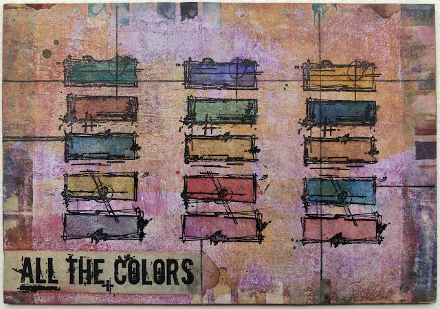
We thought it was a good time to put all the Fresco finish paints in one blog post, this is a good reference point to see all the colours, and get a better understanding of the complete range.
Fresco Finish Chalk Acrylic paints are: chalk, acrylic, very matte.
For crafters, those 3 features make it a user-friendly paint to work with.
- it dries fast (no need for a heat tool)
- it is indoor/outdoor (UV safe)
- multi surface (no need for any primer/gesso) ... think of it as hundreds of shades of gesso
- the colours vary in opacity depending on the colour. Generally bright colours are more translucent than pale or 'dull' shades.
There are 3 paint collections; 2 designer lead, and one 'in house' core line
- Seth Apter (40 colours) these are muted and grungy
- Tracy Scott (36 colours) a bright and zingy range of colours
- PaperArtsy Core line (144 paints: 22 colour families of 6 and 12 'others' Metallics, glazes etc) Most of these colour families range from dark to light within a group of 6 eg grey-blues, yellow greens, neutrals etc
Let's take a closer look at each of the 3 collections ....

 |
| artwork by Seth Apter |
The range of Seth Apter paints tends to be muted, grungy colours. There are a few exceptions of jewel toned colours: Blue Lagoon, Purple Majesty and Toffee Apple that add some interesting zing. You will find Butter is a useful, opaque yellow handy to edit any other colour into something fabulous. The more you explore the possibilities within this palette, the more there is to enjoy about them!
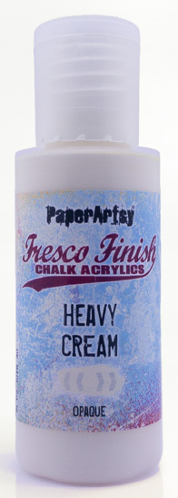
Everyone loves Seth's neutral 'Heavy Cream' it's a gorgeous warm white, perfect for knocking back or building layers. Of course, there are a few wild cards: 'Squid ink' is an unusual purple-brown that is wonderful for those dark layers Seth likes to kick off with, Steel Grey has a blue undertone which is fabulous over a larger area, and Agave is a stunning blueish green, and don't forget Gold Rush ... another warm shade that brings life.
It is hard to single out any colour, they all have something to offer that completes the others to offer options for those all important layers ...remember Seth's words ... 'you are only 1 layer away from MAGIC!'
 |
| artwork by Seth Apter |
Seth Apter Fresco Collection: 40 Colours (2025)


 |
| artwork by Tracy Scott |
Tracy Scott is a designer who loves bold and bright colours. You will find her range is full of zest and zing, and that ties in perfectly with her love for flowers and mandalas.
In general terms, bright colours are often translucent colours, with low opacity within the Fresco range. But that is not always the case, for example Cerulean, Shutters, Berry Nice and A Bit Fishy are all pretty bright colours, but also offer high opacity...very useful. Translucent paints are fabulous for colour mixing, so you can bring about new colours, or edit existing and a translucent colour is perfect for colouring in or adding shade and depth while not obliterating black stamped lines as you colour an image!
One of Tracy's tricks for creating shade and depth is to use colouring in pencils over top of the fresco paints. As you might be aware, Frescos are a chalk paint, and this means they dry with a toothy surface, which colouring pencils adore, it gives a nice bit of texture to grab onto!
You will notice we add chevrons to our bottles and hand-paint each label. The purpose of this is to allow you to identify the opacity coverage of the paint.
 |
| artwork by Tracy Scott |
Tracy Scott Fresco Collection: 36 Colours (2025)


PaperArtsy Core Fresco Paint Range

We
have 22 colour families of 6. (see the colour carDs below).
Each family ranges from dark to light, and within it you might find a mix of opaque, semi-opaque and translucent colours, like the set of minty greens shown in the image above.
We also have
- 3 glazes
- Pearlescent and Metallic sparkle glazes
- Frosting Glaze for on acetate or glass
- Drying retarder ideal with gel plates or hot weather
- Crackle Effect see one colour under another through the cracks
- 4 metallic paints: Gold, Silver, Copper, White Fire
Lets take a look at each of the 22 colour families, I am sure you will soon identify the types of colours you are most drawn to. On our website, when you click on each paint colour, you will find out more detail about the colour, for example the opacity.
All our paints are 50 ml in quantity, we put them into a squeezy bottle, and the DO NOT go off over time. I have a set of all our first release from 2015, and every single paint is still fine.
Some colours need to be shaken before use, others do not, it depends on how heavy the pigment is and how well it stays suspended in the base. My tip is to regularly rotate your paints to store them upside down, then you don't need to shake before use so much!
I also like to lightly sand the lid, and use my finger to add colour to each lid, then you can more easily see the colour .... when the bottles are right side up of course!
1. Bright Turquoise Blues

2. Grey Turquoise Blues

3. Grey-Green Blues

4. Grey Blues

5. Bright Clean Blues

6. Purple Blues

7. Blue Purples

8. Purples

9.Pink Purples

10. Bright Pinks

11. Soft Pinks

12. Coral Pinks

13. Bright Warms

14. Rustic Warms

15. Browns

16. Neutrals

17. Greys

18. Khaki Greens

19. Mint Greens

20. Clean Greens

21. Fresh Greens

22. Yellow Greens


PaperArtsy Links
Website PaperArtsy
Facebook Group PaperArtsy People
Facebook Page PaperArtsy
Twitter twitter.com/paperartsy
Instagram instagram.com/paperartsy
Pinterest uk.pinterest.com/paperartsyhq
YouTube youtube.com/user/PaperArtsy


5 comments:
Thank you! This is wonderful!
Do you offer these in bundles to buy?
I'd be interested in that as an option to purchase.
Thank You
Awesome!
This is wonderful! Thank you ❤️
Is there a dowloadable swatch template available for the whole line?
Post a Comment