Hi everyone
Mags here with you today.
I've been having fun with the topics and theme for this quarter's blog posts. As usual I couldn't decide which to go for, so incorporated them all. I love creating art dolls and Lynne Perrella's stamps are ideal for this. With tons of gorgeous detail and beautiful faces, it was a difficult to choose which stamps to use. In the end I decided to create a 3D doll with wings, so Lynne Perrella Stamp sets (LPC042) and (LPC041) were the obvious choice. I also wanted to use the colours Leandra had chosen for the master wheel, there was a pretty Aqua and the other two colours created a flesh tone and pale rust, ideal for my idea. The over-arching theme for this quarter is transparency and I had a few ideas for incorporating this, the main one being recycling a used plastic bottle and creating acrylic skins. More of that later.

I love how my art doll turned out, I call her Rusty Rosa as she reminds me of a Spanish princess with her terrarium crown and layered, textured skirt. I had so much fun creating her wings using Paperartsy Fresco Finish Pearl Glaze (FF53) and Crunchy Waxed Kraft Paper (WKPA5), it's an easy technique and uses up those leftover baby wipes from cleaning the rusty tray. If you follow me on YouTube you will know all about my rusty trays!

My initial idea for creating Rosa's skirt was to use wire or chicken wire , unfortunately this idea didn't work. As with a lot of creative ideas, we rethink and adapt and I think that my second idea of using a plastic juice bottle turned out better. I may create a second art doll using the other stamp in the set along with a different shape bottle, but for now, lets concentrate on Rosa.

I love using texture and rust in my projects and was keen to combine fabric with both, so Rusting Powder (RP45) and Grunge Paste (GP190) were going to play a role here. I also liked the idea of film-transparent look to her wings, so Pearl Glaze might work to create an acrylic skin to combine with or sit over the stamped wings.

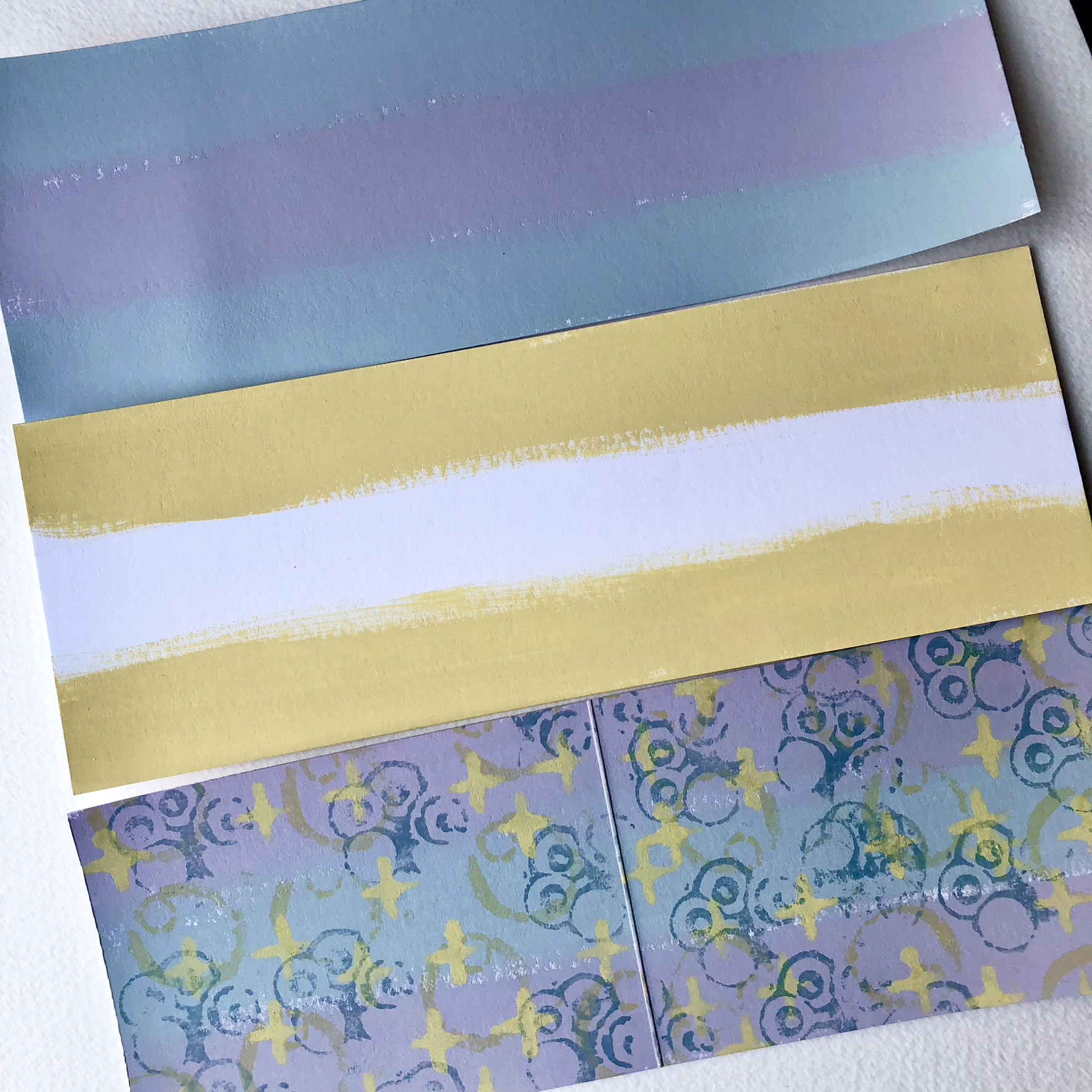
The starting point was to create my colour wheel. There is a downloadable colour wheel in the PaperArtsy People Facebook Group files. I printed it on a sheet of A5 heavy copy paper. I fell in love with all the gorgeous colours it created with just 3 Fresco Finish paints.

Next I chose a split complimentary colour scheme, this being the PaperArtsy Fresco Finish Chalk Acrylic-Aqua Duck egg (FF199) as my Primary colour with the 'split' of the two tertiary colours at either side of the orange directly opposite. These shades are created from Butter (FF129) and Candy Floss (FF70). Its much easier to see this explained in the photo below.


It was now time to create the doll and her skirt. I usually start with a prototype for projects such as this, it makes it easier to plan and change direction if needed. So I stamped out the images from Lynne Perrella stamp set (LPC042) and (LPC041) that I wanted to use on medium weight cardstock. As you can see, there are lots of fabulous details in the stamp which were going to be useful later.


Creating the skirt base for my doll was fairly straight forward, I measured and cut the clear plastic bottle to the correct height. It was at this point that I realised some adjustment to the arms of my stamped figure would be necessary as the skirt wouldn't fit at the waist with the arms so close to the body. So I removed the arms from my prototype and fashioned extras to see how they would work as movable limbs. This was an added bonus, created out of necessity.

It was at this point that I could see the potential for creating added details on the doll as well as creating some fabulous textures on fabric to contrast with the clear plastic of the skirt base. I still wasn't sure how I would bridge the gap around her waist, but that would become clear later.

Now that I had a firm idea how the basic structure of my doll would work it was time to create some of the more exciting parts of the project. I had always had a firm idea of how I wanted the skirt and wings to look. As it turned out, my original idea for the wings would need to change slightly, but we'll come to that later.
To create my doll's body I stamped onto heavy weight water colour card using Ranger Archival ink (Jet black) and a stamping platform. At this point it is important not to remove the stamps from the platform. I then coloured the face, legs and arms of the image with the flesh coloured paint.

Once completely dry, you can place the painted card back into the platform and repeat the stamping to add any lost details back onto the image. Fresco paints being so chalky accept ink beautifully, and it dries fast on the paint too!

It was now time to move on to adding some interest and texture to the fabric from which the skirt would be made. I gathered a selection of cotton and natural fabrics.
The first strip of muslin had some stencilled letters and numbers added using Ranger Archival Ink (Jet Black ) and a sponge. Lynne doesn't have any stencils in her PaperArtsy designs, so I used a PaperArtsy Stencil by Sara Naumann (PS271) which tied in with the numbers and letters on Lynn's stamp designs.


I had some tea-stained cotton in my selection, I taped the stencil to the fabric to mask off any area where I didn't want Grunge Paste, but also to make it easier. The paste was easily applied with a palette knife.

Whilst the Grunge Paste was still wet, and with the stencil and tape removed, I placed the fabric in a plastic tray and sprinkled over a generous amount of Rusting powder (RP45) onto the wet paste. Once the paste was dry it was easy to brush off any excess powder and return it to the pot. The fabric was given a generous sprinkling of white vinegar to activate the Rusting Powder and left to develop overnight in a well ventilated room.


I was in love with the end results. The texture and rust was wonderful.

I had an idea for creating the wings for my doll using baby wipes. To continue the rusty vibe, but at the same time clean the plastic tray used for the rusted fabric, I cleaned the tray out with a couple of wipes and set them aside.

Once completely dry I tore them into small pieces ready to use on the wings.

The next stage was to create the base for the wings. I had run out of acetate sheets, so had to improvise, thankfully I had a huge amount of laminating pouches sitting unused in a box. I stamped the Butterfly image from stamp set LPC041 on the inside of the pouch using Ranger Archival ink (Sepia) whilst it was still wet I used a cotton bud to smudge the edges of the wings outwards slightly for a softer look. Once passed through the laminating machine the image was indelible.

Once I had cut the butterfly wings out with sharp scissors, it was time to add the texture, rust colour and transparent elements. I laid the wings face down on a sheet of PaperArtsy Crunchy Waxed Kraft Paper (WKPA5) I laid several torn pieces of rusty baby wipes onto the wings and used Paperartsy Fresco Finish Pearl Glaze (FF53) as an adhesive to attach them. Gradually building up the layer and leaving the frayed edges overlapping the edge of the wings. Brushing the Pearl glaze well past the edges of the wings and baby wipe, onto the Crunchy Waxed Kraft Paper creates an acrylic skin. I made sure to repeat this several times, drying between layers. The rusted wipe layers took quite a long time to dry, so I suggest to leave it overnight at least.


Once all the layers were completely dry, I gently and gradually pulled the wings from the Waxed Kraft Paper. I started in the middle between the two wings and this seemed to work well. Once removed from the paper, I pulled tiny bits from the Pearl Glaze acrylic skin at the edges if it was too uniform. I love the way it gave the wings a ragged look at the edges with wispy fibres running through. They were almost done but needed a bit of detailing to tie them into the rest of the project colour wise. A few dots of coordinating paint added the finishing touches.

 |
| Crunchy - Waxed Kraft Paper |
Looking at my selection of rusted fabrics I wanted a softer coloured piece but with texture too.
I remembered I had brayered some leftover paint from the project onto a section of muslin, this was ideal surface to add texture to.
I love to add burn holes to paper and wanted to try this idea with fabric, so here was my chance ! It worked a treat. I used a incense stick and made sure I worked on my glass mat with a very wet cloth next to me, just in case.

I now had all my elements completed, it was time to bring them all together.

There were quite a few twists and turns with this project, some through necessity, some through artistic choice, but in the end they all added to the finished look of my art doll.
My original idea for the skirt was to have a full skirt which covered the plastic bottle, but as I worked on the layered skirt I realised I liked the transparent underskirt showing. The arms on my doll had to be adapted, this added an extra element. As you will see from the following photos, the wings also had to be adapted from my original idea. All these things could be seen as problems to overcome, but I like to see them as the project evolving and improving.
It was time to create the layered fabric skirt. Remember those rusty baby wipes from earlier ? I teased the edges of two a little to create a wavy edge and ran a gathering thread along the top edge. I repeated this with all the strips of fabric I had prepared.

Once I had all my layers gathered it was time to glue them to the bottle. As I said previously, I had planned on a full skirt, but I liked the idea of the underskirt showing. This tied in with the theme and added another visible transparent element. I tried various adhesives and discovered that Fabri-tac worked the best, it gave a strong bond with a shorter drying time than others. I started at the bottom of the skirt and worked my way to the top, finishing with a full circle of the painted, burnt muslin. I also added some scrunched up Crunchy Waxed Kraft Paper between the layers for more texture and contrast.

Now back to the art doll, who needed some arms. I backed my doll with PaperArtsy Grey board (GB03) for strength and created some arms from card which I had painted with leftover paint from colouring the stamped image. As you can see I made the arms long enough to overlap the shoulders.


My doll was now ready to be dressed. She fitted into her skirt easily and I started to add some fussy-cut elements to her arms and legs. These had been stamped onto leftover painted paper.
The next step was to add her wings. This is were I encountered a problem. Her wings were too big to fit easily on her back. I tussled with this problem for quite a while before deciding to bite the bullet and cut her wings in half. It was the best decision !


I was very happy with how Rosa was coming along, the transparent elements fitted with the theme and I loved all the rust and texture. It was time to move on to the finishing touches, so my Spanish Princess was ready for her coronation.

I wanted to add some little details to Rosa's underskirt, so tiny fussy cut numbers from the stamped images were just the thing. I used gel medium to make sure they stuck well to the plastic.

A few extra fussy-cut elements were needed, I added shading to the edges with a soft pencil, smudging it out with a cotton bud.

The last two elements to add were her crown and butterfly belt. I stamped the girl with the terrarium from stamp set LPC041 onto acetate using StazOn Ink (Black), I adjusted and cut the acetate to fit Rosa like a crown and attached at the back of her head. The stamped and painted butterfly belt bridged the gap between the body and skirt.


I really loved creating Rosa and who knows I may create a sister for her using the second image in the stamp set. I had fun playing with the Pearl Glaze to create the acrylic skins on her wings and I've found a new use for those unused laminating pouches that I have so many of.
I will definitely be using my Grunge Paste and Rusting Powder combined on fabric again, I love the effect and texture. Rosa will be taking centre stage at Christmas in our house, atop one of our many decorated trees. I may just create some matching Christmas decorations too. I can imagine a rosette of fabric with a face in the centre. I would love to see any projects inspired by Rosa, so please share them in the PaperArtsy People FaceBook Group.
Have fun and happy crafting
Mags


Facebook: Facebook
YouTube: Mags Woodcock - YouTube
Instagram: Mags Woodcock (@mags.woodcock)