Friday, 31 January 2020

2020 #2 A Hint of Spring: Cherry Blossom Gift Box with ESA Minis {by Jenny Marples}

2020 Topic 2: A Hint of Spring


With a beautiful project to herald Spring, Jenny has created a soft and sumptuous box full of texture and details and some great tips for distressing your projects.

Hi everyone, it's Jenny Marples (of Pushing The Right Buttonswith you today sharing A Hint of Spring in the form of a Cherry Blossom Gift Box.

Whilst many of us long for warmer, lighter days here in the UK, the Japanese eagerly await the flowering of the Sakura to herald the arrival of Spring. Being a huge fan of all things oriental I immediately thought of cherry blossom when seeing one of Seth Apter's new mini stamps (EM50) and it sparked the idea of creating a collage style box.


Below is a tutorial to show you how this came together and to share some ideas for using Seth's latest Minis in combination with the Soft Pinks and Khaki Greens Fresco Finish Acrylic Paint sets to achieve a gentle, delicate look to your finished projects.

I assembled the new Eileen Hull Designs Gift Box from thick board and painted it. After adding a layer of Winter Green Acrylic Paint I applied candle wax followed by black gesso so that as the box is handled it will naturally acquire signs of ageing, with hints of the deep green shade showing through in the scratches and scrapes. 

Needing a surface that could remain flexible when painted yet strong enough to cope with stitching I opted for an off-cut of textured wallpaper. This was covered in one coat of Lichen Acrylic Paint.


Seth's EM55 stamp was used in a repeating pattern across the paper using Khaki Acrylic Paint, and I then used a brayer to add random patches of more Lichen Acrylic Paint to get that slightly worn wallpaper look.


Torn scraps of thicker cheap watercolour paper were covered with Honey Dew Acrylic Paint before being overstamped with Seth's EM56 stamp using more Lichen Acrylic Paint.


To provide some contrast to the pale greens I painted some thinner copier paper with Seth's new Gold Rush Acrylic Paint before overstamping with his new Heavy Cream Acrylic Paint and EM49 stamp.


The next piece of paper was actually left over from the Valentine's box shared here earlier this month; a combination of Blush, Rose and Gold Rush Acrylic Paints were brayered over each other before being die cut to create lace effect pieces. 


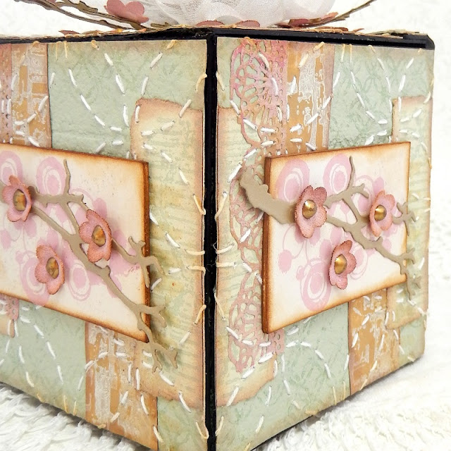
After cutting the wallpaper into squares big enough to cover each side of the gift box, the various painted, stamped and die cut pieces were edged with Walnut Stain Distress Oxide Ink and glued in place to form five identical collages (the base of the box was covered just with one of the wallpaper squares). As an extra touch of texture and detail I stamped and embossed Seth's EM54 stamp using his Vintage Beeswax Baked Texture Embossing Powder as shown below. Once complete I used a template to stitch a traditional Japanese Sashiko pattern over each collaged square to help unify the background and add more texture.


The blossom panels were created by stamping Seth's EM50 image onto tea stained copier paper with (appropriately enough) Cherry Blossom Acrylic Paint. They were then mounted onto thicker card and edged with more Walnut Stain Distress Oxide Ink.


I created branches to lay over each stamped panel by painting kraft card with Gold Rush and White Fire Acrylic Paint before die cutting each shape.


A combination of Blah Mange and Rose Acrylic Paints were added to a strip of plain cotton calico - I found following Leandra's tip of mixing the paints with a fabric medium before applying them ensured the coverage was a lot smoother and easier.


Individual blossoms were die cut from the painted fabric using Eileen Hull's Stitchy Flowers dies and after shaping them with a ball tool, I added a drop of Liquid Pearls into the centre of each one, allowing them to air dry.


Finishing the box was then simply a case of assembly; after adding the square collages to the sides and top of the box I glued the blossom panels, branches and flowers in place on the sides as can be seen below.


In order to add some dimension to the top of the box lid I used some white wire edged ribbon to form a bow, inserting the die cut branches and flowers to enhance it further. A hot glue gun is definitely recommended for this stage! Below are some close ups so you can see more of the details.


And here's the finished Cherry Blossom Gift Box in full again.


I really enjoyed combining this softer colour palette with Seth's stamps and hope it gives you ideas for looking at his images as more than just backgrounds to be used with the punchier shades.

Thursday, 30 January 2020

2020 #2 A Hint of Spring: A Piece of Art with ESA Minis {by Amanda Pink}

2020 Topic 2: A Hint of Spring


Amanda's post showing us step by step how she's created her multi layered piece is a really useful resource for those wanting to get more texture into their art. The addition of the heat embossed accents provide a real fabulous depth of focus to the piece.

Hi everyone, it's Amanda ( ink-a-pink) here with you today, and I'd like to share with you the project I have created for the current topic: 'A hint of Spring!'.

It seems that as the New Year came in one door, my creative mojo walked out the other so I welcomed the opportunity to create something for this topic using some of PaperArtsy's fabulous products. I was sure they would help the mojo return. So, I had no real direction or definite plan of what I would actually create I simply 'played' around and enjoyed the products. From doing this my mojo returned and my finished project was realised. It is a multi-layered mixed media art panel that features some of PaperArty's Jan 2020 new release paint and stamps.


Have you seen PaperArtsy's Jan release of new Fresco Finish Acrylic Paint colours? They really are something special. Be sure (if you haven't already) to stop by here to see them in all their beauty! From the newbies I chose to work with the blue and pink shades: MarblesBlue MoonBlue BayouMauveGlobe Thistle and Grape.


I also added a couple of oldie but goodies PaperArtsy Fresco Finish Acrylic paints: Snowflake and Inky Pool.
All these colours evoke thoughts of Spring for me.

The Jan 2020 new release stamps are just as fabulous as the new paint colours. Something for everyone; the choice is yours! I was very happy to have the chance to work with some of PaperArtsy new Eclectica (Seth Apter) mini  stamp collection (EM49, EM51, EM52).


Both the larger and smaller background panels were created in the same way. They each have layer upon layer of detail, colour and texture all of which were created using Seth Apter's mini stamp designs and the Fresco Finish Paints mentioned and shown above.

There was a lot of repeat stamping involved and as I stamped with paint there was also plenty of cleaning up the stamps with water (a necessity when using stamps with acrylic paint!).
I worked on PaperArtsy Heavy Smoothy card which I later adhered to PaperArtsy Heavy Grey/ White Board to give the panels some sturdiness for display. 


For the first couple of layers I simply brayered the card with PaperArtsy Fresco Finish Acrylic Paint: Marbles and Mauve. This added just the right amount of colour and texture to then build upon. It also prevented any chance of 'blank page/ white fright' syndrome setting in!

To create all the subsequent layers I used one of Seth Apter's mini stamps with one of the Fresco Finish colours.


EM51 stamped with Blue Bayou (LHS), EM51 stamped with Snowflake(RHS).


EM49 stamped with Globe Thistle(LHS) ,EM49 stamped with Blue Moon (RHS).


EM51 stamped with Grape(LHS), EM49 with Snowflake (RHS).


EM49 with Inky Pool. I love how Inky Pool seem to 'lift' the whole piece and bring it to life.Inky Pool is a translucent paint so it added some deeper tones without hiding any of the other colours.

So that's 9 layers so far, just one more to go.


EM49 (just the circle part of the design) stamped with Snowflake. I really like the almost 'ghost' stamped impression that the circle/ snowflake stamping created. The addition of EM49 to the background panels also helped unify them with the circle embellishments that I created to use as part of the focal feature.


I painted some off cuts of PaperArtsy Heavy board with two of the PaperArtsy Fresco Finish Acrylic paints I used in the backgrounds: Grape and Inky Pool.
I then heat embossed the painted board multiple times (maybe 5 or 6) and stamped the circle part of the EM49 into the molten powder.


After cutting out the embossed circles I accentuated the grooves of the circle design with  Snowflake Fresco Finish Acrylic paint. I was really pleased with how these turned out. The matte finish, all the peaks and troughs of the circles within the stamp design would not been achievable if I had simply stamped the design onto painted card.

With the backgrounds and embellishments created all that remained was to bring them  together in a cohesive design. Here's a a few close ups of the finished Art Panel.


I hope by getting you a little closer, you will be able to see the layers and depth of colour, detail and texture that can be created by using some of PaperArtsy stamp designs with their Fresco Finish Acrylic paints.

I enjoyed creating this piece, especially seeing the layers develop and the anticipation of whether the next one I added would work or not. Had I chosen the right stamp? Had I chosen the right colour? Of course, it didn't matter too much really as there was always the option for another layer! 

Thanks for joining me today.
Keep on Creating
Amanda
x

Blog: ink-a-pink
Facebook: Amanda Pink
InstagramKynapi10
Pinterest: PinkArt