Sunday 31 March 2019

2019 #4 Tick Tock: Gel-Printed Cards with Hot Picks {by Ellie Knol}

2019 Topic 4: Tick Tock


Gel-Printing seems to have become Ellie's thing of late, and on this occasion she has used bright paints with Vintage stamps to create a fresh modern effect  ~ Leandra


Hi everyone, it's Ellie from PAPER-STAMPS-COLOR with you today, and I'd like to share with you the joy I had making these four cards in the Tick-Tock theme.

My aim was to feature the beautiful new Hot Picks stamp sets and started on a project, an altered frame and got stuck, yes really!  The color scheme did not work for me and I couldn't get the collage as I wanted it. Oh well,  I will finish it in my own time another time!  

SO, I started plan B. ( I said it out loud, grin.)
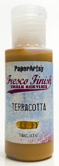
I started with an A4 size gelliprint; with Fresco paints of course and cut it up in 4 even-sized quarters.
 

I really like the colors, but was not ready to use it in a project yet, as I liked it too much. I pinched myself and thought: it's only paper and paint, and where this one is coming from, there's a whole pile of other don't-use-me prints!!!!!!


I used the new stamp sets in the Hot Picks collection, which are HP1901 and HP1902, these were only released last week, stockist details can be found here.


When I started working on this card base, I thought I was not going to like it.. but it's my favorite card of the 4 now. There's so much detail in the background to enhance the beautiful script/clock stamp, and the contrasts just turned out beautiful. I love the edges of the monoprint to be part of the card design too! It gives it a peeled-paint look.   


On this close-up picture you can see the beauty of the clock, which has been sponged with a green distress ink and heat embossed in clear. As a matter of fact, I did this with the stamped focal-point clock images on all 4 cards! 


Another quarter of the monoprint resulted in this collaged stamped card. The text stamp has been heat embossed with sea-foam white embossing powder.. it almost looks a tiny bit yellow on this background, which I really adore!


The 
stencil I've used in the monopinting really does the job here with beautiful contrasts between the red and green Fresco Finish Paints! 


I LOVE this stencil from Scrapcosy: PS074


Quarter number three of the original monoprint also has beautiful edges... 

 
 The stamped image is from Hot Picks set, HP1502 


And now for the fourth one: yummy details from the new stamp designs! I punched the clock image out and adhered it back after heat embossing it in clear, and slid another clock image partially underneath it to add to the collage. 


The heat embossed text is from a golden-oldie set, Clocks Plate 6 from the Ink & The Dog collection.


Needless to say.. working on these cards, which will make for a gorgeous gift, made me happy and relaxed. I got into the flow real quick, and enjoyed making them. I like to just go with what I have, and (this time) not to try and use any new (to me) techniques.
I am happy with the results. 


There you are..
I hope I got you inspired.. get your crafty stuff out and relax!
And of course.. enter the challenge.. you wouldn't want to miss the chance to win this time!!

Saturday 30 March 2019

2019 #4 Tick Tock: Time is Golden with Ink & Dog {by Miriam Grazier}

2019 Topic 4: Tick Tock

There's nothing more satisfying than a bunch of layered clock parts, and Miriam has done that beautifully within an MDF clock frame. Love how the texture is highlighted by Treasure Gold so perfectly too! ~Leandra.

Hi everyone, it's Miriam with you today, and I'd like to share with you a MDF pocket watch that  I have altered using the Ink and Dog Clocks series of stamps.

I chose to use these stamps as they remain one of my favourite sets since I clapped eyes on them when they were released.  I've always had a fascination with clocks and time stamps and so they have always be perfect for me, in fact they are timeless (ok, ok, I know you are all groaning at that!).  I love the variety of clock heads and they layer up beautifully.  In fact, they are so versatile that I since I started to plan my project a few months ago I have changed my design several times.  Teaming these stamps with newer products such as the Fresco acrylic paints, Grunge paste and infusions was wonderful to work with.


Every time I use these stamps I remember just how much I love them.  From the Ink and the Dog series of stamps, these are from the 'Clocks' Family: Clocks 1 (C1), Clocks 4 (C4), Clocks 6 (C6).


They never age in my stash and I always spot something I had forgotten, for example, the small text stamp which I used to stamp into the wet Grunge Paste.


I love stamping into Grunge Paste.  I love the texture that it creates.  A warning for those of you who have not tried this before..... make sure you clean your stamp immediately.  Once the Grunge Paste dries it could prevent a clear stamped image.  I also spray the stamp with water before I stamp into the Grunge Paste.  This ensures an easier release from the paste, and you only need a very thin layer of paste, then the detail will be really sharp.  


I loved how the Rusty Car Infusions dried on top of the Grunge Paste. 

  
I did pat the Infusions with a paper towel before I dried it.  This gave a softer look.  The first time I did this it was too pale so I repeated this step.  I often prefer to do this and build up the layers than create a heavier background first time.  It makes me feel more in control.


The MDF was painted with layers and layers of watered down Fresco Paint which I dried in between each layer.  I stopped counting the layers but think it was about 15 in the end. 


I loved how the paint dripped into the stamped Grunge Paste.  Once fully dry I added a very small amount of Treasure Gold to my finger and highlighted the script texture.  I also added Gloss Glaze to the clocks so that they stood out from the rest of the project.

 
I had so much fun creating this project.  It took me back to the excitement i felt when I first got these stamps at the Artisan Show.  The project brought together everything that I love about crafting and mixed media.  It also showcases how everything works so well - Fresco acrylic paints are perfect to stamp on, emboss, and really layer up.  Just perfect!

I think if I was creating this project again I would add Grunge Paste and stamping on the top of the watch.  I did consider going back and re-doing this but I didn't want to do anything that could potentially ruin my project if I made a mistake.

If you haven't got these stamps I really encourage you to get them - they can be used for so many projects.  And if, like me, you haven't used them for a while, dust them off an have a play.  I really hope that I have encouraged you to have a play.  It was so wonderful to just not think and paint and stamp and really enjoy myself and get lost in my project.  I had so much fun.

Thanks for joining me this evening.  
Miriam

Blog: Miriam's Creative Dreams

Friday 29 March 2019

2019 #4: Tick Tock: 'Cuckoo' with ETS {by Bryan Evans}

2019 Topic 4: Tick Tock

Bryan is our experimental geezer, and this time he's conjured up a cuckoo inspired clock in some really nice fresh colours and a splash of gold. ~ Leandra

Hi everyone, it's Bryan from Geezer Crafter with you today, and I'd like to share with you my 'cuckoo' clock project using one of the new stamp sets from Tracy Scott.

As soon as I saw this set of stamps the idea for the clock and the 'parts' came straight to mind. Just love the sketchy feel to this set.


I found the filler/spreader tool shown below in a DIY store, makes for a great painting tool!!. I used Fresco Finish Chalk Acrylics in SeaglassPine GroveBlah Mange, Jade and Coral


I painted some rice paper with Seaglass before adding some gold embossed powder. I did try it the other way round, not a good idea for me!!. 


Smoothy Heavy weight card for the clock's pendulum and weights. I love how a coat of Seaglass has dulled down the gold embossing a little.


Another view in a different light. Love the paperclay beak!!


Really enjoyed this project, I always find it amazing that a set of stamps can set off so many ideas. I am looking forward to seeing how you interpret the topic, and how use your stamps!!

Thanks for joining me today, Happy Creating!! Bryan.

Blog: Geezer Crafter
Instagram: bryanevans7772

Wednesday 27 March 2019

2019 #4 Tick Tock: Faux Shibori with Squiggly Ink {by Chris Dark}

2019 Topic 4: Tick Tock


At the recent trade shows we have attended I have been getting lots of positive reports of people having fun with infusions and fabric or yarn. As infusions are made with a permanent dye, fabric is a natural partner as they are permanent. In this post, Chris has experimented with a wax-resist, tie-dye method that works a treat with a die cut clock! Fascinating! ~Leandra.

Hi everyone, it's Chris Dark with you today, and I'd like to share a project that was formulated around a few ideas after choosing the Tick Tock theme and pairing it up with the gorgeous Squiggly Ink - Ding & Dong Plate 4 stamp set and Royal Blood Infusions.


The Squiggly Ink stamps are available unmounted or EZ mounted and are 1/4 plate size (ie approx A6)

At a fabric and needle arts show I went to last year there was an exhibitor selling Shibori fabric plus accessories and various homewares made from it. The fabric reminded me of tie died fabric and I expect the western version emanated from this centuries old Shibori dying technique. The stand had such impact, everything was in the traditional Japanese colourway of Indigo and white and the image of it has stayed with me and started me thinking of ways to create it in papercraft. Royal Blood Infusions came to mind for the colour, it's got that strong blue tone and the walnut crystals help it along and give it a natural appearance. I remembered some aquawax that's been in my stash forever and I thought it might be perfect for creating the resist, the wax could give a pleasing result if the application was stippled. I also brought in a Sizzix clock face die which fitted the theme and would work as a stencil. 


Above you can see a photo of a selection of Shibori fabrics. There are various resist techniques for creating the fabric; tying, stitching or pleating the fabric in different designs before dying are some and each technique has it's own name. The most used dye is indigo and sometimes madder and purple root were used. 


(From Wikipedia) 
Itajime Shibori  is a shaped resist technique. Traditionally, the shape is sandwiched between two pieces of wood which are held in place with string. Modern textile artists can be found using shapes cut from acrylic or plexiglass and holding the shapes with a clamp. The shapes prevent the dye from penetrating the fabric they cover.


For my take on Itajime Shibori I've used a die cut clock shape held down and used with aquawax as the resist medium. I was very happy with the resulting tie die effect and the Infusion colour gave a version of the traditional Indigo dye used to create Shibori fabric.

The wax is stippled through the die cut with a flat stencil brush, don't go over it too much and leave the wax to dry naturally.


Once a heavy application of the Royal Blood Infusion colour is sprinkled on and water spritzed over it you see the resist working. I love how the stippling leaves little areas where the colour can pool. Leave this to dry naturally for best results.


Wish I could do what the sentiment says sometimes :D!


Gorgeous Infusion colour doing it's thing! 


I've outlined the clock bird image to try and bring it out of the busy background with a white Stabilo pencil, there's a bit of white gel pen too.


The cluck clock image (love this clock bird!) is coloured with a mixture of copic markers and pencils and highlighted with a white gel pen. I lined all the separate bird stamps up using my stamp platform which helps with alignment or dodgy stamping!

I'm very taken with this idea and will try it again with different die cuts and colours. You can see that you really only need the wax, an open style die cut and stencil brush to get started and of course some of that luscious Royal Blue Infusions colour. On reflection I could have brought the cluck clock bird out more by adding some gesso behind it but as ever I got lost in that background and didn't want to cover it up! :D This piece is an experimentation and will go into my reference book, I don't always have a particular project in mind or am necessarily bothered about making up the piece into something specific, I just enjoy the process of trying something out and seeing what happens.....do you do that too? If you do I hope you'll give this a try.

Thanks for joining me today.
Chris x

Blog: www.sketchingstamper.blogspot.co.uk
Facebook: https://www.facebook.com/christine.dark.7
Instgram: @chrisd999
Pinterest: https://uk.pinterest.com/cdark4163/