Thursday 30 December 2021

2021: PaperArtsy - A Year in Review {Topics 13 to 15}

  
Hello again from PaperArtsy HQ,

Here we are at our final post for the year. I hope you have enjoyed taking a look back at some of the blog highlights with us. It's amazing the variety of ideas that we have shared over the past year, and of course, we will be back with many more next year too!

As we round off the year, I would just like to offer a heartfelt thanks to all our bloggers, past and present, (and future) ! The projects they create for us, and of course for you, are always absolutely superb, we cannot thank them enough for their attention to detail and willingness to share their tricks, tips and creative secrets with you all.

To our designers who go from strength to strength, you are such a fun team, all so supportive of each other, and an absolute joy to work with! I know you all have your individual quirks, and work differently and that is why you are all so unique! We have missed seeing you all face to face at the trade shows, and look forward to spending time again hopefully in the not too distant future!
 
To our retailers around the world who have pulled out all the stops to offer classes, both online and face to face and who regularly order so that you have access to our brand in all your corners of the world... thank you for your friendship, support, feedback and encouragement, and especially your patience as we have adjusted to life in France and all the new systems we are still coming to grips with!
 
And to the lovely staff here at PA HQ, we thank you too for always picking orders accurately and shipping fast so that people don't have to wait too long for anything! I love how you are always thinking on your feet and make suggestions on how we can all improve and be more efficient. You guys have been so patient as we continue to try to get things set up in the new PAHQ spaces. Oh and also for the fun Friday after-work gin tastings!

To those of you who follow the blog, thank you for all your comments, we appreciate them all, it is so nice to know that there are people out there reading and following along, and that you find this blog a valuable tool and source of crafty inspiration!

So lets talk about today's topics we are remembering! We have picks from Topics 13: Tiny (News) Print, Topic 14:Mash Up (with LPC, EGL, EEV and EAB) and last of all Topic 15: Journaling Gratitude. These have all been beautifully written,and joyful ideas as we have come to the end of the year! Lets take a look back.

Leandra 

Topic 13 : Tiny (News) Print
Text and letters play a crucial part in creation, from titles and describing, to expressing what images cannot, or perhaps to play a role as the visual texture of a piece. Topics linked to writing, typography and letters are recurrent on the PaperArtsy Blog. This time we wanted to put a big focus on tiny letters. Newsprint is the obvious example but encyclopedias, telephone books (now a vintage memory), medication spec sheets or travel guides are also good candidates, as well as lots of stamps! Our bloggers run with the idea, sneaking snippets of text in their backgrounds, putting emotion in their sentiments, or creating embellishments out of printed pages. 

My first pick is this amazing vintage spool book by Jennie Atkinson. As she explains in her original blog post, this was not her initial plan but sometimes you have to go where your muse takes you. Tiny text is everywhere, from quotes to subtle stamping on the fabric. Yes, that text on the fabric looks part of the design but she actually added it to the pre-printed design! I love how all the elements are pulled together by the repeated use of limited colours.


And I hope you didn't miss Lynn Good's bright bouquet, a riot of colour in her art journal.The tiny letters are obvious here, busy filling the background. As Helen also shares in her original blog post, mixing different dictionaries, with a range of fonts, sizes and colours, is a fantastic idea to create easy and interesting backgrounds.The contrast between the subdued text and the vibrant flowers, aided by subtle shadowing, makes for a truly striking piece.


I adored how Jenny Marples took Seth Apter's rather abstract stamps, saw their architectural inspiration and translated it into a completely representative scene, full of texture and depth. The tiny print is quite discrete here, but her original blog post shows in detail how she transformed a text stamp into the stone wall. Genius! A real lesson in how to look at stamps differently and discover the other images hidden within.


Topic 14 : Mash Up with LPC, EGL, EEV and EAB
The end of the year comes near and with it the third and final of our Mash-Up topics. This time the participants are: Lynne Perrella, the original queen of collage, with her intricate characters, Gwen Lafleur, with her intricate and ethnical patterns, Ellen Vargo, with geometrics bold and delicate, and Alison Bomber, with inspiring words. As somewhat expected with this selection, the Lynne Perrella stamps often provided the focal people but it is always amazing to see how differently our bloggers are able to interpret the same stamps. Be it with colour, technique or composition, they beautifully merge together each with their own style.

First up is Alison Bomber with this magnificent wintery piece. I love how she looked past the first most obvious use for Gwen's and Ellen's stamps and translates them into crystals and snowflakes for a very atmospheric set-up. The Ice Queen  and King obviously come forward as the focal point but they are still perfectly integrated. Alison's original blog post explains all her process and is a wealth of inspiration and tricks for subtle texture and details.


Even with an LPC lady as the main image, Etsuko Noguchi truly showcased Ellen's stamps in this wall hanging. I love the association of the ghostly vintage character and the modern colourful background. I feel it really portrays the idea of an old soul lost in the current world. In her original blog post, Etsuko shares her technical inspiration for this piece and details her creation of the masterboard that becomes her background, quite the transformation!


Nikki Acton experimented with vellum and a royal colour palette, gold and purple! How she has used only parts of the stamps is so interesting, revealing new details and creating new combinations. I also love the text peaking through the face: is it a hint of their thoughts? Her original blog post is a fascinating look at how inspiration flows, how sometimes only one little idea drives a project, which then seems to advance almost by itself.


Topic 15 : Journaling Gratitude
The end of the year is approaching fast... This is our last topic! As tradition dictates, it is the time to reflect back on another strange year. Lots of crafters explain how creating helps them express, process and share their feelings, and provides a bit of balance in their life, making things more manageable. In these isolated and anxiety-inducing times, we should not forget the good things and be grateful for the small rays of sunshine or unanticipated joyful moments. We hoped this topic to be an occasion for the community to share tips for journaling, memories of the year and inspiration for positivity.

Autumn Clark made her journal from junk materials and leftovers from the year's projects, a great way of doing her year in review and expressing her hopes for the future. I love her use of the hands and rope, so clever and innovative! In her original blog post, she shares all her inspiration and tricks for this journal, as well as two other finished spreads. Her gel printed backgrounds are full of interest, making the pages easier to fill, battling blank-page anxiety. 


She might not be a regular journaler but Helen Chilton still wanted to celebrate positivity and did so in a heartwarming riot of colours and texture. The mix of Infusions and paints create so much variation and surprise combinations. I love how the colours swirl and mix within the images, revealing details and creating depth. Helen's techniques and process, detailed in her original blog post, are very intuitive and playful and could absolutely used in a journal.


Keren Baker focused on future gratitude and made this journal to practice thinking positively in the new year. What a great idea! She also ventured out of her comfort zone to try and paint a marble effect. Her experiment is wonderfully documented in her original blog post and the result is incredibly accurate! I love how it contrasts with the main colour of pinkish-red, which also makes an appearance on the inside pages for a soft cohesive look.

Thank you for joining us again today.

In 2022 we are adding a handful of newbies to the team, something we have not done for a few years, so we are very excited to be sharing with you who they are over the next week or so on our instagram @paperartsy . Wishing you a restful holiday season, and here's to 2022 being a key turning point for us all. Warm wishes to you all

 Leandra and the team at PaperArtsy 

Wednesday 29 December 2021

2021: PaperArtsy - A Year in Review {Topics 10 to 12}


Hello from PaperArtsy HQ,

We're back for the penultimate round up post of 2021. And hold on to your hats, it's another goodie, full of inspirational ideas, techniques and crafty fun!

Today Dounia has her picks for you from Topic 10:My Favorite Colour, Topic 11:Twinkle, Twinkle and Topic 12:Sustainable Crafting.
 
Get ready for a bit of bling, brightness, and blooming good fun!

Leandra 

Topic 10 : My Favorite Colour

Here is a nice straightforward topic title! In the previous years, we tried to have regular colour topics on the blog but took a break in 2021. Therefore, for our one colour theme of the year, we let our bloggers make their choice and share a favorite combination. As expected, the resulting projects were wonderfully eclectic, from vibrant bright hues to subtle half-tones, from monochromatic cameos to the full rainbow, from barely there nuances to fully saturated splashes. Everybody loves colour, it creates atmosphere, invokes memories, shares feelings, but everyone's love for it is different, making this topic so interesting!

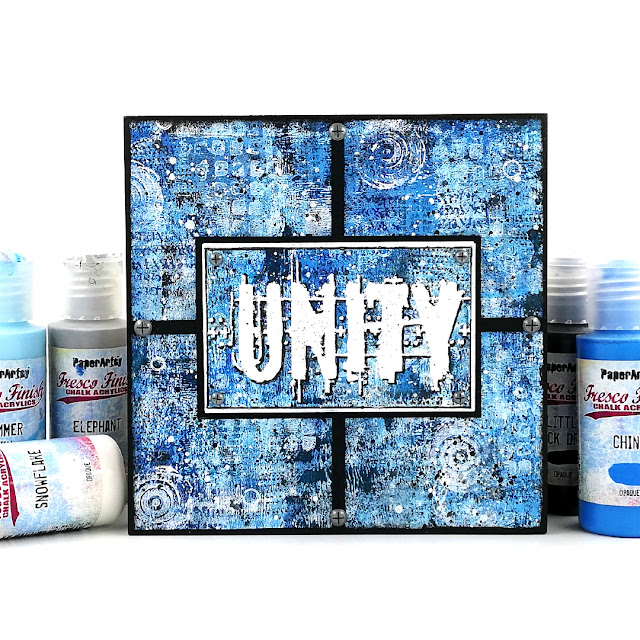
My first pick is this amazing art block by Amanda Pink. Blue is obviously her favorite colour, despite her name, and she rocks the monochromatic look. Check her original blog post to discover her process and watch her master-board develop layer after layer. I love her use of clean lines to cut through the background and how striking the embossed 'Unity' is. This piece is so bright, when blue is so often used as a soft colour.

Ellie Knol chose a combination of teal and reddish brown for her journal covers. The two mix in a gorgeous dark plum, making for a unusual palette. The obscure colours, added to subtle stencilling, create wonderfully atmospheric backgrounds. The focal images are an interesting contrast between realistic stamps and unreal colours. I love how all the elements combine to create a fairy-like dreamy world.(link to original blog post)


Jennie Atkinson's project is all about soft and subtle touches to showcase her favorite colour, tea dyed paper! I love how the Infusion in the background is so diluted, barely there, but still offers a lovely contrast to the focal images. The coordinating paper colours and inks are so skillfully balanced in her layers, providing both cohesion and interest. Jennie's original blog post is a masterclass in building a light and complex multi-technique background.


Claire Snowdon certainly does not hide her fondness for pink! She used it in 3 different media: acrylic paints, watercolors and Infusions. I love the variation of tone she achieves, making the flowers pop despite being pink on pink. They seem to burst out of those ATCs! Her original blog post beautifully shows all the details of the texture she create in her backgrounds, with lots of little touches that are not obvious but contributes to the overall style.


Topic 11 : Twinkle, Twinkle
🌟🎵Twinkle, twinkle, little star, How I wonder what you are...🎵🌟 This is basically what we asked our bloggers! Stars are probably one of the first things we doodle and are everywhere in craft products. If you also add everything sparkly, glittery or shiny, and expand the topic to space, galaxies and lights, the possibilities are endless! So what are stars to you? How do you use them in your crafting?

Tracy Springer's clever card has everything that comes to mind when thinking of stars: a galaxy purple background, white and yellow stars of all sizes, shiny gold, halo effects... Add the depth of a tunnel card and a cheeky Zini high priestess and you are in for a world of fun! In her blog post, Tracey shares her process, her struggles (not that you would guess looking at the finished project!) and the inside of the card, which is also gorgeous and star-filled.


Instead of indulging in all things sparkly, Kate Yetter went for star related stamps and a colour palette of neutrals and rusty-browns. She uses it skillfully to provide cohesion to her collage while letting the focal images pop on their white paper. Her original blog post usefully details her process to obtain this deliciously grungy background and gives you a closer look at all the ways she has used the stamps in her layers and elements.


For Jenny Marples, who likes playing with building and architecture in her art, twinkling is for windows at night, which she translated beautifully in this card. Even before she adds the focal image, her project is full of layers and textures, including the music paper, a nice nod the topic title. Despite what you might think, the window is not hand drawn and Jenny shares in her original blog post her technique to get this look from a photography, a must try.


Topic 12 : Sustainable Crafting
We are all becoming more and more conscious of our personal environmental impact so we wanted to explore how to reduce it in our small scale as creatives. Most of us already reuse packaging, empty containers or non-craft materials but there are lots of other ways we could modify our crafting habits: being mindful of the ethos of the companies we buy from, thinking about how much disposables we consume, checking how much water we use, etc. Let's not forget those products languishing in a corner of our craftroom that we just can't bin. Maybe it is time to push ourselves outside of our comfort zone and use them, or get together with other crafty hoarders and swap treasures!

Recently, lots of us have been ordering online, resulting in  mounds of cardboard and envelopes. Etsuko Noguchi chose to upcycle those parcel packaging into a bellowed folder and individual inserts. It can even be used sustainably to store left over odds and bits for future use. Check Etsuko's original blog post for details of all her layers and pictures of all the gorgeous and colourful removable envelopes.


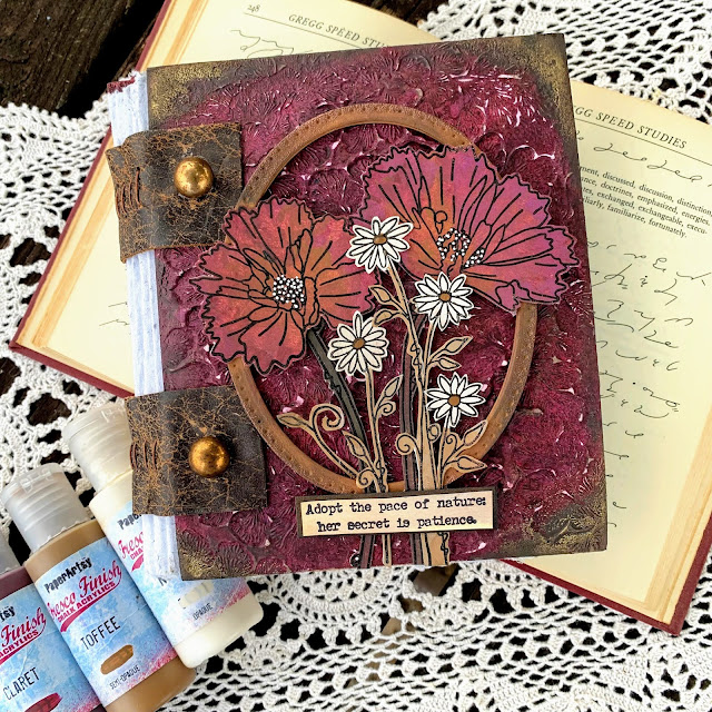
Autumn Clark went full on for her project. She made her own recycled paper to fill this lovely notebook and the leather used for binding it is from her old couch! The overall handmade and weathered look is lovely, especially paired with amazing texture and clean flowers of the cover. In her original blog post, Autumn also shares a trio of card where she experiment with her homemade paper, well worth the read!


Nikki Acton was inspired by the topic in both her use of recycled materials and the subject of her 'green' card. A simple, easily adaptable project, but where all details bring interest and harmony. I love how the circle pattern is repeated all over, on the leaves, in the additional stamps, stencilled in the background, through the translucent disc and the splatters. All the thought behind this piece is explained in her original blog post.


Well, wasn't that a fabulous array of wonderful!? We are so spoiled by our blogging team and the lengths they go to in their projects. I hope you can appreciate the time they put into each piece, but more importantly, how much they enjoy what they do while creating.

Leandra


Tuesday 28 December 2021

2021: PaperArtsy - A Year in Review {Topics 7 to 9}

Hello again from PaperArtsy HQ,

We hope you are enjoying your daily walk down memory lane to see highlights from the PaperArtsy blog of 2021.

Dounia has selected another series of stunning ideas to share with you today, so sit back, relax and enjoy this review

Today we're sharing picks from Topics 7:Mash Up {with JoFY, Emma Godfrey, Sara Naumann and Ink & the Dog Minis}, Topic 8: Nature's Treasure and Topic 9:Baubles and Bling.

Leandra 

Topic 7 : Mash Up with JoFY, EEG, ESN and I&D Minis
Already half a year had gone by and it was time for our second Mash Up topic! Again we tried to propose a mix of designers/ collections that would bring both focal and background stamps, big and small patterns, open and detailed textures. This time our bloggers combined JoFY's bold florals, Emma Godfrey's funky geometrics, Sara Naumann's layered collages and Ink & the Dog Minis' vintage imagery. They approached this challenge each in their own way and it is so interesting to compare which aspect of the collections each of them focused on, for quite varied, wonderful and, sometimes, unexpected results.

My first pick is this beautiful journal cover by Ellie Knol. I love the contrast she was able to create with a very limited colour palette and no black or any truly dark colour. Her original blog post details her extensive use of stencils and Grunge Paste to achieve the gorgeous background texture. The patterns overlap and meld together to really unify the piece and highlight the focal JoFY butterfly (not a flower!).


Lynn Good went for bright and bold, and JoFY flowers. The stenciled background brings a vibrant jungle vibe, perfect to showcase the warm blooms. How great are the bird focals? They are starkly different from the rest of the piece, both in colour and style, but Lynn cleverly integrated them using the black border stamping. Her original blog post details the twists and turns of this project, a good example of how to adapt when your crafting does what it wants!


Thinking out of the box and going out of her comfort zone, Keren Baker was inspired by Sara's seashells to make this vintage art doll. I love how she diverted lots of the elements from their obvious use. The lovely textures of the dress and the wings really gives a 3D effect and makes the doll stand out. Be sure to go to Keren's original blog post to appreciate all the small details, like the cog heart in the frame or the stamping on the face.


Topic 8 : Nature's Treasure

In the middle of summer, this topic aimed to celebrate nature, her beauty and all the materials and inspiration she offers in crafting. The PaperArtsy collections are certainly full of leaves, seeds, flowers and other natural curiosities and our bloggers did not hesitate in showcasing their favorites. It was also an occasion to reflect on how those organic patterns we have internalized from contact with nature can emerge when crafting, or meld with more 'man-made' imagery. Finally, nature also offers us more physical gifts like leaves, twigs or barks, gorgeous and unique, that we can integrate in our art or use as tools.

Blue might not be the first colour that comes to mind in a topic about nature but Nikki Acton really pulled off the monochrome look in this gorgeous card. The tiled format allows her to display lots of Lin Brown's 'printed leaves', sparing her having to choose, as she explains in her original blog post. Using a different hue of blue for the quote and main leaf is a genius idea: it makes them pop from the background, while the subtle stamped dots anchor them.


Amanda Pink proved that natural textures and patterns can bloom even from abstract stamps like Seth Apter's. I am impressed how well she married grungy, industrial elements and vegetation inspiration. Her original blog post details how she achieved the fantastic texture of the background, reminiscent of bark. Watching the piece transform along the multiple steps of the process is mesmerizing! 


In her project, Dounia Large chose to use Nature's Treasures as tools and materials rather than images. Her not-a-book is lined and decorated with dyed cork. For the cover, she experimented with pressing leaves into the paper and revealing the patterns with Infusions. A delicate look with easily obtained materials! Go to her original blog post to discover the process and see all the details!


Topic 9 : Baubles and Bling

It's Christmas in August! This year, we tried to be good and propose inspiration well in advance of the Holiday season. Our bloggers ended spending the summer in tinsel, I am sure they are thanking us... This topic is a fun one, sure to appeal of the magpie inside all of us! Time to bring the glitter, tinsel and foil out of hiding place and indulge in all things shiny. We thought these elements would pair great with baubles: tiny versatile canvas where sparkles are not only acceptable but expected! Our bloggers did not hesitate to play with size, shape and texture for a wide range of cheerful atmospheres.

She might have chosen an usual colour palette, but Helen Chilton surely brought the baubles and the bling! She certainly understood the assignment! I love how the warm colours pop against the silver. In her original blog post, you can see all the little touches she added for cohesion and maximum sparkle! She also shares her foiling technique. I particularly like how it highlights the texture of her Grunge Paste stenciling, so interesting. 


PaperArtsy designer Tracy Scott came out to play, not surprising as this topic seemed to be made for her! She certainly loves a bit of bling. Her original blog post details all the layers that went into this gorgeous piece. I love her bokeh lights effect, both simple and effective, it is such a great idea. It creating a wonderful depth in the background and helps the baubles stand out and shine (figuratively and literally)!


In New Zealand, it was actually winter for Tracy Springer, which did not stop her project from being bright and warm, but with a fur coat touch!  Her baubles are fuzzy and her doggies are cheeky in this lovely series of cards and their holder. I love her colour palette, not classic but still close enough to 'feel' Christmassy. Go to her original blog post to meet all these cute critters in all their bling out glory. Get your sparkle out indeed!

 
Hang in there, as the review continues for another couple of days more, see you same time tomorrow!

Leandra
  

Monday 27 December 2021

2021: PaperArtsy - A Year in Review {Topics 4 to 6}


Hello from PaperArtsy HQ,

We hope you have enjoyed a wonderful holiday period with friends, family, old movies and some good food over the past few days! This is the week of the year where we remind you of how amazing our bloggers have been over this past year, and share with you some of the many highlights.

Usually at the start of the year we are tripping around the world to the USA, Germany, UK for the annual crafting trade shows, so early 2021 for us meant we did not get to do those face-to-face events. Instead we stayed in touch with our shops and customers online to share our new product offering. 
 
Many of our designers switched up their classes to be virtual instead of in-person, and we also kept in touch with all our stores monthly too. Sad not to see people in real life, but here at PA HQ, after having undertaken a big move mid-pandemic from the UK to France, we were quite content to be homebodies and crack on with all the projects that needed urgent attention in our new location. For us, 2021 has been a steep learning curve both administratively, physically, and practically as we adjust to new systems, a new climate, new service providers and new suppliers.

Today Dounia has curated a stunning selection from 2021 Topic 4:Free to Fly, Topic 5:Find your Vibe and Topic 6:Mandala Mix.
 
Feet up for 5 minutes, and enjoy!

Leandra 

Topic 4 : Free to Fly

This topic was about all things winged and fluttering. Bees, Birds and Butterflies! Quite a few of our designers had releases with birds and other winged creatures this year and this topic proved quite popular. Indeed, flying invokes dreams of the open skies, freedom of movement and the joy of being outside. I think we were all yearning for those feelings after an often difficult year cooped up inside. Waiting for better times, our bloggers instead escaped to their craftrooms, or their corner of worktable, to let their creativity take flight and take us on beautiful journeys of the mind.

My first pick is this beautiful card by Claire Snowdon, a true mixed-media piece with corrugated cardboard, textured fabrics and clean stamping. Her original blog post describes how she achieved the fabulous texture on the background, playing with grunge paste, paints and Infusions. A study in contrasts: the flowing threads against the graphic staples; the grungy layers against the sharp focal points; the distressed edges highlighting the vibrant bee.


I hope you didn't miss Etsuko Noguchi's amazing fairy booklet. An ode to Lynne Perella's stamps, it is also a real mash-up project seamlessly involving stamps and stencils by 5 other designers. Her original blog post is not only a feast for the eyes, full of whimsical colours and clever details, but also a very thorough exploration of her creative process (with diagrams!) that let you grasp the amount of work and love that went into this project.


I adored how Jennie Atkinson incorporated the topic in both the substrate and its decorations. With its hint of a nest, this could absolutely be a bird house, but instead it is full of butterflies! You might not have realised it but this project does not actually involved anything made of wood! It is only clever use of basic and recycled cardboard elements and Infusions. Be sure to check her original blog post to see how she achieved this bluffing wood effect!


Topic 5: Find your Vibe

Here is another very open blog topic. The vibe is sometimes elusive, often surprising and always ever-changing. This was an occasion for our bloggers to showcase their style and their quirks but also to explore the eternal question: 'how to be YOU in your art?'. At first that question may seem a bit trite but I think we all have struggled at some point between emulating those we look up to, wanting to make something beautiful or impressive, and truly expressing our own personality and sensibilities. As everybody's vibe is indeed different, we had a wide and varied range of projects in this topic, so I have chosen 4 projects instead of 3.

First up is this gorgeous journal layout by Jenny Marples. Everything, from minimal and striking use of colour, to to the multiple layers of texture, is balanced. I am always amazed by her masterful use of white space, full of delicate and subtle variations and contrasting sharply with the focal points. Even if you do not feel up to hand-drawing yourself, in her original blog post, Jenny shares a few of her tricks to overcome our creative roadblocks, this one is really worth a read!


In her blog post, Tracy Springer shares how she finds inspiration in the stamps themselves and takes us on a creative adventure as she builds her characters and their story. Not afraid to mix and match and modify designs, she also reminds us that no image is static and that no one is safe from being chopped up and reassembled (on paper, of course!). This bright and colourful composition is only part of her project, a box hiding a surprise!


Despite the complex layered look of the cover, Autumn Clark's card-folder started with very simple gel printing, a great way to find your spark when maybe lacking inspiration. Don't be intimidated as she shares how she makes the most of her prints and achieves easily an intricate look. Her original blog post is also full of tips and tricks to create that vintage look, full of soft colours and detailed layers.


When trying to find your vibe, you might not think of scrapbooking, but Kate Yetter proved the two are totally compatible! She used this mini album of family photos as an occasion to create lots of yummy mix media backgrounds and just have fun mix and matching. Recycled papers, paints, infusions, textures, stamping, her original blog post has a bit of everything and encourages you to play: each page is an experiment and lets you decide what is you. 


Topic 6 : Mandala Mix
At the intersection of art and spirituality, Mandalas are more popular than ever, both for the meditative process and the stunning result. While the more traditional mandalas, based on circles, symmetry and repeating patterns certainly make for gorgeous pieces, we added 'Mix' to the topic title so that our bloggers would feel free to wander outside the geometric box, and they certainly did not disappoint! While some took full advantage of the mandala-ish stamps and stencils of our designers, some brave souls unearthed their compasses and protractors for a bit of maths and craft!

In the PaperArtsy family, I think it is fair to say that Tracy Scott is our Mandala Queen! Lynn Good certainly thinks so. She chose her stamps to create this vibrant and striking journal page using the Blackout Technique. She shares her process in her original blog post and watching this page's evolution is truly mesmerizing. By adding doodling to the stamping, she even preserved the meditative aspect of mandalas.


Moving out of her comfort zone, Nikki Acton went for a carefully constructed piece playing with contrasts. The circles against the squares, the geometric structure against the natural focal elements, the daring colour combo... Check her original blog post for close up pictures, as each zone is delicately patterned, the different pieces pulled together by symmetry and subtle touches of pen work.


Do not limit yourself, any stamp can be the base for a mandala! Jo Firth-Young masterfully illustrated this with her own stamps, here in a gorgeous subdued palette on kraft card. I love the mix of strict geometry and free doodling. At first look, you are struck by the repetition but a closer look reveals each stalk is unique and slightly different. Her original blog post offers step by step pictures of her process and details two other projects, each with its own vibe.


I'm sure you have found some wonderful ideas to add to your Pinterest boards within this selection of posts. We are so fortunate to have bloggers who push themselves to try new ideas, experiment and share their strengths so willingly with us all.

Leandra


Sunday 26 December 2021

2021: PaperArtsy - A Year in Review {Topics 1 to 3}


Hello from PaperArtsy HQ,

At this time of the year, we take a look back at some highlights of the 2021, and the amazing projects our bloggers have shared with you. 

I guess we could all agree that 2021 has be a year of living life a lot more 'virtually' than we normally do. Systems are more automated, education and online classes have become more accessible to us all. Did you learn something new this year? Did you achieve a personal goal, or tick something off the bucket list? 
 
It has been a tricky year for many of us. Less travel, less contact with loved ones, and a lot less hugging and physical contact! Were you challenged in ways you least expected? I guess all these things help us appreciate what we do have, as well as those we have lost, or things we can no longer do so easily. no one thought it would all go on this long, yet here we are. It is amazing how resilient we can be when we have no choice.

I suggest you grab a mug of something hot, some leftover food from yesterday, no doubt we all have some of that, and settle in for the first of a few days of review posts.

Today we are sharing my picks from Topics 1: Stamp Mash-Up {France Paipllon, Courtney Franich, Seth Apter and Ink & the Dog},  Topic 2: A Pocketful of... and Topic 3: The Creative Laboratory.
 
A big thanks to Dounia for curating these posts.

~ Leandra 

Topic 1: Mash Up {FP, ECF, ESA and I&D}
We started the new year with a new concept: stamp mash-ups... Lots of us often mix designers when creating, but this time, we are doing it on purpose! We tried to select distinct and different styles that we could see working together, from France Papillon's clean details, Courtney Franich's collaged textures, Ink & the Dog's vintage layers and Seth Apter's grungy abstracts. This topic is all about looking at those stamps (and stencils) to find out how they might interact differently, and maybe stepping a little outside of the comfort zone of your usual style to have some experimental fun!

My first pick is this amazing project by Nikki Acton which I feel really represents the mash-up concept on one small tag. Each collection is recognizable and has a place to shine, while still creating a cohesive whole. Playing on geometry, Seth's circles work really well with the I&D clock, despite being pretty much opposite styles. Nikki's explanation of her process is also an enlightening read, give it a go (link to original blog post)!


And I hope you didn't miss Corrie Herriman's very mad project (her words...). A true undertaking! On striking, striped backgrounds, the stamps coordinate beautifully, helped by the consistent use of the same background stamps and the careful choice of focal images. The recurring pointy hats really emphasize the fun vintage circus vibe. Corrie's attention to detail is amazing, so check the original blog post to see all sides of this gravity-defying project.


Now for something truly out of the box ... Keren Baker decided to paint a violin (and not for the first time either)! This is truly a study in layers, from the subtly crackled 'sky', to the transparent leaves and the number-stenciling across the focal images. The limited colour palette really makes the stamped images stand out and the pink really 'pops'. Be sure to go to the original blog post for more detail pictures of this project, as it is difficult to do the post justice with just one image.


Topic 2: A Pocketful of...

This topic was originally inspired by pocket journaling. It is quite a long-serving trend and several of our designers enjoy bullet journalling, or mini journals and have created stamps perfect for this theme. However we purposefully left the topic vague enough that other interpretations could be explored, from actual fabric pockets to a 'pocket of time'. Our idea was mainly to explore the relationship between the outside and the inside, the exposed and the secret. Our bloggers were sometime a bit mystified by this title but rallied quickly with wonderful ideas on how to squirrel secrets into pockets of all sizes.

Carol Fox obviously got the pocket journal inspiration for gorgeous tag book in sunset colours. Sara Naumann is a fan of journaling and pockets herself, making her stamps perfect for this type of project. Carol's balancing of warm and cool colours is masterful. Her careful layering of stencils and stamps results in backgrounds soft enough for her to record her vacation, yet striking enough to add and complement her photographs too. (original blog post)


Now, pockets do not have to hold cards or pictures, for Leandra Franich they can also hold... paper artdolls. Frankly I suspect Leandra really wanted to make the dolls and then made her pocket dollhouse to fit the topic. Art dolls and Lynne Perrella stamps is a concept that goes hand-in-hand from years ago, in fact most of what Lynne designs are a form of Art doll, but earlier this year it became a bit of an Instagram craze thanks to Meghan Whisner-Quinlan. With Leandra's make, we can still appreciate how transparent layers create both softness and complexity, while the recurring use of script in different forms allow the girls to link to each other while each has her own personality. Check the original blog post to meet them!


And now for a pocket party! Helen Chilton took Zinski Art's new Alpacas & Llamas collection and ran away with it. These stamp are made for bold and bright colours and this bunch seems to be having all the fun! The black and white phrases contrast beautifully with the pocket designs for maximum impact. This is actually an altered book and Helen describes the technique in detail in her original blog post.

 
Topic 3 : The Creative Laboratory

Another one of those open-to-interpretation topics... Aren't we creative each time we craft? So, let's bring some science in our creativity! This was an invitation to play around with scientific imagery but also to experiment. Maybe it is the occasion to try a new product or to attempt a unusual technique, to compare brands or contrast processes to get just the result you want, and maybe discover other things you like along the way. Of course, like our precise bloggers, you need to write your experiments down, that's what makes it science! 

First up, Jenny Marples played with clean colours and the science-inspired 2021 Hot Picks release for this striking pocket book. It is a gorgeous example of layering and balance of colour, as well as a great use of white as a contrast. This booklet is also filled with everything a little chemist might need, so do not hesitate to check Jenny's original blog post for more pictures.


Autumn Clark went with the 'experiment-and-discover' interpretation of the topic. You might call it a happy accident process! Following the scientific method, she theorised that the resist effect of Vaseline against paint could be applied to Infusions, then proceeded to very thoroughly prove her hypothesis with extensive experimentation, with amazing results! Truly a must try on your next 'lab' day, so go over to her original blog post to learn all the details.


I loved how Miriam Grazier reflected on the topic and built this 3D piece referencing school experiments. It melds science and craft beautifully, with the France Papillon DNA image and the magnifying glass along side the detailed shrunk animals and layered background. Miriam, like a scientist, also thinks beyond the obvious and employs ingenious upcycling. Her original blog post is an insight into her creative process, with its twists and turns and flashes of inspiration.


It is fun to look back on what our genius bloggers have shared with us over the course of a year. This year seems to have zapped by in a blink, but at least the blog remains the perfect reference tool.
 
Don't forget to save the posts that float your boat on pinterest. No excuse now, you'll hit the New Year with a dozen ideas to crack on with!

Leandra