

Hi everyone, Dounia here, for the last colour of year, all about the deceptively simple MONOCHROME.
Over the last two years, here on the PaperArtsy blog, we have explored the colour wheel. We touched on how to create a colour wheel, how to customize it and achieved original colours. We have looked at the different schemes that can be extracted from a wheel as well as the impact of lightness and saturation. Very logically, we are now ending this year colour cycle by focusing on maybe the simplest way to work with colour, just using one!
Monochromatic means literally 'one colour' but, as you hopefully will this in this post, there are many different ways to handle this restriction, with a wide range of possible results.
While often intimidating, monochromatic palettes are an amazing ways of building a unique atmosphere. As we all give colours meaning, via personal or cultural associations, a one colour project can also convey great and clear emotions while standing out. For more info, this great article with lots of examples on UX Portfolio will give you a lot of the basics on creating memorable works with this colour scheme. On the more practical side of things, this article on Monochromatic colours by Colors Explained can guide you on how to choose and build your own monochromatic palette.

Now, let's start our exploration of the monochrome world at the beginning. That is the first ever true monochrome painting, the (in)famous 'White Square on a White Background' by Kazimir Malevich.
.png)
White on White (Kazimir Malevich, 1918)
Malevich wanted to detach as much as possible from representation in order to convey pure feeling. His work was a real break form older movements and was very influential in the development of abstract art.

IKB 191, Yves Klein (1962)
Another artist well know for his true monochrome paintings is Yves Klein, especially the blue series with his own colour, the International Klein Blue or IKB. For this pioneer of conceptual and performance art, the significance and emotional meaning of a piece came from within the person looking at his art.

This is a concept still used today, especially in interior design. Colours are ripe with meaning and often unconscious idea associations that can be used to create an atmosphere and evoke specific feelings. While this deep red room feels intimate, sexy and a bit dangerous, we would tend to think of a blue room as calm, or a green one as fresh.

Yellows and oranges bring to mind golden summers, glowing fireplaces or cheerful flowers and are perfect for warm, bright and welcoming places.

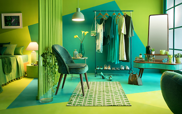
Of course, the resulting atmosphere depends not only on the hue chosen (red versus green) but also on the lightness and saturation of the colour. These two room are the perfect example! While the light green bathroom feels airy, fresh and calm like the start of spring, the bright saturated lime bedroom is almost aggressive and oppressive, though a lot more original.

This shows one of the limits of true monochrome: while it is effective it can easily be overwhelming. Lighter, desaturated colours can be a solution to calm things down.
Room dressing is not the only form of design were one colour looks are trending. People can dress monochromatic too! It is a great way to ensure you look well put together and brighter colours will certainly make you stand out.

L'accord bleu, Yves Klein (1960), picture by Jaredzimmerman (WMF)
Truly using only one colour is quite restrictive and using texture really is your number one tool to bring interest. But the apparent simplicity makes for an eye-catching and appealing result. You can see some more examples in this Monochromatic collection by Natalia Acklam.

Tag by Blue Box Babe
This a great way to create a very cohesive piece or series and to explore how the same colour behaves on various substrates and surface finishes!

An easy way to ease some of the restrictions of pure monochrome is to add black and white. Technically, those are values, not colours, so you are not breaking the rules! These additions, and the whole range of greys they can create, bring much needed variety and breathing space without compromising the cohesion of the look.

Oil Cloth from Casa Frida
Your chosen colour can still be the main player and will perhaps grab even more attention when popping out of a white or black background.

Bollenarbeit 21, Sati Zech (oil on canvas, 2006)
Patterns and textures are now possible, creating complexity out of your pure colour.

With just the important element in colour, monochrome is great for eye-catching and clean pieces with maximum impact. The touch of colour really bring the eye toward your focal to deliver a simple and memorable message.

In interior design, the advantage of colour blocking is really exemplified by the very popular 'accent wall' (or here, the accent ceiling). It is is a great way to structure space and create layers that can be easily replicated in art and crafts.

Let's not forget that the perception of a colour is greatly influenced by those around it: the same colour on white will look lighter and less saturated then on black for example. In these two rooms, the same yellow wall has different impact against the clean white space, very bright and funky, or the textured grey one- more subdued, cosy and elegant .

This also needs to be taken into account if your chosen colour is just a pop against your values. It will seems deeper, richer and more luxurious in darker surroundings than lighter ones.

Illustration by Laila Ekboir
Another point to consider is whether your colour will be part of the background or the focal. As the pop or block of colour is most probably going to attract attention first, it seems natural to pair it with what should attract attention: the focal. In the illustration above, the blue really makes the bird stand out from the background and helps create the illusion of depth.

Let go of the world 1, Rodger Schultz (mixed on panel, 2011)
However, as shown by this painting above, the bright colour in the background also works beautifully to make the black crow pop, using colour and lightness contrast.

A morning song, Shi Yi (woodblock print)
In this print, the blue is localised on the bank and its reflection, which is neither fully the background or a focal point. The more subdue shade helps it harmonize with the greys of the hills and water, bringing interest and variety without making it stand out and stealing the attention from birds and trees.

The integration of your colour in the composition also plays an important role. In Amanda's project, all the elements: the gradient of greys, the abrupt switch from white to black, the contrast of a circle among squares, focuses the eye on the centre, were the red butterfly pops.

Yin, Hiromi Nishizaka
In this illustration, the colour is removed from the main figures and only stands out by colour contrast, creating an interesting duality in the composition.

Red tree path, Melissa Tucker (oil on canvas 2020)
In this painting, we see both uses. On the one hand, the red silhouette stands out in the middle of the light space, with a path leading the eye to it. On the other hand, the same red is partially hidden in the tree, creating a subtle counterpoint. For more inspiration, you can also check this Monotone Colour Scheme collection by the Art Diva

Of course, your colour does not have to be an accent, it can certainly be the most present one! To steer away from the overwhelming issue, a good trick is to break it, for example with a pattern of texture. This pink bathroom would look very different without the black grouting creating dimension and interest!

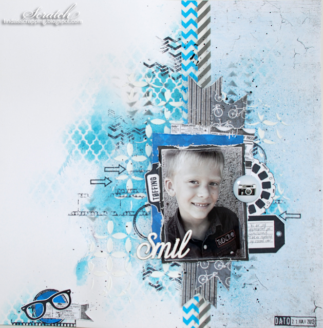
Scrapbook page by Paige Evans on Scrapbook Expo
This page is another version of the same idea. The yellow is sectioned by the pinwheel pattern and fragmented into all the little embellishments, allowing an effective overall effect without being boring or overwhelming. The colour unity here is crucial in creating cohesion despite all the elements, which might otherwise make the page appear too busy. The monochromatic look also make the focal pictures stand out, helped by the composition guiding the eye toward them. For more colour block colour looks, you can check this collection of Monochromatic Cards by Donna Ellis.

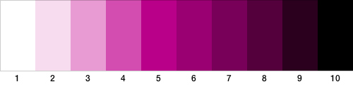
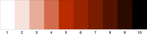
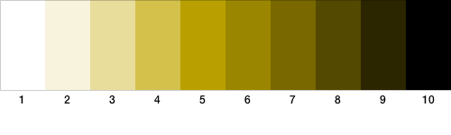
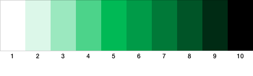
If we are using black and white, we can also mix them with our 'one colour'. Adding white will yield tints or lighter colours, while adding black creates shades or darker colours. If you play with adding grey, tones emerge, more subdue and often sophisticated colours. Be sure to (re)visit our Topic 2023 #5: Tinged Blue here on the PaperArtsy blog for info and inspo on tints, shades, tones and more. Remember that these variations will look very different depending on your starting hue! Here are some possibilities among many others:
Monochromatic can actually refer to black and white work, despite the fact that neither are colours. Black and white photographs are, for example, called monochromatic, often to distinguish them from colour ones.

Think also of the antique sepia photographs, displaying tins and shades of reddish brown, or the mysterious blue cyanotypes that are regaining popularity right now.

When photography was still majorly on film, manufacturers offered bluescape or redscape special films for unique monochromatic pictures. Polaroid also had an Impossible Monochrome collection, with pretty striking results!

With paints and inks, creating tints and shades allows us to explore light and shadows and better understand light contrast, both very useful tools! If you do not feel very confident in your paint mixing skills, there are lots of fun, crafty exercises you can try before going for a full on project. For example, check this Tutorial to create monochromatic layered patterns by Zart for simple geometric pattern and lightness contrast.

You do not need to have lots of different tints and shades to create detailed and interesting pieces. In this scrapbook layout, 4 greens are enough to build layers and depth. The key is to choose shades with plenty of contrast for them to stand out against one another. At the same time, we still read the green as one colour block, making the white photo strip pop!

For the opposite effect, on this lovely card, the white space is dominant and the green create the interest. The different tints allows for layering and create an effect of depth and dimension.

Blue and Grey Textured Tree, Amie Lynn Murray (oil on canvas)
Instead of selecting a few distinct shades, you can play for lightness gradient. They make beautiful and effective backgrounds. If you think of a landscape with a far away horizon, you will notice that the farthest a plane, the lightest we perceived it (in most conditions). This is ingrained in our mind and we are therefore used to interpret lightness gradients as depth gradients. All of that to say that continuous gradient will create the impression of depth, without necessarily having to build layers!

Free Flow n°2, Julia Ibbini (laser cut paper over ink on Mylar, 2018)
More random variation of lightness will create a very different effect. It is a easy way to create interest in a block of colour, making your work look more spontaneous and free flowing.

As already explained earlier in this post, monochromatic palettes are a great way to create cohesion in a project. With tints and shades, you can easily built up the complexity and intricacy of your work without compromising that visual cohesion. For this mini album, using only kraft tones and black allows the elements and patterns to work together while still being able to layer. Varying textures and patterns is key to make monochrome work, to avoid boring uniform expanses of colour.


Designs by Bjorn Wallander & HB


Designs by Nicole Franzen & Fantastic Frank
Again choosing examples from interior design, all from this article on House Beautiful, we can review a few tricks to make a monochromatic palette work. First, using neutrals (here mainly white) to break the colour creates breathing space, keeps the colour from being overwhelming while allowing it to shine. Also, using several tints and shades builds interest and contrasts while creating a more complex, subtle and luxurious atmosphere. The brighter or darker elements stand out while still chiming with the rest of the composition. This can be use to highlight some details to truly make a work personal. Of course, finally, once more, the choice of base colour really impact or perception of an image, from cheerful bright colour, to calm cool ones, via elegant and sophisticated earth tones.
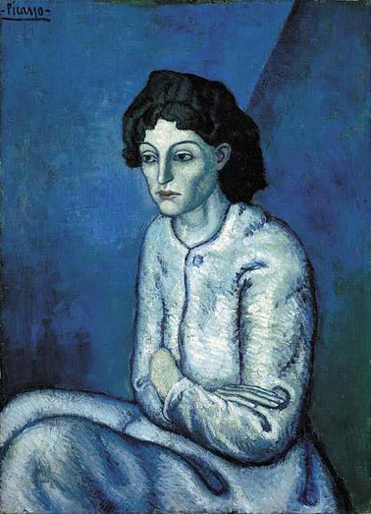
This concept also applies art and crafts works. Blue is often linked to sadness, loneliness and even sickness. This literally colours our perception of predominantly blue art, especially if it contains human figures. This is particular evident in Picasso Blue Period, as shown above. This impression is reinforced by his use of tones along with tints and shades. The more muted colours create calmer, softer atmosphere but can also evoke bleakness or monotony.

Of course, most of us are not Picasso, but that does not mean tinted portrait, or other themes, are out of our reach. Pam explains her process extensively for this striking piece, giving lots of helpful tips to get you started! While still playing with various tints and shades, she has stayed away from tones, preferring clean, fresher colours, which impact the general feel of the portrait.
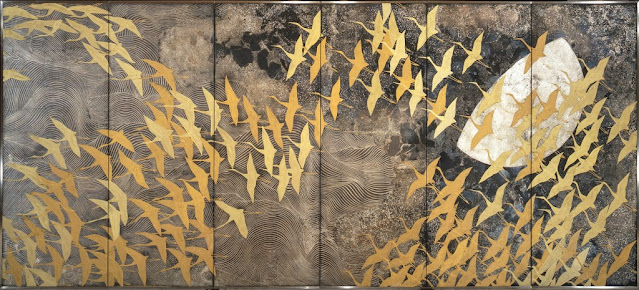
A Thousand Cranes, Kayama Matazō (colour on silk, 1970), picture by Cosmomontoya
Finally, I just want to share this beautiful piece, that shows just of far you can go with with a range of values and tints and shades. 'Monochrome' might not come immediately to mind in front of this painting but the reduced number of colours create an delicate harmony. The plain cranes detach from the busy background by contrast of texture, with no jarring transition. They look at home in the sky.

This part is a continuation of the previous one, exploring tints, shades and tones, but I wanted to focus on creations where black and white are (pretty much) inexistent. Contrast then relies only on the differences in lightness and saturation which, in my opinion, create a completely separate atmosphere.
This poster only uses green, green and green, cleverly getting its message across. Using a tint for the background instead of white create unity, evokes nature, and helps the poster stand out on a white wall. The simplicity of the colour palette helps it appear clean and put-together while still being memorable.

Picture and posterization by Kara Bullock
Using only a few shades can work for more complex images too. Posterization and colourization of photograph is a classic since the Pop Art movement. The key is to keep enough levels of colours for the image still be understandable.
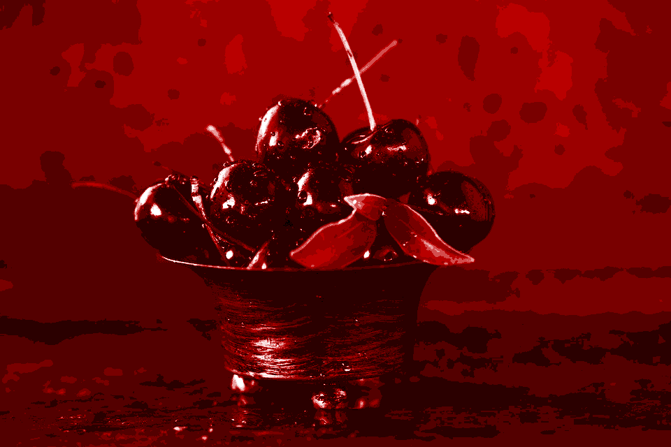
Once again, the choice of the main hue can greatly impact the looks and meaning of the resulting piece. Especially if you go an 'unnatural' colour for a representative image. We receive and interpret those cherries very differently is they are red or teal!
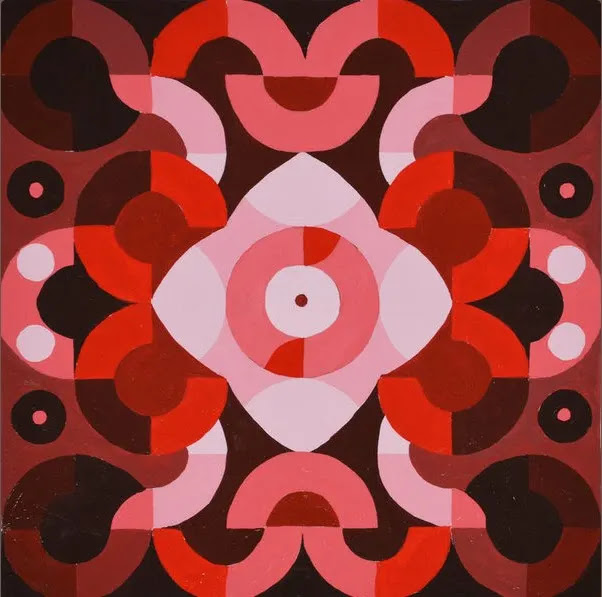
Monochromatic painting, Tracy477 (acrylic on canvas)
Unnaturalness is not an issue with abstract work by hue still colour our perception of it. This harmonious piece ifs a more advance version of the the tints and shades exercise seen earlier. The contrast between the light and dark colours makes the center motif pop despite the absence of black and white.

Whispers, John Nolan (acrylic on canvas, 2010)
Working with values allows us to focus on seeing the worlds as varying levels of light and shadows, to better understand how many (or how few) we need to translate dimension, expression and life.

Scrapbook Layout by Flora Farkas
Of course, there is no obligation to limit yourself in the number of tints you work with. Hence the come back of the gradient! Without white, the graduation is softer and more harmonious, here for a girly and romantic page! You can have your feel of Monochromatic Scrapbook Pages with this collection by Scrapbooking Bee.


Pictures by Lindsay Kreighbaum
Striking, memorable and clean looking, monochromatic palettes are often used for branding and marketing. We all know colours that will forever remind us of certain products or brands. For this, completely tonal photographs have been quite popular late, as shown by this Monochromatic styling collection by RitaB².

A comparable style can be achieved in mixed media by letting texture pick more or less colour, creating tints and shades organically. Quite a fun process detailed by Andrea in her post!
The rest of this section is a tiny collection of tone-on-tone art and craft work that caught my eye, just to give an idea of wide range of techniques and subjects possible.

Vase et bouteille, Amédée Ozenfant (pastel on paper, 1925)
This cubic still life reduces glassware to it highlights and shadows, focusing on shape rather than dimension and het retaining enough detail for our mind to reconstruct meaning.

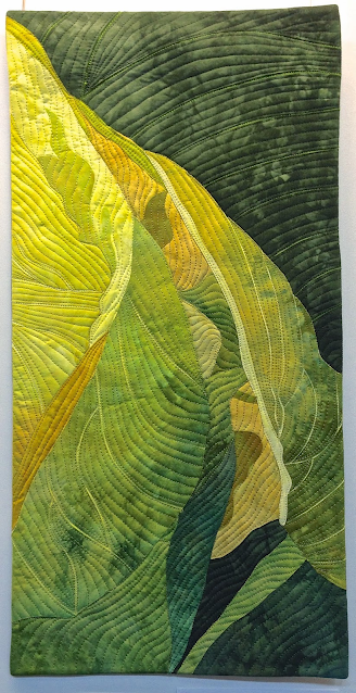
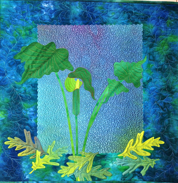
Spring Green, Chris Daly (hand dyed and quilted fabric, 2012)
While green is certainly on topic, this quilt is a beautiful exploration of values. The stitching, creates its own shadows, adding to the textural feel. Monochromatic quilts are a big thing, as shown by this Monochromatic Quilts collection by Marcia Peterson!

These birds in the setting sun are a great example of monochrome happening in real life (probably with a little help from some editing magic). The warm light and hazy background create a cozy and slightly surreal atmosphere.

Design and picture by Karen Jerzyk
Speaking of surreal! While this scene is happening in real life, it is obvious meticulously designed. The limited contrast forces us to real focus on the details to discover what might be going on. I recommend checking the whole 'Colours' series!

Joanna Frick (oil on canvas)
Monochromatic abstract art is so very interesting: what do you see? how does it make you feel? Does the fact that it is blue plays a part in that? Blue is certainly a favourite of many makers. Selling paint, we certainly see it! If that is your case, be sure to explore this Blue Monochromatic Art collection by Anne-Marie Pepin.

Red Landscape, Bob Barker (oil on canvas)
This landscape uses the whole range of tints and shades for maximum dimension. The unusual red brings to mind alien or apocalyptic visions.

Now we are departing slightly from the definition of monochromatic as 'using only one colour'. Let's cheat a little! Indeed, we often associate colours that actually cannot be made from one single colour using only white and black. They are not of the same hue but for us they still go together. Let's play spot the hues and see if you would consider these following examples monochromatic...
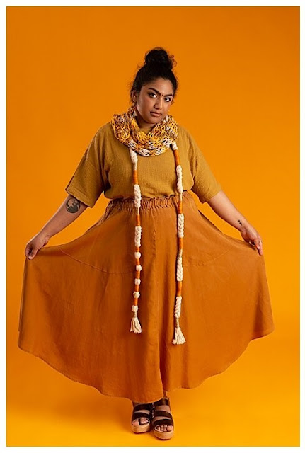
Here, while the ochre from the top could be a shade of the yellow from the scarf, the skirt is obviously more orange. All certainly go together really well, but is it a monochromatic look? Go check the rest of the looks in the article to continue the game!

Global Brief, Keith Negley
This illustration has great harmony, beautiful texture and certainly offers an intriguing atmosphere. Focusing on the foreground mountains, some are more green, some are more blue... Certainly truer to real life !
The page plays with black, white, grey and blue. Or rather, blues. The stencilling in the background is more turquoise-y, hence containing more green than the matting behind the picture. Is that enough to not consider it not monochromatic?
Encore series, Elaine Quehl (quilted fabric)
This intricate quilt plays with hues as much as values, going from almost yellow to dark bluish green to create dimension and contrast. But we would still said it is all green.
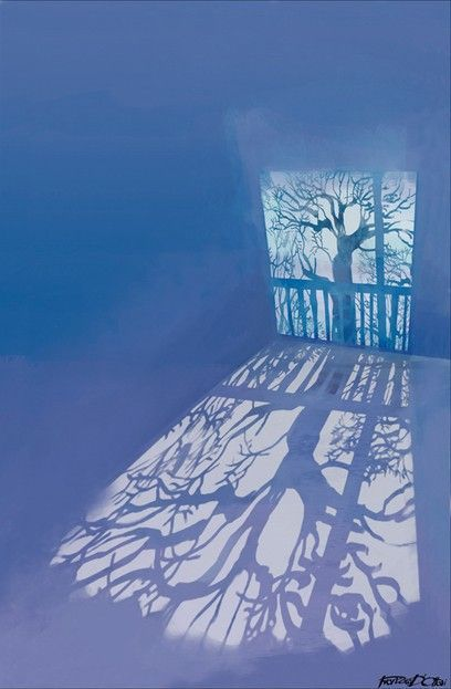
The Almost Moon, Francesca D'Ottavi
This gentle illustration softly intertwines cleans blues and light purples for a dreamy look. It cleverly recreates the distortion or shapes and colours in projected shadows. Is it monochrome? Does it matter?
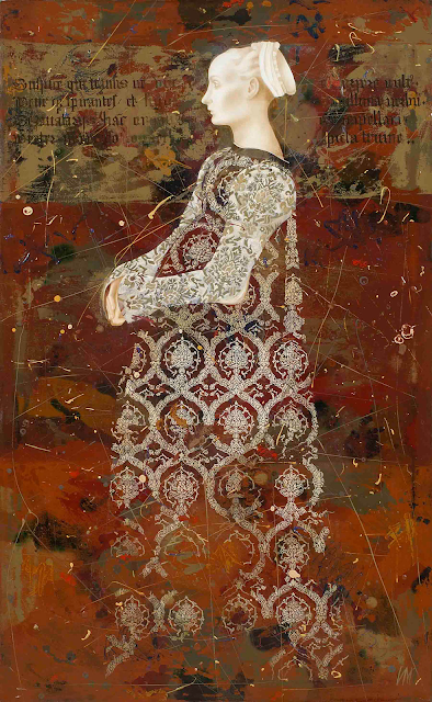
The Shadow of the Fresco, Igor & Marina (oil on canvas)
While also involving some variation of value, most of the texture in the background come from oranges and red of different hues. Because most are of the same tone, they still create an unified plane for the much lighter silhouette to detach from.
This is certainly green room, but the contrast between the green gold and the blue green elements is expressly used to structure and inhabit the space. We are now in the realm of analogous colours, or colours next to each other on the colour wheel. As a colour scheme, it is considered distinct from the monochromatic palette. But would you say it still count?
Here is another conundrum: blue green, blue and purple blue... They are an analogous scheme but would you consider this more or less monochromatic than the previous image?

Playing with Orange, red orange and red, Sue is also using an analogous palette. However, thee cohesion of the card colours is undeniable and we culturally are used to consider yellow, orange and red as the same close family. On the other side of this phenomenon, English considers red and pink to be distinct colours, even if pink is actually a red tint. Would you then consider a red and pink piece to not be monochromatic? Let's see what you think of this 'Monochromatic' Scrapbook layouts collection by Nelia.
Monochromatic Seas Red, Nathan Biggs (acrylic on wood)
Here is a perfect example of how we unconsciously associate warm colours. Yellow, orange and red are further apart than analogous colours, this actually a triad! (you can check more about triads in our Topic 2022 #14) Yet monochromatic is in the title. Do you agree?
Jack in the pulpit series, Frieda Anderson (quilted fabric)
This is another triad, of cool colours this time: yellow, green & blue. Contrast actually come a lot from texture in this intricate quilt. While the yellow leaves pop from the blue background, the green one do a lot less.

Finally hear is another to 'cheat' on a monochromatic scheme. Etsuko's card is mainly blue. She plays with tints, tones and shades to create interest as we have seen in this post. But the lightest colour is not white but a very pale yellow... essentially a second colour! Is it limited enough that you would still consider this piece monochromatic? And if yes, where is the limit?
I hope this post make you want to explore the possibilities of monochromatic palettes and play with values. Or at least provided you with some eye candy and maybe next time monochrome is used in branding or aesthetical imagery, you will notice!
Stay creative...
You could tag us on Facebook, Instagram @paperartsy , Twitter, or post in PaperArtsy People Group on Facebook. We really love to hear about how the blog topics have inspired you, so don't be shy!!


No comments:
Post a Comment