Hi friends, it's Dounia with you for another 'With 3 Things' post.
This feature on the PaperArtsy Blog is where 3 bloggers are sent 3 items to include in their project. We have no clue what PaperArtsy HQ is going to send us, there might be a slight variation (for example on this round we each were sent different stamps sets from the same release) but generally 2 of the 3 things will be identical.
My mystery package contained the stamp set FP019 by France Papillon, a pack of Printed Tissue PT08 by Alison Bomber and the PaperArtsy Small Songbird die to play with. the next blog topic is 'Ink Pads' which I chose as inspiration and to add another challenge into this project. I focused on a quad of blue Versamagic Ink pads by Tsukineko.
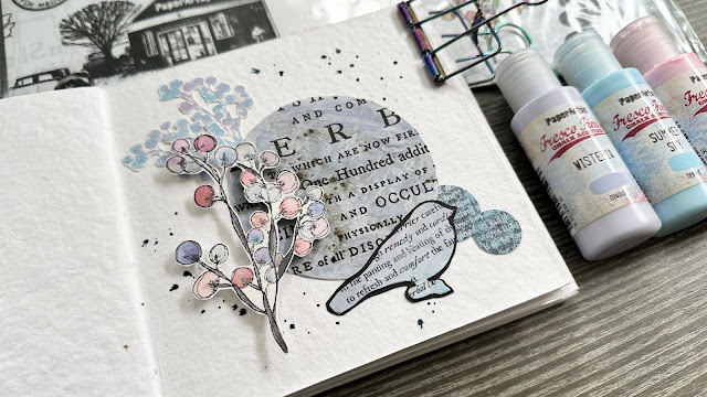
With all of that, I made a trio of tags! They are interactive to fit into the overall theme of 'Hidden'. Though I must admit I was more focused on the technical processes and scrambled at the end to put everything together in a cohesive finished project...
VersaMagic are very pigmented inks and boast great opacity. I wanted to explore their layering possibilities and how different they would look depending on the background. So I started conservatively with two tags with maximum value contrast: one white and one black. I decided to take advantage of the blue gradient to implement one of my favourite stamping technique: building depth with repeat stamping and colour value.
I started with the colour closest to the background, so the lightest on white and the darkest on black and covered most of the space. This is appear the 'furthest away' as it blends to most with background.
I then picked the next shade and covered slightly less of the tags to create a slightly 'closer' layer.
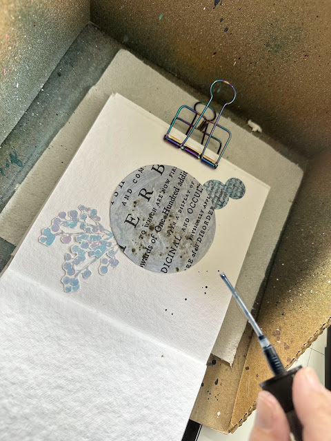
Final colour, same process! I loved how the ink shows up on the black but the mass of lines were becoming very confusing - I needed something to make the foreground pop. As Versamagic is a water-based ink, you can dilute it with water when wet (but it will set permanently once dry). I used the transparent tones created with the water blend to colour parts of the lightest stones and highlight them.
To be quite frank, I preferred the tunnel effect created by the berry stamp so I did a version on black, reversing the colour order. I think the depth works on both of them but with very different vibes!
This close-up highlights how the layering near the sides contributes to the depth, not just he colour. Also the black paper is slightly textured, which is really evident in macro!
My next idea was quite experimental for me. PaperArtsy Tissue is printed by the off-set method, meaning actual ink is on the surface. It can therefore theoretically be used for image transfer on a gel plate... As VersaMagic is a slow drying pigment ink, I thought it could be a good candidate for coordinated prints. I set out to try:
I inked by gel pate, took a print with selected section of Printed Tissue (I was careful to put the printed side on the plate, generally), then quickly took a second print with a black piece of paper. Success!
The results are quite subtle but I love the dreamy atmosphere they create. The transfer is often more obvious with bold designs like the titles but the botanicals also work. I had the outcomes with the darker ink, as the other did not create enough contrast for the transfer to be really visible. Also my gel plate is now blue.
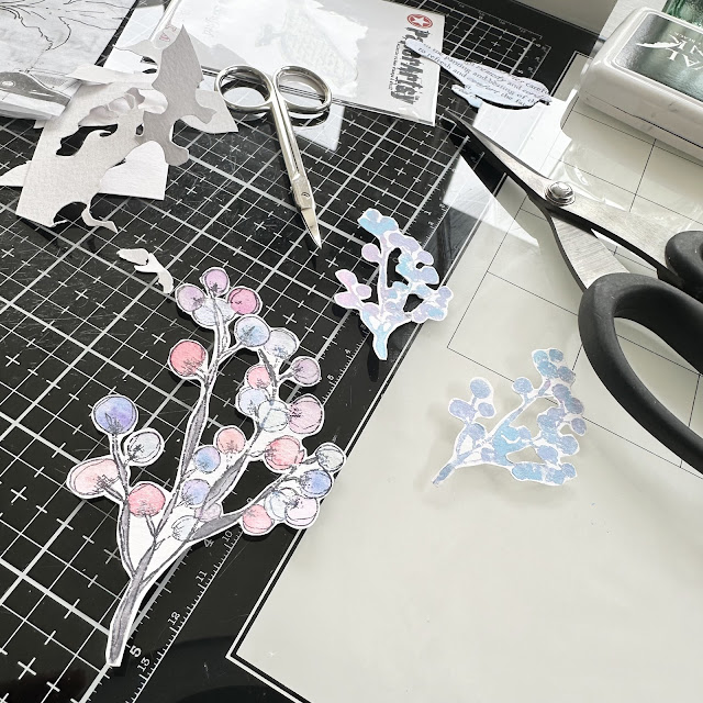
Between the print and the coloured tissue, I had quite enough material to die cut birds and finish the tags.
For the current theme 'Hidden', I have added flaps that can open and reveal little surprises!
I am quite happy with this playing session and plan on experimenting more with tissue image transfer. I hope this project inspires you!
Stay creative!
Dounia


