
Hi there, Liz here. I’m back again. Firstly I would like to say thank you very much for all the wonderful comments about last month’s blog . I was away with my father when the blog came out and when I got back all the comments were there for me to read . It was amazing . So , to all the other designers I would like to say that I look at every project and enjoy them immensely. I haven’t commented ‘cos I’m slightly computer illiterate and haven’t figured out how to do it ! But I will.
Today I am going to do something a little different. No project (sorry) . Instead I am going to look at colour-mixing and a tiny bit of colour theory (nothing heavy). Normally when discussing colour theory you use ‘artists’ paints (I’m sorry if I inadvertently offend anyone), numerous different paints are used by many different types of artists, however colour theory is easier with 'artist grade' paints because the colours we use to mix from tend to be pure pigments).
Artist paints across various brands generally have the same names, things like Burnt Umber, Quinacridone Red, Pthalo Blue and so forth, and these are staple, well recognised colours that we then use to derive other colours from. When using these colours, colour theory is pretty straight-forward.
The Fresco Finish Paints have deliberately been designed to NOT follow the standard 'artist paint' colour pattern, they have been designed for specific use (just for us, yeah) and are wonderful! They have been arranged in colour groups to make blending them easier but with a bit of knowledge you can mix the exact colour you want to increase your range of colours you have to hand. And that's what I shall explain in this post, how to mix colours.
As Leandra explained in an August Blog post, and I quote:
"Fresco Finish Acrylic is a paint, the quality of which falls on the spectrum somewhere between Craft and Artist grade. But it's hard to compare to other paints because its so different to any other paint out there. It's very matte, we labelled it 'chalk' paint because that is how it feels when you touch it, and the first batch we released were all extreme high coverage, ie opaque. But all the paints dry the same with a super smooth, flat and matte finish. We want to make paint for people to muck about with on all kinds of surfaces.
Here at HQ we are interested in making user-friendly paint, in a nice range of colours, that does what it says on the tin. We want to bring it to you for a great price for 50 ml, and with a long shelf life. In other words, value for money, nice and easy to use, and fit for purpose. Whether you want to create backgrounds, scrapbook, journal pages, cover wood, create unusual textures, or add a bit of bling or crackle, we've got it covered (see what I did there). So people, rise up and become a master-splodger guru of experimentation !! We are making paint for crafting situations. And it's meant to be FUN !!
We are offering something different in the marketplace. A colour palette that reflects interior design trends, current colour trends, and current fashion trends and therefore we offer a colour palette that is fresh, relevant, fun to use and looks good on the walls of your home or in your most private journals. Most of our paints match beautifully with each other. It's not hard to select a bunch of Fresco paints that look good together. We specifically designed it that way. To make it easy for you. Light, medium, dark, super dark in families of beautiful colours."
1 Colour Wheel.
I suspect that everyone knows about the colour wheel, or at least know what one is, even if you don't know how to use it, but it is a good place to start.
This one shows six colours:
Three Primary colours; Red, Yellow and Blue (called primary because we can’t mix them up from other colours) and
Three Secondary colours; Orange, Green and Purple (called secondary because they are made from the primary colours).

2 Mixing Colour
If you are mixing colours it is much easier to start with 6 primary colours – two of each. This is because even primary colours come as a range of colours from cool to warm.
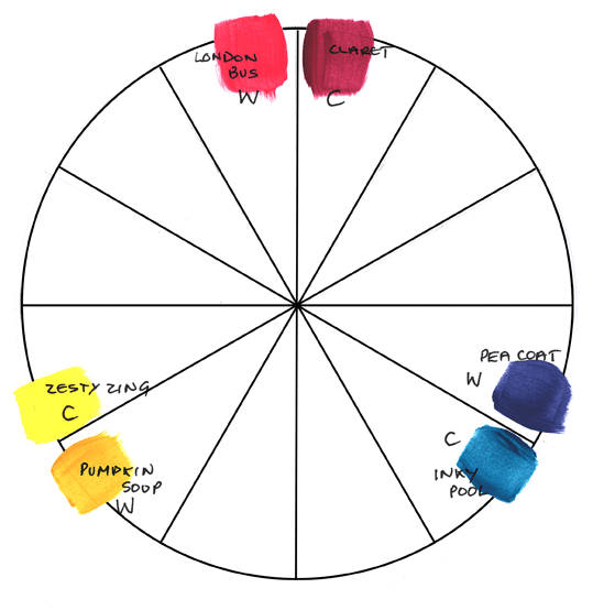 On this wheel I have chosen translucent colours because they are the clearest brightest colours in the Fresco Finish palette. Translucent shades are low coverage, but they also tend to be pigment heavy, very good for a colour mixing starting point.
So what do I mean by warm and cool colours ?
Look at the two yellows. Pumpkin Soup is yellow (obviously) but is slightly orange. It has a little red in it and feels warm. Zesty Zing (has no red)so it feels cool.
Similarly, Claret (Slightly blue) is cool and London Bus is warm.
Again with the two blues, Inky Pool looks slightly green (cool) and Pea Coat slightly purple (warm).
{NB. The colour Pea Coat has been amended August 2013 from a translucent to a slightly darker opaque while I was writing this article so I mixed a little Eggplant into the new Pea Coat to make it slightly warmer, so check which Peacoat you have in your hands before repeating this exercise}
If you are mixing colours it is much easier to start with 6 primary colours – two of each. This is because even primary colours come as a range of colours from cool to warm.

So what do I mean by warm and cool colours ?
Look at the two yellows. Pumpkin Soup is yellow (obviously) but is slightly orange. It has a little red in it and feels warm. Zesty Zing (has no red)so it feels cool.
Similarly, Claret (Slightly blue) is cool and London Bus is warm.
Again with the two blues, Inky Pool looks slightly green (cool) and Pea Coat slightly purple (warm).
{NB. The colour Pea Coat has been amended August 2013 from a translucent to a slightly darker opaque while I was writing this article so I mixed a little Eggplant into the new Pea Coat to make it slightly warmer, so check which Peacoat you have in your hands before repeating this exercise}
3 Why is it easier to have two primary colours when mixing colours?
By now, if you have some Frescos of your own, you have probably found out that you can get some peculiar colours that you didn’t expect when mixing colours together. Some of these are lovely and interesting and some of them are 'muddy'. This is because of the way that the paint colours are made – to get a certain shade of colour there are often several colours in the mix and often white (for the paler shades) and if your mix ends up with all three primary colours in it it can look grey or muddy.
For example mixing Zesty Zing (cool) with Pea Coat (warm) gives an olivey kind of green because there is yellow (zesty zing) and blue+red (Pea Coat) in the mix .

4 Useful Colour Mixing Ideas
Having said all that, I think that I would like to show you some useful ideas about mixing .
As before across the top of the chart, I have used the 6 translucent colour wheel colours as before, and also Eggplant, Autumn Fire and Hey Pesto so we have a full rainbow of colours. .
To start with how do you make colours darker ?
The obvious way is to add black (Little Black Dress) which works well but can often make the colour dull. If adding black to these colours, add the black to the translucent colour a little at a time because the black is opaque and can ‘drown’ the colour.
I can’t give exact amounts because each colour mixes differently and so you might just need a touch of black for one colour and more for another. The same idea works for any colour mix; add the opaque colour in small amounts to the translucent colour, and if mixing paler colours add the darker colour to the paler colour in small amount.

There are other ways of making colours darker and getting lots of different colours without using black, lets try with other dark colours too. You can see down the left side of the chart adding black to yellow turns it green but this might not be what is needed.
Try adding a dark brown, like French Roast or even Squid ink. Adding the colour on the opposite side of the colour wheel will also make it darker. In this case I have yellow and purple but a red /green mix or a blue/orange mix can give darker colours.
If you keep a chart, as I have above, then you have a point of reference, and a methodical way to generate colours.
5 Adding more of the same dark colour
Just to show what happens as you add increasing amounts of black to Blood Orange. Lots of lovely dark reds !

The obvious way is to add white. Start with the rainbow across the top again.

This chart shows a few of the variations of the colours by adding more and more white (the first 5 rows).
However as we did earlier with various darks, of course you could also use other pale colours such as Stone or Nougat to get some really pretty colours. The bottom two lines on the chart show this.
7 If you only have a few colours
This chart shows the wide range of colours that you can get with just a few colours.

I’ve started with the yellows (Pumpkin Soup, Zesty Zing) and slowly added more and more of the blues to show lots of nice greens.
When I mixed yellow and purple I got another range of colours with some rather nice browns. Mixing colours like this is fun so could I suggest you have a go? There is nothing quite like doing it yourself.
8 And another thing...
Here’s another idea stolen from ‘fine’ artists. Often you choose a group of colours that you want to use or you only have a small selection to use and they don’t quite ‘go‘ together.
Again, start with your rainbow across the top. Then we add to each a touch of the another colour you have that doesn't quite 'work' with them in its direct from the bottle form. Watch what happens...

If you add a little of another colour to all of them (again add it a little at a time because each colour needs different amounts) they will tone together.
This can be very subtle but works really well. Traditionally, earth colours such as 'burnt umber' are used for this process but it works just as well with browns from the Fresco Finish range. I’ve used the same range of 'rainbow' colours and added Chocolate Pudding, Cinnamon or French Roast in the top set. In the lower set of 3 I’ve done the same thing with paler colours; Irish Cream, Mushroom and Stone, to get some lovely paler colours.
9 Now you can just go crazy...
Finally I’ve just gone a bit crazy mixing all sorts of colours together to see what I got !
The single colour on the left, for example Space Cadet is mixed with three other colours, for example three yellows. The resulting colours are shown after the = sign.

At the beginning I said that sometimes you get some interesting colours.
Look at the bottom of the chart where I have mixed Very Berry with turquoises or where I have mixed Pumpkin Soup with purples. The resulting colours are lovely soft purple-blue- greys.
I hope that this is helpful and can I suggest that you try mixing some colours (any colours) and see what happens. A word of warning though- this can be fun and be rather addictive ! See you tomorrow!
Leandra says: Oh my goodness Liz. This is such a fantastic resource, and such a useful one too on a daily basis!!! And there was me just wanting to make paint colours that I liked, and suddenly you have opened the door in such a clear, logical manner to show us how to easily generate a wealth of other colours. Those purple people are gonna go bonkers!!
I think this is really useful for us all to understand how and why we should manipulate the paint to work for even more versatility than it already offers. Thank you!
Gillian Says: Wow what a fab way to explain the use of colour, I love how you have taken the time to experiment and come up with some totally unique cool colours i.e Pumpkin Soup mixed with Purples .... beautiful. Thank you so much Liz for this invalueable resource.


15 comments:
Oh my what a wonderfully useful resource. Thank you for taking the time to set this out so logically for us.
that must have taken you hours of fun mixing your colours!! I do love the results though and look forward to some colour playing of my own.
Fabulous, I love colour wheels and colour mixing. I am very bad at writing down the mix though so i can never replicate it lol
Wow, great Liz. Will make a fab resource for everyone. and I now know why I sometimes get muddy colours.
Jo
Thank you for this Liz, it must have taken an age to put together. I think I shall have to print it out & study it carefully - me & colour theory do not have a good track record.
This is great! Must have took u ages to put this together! Fab resource, thanks! xx
Wow wow wow, I took a colour theory online earlier this year but I have learned loads in this post and even better it's with my favourite paints :-) Kezzy xxx
Wow Liz - what a lot of work put into this. Leandra and Mark - how about making this into a pamphlet to sell along with the paints?
Fresco Finish is wonderful paint. Thank you for the color mixing method. This is very useful.
Fantastically clear journey through mixing the Fresco paint colours - thank you!
Alison x
Really HAPPY that you have created such a useful resource for all us Fresco Fans Liz, something i need to print out & study.
Must have taken you ages and given you lots of enjoyment along the way, appreciate you sharing your results.
Thanks again:-).xxx
This is an amazing piece of information which for me, is extremely helpful. Thank you for sharing.
Thank you so much Liz for this valuable resource. It's going to go on and on being useful! Julie Ann xx
Liz: (another) brilliant post, very inspiring. I'm printing it off and sticking it in my sketchbook for future reference.
:o)
brilliant. you've created some really beautiful colours.
Post a Comment