A
shadow box encapsulating a girl with a unique twig skirt is the perfect
way that Autumn has chosen to give a thoughtful gift for a friend using
a favourite Lynne Perrella image. She's also got a clever tip for
blending paint on paper and creating your own gel plate inkpad! ~ Keren
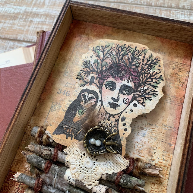
Hi everyone, it's Autumn Clark from SewPaperPaintwith you today to share with you a shadow box doll art I've made with my absolute favorite stamp by Lynne Perrella.
I
made this project to encourage a very dear friend who is going through a
rough time. She and I have been making paper dolls for almost two
decades, so I wanted to beef up the idea and make a gift she could
display in her own art room, thus the shadow box.
My
friend has always loved deep jewel tones, so I chose a palette of gold
and wine, which she also loves. Ha ha! One of my favorite ways to
incorporate tiny text into a project is by using book pages and hymnal
pages. I chose a hymnal page and treated it with a coat of matte medium
on front and back so I would have blendability with my chosen
PaperArtsy Fresco Chalk Acrylics. Then I did some finger painting; what
fun! I blended Nougat where I would stamp my doll's face and smoothed out the edges with a baby wipe. Then I went on in a circular motion with Gold Rush, then Toffee, and finally Mahogany.
I wanted to raise my doll's head from the base, so I started all over
and repeated this entire process on another sheet, on which I stamped
"tree hair lady" from PaperArtsy {Lynne Perrella} Collection (LPC049). I was then able to add watercolor detail to accentuate her and her owl companion's features.
Though
I was really happy with my background color, I wanted to add in some
pattern. I chose another favorite stamp, a tile image, which I love to
use for repeat patterns, PaperArtsy Eclectica³ {Emma Godfrey} Collection (EEG26). I stamped Toffee over the center and Mahogany
over the lower portion in rows. To stamp with paints, I simply brayer a
section of paint onto my gel plate then use it as an "ink pad." As a
bonus, you can brayer out excess paints and make a gel print to use for
later. Win win!
Now,
the way I often start a project is by sketching an idea. My idea was
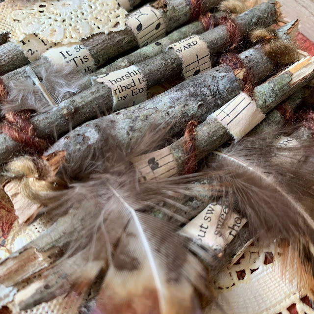
to make a twig dress for my lovely tree girl. I had fun selecting twigs
and breaking them to size. I took some yarn and wove it in round and
round each twig to connect them. Once they were secure, I wove strips
of hymnal pages between the center layers. I also secured some found
feathers.
Next, I decorated the edge of my wooden shadow box. I embossed the tile stamp in gold on paper printed with Mahogany I added a nest charm to tie in the metallic detail.
The
final detail was a bit of paper doily place-mat from another dear
friend. I loved the torn, irregular edges and lacy accents.
I
hope you paper doll lovers out there will be inspired by these
techniques and my friend will be encouraged by this creation. It's
always a joy to play with Lynne Perrella stamps!
In
conclusion, there are so many ways to incorporate text into your
stamping projects. In the photo above you see the reason I chose this
particular hymnal page, to subtly pray for peace and joy for a dear
friend. I find peace in nature, particularly among the trees. And
using natural elements, vintage bits and beautiful stamps allow me to
bring that feeling indoors. What elements inspire you and how can you
blend them into your own work, whether as a focus or subtly? I
certainly hope tiny text will be making an appearance for you soon as
well.
Making
a scene from non-scene type images is a clever stretch of any stamps.
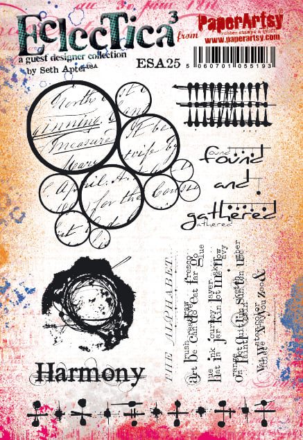
Jenny has been experimenting with some of Seth Apter's new stamps and
made a fabulous wall of words. She's got some great tips for making your
stamping look metallic and creating more natural looking foliage and
flowers. ~ Keren
Hi everyone, it's Jenny (Pushing The Right Buttons) with you today, and I'm here to share with you a new journal page that features images from one of Seth Apter's new releases.
I
am a huge fan of Seth's designs particularly because they are so often
based on the architectural and structural features he sees around him
every day in NYC. Looking at them from a different perspective they
could also represent things seen in and on buildings in other parts of
the World, like a cottage in rural France for example...
This
piece begins with the edge of a torn piece of manuscript and some
PaperArtsy Grunge Paste, all designed to give the feel of the side of a
rustic building.
Apply
Sand, Stone, Heavy Cream and Chalk Fresco Finish paints in layers
(working from dark to light) with a spatula to blend the manuscript and
Grunge Paste together.
Seth's 'The Alphabet' text stamp from his new ESA25
stamp set was the original inspiration for this whole piece - to me the
way the letters and surrounding tiny text have been grouped look like
uneven brickwork.
Repeat
stamp 'The Alphabet' (minus its title section and final line) using a
pale grey permanent ink, knowing the uneven layer of Grunge Paste
beneath will give the stamping a worn feel by missing parts.
Use
the grouping of the letters as a guide and draw around them with a
permanent marker (black or dark grey are perfect for this). I would
suggest practicing on a piece of scrap of paper so you can work out what
you want your 'bricks' to look like.
Add
some shading to make the bricks look more realistic - I used a
watercolour pencil along the bottom and left-hand side of each brick,
blending out the shading with a water brush. At this point you can reapply
patches of Grunge Paste to break up the pattern a little and tone down
the lines around the bricks if they are too prominent with some more
paint.
This
second stamp from Seth's set immediately reminded me of window
shutters. To recreate them start by applying a thick layer of Grunge
Paste to a piece of card. Allow it to start to dry a little then push
the stamp into the paste to create an impression. Two hints; first, if
it doesn't create the right impression use a wet spatula to smooth out
the paste and try again. Second, make sure to spritz your stamp with
water before plunging it into the paste and wash it as soon as you've
finished to remove excess paste.
When
the embossed paste has dried paint it and then re-stamp with a
contrasting permanent ink (I used a white StazOn Pigment pad for this).
You can make a 'mount' for your completed shutters by drawing brick
shapes on a slightly larger piece of card, painting them with the same
paints as the main wall. It's worth painting the centre of the mount too
since some of it may show when your shutters are glued on top.
Older
walls often have metal ties inserted into them to prevent them from
pulling apart and ultimately falling down! Another of the stamps from
Seth's set is perfect for recreating those. Try clear embossing over
your stamped 'ties' to give them a metallic look.
With the building 'constructed' it's time to add some prettiness and colour. One place to start is with Kay Carley's stencil PS080
which helpfully includes little butterflies and dragonflies as well as
the grasses and flowers found in a rural border. Use a mix of green
shades for a more realistic feel.
After
starting with the stencilled greenery you can make it even more 'wild'
and unstructured by dipping a wooden skewer into the various green
paints and adding pointed lines over the top. I also added extra detail
to the flowers following the positioning from the stencil.
It's
often only when you get to see the 'almost complete' stage of a project
that you can take a step back and consider if it needs any adjustments.
In this case with the walls looking too grey I went back over the edges
with a little more Grunge Paste and followed up by adding patches of
the Sand coloured paint.
The window panel was glued into its final position, a little over from where it was originally planned.
To
help draw the eye around the finished page a little better, a couple of
the tiny butterflies were stencilled in place using a mix of the Claret
and Grape paints. You can draw in the tiny details like the antennae
with a fineliner pen.
I
found when it came to stamping the phrase 'found and gathered' from
Seth's stamp set it didn't quite fit around the flowers. To make it work
I stamped the first two words independently of the third, moving that
one a little further over to the right.
Here's a reminder of what the finished piece looks like;
Take
a look at the images in your stamp sets with fresh eyes to see what
they bring to mind. It may be something you've encountered on adventures
abroad or even something much closer to home. You don't need to draw an
entire building or landscape to capture the feel of those surroundings.
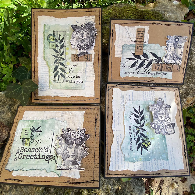
Hi everyone, it's Leandrawith
you today, and I'm here to share with you some tiny print ideas with
Lynne Perrella and Sara Naumann stamps. These cards were planned to be
simple,it was the 'Absorbent Ground' (a Golden product) I was digging
into testing for this post. If you are looking for fast Christmas cards,
then these are definitely that. Even the process I have used can be
simplified further without difficulty.
When working directly onto vintage papers,
or onto book pages, I like to knock back how bold the printed words look
to make the substrate more usable. Generally I use paint thinned with
Fresco Matte Glaze. This allows the image I stamp on top to be seen a
bit more clearly. However, for this topic, Tiny Print, I really wanted
the print to still be seen through all the layers, and with that in
mind, and to stay true to the intention of the product I was testing, I
opted for watercolours on top for a gentle tint. Yes, I could have used
Frescos, and those and infusions will be future experiments to explore
over the 'ground' product.
OK
so I am heading into a deep dive on how I found this tub of 'Absorbent
Ground (white)', seen in the centre of the picture below. When I took
this photo I didn't know realise where I was heading, but I adore gels,
mediums etc so this was a chance to explore! The plan was to find out
if the 'ground' made it easier to create watercolour backgrounds on
vintage papers. Answer: well, it kind of helps, but it still isn't
anything like working directly on good watercolour paper...however, it
served my purpose pretty well in the end as you will discover as i walk
you through the process. I ended up very happy, but not for the reasons I
originally expected.
As
an aside, both Absorbent Ground and Fibre Paste are Golden products
that are supposed to help your paper behave more like watercolour paper.
(they also have Qor branded versions of the same product) Qor are
Golden's watercolours, a fairly new product for them that seems to be
getting good reviews. They really do 'suck in' the colour into the
paper, and the colours seem to dry quite nicely on top of it, but they
actually don't let your 'wet in wet' watercolour techniques 'travel'
anything like they do when you get those magical effects on watercolour
paper, so don't get too excited....
However....
*drumroll*.... it creates a gorgeous 'toothy' surface to stamp onto,
and that WAS AMAZING! Let me attempt to describe how this product feels:
when you rub your fingers over the dry ground it's more gritty-chalky
and much more finely textured than fresco paints, which feel
silky-chalky by comparison. As a product it really seems to 'pull into'
itself the product you apply on top. So, for example, take a look at
just how black the inked images are in the samples I made. Usually you
would expect a bit of texture, a bit of the image to be paler in some
areas, but I must say, every print I made with archival ink directly
onto the absorbent ground was perfect! So for that feature alone, it was
a really good experiment to do! I LOVED how the rubber stamps with
archival ink perform over the ground.
So
let me back up a bit. It is good practice, when testing out theories,
to use the same brand where possible in the layers, this was also the
recommendation on the tub of ground. My vintage paper (a very old
handwritten record of each French plot of land within an property
purchase agreement) was particularly fragile, so I started by sealing it
with matte medium to secure it to smoothy card and then applied gesso. I
used a catalyst tool to get extremely thin layers. Matte medium
(Golden) in the tall bottle, is a pourable, runny product, much thinner
that a gel medium (see the videos below for info on these products).
Next
I applied 2 coats of the Absorbent Ground. It doesn't say how much to
apply, how thick, or how many coats on the tub instructions. For all of
these layers (matte medium, gesso, ground) I really, really liked using
the catalyst tool. It kept the layers thin and even while spreading only
a small blob of product and I didn't get any bubbling or buckling,
despite the paper being thin and fragile. The vintage paper certainly
felt stronger/ fortified after these layers had been applied.
By
the way, (another digression...) if you want to know more about gels,
mediums, and so on, we did this as a blog topic in August 2015 (here is
the link to the 'masterclass' blog post which is a really good resource - picture heavy with plenty of examples, a handy one to pin or save)
I
filmed 2 videos at the same time explaining the basics, and looking at a
few different brands and price points. If you don't understand what
mediums or gels are for, what the differences are, and would like to
have some ideas regarding use with paints and other colour products, or
if you are not sure what to buy and why, then this is a good starting
point to get your head around what is out there. (I love all texture
products, so I collect and use loads! But it does require discernment.
Note the difference between fine artist-grade and craft-grade products.
Even within a brand, there can be artist grade and student grade. If the
price is similar of an artist brand to a craft brand, then you may end
up paying over the top for a product with no track record! eg a shiny,
plastic gesso is really not what a gesso should be)
The
first video is about Acrylic Mediums (in other words thicker viscosity
products that we can use in mixed media for adding texture and much
more)
This
one is about Acrylic Pouring Mediums, in other words runny products.
Golden still make glazing liquid (2 of the tinted glazing mediums I show
are no longer available), but of course you can use the still available
clear glazing liquid in matte, satin or gloss to make your own custom
tint in the finish you prefer.
OK
back to the topic at hand: Tiny Print. Here is how my paper looked
after 2 coats of Absorbent Ground. I really wanted to be able to see the
writing on the paper (that was the whole point), and that is why I
chose to use watercolour on top, being translucent, I hoped even darker
colours would not obliterate the writing.
I
decided the next step was to apply the watercolour to the edges of my
papers that had been pre-torn to match the size of the stamps I was
going to use on top, while still leaving room for the LPC images to be
added later.
What
I found was that to get an even coverage, and no domineering 'tide'
marks I needed a fair bit of of water, so a water mister was good to
shift the colour around and still allow some contrast.
Next,
while the papers were still wet, I also dropped in a few concentrated
drops of colour in 2 different shades of colour. As soon as these hit
the watery surface they did soften out a bit, but nowhere near as much
as they would if I was working on good quality watercolour paper.
However, I quite liked how they settled, so I left them to dry off
naturally.
I was
interested to see notice they certainly dried 'into' the ground, and
the effect was almost soft and blurry - which I really liked!
You
can see how soft the background looks once dry. I did wonder if the ground actually
hinders watercolours looking as vibrant compared to how they might if they were used the
same way on watercolour paper. Anyhow, lucky I am not a watercolour
expert, as I might be disappointed with this 'ground' product, however, for me,
there were other exciting things about the Absorbent Ground that I was just about
to discover....
Look
at how beautifully it stamps up!! I could NOT believe this, the
archival ink looked blacker and way less purple than it usually does,
and the sharpness was spot on superb. I just LOVED how I had to really
peel the paper off the stamp, it was like it sucked right onto the
rubber and the stamp surrendered all its ink to the absorbent ground,
with the paper piggy in the middle - I guess they named the product perfectly, it absolutely IS absorbent!
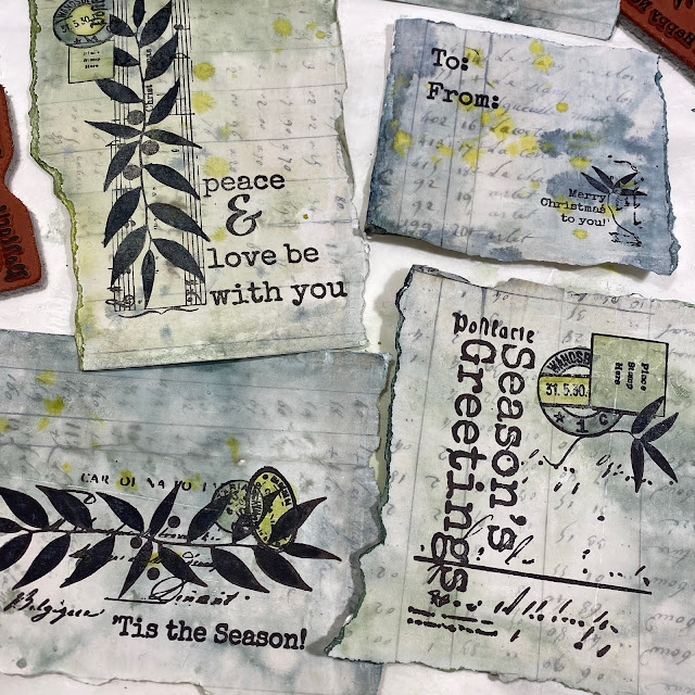
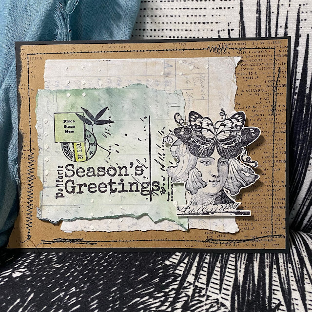
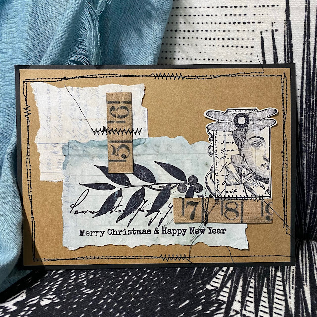
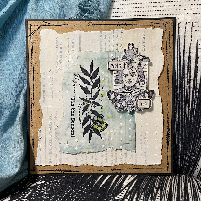
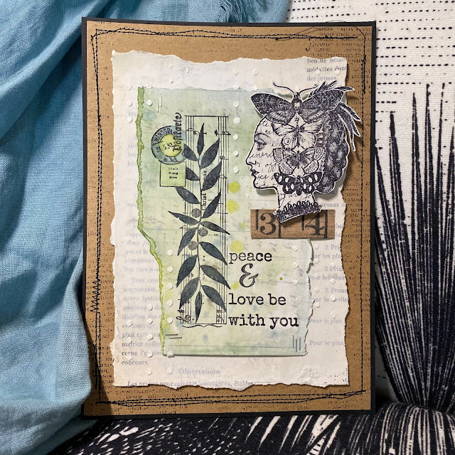
These
are the Sara Naumann Christmas themed stamp sets I used, we released
these last year, and I really love them for making cards and tags for
Christmas.
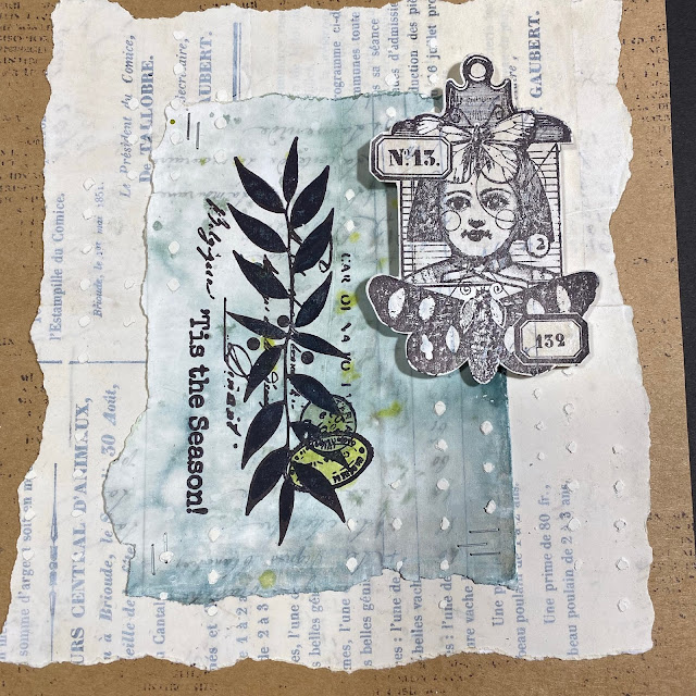
This
was my second sheet stamped with Lynne Perrella 'head' images. I
partially inked up some of the larger stamps as the intention was only
to use the heads. There are so many LPC stamps to choose from. We all
know how detailed these stamps are, and wow does Absorbent Ground pull
out those intricacies beautifully! I was very tempted to start using the
watercolours again to add shading to these stamps, even a touch of
sepia on the faces would look good right ?? But my plan was for
minimalist cards on this particular occasion, so I resisted the urge. I
know I will do this again, I've barely started playing with this
product. I will certainly run more tests, and create some collage
elements. Then in future projects I can then add colour if required. I
think it would be very handy to have some of these ready for immediate
use in my 'bits and bobs' stash!
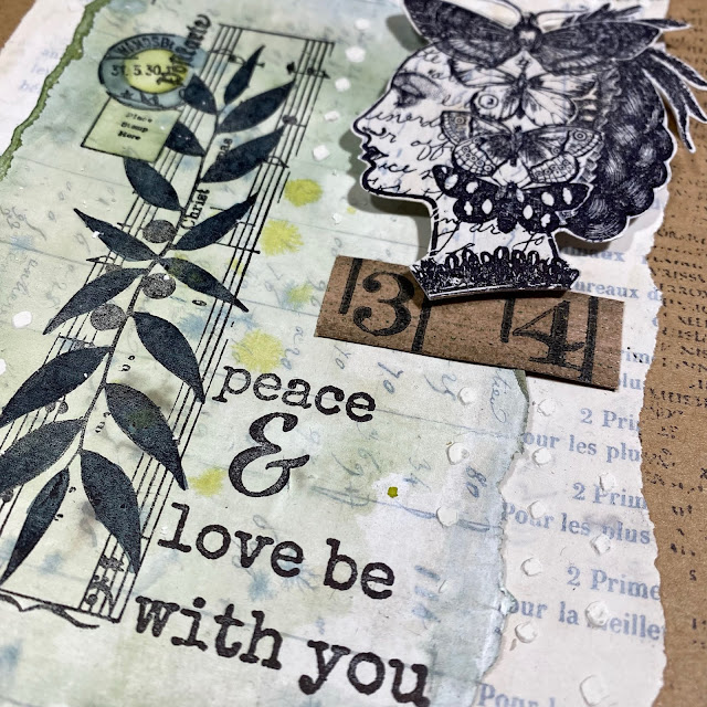
So
the composition is pretty simple. The coloured Sara Naumann stamped
layer gets stapled to another layer of lightly gessoed vintage paper.
The LPC head gets stuck on with foam tape, and then I used the popular
Sara Naumann stencil (those tiny dots) with Grunge Paste for a bit more
interest.
I occasionally added a bit more intense colour to the BG, (like on those postmarks)
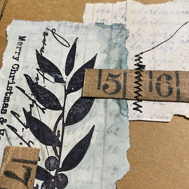
And
one sample was made from all the left over scraps, and some vintage
tape ruler I found in my stash, that tied in perfectly with the Kraft
paper background.
I
just love how you can still see the Tiny Print of the Vintage paper
peeking through. Who was that person who hand wrote all that information
out at the land office all those years ago!! Can you imagine !!!
I
felt black stitching was needed as the final touch to frame each
layout, and occasionally to secure embellishments. This is where you
need to do your worst sewn wonky lines possible - almost impossible for me after quilting meticulous 1/4" seams for years!
A couple more close ups of the detail ....
You
know, I think I could get away adding some sepia shading to those LPC
faces...I might go and do a bit of subtle faffing/ tweaking!
I
have inadvertently stretched a fast-card post out into a gels and
mediums play-fest, but that is what floats my boat, I just LOVE
experiments, and to find a product that improves your stamping - well
that is VERY exciting for me!
Let me know if you have played with that Golden product and what you have done with it!!