Monday 27 February 2023

2023 Topic 03: Focus on Seth Apter {by Asia Marquet} with Seth Apter Products


Hi everyone,

It's Asia Marquet (Lemon Creation) here with you today.

Some of you probably know already that I love Seth Apter's designs as I love everything grunge and messy. This was the first thing I though about when I saw the Track theme and Seth's stamps. But today I put a little spin on Seth's designs and decided to use  them  in sparkly and feminine and not so much grungy way. 

This idea brings a smile to my face, as this isn't really a type of project you would think to do with grungy stamps. But then again - why not? I love good challenge, so here it is; a feminine layout with messy stamps. Let me know if you think I managed to pull it off.


Before I start, let me be honest with you - it has been more than a year, maybe even two, since I created my last scrapbook layout.  Why? Well, mostly because of its size- you make it, you need to store it somewhere and you need quite a lot of products to fill it up as well. So todays project will be a tiny bit different. If you, like me, are overwhelmed with 30x30 scrapbook layout size, then make it smaller! This is what I did here. Making my layout a tiny bit smaller than standard size helped me to better manage the background and to take better photos.

This is such an easy "trick" so not to get overwhelmed with filling up a big piece of paper and needing 1000 different embellishments to fill it up.  If you are not a scrapbook lover, or if big projects scare you, try to create today with me and you may actually be really surprised.

Why create a scrapbook layout then? Because to me they can be a particularly feminine art form within mixed media and I thought the 'Tracks' theme would be more visible on a bigger background. It was easy and fun to create it and hopefully it will give you an idea of using Seth's stamps in a completely new way.

What's more important, while creating this project I came up across very funny way of creating your own "3D" type embellishments from stamps, so let's have a look at the process.


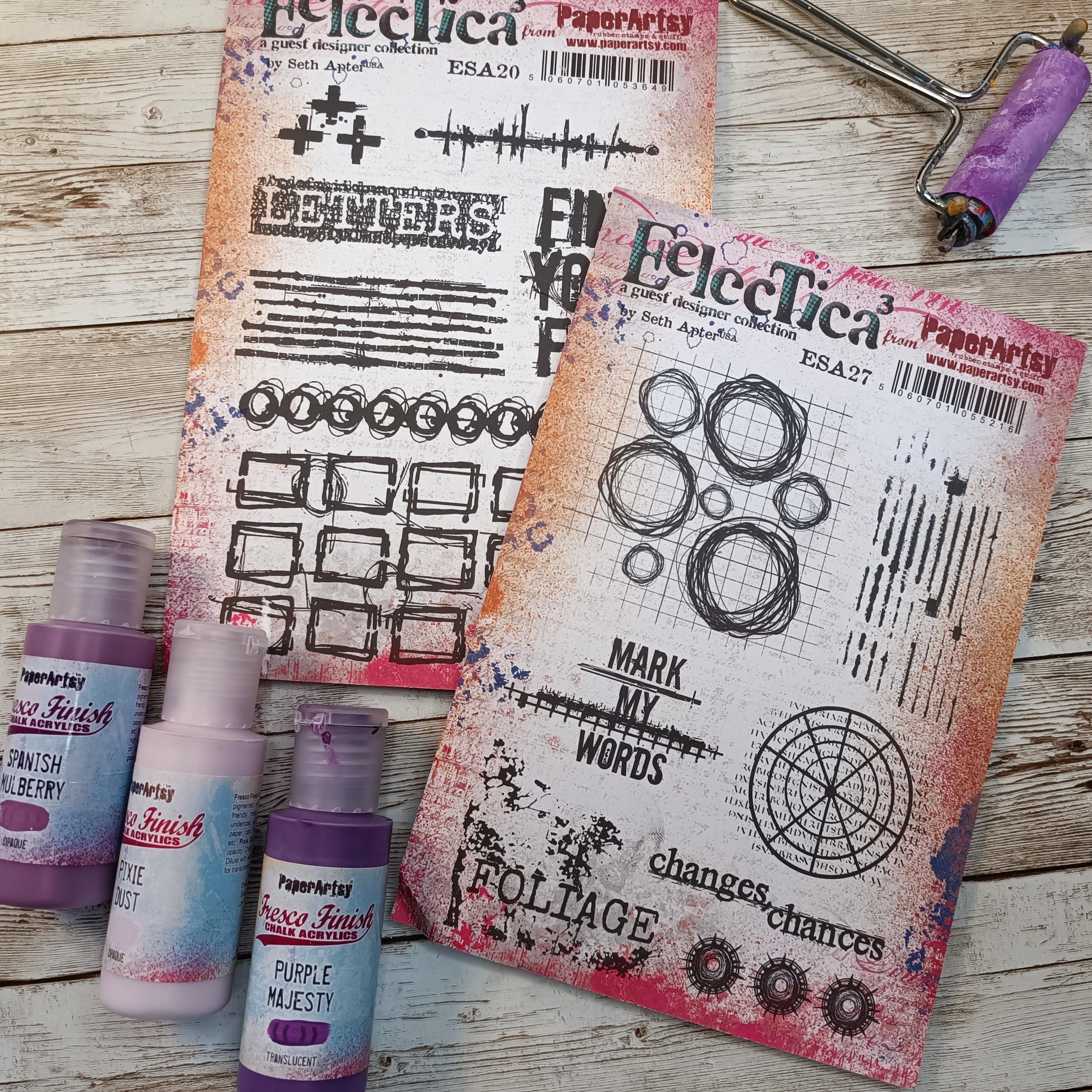
As I already mentioned earlier, I really love working with Seth's stamps, but I am learning to create more with acrylic paints. While planning this project, I knew I was going to use acrylics as they are all creamy, nice and perfect for a clean, romantic design. I did not have a general idea in my head, I just wanted to make a feminine layout, so I knew I was going to go for purples and light pink from the Seth's Apter Fresco paint collection (and to be honest I do not know how to work with real, bright pink- a color that overwhelms me).
 
But the general idea stays the same with the colors I have chosen, as they are very feminine and as close to bright pink as I could manage. My choices of Fresco Finish Chalk Acrylics for this project are: Purple Majesty (FF221), Pixie Dust (FF113) and Spanish Mulberry (FF71).
I have chosen two Seth Apter's stamp sets 20 (ESA20) and  set 27 (ESA27). The first one will help me to create a background, from the second one I decided to use some parts to create embellishments.


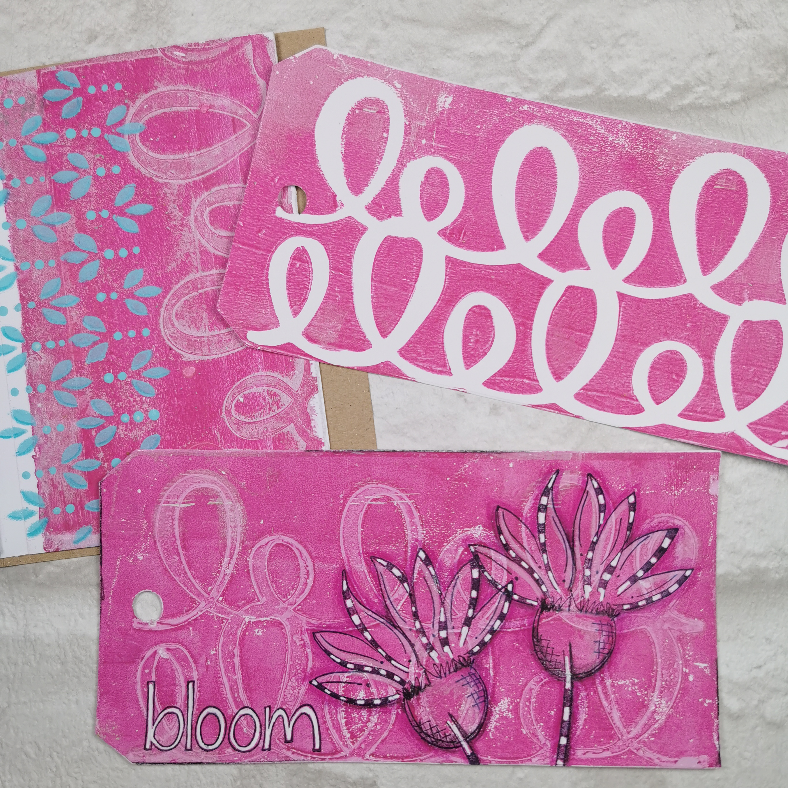
The very first thing I made was a background on which I wanted to do some stamping to use as embellishments later on.  I started here as honestly I was not sure what to do on the layout itself. I needed to have some time to think and see the embellishments first and then go from that. This is a good tip if you are stuck- instead of doing things in the "right order", start somewhere in the middle and see where this 'middle' will take you.


This background was created on a scrap piece of mixed media paper by adding (with a brayer) two Fresco Finish Chalk Acrylics- Spanish Mulberry and Pixie Dust.  After drying the page (dids you realise Fresco paint dries so quickly!?), I added some splatter with Fresco Finish Chalk Acrylics (Spanish MulberryFF71) for more definition and interest, then let it partially dry and then cleaned the insides of the splatter with a damp cloth. This is a really cool technique which allows you to get some sort of "empty" splatter (see photo below).


Happy with the background, I added to it some stamping with different elements from Seth Apter's stamp set 27 (ESA27). I used VersaFine (Onyx Black) permanent ink (which dries rather slowly, so be careful not to make a mess with your fingers!), if you're impatient, you can use a heat tool or emboss with a matt clear ink.


After the ink was dry, I fussy cut all the elements. The biggest 3 circles were fussy cut differently- one exactly as I stamped it, but the two remaining ones were cut with some parts missing (see photo below). This is another "trick" I like to use- altering the shapes of my stamps to add more interest to the page and really get more out of your stamp sets.


I think the best part was to fussy cut the stamps and adjust them a little to my liking, but in the next step I will show you how to get them to really stand out from the project.

At this point I finally had a clear idea in my head; let's add some circles to the background of the layout as well. I took the scrapbook page and a piece of printing paper from which I cut different size of circles. I used this piece of paper as a mask on my page and applied paint through these 3 circles: Fresco Finish Chalk Acrylics: Purple Majesty (FF221) and tiny bit of Pixie Dust (FF113) (application  with a brayer).


I wanted the colors on the backgrounds to be a little bit different than on the embellishments, even though they are quite similar. The application with the mask and brayer left me with some small imperfections, but this will be fixed later on by adding embellishments. To match the background circles to Seth's stamps I doodled around them a little bit with UniPin black fine liner.

Next step was stamping- a fairly easy task. I used Seth Apter's stamp set 20  (ESA20) and the same VersaFine ink (Onyx Black), trying to make a criss-crossing track pattern on the page. I have chosen from the set two stamps which worked in my opinion the best with the "circular" feel of the page. While stamping, don't forget about the masking technique- if you don't want stamping in some places on your project and you need to use an acrylic block, add a piece of thin paper in the place where you want your stamp to not be visible. I used this technique here as well.


The second stamp from this set was stamped ever so lightly onto the page. To get this effect you can either use brighter ink, or you can stamp the first impression on the piece of scrap paper, and then without re-inking the stamp, stamp it onto the layout (second impression). This will give you a nice, but way brighter image (photo below).


Let's make some cool embellishments now!


This is definitely the part of the project I enjoyed the most- making embellishments from previously stamped images! While making them I got this funny idea to kind of twist or fold them between my fingers, so they changed shape.


Happy accidents make good embellishments at the end- in a few swift movements of my fingers, my whole layout got more texture and layers. Don't they look super-cool now all crinkled and dimensional?


The very last steps of my project were to put everything together. I made clusters of my fussy cut embellishment around the photo I have chosen as the focal point. As you can see it is a picture of a very beautiful, elegant woman. I wanted to highlight the fact that this is a very feminine layout. To make it even more sweet and romantic, I found some enamel stones which I added to the page.


A little bit of glitter and some micro beads always gives such a nice touch to this type of page.

I felt like my layout needed some sort of sentiment to finish it correctly. I chose the part of one of the stamps (ESA27) which says Changes. I thought, after all I made some changes to the way Seth's stamps are usually used hence this part of stamp will be better; Then again, as women we go through so many changes- so this word just sits so right with me for this layout.

Here is the finished project:


I am wondering what do you think of my layout and this quite unusual use of Seth Apter's stamps? I did have fun making it, even though it's not something I would be creating every day. I am, after all, a grungy girl. But it was a nice challenge and I was so happy with the way my embellishments turned out, all bendy and nicely textured. This was definitely the high point of my project. The low? glitter and stone embellishments- adding them to the paper, with glue sticking to my fingers- not the most enjoyable part of this story, but hey, I managed!
I truly hope I gave you an idea on using your stamps in a completely unexpected way (or any other products for that matter). What will you create next? I am sure it will be something beautiful!

Asia


Facebook: https://www.facebook.com/asia.marquet/
Instagram:https://www.instagram.com/lemoncreation_art/
Pinterest: https://www.pinterest.fr/LemonCreationAsiaMarquet

Friday 24 February 2023

2023 Topic 03: Seth Apter - An interview and the focus of our next Blog topic!


Hi everyone,

Today we are doing things a bit differently as the topic of this blog topic is all about one of our wonderful designers; Seth Apter

I feel like we need a big flashy intro here .....


There we go ... that's better ..... (haha, that crack me up ... it's so NOT Seth, but its pretty funny nonetheless!)

So, we have come up with a few questions for Seth so let's see what we can find out about Seth that maybe you didn't already know....  

Historically Speaking ...

Question: Before you were a full time artist, did you have an inherent interest in art yourself?  Did you go to exhibitions, or maybe collect art as a consumer and has being an artist changed how you view other people's art?

Answer: I was an art lover long before I started on my journey as an artist. Being in NYC, I have always visited museums, galleries, and auction houses. And definitely bought art along the way, like this abstract work from artist Rebecca Crowell. Since being an artist myself, I have a greater appreciation for the work that goes into creating.


Question: How did you feel when you transitioned from having a day-job to being a full time artist? Did it take you long to make this move and what precipitated it? How did you know the time was right for you? 

Answer: My first career was as a full-time psychologist. As my life in art became increasingly important to me, I began to slowly transition to become a full-time artist. This was a slow process for me and the shift took me about 5 years. When I finally took the leap, I somehow intuitively knew that the time was right.


Question: Do you think your art has changed much over the years? Are there things that always remain constant? 

Answer: I somehow have been quite consistent since the start of my life in art in terms of my creative voice and direction. But as can be seen by this image - the first posted on my blog in 2007 - my initial work was much less layered, complex, detailed, and textured.


Question: Do you have a couple of people who you consider to have influenced your art, perhaps this was before (or during) you finding your unique style?

Answer: My work has definitely been heavily influenced by Patricia Larsen, an artist I met serendipitously who led me into the world of creating. The image below is a work of hers that hangs in my home. Other artists who have influenced me include Antoni Tapies, Jean-Michel Basquiat, Hannelore Baron, and all the artists in the book True Colors


Question: Looking back, is there one moment that you are particularly proud of, or perhaps a piece you made that to this day you can't let go of for some special reason?

Answer: Being part of a group of artists selected to work with Sing For Hope in 2019 to paint a piano that would ultimately be donated to a school in NYC. From start to finish the project was exciting, inspiring, and very fulfilling.


Philosophically speaking ...


Question: Do you think there is a dividing line between 'art' and 'craft' ?  Do you differentiate and move between these worlds?

Answer: I do not separate art from craft and simply feel that each person ends up creating in a domain that most resonates with who they are. I bristle when I hear somebody speak of a hierarchy where fine artists are automatically better than crafters. I truly believe that anybody who choses to create is an artist - although I recognize that there are many people who are not comfortable with that label for many reasons.

 
Question:You spend a lot of time endorsing other artists and interviewing them too. Why is this area of sharing what other people do so important to you? 

Answer: Art for me has never been about sitting alone in my studio creating. It has always been community-focused and all about collaboration. I also believe that there is more than enough for all of us and supporting, amplifying, and lifting up others is the way to go.

 
Question: Do you like to work on a single piece of art in a collaborative style with another artist? Is this a regular thing? Can it be a train crash? Does this change how you work and how do you decide when a collaborative piece of art is 'done' ? 

Answer: Artist collaborations have been something I have done since the start of my journey back in the day of Yahoo Groups. It is challenging, sometimes frustrating, and always an inspiring experience. The process pushes me out of my comfort zone and in the end I create work that is different from what I would have created on my own. Just like with my own work, it is simply intuition that indicates a work is complete (or a deadline LOL). Image is from a series of work I collaborated on with Roxanne Evans Stout that was ultimately exhibited in 2013 in Oregon.


Question: Do you evaluate your own art and your progress or try to measure your success? 

Answer: I have posted my work on blogs and social media for years. This archive, along with my journals, gives me the opportunity to look back at my progress, reflect on changes in my style, and - in a manner of speaking - evaluate my journey. I wouldn't say that I use this to measure my success but more as a way to mark who I was at different points in time. 


 Practically speaking....


Question: We have often heard you say that you have never experienced a 'block' when creating. Why do you think that is ?

Answer: I am always, always, always working on many pieces at a time. Often in different art domains (collage, painting, book arts, fiber arts, assemblage, journaling, etc.). As a result, there is always some form of making that seems to call to me. Plus I surround myself with inspiration which I can always draw from; this is my inspiration wall which I switch up each year.


Question: Do you use different products now than when you first started on your creative path? If you were stuck on a deserted island, what are the main supplies you would need to have with you?

Answer: I am a pretty loyal product user. When I find something I like, I tend to keep using it. That being said, I also like to buy new products all the time (and am betting you do to). Over the years as a result, my favorite supplies have shifted back and forth. As for must-have supplies on that island, it would definitely include paper, PaperArtsy acrylic paint and brushes (guess I could use sea water to clean up), a gel plate and brayer, some stamps, ink pads, and Stabilo All pencils. Oh...and a pencil sharpener.


Question: When you teach,  what format do you find works best for both you and your students ? How have you found online versus face to face and what kind of set up do you think is the most interesting ?

Answer: Hands down I prefer teaching in person as I love being in a room filled with creatives creating. But since the pandemic, I have transitioned to nearly 100% online teaching. Most of the time I do it in a Live format via Zoom or Facebook Live. It has been much more satisfying than I would have thought. 


Question: You often use found ephemera in your art. Do you have some favourite places to source these types of things and do you have a preferred way to store these sorts of things?

Answer: I use ephemera, found and bought, all the time. I always use the original, rather than a copy, as it adds a level of authenticity and history to my work. My storage system is the OBP Method - One Big Pile - in a drawer with no organization at all. I find these items at art/craft shops, antique stores, flea markets, and anywhere I can online.


Designer Life ...

Question: How did you first start designing for different companies? Who approached who? Can you share a bit of how that process evolved for you, and do you have any advice for your younger self now that you are more aware of this process ?

Answer: It all started for me in 2013 when Mary Beth Shaw asked me if I wanted to design for StencilGirl Products. Product design hadn't been on my radar but after creating my first collection of stencils (pictured below), I got the bug and have developed lines of products with many companies since that time. Several collections - including with PaperArtsy and Spellbinders - came as a result of initially being a blogger for the company. As for my advice for my younger self, it would probably be to make sure the company culture and ethos matches yours.


Question: As a designer, are you influenced by 'trends' in the arty-crafty world ? Do you try to reflect trends in the products or designs you create? Are you influenced by other creative sectors ?

Answer: I think I am influenced by trends indirectly as I do spend time researching and being aware of the current trends. But when I go to design, I am always looking inward to create products that are a refection of my artistic voice at the time. It is important to me that my work be inspiring and useable, even years after it is introduced and nearly all of the companies that I work with do not retire designs but rather keep them available on an ongoing basis. I am influenced by all sectors - home decor, fashion, graphic design, packaging, window display, etc.


Question: Is there a product you love to use that you wish you had designed?

Answer: I don't usually think that way but on occasion there is a favorite color in a product line that I love and use over and over that I wish hadn't been already developed cause I would have liked to have happened upon it myself. Some examples include Inky Pool PaperArtsy Fresco Finish Acrylic Paint, Fossilized Amber in Tim Holtz's Distress line, and Golden's Transparent Brown Iron Oxide High Flow Acrylic Paint. 


Question: What does it feel like when other people use your products and share with you what they have made? Do you learn or get inspired by seeing other people using your stuff?

Answer: Being embraced in the design world and seeing all the magical creations made by others with my products is endlessly exciting. Most of my design work is abstract so it enables other makers to really make it their own. And so many people create in ways I could not have even imagined! Pic is a piece from Debi Adams where she used my products from 3 different companies.


Looking ahead ... 


Question: You have recently announced you have a line of fabric launching this year. How do you think this might impact on your creative journey this year ?

Answer: I have a feeling that this will be a game changer for me. I have always used fabric in my mixed media art work and have a longstanding love of hand stitching. Now having my own line of fabrics with FreeSpirit Fabrics, I plan to lean further into fiber arts. I do think that this will lead me to new and different ways of creating that I am still discovering.


Question: Do you envision you will be doing more travelling in the coming year? What have you missed most about not being able to leave New York ?

Answer: I have barely traveled since March 2020. In May of this year I will be teaching in Spain and in June I am teaching in Taos, New Mexico. My experiences at both places will determine how much I travel for the rest of the year. I do love all of what NYC has to offer but travel to places that are different has always served as a huge inspiration for me and I miss that.


Question: Everyone knows iced tea is your favourite drink, but can you cook? Do you have any new skills (maybe non craft related) that you want to learn in the near future?

Answer: Ha. I pretty much have at least one Iced Tea every day. No matter how cold it may be outside. As vices go, it isn't too bad. Can I cook? Well...let's just say that I cook about as much as most New Yorkers - that would be sort of yes. As for new skills, I am still working on all the old ones!


Question: Do you have a couple of events planned this year that you want to share with us?

Answer: In addition to my teaching trips to Spain and New Mexico, I hope to be going on the road to promote my new fabric line beginning in September. But mostly I will be in my studio, splitting my time between creating, computing, and looking out the window!


Visit me at my website, on Instagram, via Facebook, over at YouTube, or in my FB Group Seth Apter Creative Community.


Thanks so much for taking time to answer our questions Seth! Can't wait to come and drink Iced Tea and visit some of your NYC regular haunts with you. It feels like so many things we have talked about doing in the past just got put on hold due to the crazy few years that just happened! So great that you will be back on the road this year and sharing your love of creativity with people far and wide! You know you are welcome in France anytime too!!

Best wishes and happy crafting to one and all
Leandra

PS If anyone missed Seth and Leandra's 'PaperArtsy People Playalong' that we did on February 5th, here is the link - we freestyled it talking about the differences between Opaque and Translucent Fresco paints .... and despite doing the same general technique, we both created totally different pieces, it was so much fun. 
Grab your supplies and play-along! Here is the Link 

Over the next few weeks our blogging team will be showcasing all things Seth in some very interesting ways! Keep an eye on the PaperArtsy blogPaperArtsy's Instagram and PaperArtsy People to keep in the loop with everything new!

Thursday 23 February 2023

NEW PaperArtsy Products: JOFY {February 2023}


A note from Leandra:
Oh, how a JoFY stamp release just makes your heart sing. We adore her quirky flowers, the simple, effective gel prints, and the bright colours she uses; year round these stamps adds sparkle and a smile to your day. Whether it is a junk journal or cardmaking, these stamps just tick all the boxes, go large, go small, it doesn't matter, everything is possible!
 
Jo will be along to share with you LIVE her new products and ideas over in our Facebook Group, PaperArtsy People shortly after this post publishes. I hope you can drop by for the live, or try to catch the replay. We love to hear from the designer about each new release and understand more fully the ideas they have with each product!
 
Please check the list at the foot of this post to find a retailer online or geographically near you, it makes sense to order within your country wherever possible. We have been shipping to them for the past 2 weeks so everything is in stock now!
 
Hi everyone, Jo Firth-Young here (@jofyjowww.jofy.co.uk). I hope its not too late to wish you a happy new year? I hope 2023 is treating you well.
  
I'm here to share with you my latest release of 3 new stamps sets and 3 new stencils. When I started to think about these sets I knew I wanted to create smaller designs - sized to work on cards, pocket sized art journals, ATCs, tags and postcards etc.... motifs that would work together or as little stand-alone elements to accent a page.

I've designed an informal alphabet that I know is going to be very useful (& one I will be using A LOT!). There are several styles of flowers - some realistic and some less so - the ones on JOFY123 are lovely doodle flowers that are great for paper-piecing and layering up.

There are also designs that compliment and coordinate with previous designs, but slightly smaller ones in this offering for size options! I love a loopy border so I've created a couple of smaller background stamp designs and 3 loopy masks that will be great for using with a gel plate.

I imagined these stamps being used in small sized journals so I decided that's how I would make several of my samples - in a 8 x 12cm handmade mini journal created with gel-printed and repurposed papers ... lots of bits of this and that - you'll see pages from the journal throughout this post. But don't worry if journaling is not your 'thing' the designs are easily transferable to cards.

There's lots to see so lets get started....

Price: RRP €23.00 +VAT Size:5" x 6" (13 x16.5cm)
All stamps are individually trimmed onto cling foam, with a laminated storage/index sheet.
  
JOFY Collection Stamp Set 122 (JOFY122)

One of my favourite designs from recent releases is the loopy border on JOFY114. I thought it would look great as a background design. So I played around with it and now we have a cute little loopy background - it can have standing loops (as shown) or hanging loops by rotating the stamp 180degrees.
Doodled circles always seem to be popular so this plate has 3. - so many uses for these!
 
Thrive journal page


This flower is based on a garden daisy - but when painted with bright colours it takes on a very different look.


Thrive tag


I've included 3 words on this plate- perfect for garden themed projects but that will also suit other journal themes (great for positivity mantras).


Flower Arrangement


I created this sample to show that even though these designs are smaller they can still be built up and used on bigger projects. This vase of flowers, on a panel created on a gel printed background using the new PS371, measures 18cm tall.


Mixing realistic and imaginary flowers makes an interesting arrangement. The flower in the photo below was inspired by one of my previous designs (JOFY80) one which I love but is quite large - so I thought it would be nice to have a smaller, daintier version. 


JoFY Collection Stamp Set 123 (JOFY123)

Can you ever have too many doodle flowers? No, me neither!

Doodle flower meadow


Oh my goodness I like these doodle flowers so much!!! I had so much fun stamping and colouring them - they're so pretty I can't help but smile when I see them! These were stamped onto pages of gel printed paper and accented with coloured pencils - but you can colour them with watercolour or acrylic paints - and they will look fantastic coloured with alcohol markers too for extra vibrance. 

I have not supplied a stem stamp for these - I encourage you to draw your own - I think this gives you more freedom in how to use them.
 
 
Here is one of my 'in progress' photos - you can see how I have stamped the designs onto several sheets of gel prints and have cut, layered and coloured them. IT can be a fun mix and match opportunity.


Its a JoFY garden!

These designs can be used for dimensional projects too. I can't cope with the cuteness of these! I don't often describe my work as 'cute' but these petal filled pots just are! lol  They're so pretty. I think their size adds to the 'cuteness' - they measure around 15cm tall.


There are a couple of flowers from other stamps sets in the flower pots, nice to show how the sets are interchangeable.


 Pretty Maids all in a row...


These individual flowers look great in small bottles - this design could be easily recreated on a card or panel.


JoFY Collection Stamp Set 124 (JoFY124)
 
Bloomin' lovely

The alphabet is the main image on this plate, but I wanted to create a project where the flowers are the focus.  The main flower has 3 layers that can be easily trimmed to create different sized blooms as shown on the panel below.  


I designed the alphabet so it can be used as block as a background or cut apart and used as individual letters to create words or phrases. The photos above and below show the alphabet block stamped & embossed on the background.


'Now' journal page

On the journal page in the photo below I used the alphabet block as a 'feature' background (part of the image rather than a base for other images) and coloured the letters to show how the different ways they could be used... solid, shadowed, outlined, and in blocks - just a few of the ways.


'Love your life' journal page 

I wanted to design an alphabet with letters that could be mixed and matched with other alphabets and words I've designed previously or that you might have in your stamp collection. On the journal page below I've used the individual letters of the block to create the words and teamed them with 'love' from JOFY86.


Large Size: 6.25" x 9.5" (16 x 24cm) Price: RRP €6.58 +VAT
  
PaperArtsy Stencil 371, Large (PS371) by Jo Firth-Young

 Loops!!


These journal pages feature prints of different sizes of the loops masks - a first-pull print (on right) and a ghost print on left - interesting to see how the ghost print gives an outline of the mask.


PaperArtsy Stencil 372, Large (PS372) by Jo Firth-Young

I like designing stencils that build up to create a 'scene', motifs that can be used on their own or in any combination. With these images as the base layer you can add detail using stamps from this, or any previous, releases.

Meadow


On the sample above I only used the stencils to create this scene. The top right shape on the stencil is the base layer for the spiky flower head - but I found it works just as nicely as a flower on the ground - imagine a cactus or similar. (It also reminds me of waterlilies...)
 

The photo above shows the detail of the layered flower.


Its easy to place a few stamped pieces on top of the meadow scene so you can see how effective it looks with more detail added.


Meadow gel print


This was the first 'meadow' scene I made, working on a gel-print brayer-clean-off page that I decided was too nice to throw away. I've included this as it shows the spiky flower without the solid background. On this sample I added accent/shading to the shapes with coloured pencils. You could also outline these shapes with a black pigment pen for a sketched effect.


PaperArtsy Stencil 373, Large (PS373) by Jo Firth-Young

This stencil features 3 background designs - the middle one was initially designed as a border but works really well as a repeated/tiled background design, and makes a beautiful accent on some of the journal pages I have created.


Love your life journal page


The spots stencil makes a fun background for the above journal page.


The flowers stencil  makes a lovely corner accent - it would look lovely on a card with a die-cut greeting, or a sentiment stamped using the letters on JOFY124.


The flower stencil has been used here to create a gel printed background (the print was accented with coloured pencils) - you'll achieve a good print of this stencil if you use a lightweight paper.

---
These new stamps and stencils have been such a lot of fun to design and work with - I have so many plans for them! They will pop into my journals and onto my cards on a regular basis I'm sure.  I hope I've inspired you, if I have please tag me (and @PaperArtsy) on your social media project posts as we love to see what you make!!

I hope to see you soon, take care

Jo


Website: www.jofy.co.uk
YouTube: Jo Firth-Young
Pinterest: @jofyjo
Facebook: JoFY Jamboree!
Twitter: @jofyjo
Instagram: @jofyjo

Teaching Schedule:
I'm feeling ready to start in-person classes again - I miss seeing people and talking all things arty! Please contact me if you would like to discuss this.

Below is a list of the retailers who have already got these new releases in stock ready for you to buy NOW!