Wednesday, 31 July 2019

2019 #12 Eyes: Eye of Horus with EEV {by Chris Dark}

2019 Topic 12: Eyes


It's stunning how Chris has pulled this project together from a simple shape. The way she uses paints and infusions together is fantastic. Much to learn from these ideas! ~ Leandra

Hi everyone, it's Chris here with you today to share my card on this fortnight's theme of 'eyes'. I didn't have an idea for my project initially, I just knew that the plain petal shape from Ellen Vargo's stamp set EV009 was eye shaped so that was my starting point. As soon as the stamp set arrived and I could see the size of the petal stamp the idea came of the Eye of Horus (also known as a wedjat eye) as I knew I could build pattern around it and I've seen lots of variations of this symbol of protection in the British Museum, in artworks etc., it's popular for tattoos as well.

It was satisfying to be able to use all the stamps in the set, once I started I could see the possibilities and one of the pattern circles, the one with the radiating lines made sense to be used as the iris of the eye. As always though I started with the background, it somehow gets the creative juices flowing. 


As you'll see from the main project photo, once dry my card bent a little due to using a bit of wet glue with the hessian sheet but I can pop it under something heavy to sort that out later. I really like the texture the hessian adds and it fits the theme of the card. There's sparkle and shine in there as well with gold sparkle embossing powder and gold paint, they all help to add interest.


Blue OysterBlue LagoonBora BoraBeach Hut, and Gold were my colour choices in Fresco Finish Chalk Acrylics


 with Terracotta and Royal Blood Infusions.


Smoothy Heavyweight A4 White Stamping Card is my substrate, it holds up to the paint, infusions and brayering without the surface degrading. 


The stamp press came out so that I could repeat stamp the main feature of the card. As you can see I'm down to a 12" area of desk by this point! :D


I've stamped all the patterned petals over one of my backgrounds and they slotted together very nicely on the (dirty :D) stamp block to cover the background quickly.

Here you can see the layers of the eye. I stamped the plain petal again onto the turquoise background, drew a freehand border around it and cut it out. I stamped the radiating pattern circle over the white petal for iris and pupil and then glued them together.


I continued building a border pattern around the eye after sticking it to the gold background. The patterns are created freehand with a black paint pen and coloured with alcohol markers for ease of colouring the tiny parts of the patterns. A nice pearlescent effect is achieved because the gold paint beneath shows through the transparent markers. The transparent paints in the range could also be used for this step.


The flourish parts under the eye and the blue eyebrow over the eye were freehand cut from the blue background pieces and outlined with black paint pen. 


The stamped areas are coloured with markers outlined and highlighted with paint pen. I added pastel pencil under the eyelid area as well although a true eye of Horus would be completely void of shading in this area and there would be no iris just the black pupil. For some definition I've added black
watercolour pen around the eye and the sticker sentiments pulled out with a damp brush.


I doodled quite a bit in white, I find it relaxing and I've added more shimmer with some glitter paper and some perfect pearls around the black border using Seth Apters mini stamp EM44 and Versamark ink, I also used the stamp on the gold background with Blue Oyster paint for more texture.

It's very satisfying to make something completely different from a stamp intended for something else, so this was a very enjoyable make for me. I wonder if you have any stamps in your collection that you could re-purpose to create an eye and join in with us this fortnight, I would love to see what you come up with if you do.


Monday, 29 July 2019

2019 #12 Eyes: A Case for Mr Magoo with Ink and the Dog by Lucy Edmondson

2019 Topic 12: Eyes


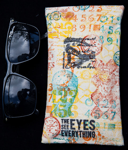
Summer weather calls for a case for sunglasses!  Lucy to the rescue with this stamped fabric case. ~ Leandra

Hi everyone, it's Lucy from Lucy's True Colours here with you today, and I'd like to share with you a calico glasses case I have made using Vintage Ink and the Dog stamps: oldies but goodies!

As soon as I heard the topic 'Eyes' I thought of the Ink and the Dog Mini 'The Eyes See Everything', although in my case they don't, as I'm the resident Mr Magoo in our house. I cause much amusement seeing things that I mistake for other things because I haven't got my glasses on. I really don't like having 'eye furniture'. By the time this comes out I will have a new pair of glasses which are a bit more trendy than my old ones, and some prescription sunglasses - and a homemade case for them! For those of you with perfect vision, I hope you will make a case for your holiday sunnies!


I wanted to make a simple, rectangular soft glasses case, so I cut a large enough piece of calico and started off stamping a selection of Ink and the Dog stamps in shades of yellow Fresco Finish Acrylic paint. 


 I used Eclectic Plate 4, Clocks Plate 5, and Letters Plate 5, with Yellow Submarine, Tangerine Twist, Zesty Zing, and Mustard Pickle Fresco Finish Acrylic Paints.


I then carried on, overlapping and filling in the gaps, using darker orange Frescos such as Tango and Autumn Fire, and turquoise  shades such as Beach Hut, South Pacific, Caribbean Sea, Mermaid, and Jade. 

  
Stamps used, again from Ink and the Dog, were the Flourish Mini 96, the Words Mini  44, and one I have a particular fondness for, Phrenology Man Mini 83, which always reminds me of Mr PaperArtsy (I'm sure this will be edited out if it's too cheeky, but he is so perfect for the theme, with his sunglasses on!). I also love the clock and 'the voices speak only to me' words from Eclectic Plate 4!


Now it's time for the stamp positioner, to get a really deep black for my  main stamp image, Mini 02, the Eyes See Everything and the eye in profile, using archival ink in Jet Black. I do love having the stamp positioner for things like this, don't you?


  Then it's time to add a bit of wadding and stitch it into a simple pocket and we're done!


I had such fun making this glasses case which I know will be really useful to pop in my handbag. I hope I have encouraged you to dig out your old Ink and the Dog stamps. It's incredible to think they started in 2004, and I have had many of mine for such a long time. They still feel so very current and versatile. The fabric piece could be used in so many different ways: make up bags, pencil cases, covered boxes. I'd love to see what you make!

Blog: Lucy's True Colours
Facebook: Lucy Edmondson
Twitter: @CraftyLuce

Sunday, 28 July 2019

2019 #12 Topic Introduction: Eyes

 2019 Topic 12: Eyes


Hello everyone, Keren here. Eyes are mesmerising aren't they? In order to really see this topic, I thought it would be a great idea to garner some good tips on how to draw them. We don't all feel confident drawing, and you might never want to create a hyper-realistic eye, but this artist gives some great tips about placement and perspective, which are right at the beginning if you don't want to watch until the end.


Rather than begin with the literal, I thought we'd start off with a troll; a flower troll to be exact! One that makes use of the unusual to create eyes with. Darcy made this delightfully quirky guy who's a fitting piece of eye-candy.


When we are looking at producing an intricate piece of art, if you're anything like me, you want to have some decent tools for the job. Sometimes being arty through using everyday tools produces beautiful results. This eye impressed me, not only because it is artistic but due to the tools she uses. Getting such good results from simple crayons is really inspiring.


It's interesting that you can really play around with the position and size of eyes for differing results. This piece is so emotion filled. Eyes have a great deal to do with conveying feeling.


If paint and pen are more your thing, watching this artist create a mixed media eye gives me lots of ideas about creating depth with colour.


Making the eye to be the centre of the story is Tal Peleg's speciality. She uses the upper eyelid as the canvas to recreate famous stories and films.


Working in Art Journals gives you plenty of room to express yourself. This artist loves journalling and has used texture without bulk. I love the canvas frame that draws your eyes into the ..eye! She's used Fresco Finish Chalk Acrylics in combination with other paints to give a varied effect.


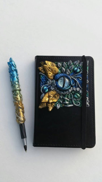
If we're talking eyes, there's no reason to limit ourselves to humans. With the rise in popularity of fantasy creatures why not try your hand at creating something mythical! This notebook is full of beautiful textures and almost gilded leaves


Trying to create an eye makes us think of detail, but having crucial elements of the eye helps suggest enough to create a fuller picture. This beauty has been put together with creamy pastels and is part of tutorial about using eyes in your journalling.


If you're wanting to evoke something to do with sight, why not use the iris as part of the illustrative process. This digitally created piece makes me want to create a collaged piece with acetate and photographs.


The aptly titled 'The Window To The Soul' is an arresting piece created just with pencils. I love the clear light reflected in the eye and the natural theme.


Black and white treatments add a depth that draws you in without the clutter of colour. View his eye, the life behind them; a vivacity and wisdom garnered from his years.


All of our examples so far have taken a straightforward look at eyes. This abstract piece amusingly entitled 'she could count the times she smiled on one hand', have the eyes both in different places and not sized the same. It works wonderfully though. The colours remain unified and the under eye treatment unifies the piece.


Before we wrap up, I was eyeing up this piece as a completely 'left-field' piece. It's entitled 'Catachresis #13'. I'll leave it to you to work out why I've included it! 


You're going to love the projects we have coming up for this topic. We are not doing the linked challenge  for 2019, so if you want to create along with us and this topic, please share on our social feeds so we can see what you get up to. The best places are Instagram @paperartsy or post in PaperArtsy People Group on Facebook. Make sure you tag us in your contributions, we love to see what you get up to in your creative world! 

Saturday, 27 July 2019

2019 #11 Retro Colour Palettes: Art Journaling with ESA {by Kate Yetter}

2019 Topic 11: Retro Colour Palettes


Here's a beautiful journal spread from Kate, in what are subdued retro tones for her, but to me they still feel rich and the gold touches add opulence too!  ~ Leandra

Hi everyone, it's Kate with you today, and I'd like to share with you an Art Journal Layout I made for the theme: Retro Colours. When deciding on what colors to use I automatically thought I had to use colours from the '60's or '70's since that is what I associate with Retro. But when looking up the definition of Retro it simply means to imitate a style, fashion or design from the past. 

Since my project is centered around Seth's new stamps, I wanted to go with a colour palette that would not only showcase the patterns, but would make me feel like I was holding an old treasure in my hands. And that is when it hit me: black, white and gold. Black and white are the color of old movies and gold screams ancient.


I don't often work in muted color palettes as I am all about bright colours and contrast. But I love looking at art that looks like it has been just been pulled out of an old forgotten trunk. This project made me feel as though I accomplished what I set out to do.


I used vintage newspaper for the background before adding a bit of black gesso and gold embossing. I am using Seth's new stamps.


Tearing up a map that I printed, I stamped around the edges and again gold embossed.


Using my Infusions (Terracotta, Lemoncello, Olive Tree), I sprayed a handmade envelope, stamped it and embossed it in gold.


Adding the map and some black thread not only added contrast but texture to my page. The envelope became the perfect focal embellishment to hide a small treasure. 


And of course I made something pretty for inside the envelope.


I used some of my favorite Seth Apter stamps along with Lemoncello infusions and black and white gesso.


That gold shine makes me happy and reminds me of buried treasure waiting to be found.

I really enjoyed working with this palette. It was out of my comfort zone but it definitely speaks Retro to me. I hope you challenge yourself to experiment with a retro colour palette that may not be the norm. Remember, Retro is anything that imitates a past design, style or fashion. So basally, the sky's the limit!