Tuesday, 30 June 2020

2020 #11 Calming Lace Book with EAB {by Claire Snowdon}

2020 Topic 11: Calming Colours


So lovely to have a project sharing Tracy's Lace Booklets. There are plenty of ways to decorate these, and contrasts between cut and solid pages are the key to getting a 'pop'. These soft delicate colours Claire uses in sage greens, grey-blues and blush pinks certainly ooze a gentle, calming vibe.
~  Leandra

Hi everyone, it's Claire Snowdon with you today, and I'd like to share with you my take on the calming colours theme using one of Tracy Scott's Lace Booklets.

I've really enjoyed playing with the new Lace Booklets; most of my projects with them so far have been very bright and colourful, very much as Tracy would use them!  So I thought this topic would be the perfect reason to try using them in a different way and to play with some different colour schemes than I would typically use.


I started the project by thinking about calming colours, but those which would still offer contrast so when the pages are closed you still get the great lace effect.  I started with the pink pages - using Fresco Finish paints in Sorbet and Blah Mange.  I used the colours to get a kind of ombre effect and also the darker of each colour to frame the page.


The green pages were created in a similar way using Fresco Finish paints in Sage and Zucchini paints.
And the blue colour scheme was created using the paints in Blue Oyster and little touch of Wisteria.


As a great bonus with the lace booklets you can create some fab stencilled backgrounds with the 'waste' paper you put underneath the pages when painting the pages.....so I will use these papers another time for a different project :)


On the back page of the booklet I wanted to add some texture so I used lots of the text stamps from EAB19 stamped using Fresco Finish Snowflake - I also like this particular page as when you look through the layers of the lace pages it reminds me of clouds in a beautiful blue sky.


I added stencilling to the green page using PS187 and the Snowflake paint again.  Then I really wanted the beautiful quotes from EAB19 to really stand out from the pages so I embossed three of the quotes with white embossing powder onto black card. 


I added some white pen work to the green and pink pages with a white Posca pen. I really like this little detail as it brings the lace cuts to life.


I added a little bit of the Snowflake paint on a sponge all around the outer of edge of each page. I felt this added to the 'cloud-like' feeling of the booklet and was in keeping with the topic.
 

If you haven't tried using the lace booklets then I would really encourage you to give them a try - and Alison's stamp sets have such beautiful quotations that really can compliment any project.  I hope you'll find time to join in with the calming colours topic and spend some time relaxing with this colour scheme.

Thank you for spending time with me today,

Claire Xx

Blog
Instagram
Pinterest

Sunday, 28 June 2020

2020 #11 A Gift of Kindness with EGL {by Miriam Grazier}

2020 Topic 11: Calming Colours


The world needs more random acts of kindness and Miriam's card set she created to give away is also calmingly beautiful too. As you look at the stamp set images, they're coloured and vibrant, and yet when given an alternate colour scheme, the stamped designs look so different. 
~ Keren.

Hi everyone, it's Miriam with you today, and I'd like to share with you a note card set that I have created to gift as a random act of kindness. 

As my base for the cards I created a masterboard which I was then able to cut up, making each card look similar but unique.  I think this is a really great way to bulk make cards for those who don't have much time to create, but this could also be stepped up for those who want more detailed cards.


I loved creating these note cards.  The colours and method of creating a masterboard and fussy cutting images actually calmed me at a time when I need a lot of calm in my life.


I started by simply creating a painted sheet of card.  I loved how this looked as it reminded me almost of watching the sun setting over the sea, again, a thought that brings calm in my life.  The colours are so beautiful.


I stamped various stamps from Gwen LaFleur over the painted background.  They created a wonderful shimmer.  Gwen's stamps are so versatile.  They can be used with pastel colours as I have done here but also with bold and vibrant colours.  


I created pools of colour on cardstock and stamped various images which I then cut out.  I still have loads left for other projects.  I love the look of all of the beautiful images together.


I created the cards to be really flat so if the recipient wishes to gift them the postage wouldn't be expensive.  You could always add dimension to these though.


I also stamped using Eclectica Mini stamps by Emma Godfrey.  I stamped on scrap paper first so that the colours were not so vibrant on my cards.


I was really pleased with how the colours all worked so well together and suited the 'calm' palette.


I also found that all of Gwen's releases work well together and can be mixed and matched.


I love how the images on the masterboard sneak through, giving more detail for the recipient to look at.


I found creating these note cards very relaxing. Knowing too that I will gift them for someone else to use was satisfying and made me happy.


I think it might be a nice gesture to create a matching box for these too. It would make a really personal gift and the recipient gets to keep the box after they have gifted the cards.

I would really encourage you to have a go at creating a matching set of cards.  The colours worked really well with the stamps I chose to use.  I also think that it would be a really kind gesture to create them to give away. I truly believe that every small act of kindness has an impact on the world, so why not start by creating a thoughtful gift for a friend, or even a stranger.

Thank you for joining me this evening.  I look forward to seeing your take on the Calming Colours theme.

Happy crafting!
Miriam


Saturday, 27 June 2020

2020 #11 Wisdom Begins in Wonder with HP {by Jennie Atkinson}

2020 Topic 11: Calming Colours


Jennie's gel plate experimenting give rise to a beautifully delicate and subtle tag which appears, at first glance, deceptively simple. Closer inspection will show all the details and layers provided by some calm coloured Fresco Finish Chalk Acrylics.
~ Keren

Hi everyone, it's Jennie (Live The Dreamwith you today, and I'd like to share with you some of my favourite calming colours! I have a real soft spot for all the lovely light Frescos and some of the new ones have become my instant favourites. They are a perfect dream on the gelli plate and combine so beautifully.

I have used a very large Hot Picks stamp for my tag and utilised some gelli plate prints using just three Fresco Acrylic paints but on different substrates. 


To get a feeling of calm with Frescos I do find the gelli plate is just perfect as sometimes the second print is the one I really want, but the first is always there to add little pieces - and of course vice versa.


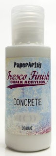
These are my favourite combination at the moment ..... Frescos Concrete, Lichen and Marbles (although I was hard pushed not to include Iceberg)! And combined with Scrapcosy's Stencil they gave me some super prints.


I coloured some old book paper in the same way and then took a second print to get the text that was left. At this stage I had no idea what I was going to use but I had plenty of choices.


I wanted to use the large stamp in this set but I was unsure whether it would fit on the tag.


I have some rather thick tissue paper which is no good for adhering to surfaces but makes a great template. I stamped onto the tissue to see how it would fit onto my tag - it just about fits! I then cut this tissue and kept it in the envelope with my stamp set. It gets a bit tattered but I always have it to test for size.


I adhered my gelli plate papers to my tag and rather than stamp straight onto the tag (I am a bit of a wimp!) I stamped it on some fine tissue which gave me the chance to place it where I wanted it. I find giving it a roll with the brayer is better than a paint brush for smoothing out; there are less tears, (as in holes rather than the watery stuff)...


I wasn't too sure how well the stamp would show up on the old book paper but the layer of paint was enough to push the text back. 


The text paper butterflies added another dimension and sat on the tissue nicely. 


I used some of the left over papers to cut a couple of tags which I stamped with parts of the big stamp. The edges of everything got brushed with some brown ink as I felt they needed some definition. It is always surprising that adding one small element suddenly makes the project feel right.


I added the tags on foam pads to give a little depth and to hold them in place. I always like my little embellishments to be stuck in place rather than hanging free. That way they are less likely to get torn off!


I had a small mark under the tissue where I had to join my papers so used this small quote from Alison's Magic and Wonder quotes. By stamping on the edge of the old text paper everything coordinated.


I love how subtle the Fresco colours have become by first using the gelli plate and then covering them with the tissue. You can just see some of the stencil marks under the clock face. 

When I set out to make some papers using the gelli plate I had no idea how I was going to use them or how I would then use the Hot Picks stamp which I have to admit was far larger than I was expecting. Sometimes you just have to let things evolve! I love how the text paper has taken both the paints and the stamp to give quite an ethereal feel to the soft colours underneath.  I didn't get to use all my gelli plate papers, including the lovely shadow text ones ..... but there's always another project!


I have used gorgeously calming colours of Freso paint, but you can achieve similar softness with some of the brighter Fresco's by using the second pull from the gelli plate. So do experiment and don't think bright necessarily means bright!


And it was a lovely calming creative process ..... no stress!

As always thank you for joining me.
Jennie x