


Yellow - Rustic
Main Colour: Yellow (FF Terracotta)
Complements: Aubergine, Deep Blue
Type: Classic, Rustic
Created from Frescos: Terracotta, Blood Orange, Blue Lagoon
Hi everyone, it's Liesbeth with you today, and I'm here to share with you my Split Complementary Colours adventure and my altered book art journal spread!

Mixing colours, and creating your own new colours, is so much fun and always very surprising! I took lots of time for the Fresco-mixing and playing and I enjoyed it very much! I decided to make a messy´ journal spread with the three complementary colours and to show you that planner stamps are also very usable for a journal page or cards. Hope to inspire you!


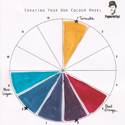
You will find everything about the colour wheel and a clear explanation about split complemetary colours HERE in the topic introducion. I used a rustic colour combination of PaperArtsy Fresco Acrylic paints: Terracotta, Blue Lagoon and Blood Orange.

I will use yellow the way it is. To create the split complementary colours I first mixed blue and red.

A dark purple showed up, I painted it on the colour wheel just between blue and red.

Then I mixed the new purple with red (Blood Orange)...wow, it turned out a beautiful eggplant colour!

Next I also mixed the purple with blue (Blue lagoon) and a strong dark blue appeared.

So the colours for my project were ready, I marked them with the red arrows.
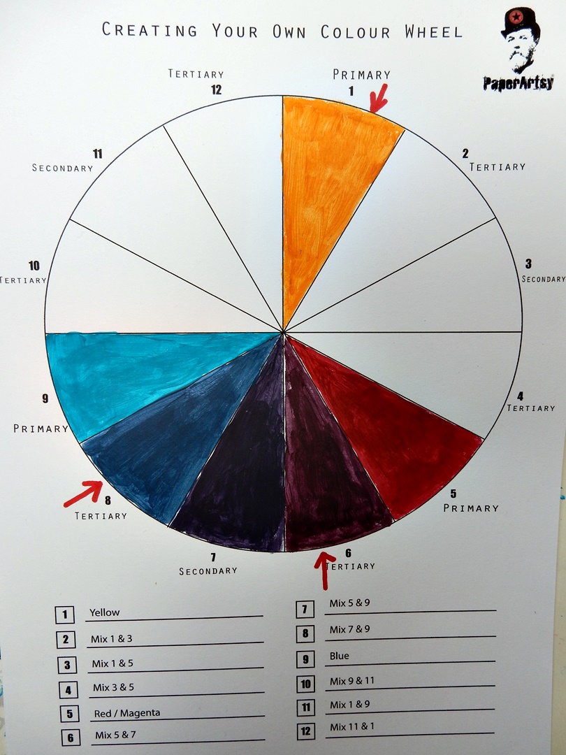
I couldn't resist finishing the entire colour wheel this way; fascinating! :-)


Now it's time to use the complementary colours in a project. Complementary colours always work perfectly together so there's nothing to worry about! I chose an old book (again;-) ) to create an art journal spread using two of the brand new France Papillon stamp sets FP025 and FP026. I really love them!
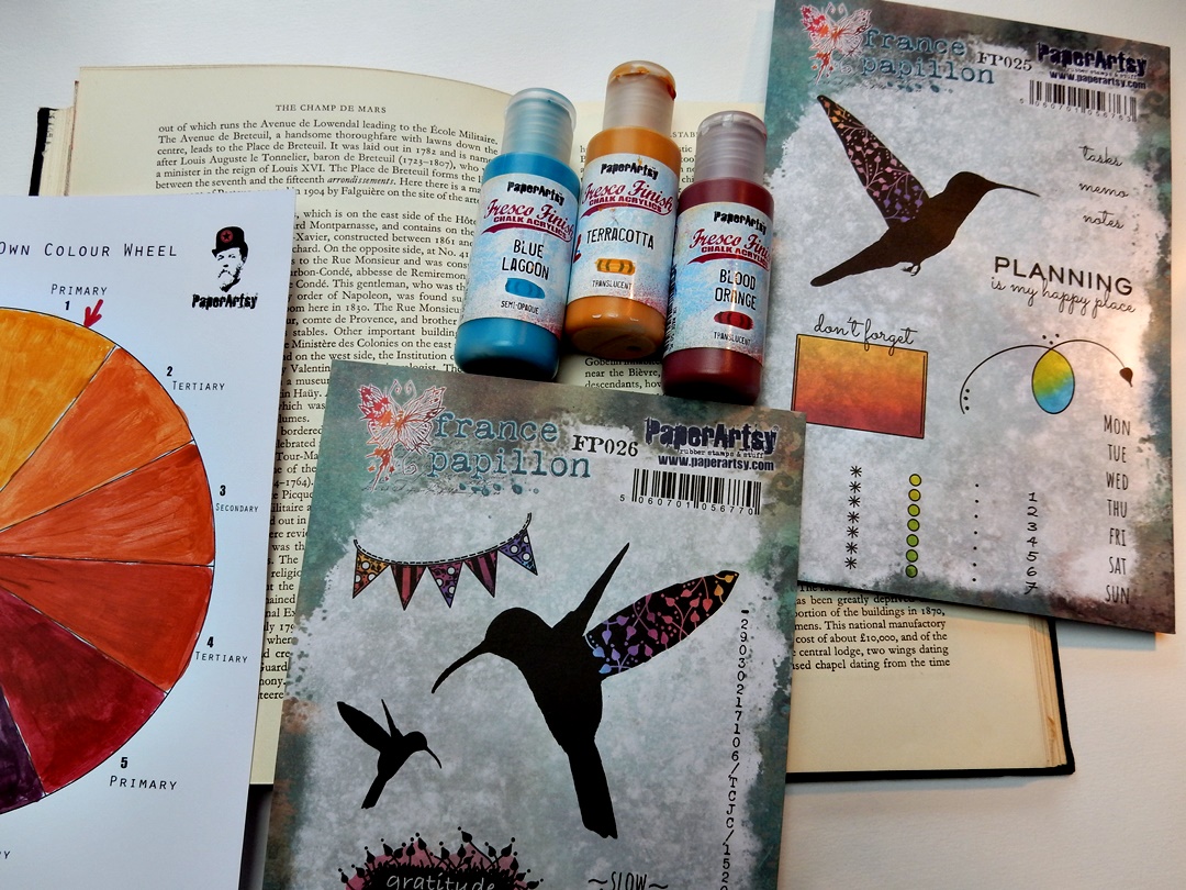
The stamps are designed for bullet journaling and planner making, but also very usable for 'normal' journaling, cards and every other way of stamping!
I started with a thin layer of gesso onto the pages to move the text to the background a bit.

Then I tore some pieces out of PaperArtsy Printed Tissue (PT01)

Using gel medium I glued the tissue images onto the spread, I left the top and bottom of the page uncovered. I stamped here and there with the days-of-the-week stamp (FP025) using black waterproof ink. After that I softened the images and text a little bit with watered down gesso and dried it.

I applied in a horizontal move with a palet knife some of the dark blue self mixed paint. Don't work very neatly, embrace the untidiness here ;-) After the blue was dry I watered down some eggplant paint (also self mixed) and made puddles and splatters here and there.
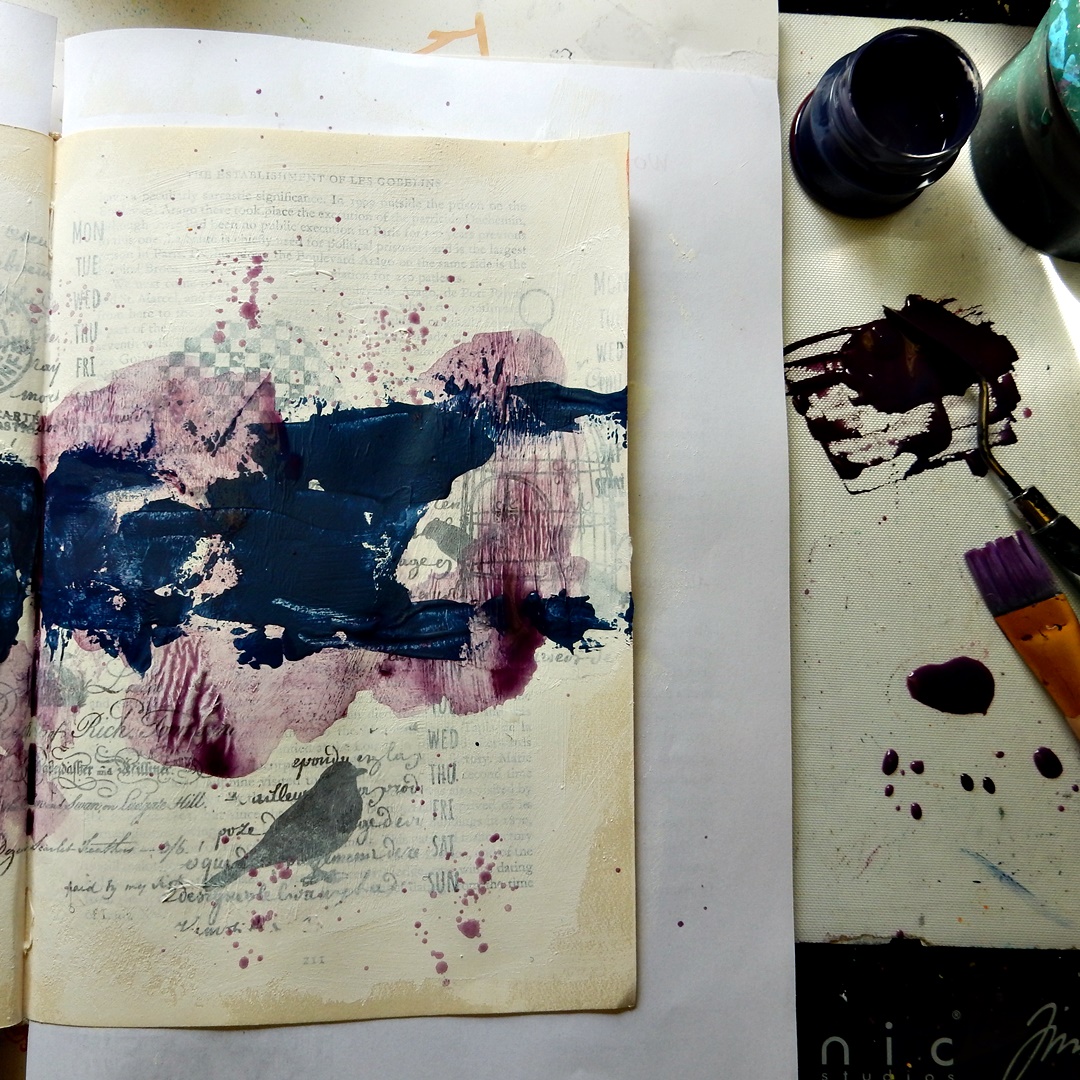

This is what it looks like now. I love the effect of the difference between the very opaque layer of the blue paint and the watercolour, transparent look of the very watered down eggplant paint! I dried everything well.

Time for some yellow (the pure Fresco paint Terracotta) Using lots of water again I made puddles and splatters and I stamped circles with a lid.

Using black waterproof ink and white Color Box ink I stamped several stamps of the two stamp sets, including the bullet stamps (stars and dots) and the long numbers stamps at the edges of the pages.

Something was still missing...so I decided to stamp the PaperArtsy Mini Stamp 74 (Mini74) with white Color Box ink onto the big blue areas, and I erased the ink a bit with a brush and water.


The background was ready! Time for decorating and embellishing! First I wanted to bring in more yellow, so I painted some pieces of cardstock with the Terracotta paint and stamped the big birds, flags, word and some small squares on it with black ink and cut them out.

Then I did a search through my craft room and collected some stuff I planned to use to finish the spread: metal embellishments, washi tape, torn book paper and real postage stamps.

Starting with some torn pieces of the washi tape I built up the composition. The real postage stamps were popping out too much so I covered them partially with eggplant and yellow paint. I cut the oval metal piece in half and glued them at the edges and I did some additional stamping: the word Perfection with black ink and the small bird with the Terracotta paint. I finished the spread with a white gel pen and a black fine-liner.


I really recommend you to try mixing paints using the colour wheel and to try the complementary colours yourself, it's so much fun and you will learn so much about colours, I did! And also to try to look at your stamps in a different way...these beautiful stamp sets are so very multifunctional, try to use your imagination, and have lots of fun!
Thanks for stopping by!
LiesbethXX

Blog: Liesbeth's Arts & Crafts
Facebook: Liesbeth Fidder-de Vos
Instagram: liesbeth_fidder


2 comments:
Gorgeous colours, and a lovely spread!
What a stunning spread - so vibrant and fab use of the tissue paper.
Alison x
Post a Comment