Wednesday, 30 August 2017

2017 #12 Hybrid Inks: Dragonfly Dreams {by Wanda Hentges}

2017 Topic 12: Hybrid Inks


This is a surprising technique. Do take time to watch the video, it is always interesting to see how people apply inks to get oxidised effects. But the resist! Oh my, it really does not work the way you expect, but it's magic! 

Hi everyone, it's Wanda (Art By Wandawith you today, and I'd like to share with you a large card (5" x 7") using a technique I love with Distress Oxide Inks and Transparent Texture Paste. 

I've been doing this technique since shortly after the Oxides were released including, at first, figuring out why sometimes it worked well and other times not as much (it's important to get enough oxidation).  What I really love about the finished technique is the contrast between the oxidation and the glossy paste - it's fabulous!!!  


I've also embarked on a new journey... videos.  I've made my very first video for this post and it's helpful for understanding the technique fully.


I mentioned in the video that I would share a picture of the finished panel.  Here it is.  Beautiful, huh!!


With PS026, by Sara Naumann


Sara's wonderful new stamps were on the final sample I made (ESN21

and stencils (PS062, PS063) have been used for the card.


My plan was to stamp the dragonfly collage directly on the background  in black and then add the colored dragonfly on top.  I did this but did not get a good stamping because first my stamp slipped on the paste and then also the dimension didn't allow complete stamping.  I didn't want to start over but didn't really want the opaqueness of cardstock to hide the mess so instead stamped the image onto colored vellum and lined it up over the first stamping.  This kept things soft and allowed a hint of the background to show through.  The dragonfly (image and word) are stamped with Oxide ink onto Smoothy Card, cut out and layered over the stamped collage.  The wings of the colored dragonfly are brushed with Metallic Glaze Fresco Finish.


To continue the theme of the sequin waste in the stamped image I took some actual sequin waste and painted it with Bubble Gum Fresco Finish Chalk.


Stitching is a wonderful way to add detail to edges!!  I tend to make my stitching crooked on purpose because I'm not so good at keeping it nice and straight.  Going around twice gives it an arty look. 

The Distress Oxide Inks are fabulous whether you are making backgrounds, stamping, or water coloring with them.  Combining them with the Transparent Paste is a whole lot of fun!!!  I hope you will give it a try and that you will share your makes or plays.  I'd truly love to see what you create!!!

Thank you for following along.  Please let me know what you think of the post and the video.  Would you like to see me create more videos?  

Hugs, Wanda

Blog:  https://artbywanda.blogspot.com/
Facebook:  https://www.facebook.com/wanda.hentges
Twitter:  https://twitter.com/WandaHentges
Instagram:  https://www.instagram.com/wandahentges/
Pinterest:  https://www.pinterest.com/wandah/

In love with this technique! Very cool, and interesting that you say it requires a lot of oxidised layer too! I can see a lot of people trying this out! ~Leandra


We always hope that you  learn something interesting from our blog

Our creative team love to read your comments so much, so please take time to let them know you've been inspired!  

Why not join our 2-weekly challenge by blogging your create response to the current topic and link it here?

The current topic link Topic 12: Hybrid Inks will close 17:00 (London Time) Sunday, Sept 3rd 2017, and the winner will be announced 2 hours later at 19:00.

All links go in the draw to win a £50 voucher to spend on products of your choice from the PaperArtsy online store.

Monday, 28 August 2017

2017 #12 Hybrid Inks: Vintage-Brights {by Clare Messenger}

2017 Topic 12: Hybrid Inks


There's nothing we like more than a colour palette challenge. Using Vintage stamps with a bright palette is one of those awesome things we totally LOVE, and Clare has created some striking bright-brown contrasts in this piece!


Hi everyone, it's Clare Messenger here with you today, and I'd like to share with you what I discovered using Paperartsy pearl glaze as a resist, used along with Distress Oxides.

I loved that while using the pearl glaze as a resist it  kept the vibrant colours and stamping underneath, peeping through the distressed layer!  Using the glaze through stencils it enabled me to create my inky 'Dream Scene'


Using Wilted Violet, Cracked Pistachio & Broken China I splodged & stamped  using Vintage Ink and dog stamps & stencilled with various Paperartsy Stencils  


I found that after applying the Paperartsy Pearl glaze, through Emma Godfrey's mini masks, I was able to distress the whole piece using Walnut Stain, Distress Oxide. Don't panic! A quick wipe back with a baby wipe tidied up the oxides that were left behind on the glaze.
I really love the combination of textures, you have the earthy, rich matte feel from the oxides and the pearly sheen from the glaze.


I decided to experiment further using different colourways. The post card & poet was made with Broken China, Fosilized Amber & Spiced Marmalade.


Adding more layers of stamping using the oxides and then Versafine Onyx Black gave the project even more depth.


This is quite a dark piece for me so I'm really looking forward to experimenting with some brighter colours and trying out some different glazes to see what different effects I can come up with.  Initially I started off trying these out on index cards to see what colour comobos worked for me and what inks worked well over the top of the glaze.  So I now have a little collection of reference cards with what colours I used.  I think I will be adding to the collection as my experimentation continues! 

Thank you for stopping by today. 
Happy Crafting,

Clare.

Blog:http://craftyclarey.blogspot.co.uk/
Facebook:https://www.facebook.com/ClareMCraftyMoments/
Twitter:https://twitter.com/claremessenger
Instagram:https://www.instagram.com/clarecraftsalot/?hl=en
Pinterest:https://www.pinterest.co.uk/claremessenger/

This is such a great idea with the glaze! Love how that gave you some control over the brown too, and Emma's stencils with such fine detail are perfect! Great combos! ~Leandra


We always hope that you  learn something interesting from our blog

Our creative team love to read your comments so much, so please take time to let them know you've been inspired!  

Why not join our 2-weekly challenge by blogging your create response to the current topic and link it here?

The current topic link Topic 12: Hybrid Inks will close 17:00 (London Time) Sunday, Sept 3rd 2017, and the winner will be announced 2 hours later at 19:00.

All links go in the draw to win a £50 voucher to spend on products of your choice from the PaperArtsy online store.

Sunday, 27 August 2017

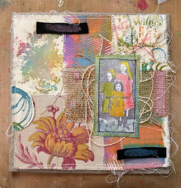
2017 #12 Hybrid Inks: Distress Oxide Reinkers on fabric {by Helen Chilton}

2017 Topic 12: Hybrid Inks

As you know, we have been rocking the whole Hybrid ink vibe here at PaperArtsy for the past week. Lots of experiments being undertaken by our blogging team, and of course, Helen is the 'Queen of innovation', so I hope you enjoy her use of Distress Oxide re-inkers onto fabric as much as I do!


Hi everyone, it's Helen with you today, and I'd like to share with you a project using the Distress Oxide re-inkers on fabric.

I particularly like the re-inkers because of their intense colour. I've had a go with various types of fabric and various techniques then put them all together to make a patchwork piece.


The great fun here is working out where to put each piece and adding all the details. I thought I'd experiment first with different techniques and materials.


I like the way the stripes of colour on the right blended into each other.


To stamp with the re-inkers I just dropped some onto a craft mat, swooshed the stamp in it and pressed down.


The flower on the patterned material is painted with the Spiced Marmalade re-inker - this technique would work for any patterned fabric with an outline design. The colours even work on the open weave burlap - love the soft, muted effect here.


Lastly we've got the buckram which is a stiffened fabric used in curtain pelmets apparently - I had to look it up!  It's got starch in it so when you wet it it softens up and then as it dries it stiffens up again, meaning you can shape it. I found it purely by chance and was planning to use it to make fabric postcards as it stamps well. As you can see. it also holds an embossed pattern. The doodling on the right is done straight from the bottle.


Once I'd had a good play I started to fit the pieces together.  I've used some Ink and The Dog stamps: Ancestors Plate 1 for the main image and a selection of others for the background (Words Plate 4, Wings Plate 2 and 4). All these sets are A6 (ie quarter-plate size)


I've stitched them  onto a piece of card underneath. I've left the fraying bits and cotton threads as I like them.


Just keep building it up. I chose black thread for the main image to make it pop.


Then start adding all the details - this is my favourite part. The words are from a Tim Holtz Remnant rub-on - I was really pleased with the way it worked on fabric as I wasn't sure it would take.


I cut round some doodling here to add it to the edge and turned my buttons upside down as the top was too shiny. Pearl buttons often have interesting colours on the back!

I loved making this project as it's made from scratch - all the fabric's been hand decorated and because the same re-inker colours are used, it hangs together well. Anything with tiny detail appeals to me. As there are now 12 new colours of Distress Oxides available you could have a play with those. However, remember that the colours are not water proof so it's not suitable for anything you might want to wash. Might be interesting to stitch the pieces together though and spritz with water afterwards to see what happens?!

Blog: A Splash of Colour

Teaching at The Craft Barn: 
September 20th and 23rd
October 18th and 28th

Oh Helen, this turned out brilliantly! I love all the textures of the different fabrics, and now you have an awesome sampler of your experiment to hang on the wall too! I love how the re-inkers seem to be fantastic on all the mediums you tried, and in all kinds of ways too! ~Leandra


We always hope that you  learn something interesting from our blog

Our creative team love to read your comments so much, so please take time to let them know you've been inspired!  

Why not join our 2-weekly challenge by blogging your create response to the current topic and link it here?

The current topic link Topic 12: Hybrid Inks will close 17:00 (London Time) Sunday, Sept 3rd 2017, and the winner will be announced 2 hours later at 19:00.

All links go in the draw to win a £50 voucher to spend on products of your choice from the PaperArtsy online store.

Saturday, 26 August 2017

2017 #12 Watery Inspiration {by Keren Baker}

2017 Topic 12: Hybrid Inks 


Keren is back, and she found out something pretty cool with Nuvo and Oxide inks, plus she has some StazOn opaque white in the mix too, and then there's the colouring in products!! Quite the experimenter!

Hi everyone, it's Keren Baker with you today, and I'd like to share with you a project experimenting with watercolour, alcohol markers, blending alcohol and two Hybrid type inks; Nuvo Hybrid Ink and Distress Oxide inks.

Putting these inks through their paces in combination with other products made for a really interesting experiment. I've chosen Clare Lloyd's 06 set


I wanted to see what would happen if I used BOTH watercolour and alcohol type products with the hybrid inks and how the Distress Oxides would react when your colour over them with alcohol markers and when you mix the inks with more blending alcohol. I thought Clare Lloyd's set would be perfect with the water theme and starting by mixing Distress Oxides with more Ranger Alcohol Blending solution and adding it onto some Hot Press Bockingford Watercolour paper.


Those three pieces show three 'pick-ups' from the one set of Distress Oxide dots and swished Blending Alcohol. I used the Distress Ink re-inkers direct from the bottle which I'm finding much more useful than the standard ink pads. I liked the more sparse amount of ink as I wanted a 'watery' effect. The alcohol further spread and diluted the Oxides and they sunk into the paper more quickly with the alcohol producing a beautiful soft but speckled effect. Adding more water then will change up the look.


What was fascinating, was after stamping with the Nuvo Shadow Black Hybrid ink, it appeared to sink behind the oxide colours and wasn't affected by the alcohol markers. The alcohol markers didn't change the colour of the oxides (which was the opposite of what I'd imagined) and although I was more careful adding the watercolour using Aquamarkers (Nuvo) around the oxides as I didn't want the effect changed; the ink held waterfast.


In line with the sentiment I'd chosen from the stamp set, I wanted not only to have the whirling water around her face, I wanted to add some rain. I could have just stamped over the top but thought another transparent layer would be interesting. The Hybrid Black Shadow ink can be heat set onto non-porous layers- so would have been perfect for the acetate, but I preferred the white, so used White Stazon instead. Adding blue alcohol marker colour to the reverse of the white stamped acetate layer gave the girl further dimension.


Attaching the acetate piece using a trickle of yellow stitching completed the look.


I highly recommend having a play with the Hybrid inks; loved playing with them. The Nuvo Hybrid Ink is perfect for just about anything that you throw at it. The Oxides will react in different ways dependent on what you put over or near it. I am definitely going to be experimenting more with adding to the Oxide inks with alcohol and other products before adding to cardstock or other substrates. The Hybrid style stamping inks are really my new favourite ink as I don't have to make a colouring decision before I stamp! 

Thanks for joining me, 
Keren xx

Blog: KerenBaker's blog
Facebook: https://www.facebook.com/kerenjb
Twitter:@craftstampink
Instagram:Craftstampink
Pinterest:Craftstampink

Ohh she really looks drippy, and no surprise after all the inks you threw at her! Love how she is peeking out from behind them all! Must remember to use my re-inkers direct from the bottle!! ~Leandra


We always hope that you  learn something interesting from our blog

Our creative team love to read your comments so much, so please take time to let them know you've been inspired!  

Why not join our 2-weekly challenge by blogging your create response to the current topic and link it here?

The current topic link Topic 12: Hybrid Inks will close 17:00 (London Time) Sunday, Sept 3rd 2017, and the winner will be announced 2 hours later at 19:00.

All links go in the draw to win a £50 voucher to spend on products of your choice from the PaperArtsy online store.

Friday, 25 August 2017

2017 #12 Hybrid Inks: A New Hybrid In Town {by Miriam Grazier}

2017 Topic 12: Hybrid Inks


In this post we look a the brand new hybrid ink from Tonic Studios, part of their Nuvo range. Now I must admit, I really wasn't expecting anything amazing as reports on other parts of their Nuvo line are variable, but I really love this ink! It seems to have been overshadowed by the concurrent Distress Oxide launch earlier this year, and even now, 8 months later, info about them is still thin on the ground, so I seconded Miriam to run some tests of our own!


'Hybrid' of what? Well it smells a bit solvent, but it behaves like a permanent archival ink. It is super-fast drying (stamp and immediately rub it and it will not smear!) but the great feature of this ink is you can use it with BOTH alcohol ink pens AND watercolours markers and it WILL NOT BLEED!! That my friends is very, very handy! 

The packaging is slick, the inks are named both ends of the pad (but not on the top - ?) and as a raised pad, it is easy to apply to stamps. It dries so fast, it does not require a heat gun, so overall it is a super-useful ink! Available in 6 colours, all quite 'heritage' in tone: Black Shadow, Acorn Brown, Poppy Red, Safari Green, Empire Blue (a purplish-blue) and Metro Grey. Here's Miriam to explain her findings.


Hi everyone, it's Miriam from 'Miriam's Creative Dreamswith you today, and I'd like to share with you my experiments with the new Tonic Nuvo Hybrid Inks.

I have to say that when I first heard about these I really wanted to put them to the test.  In my eyes, nothing could beat Archival ink, but I have always been frustrated by the fact it limits me to particular projects - for example, I can't use alcohol inks if I use a pigment ink on a project, or likewise, I can't use water colour if I use a dye ink.


My finished project uses lots of different mediums that I would never normally be able to use together.  Tonight I am concentrating on my experiments with the Nuvo inks, but you can see the steps showing how I created this project by popping over to my Blog.


I started by simply stamping and using inks and paints.  Immediately I could see that these inks were special - they have the best qualities from both Archival and Memento inks.

This excited me, then prompted me to try the inks on different materials.


On both Vellum and Acetate the Memento ink smudged.  The Nuvo ink is very fast drying which meant that I wasn't waiting for a long time or having to zap it with a heat gun - this was especially good for me on the Acetate as I normally leave this to dry overnight so that I don't warp it with my heat gun.  But the Nuvo ink doesn't need to dry overnight at all!


The Nuvo ink worked incredibly well with Infusions and over Fresco Finish paints too - no problem getting a crisp, clear image.


The Nuvo inks worked amazingly well on Canvas fabric - in fact, I would say that it came out on top during all my experiments - I love how clear the image has stamped.  Even on coarse watercolour paper - this is definitely a game changer in my book.


It was only on Glossy card that I found the Nuvo ink disappointing.  After taking this picture I tried the stamping again, this time heat setting the ink, but it still smudged completely.  Not really sure why.  However, I have to admit, this would look great for a ghost image and background stamping.


For my project I even mixed some of the ink with Grunge paste - I loved the colour that this created.


That was my quick tour of the experimenting that I did with the new Tonic Nuvo Hybrid Inks. They have certainly made me think of the possibilities - and the fact that I can now be more adventurous in my mixed media projects.  

If you get the opportunity to try these inks I would recommend that you go for it.  They really are versatile and quick drying.  It also means that if you take craft products away with you or to craft groups that you only need to take one type of ink pad instead of many.  

I really enjoyed using these hybrid inks, and I hope that I have inspired you with my Tonic Nuvo Hybrid ink experiments tonight.

Blog: www.miriamgrazier.blogspot.co.uk

Thanks Miriam for your thorough testing of this ink. It really does seem like a fantastic all-rounder for us stampy folks! Lets hope they follow up with more colours in the range!

We always hope that you  learn something interesting from our blog

Our creative team love to read your comments so much, so please take time to let them know you've been inspired!  

Why not join our 2-weekly challenge by blogging your create response to the current topic and link it here?

The current topic link Topic 12: Hybrid Inks will close 17:00 (London Time) Sunday, Sept 3rd 2017, and the winner will be announced 2 hours later at 19:00.

All links go in the draw to win a £50 voucher to spend on products of your choice from the PaperArtsy online store.