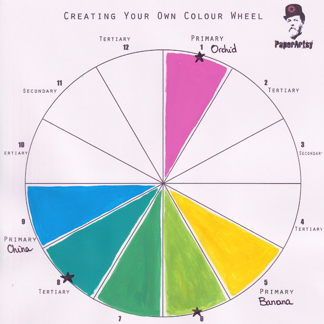
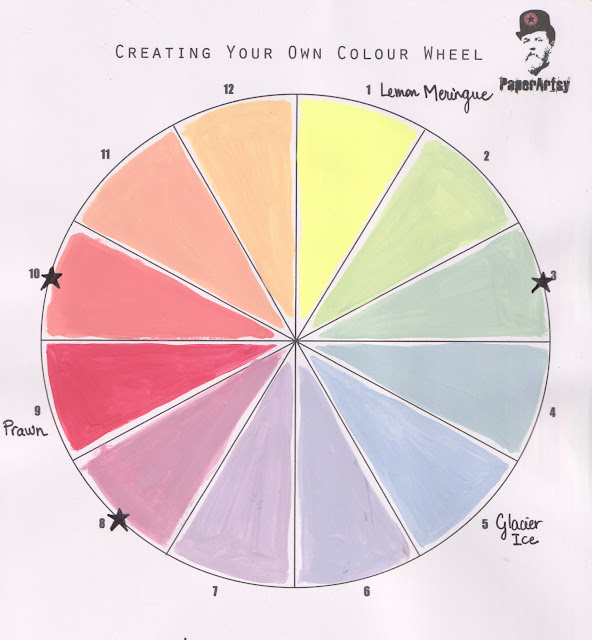
Hi everyone, Keren here with you today to talk about colour. You might remember the fun we had a while back creating our own colour wheels and exploring some colour theory. If you've not seen it, do check out the post and also the Facebook video. We have blank colour wheels in the PaperArtsy People Facebook group if you'd like to download and have a go for yourself.
This time we're going onto another combination of colours - namely split complementary. You might be wondering what that is, and it's pretty simple; pick your first colour (often called the base colour), then go to its complementary colour. If you don't remember, this is the colour directly opposite it on your colour wheel. Now, you need to pick two colours directly either side of this complementary colour to form your split complementary scheme.
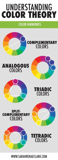
Here's a graphic that contains the main schemes with our split complementary scheme at the bottom. I've added the whole thing as it's one of the clearest I've seen around and will be helpful to anyone looking to upgrade their colour picking skills.
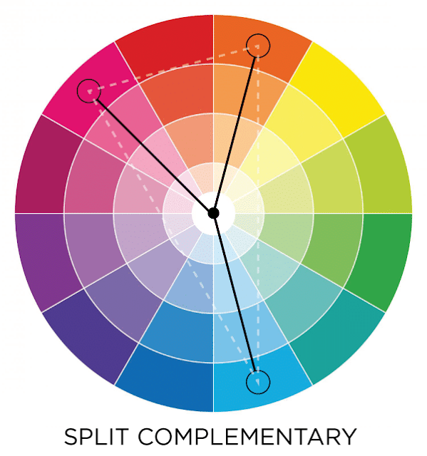
Think of it as a 'y' on the colour wheel.
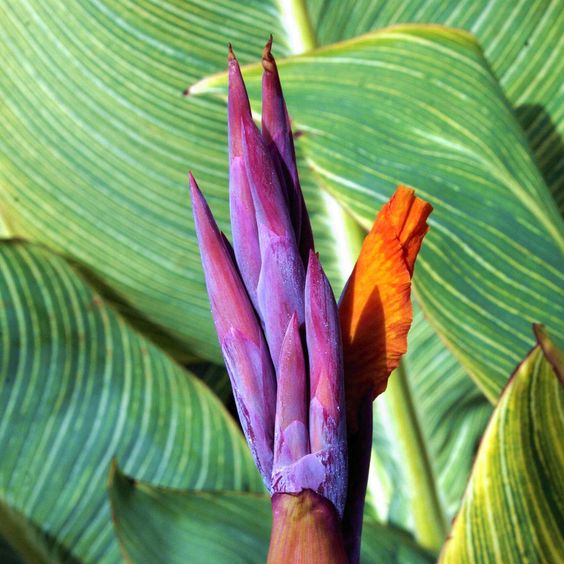
So that's the basic idea- although it can be tweaked a little as we'll see later. The colour scheme has high contrast and is great for when you're choosing your colour schemes but with not as much contrast as the complementary colours. It's a slightly subtler version and an easy way to get colours that will match without looking like you've tried too hard. How does it actually look ? Let's start with green - that's our base colour. Its complementary colour is red and the two colours either side of that are orange and magenta.
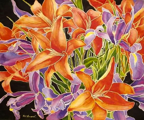
Here's a watercolour painting using the same colour trio.
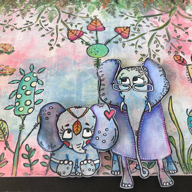
You're going to see some really interesting Fresco Finish Chalk Acrylics schemes over this topic. Here's one of them. It'll hopefully give you an idea of non-typical schemes as most you'll find online will often have the CMY (Cyan, Magenta, Yellow) combo. Here's using some colours you may have in your craft stash.
Magenta - Bright
Main Colour: Magenta (Orchid Fresco Finish)
Complements: Green Gold, Turquoise
Type: Classic, Bright
Created from Frescos: Orchid, Banana, China
Here's something from Leandra on the PaperArtsy blog using very similar colours.
Here's a gentler pastel-ly type of mix.Main Colour: Blue (FF Mermaid)
Complements: Apricot, Rustic Pink
Type: Classic, Pastel
Created from Frescos: Mermaid, Vanilla, Cherry Blossom
You can see the same colour vibe from Jo Firth-Young's latest collection (with the addition of green).
Another colour combo is using Grey-Green Tones.
Main Colour: Soft Green
Complements: Salmon Orange, Pink Purple
Type: Twist - unusual grey-blue softens the entire wheel
Created from Frescos: Lemon Meringue, Prawn, Glacier Ice
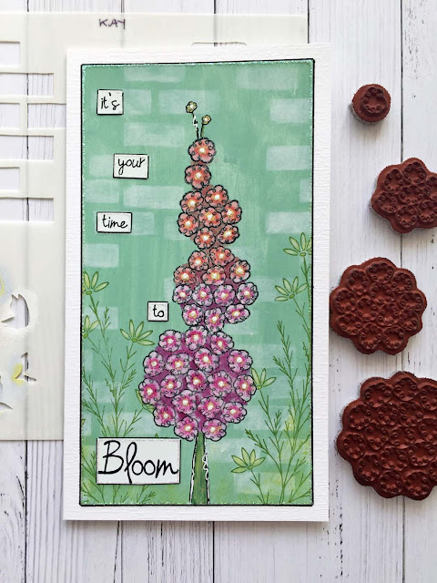
Here's a beautiful example from Kay Carley that practically hits the right colours.
I won't go through all of the colour combinations that you're about to see on the blog, but I wanted to talk about the fact that you can tweak the standard formula for creating split complementary colours. We've already shown that it is a uniform 'triangle' from the base colour to colours directly adjacent to the complementary one (opposite to the base colour.) What if we take one step either way? If you spread the triangle so you have three spaces of colour between each segment at the bottom of the triangle, you'll end up with a triadic scheme. But allowing two spaces by shifting one extra to the right or left ? Here's what I mean.
The colour wheel from above has stars against the split complementary scheme. Shift them one step either way and you have new schemes (one shown by arrows and one shown by flowers).
There's also what someone has described as a split complementary plus scheme- which ends up being a colour combination of 5 colours. It's a split complementary scheme adding in the two colours next to them. In effect it's combining a triadic scheme (which we're going to look at in the future) and the split complementary scheme but combining them gives a full bodied colour combo which will work beautifully too.
I hope that all this talking about colour has got you itching to go into your creative space and paint up some clever colour combinations. This next set of blog posts is going to be vibrantly colourful and will give some wonderful colour ideas for your next project.
Enjoy
Keren
Does this topic push your creative buttons? We would LOVE you to share what you get up to with us! A great place is tagging us on Instagram @paperartsy or why not join us and post in the PaperArtsy People Group on Facebook. We love to see what you make!





.jpg)


No comments:
Post a Comment