Showing posts with label HP1507. Show all posts

Monday, 13 May 2024

2024 Topic 3 : Vintage PaperArtsy Stamps {by Autumn Clark} on the PaperArtsy Blog


Hi everyone!  It's Autumn Clark from SewPaperPaint here with you today.  
I've been super excited about the Vintage Topic, as it's by far my favorite of creative styles.  With our underlying theme for the quarter being Glazed, I began thinking about how to incorporate a little "trash to treasure" in with a vintage glaze concoction using the new PaperArtsy Mattints...


The reason I'm enamored with Mattints is their gentle ability to transform the color of the surface on which they are placed, especially tissue paper.  It's magic to see the tint and glue abilities work simultaneously!  


I thought long and hard about a mash up of designers and chose to work with PaperArtsy Hot Picks 1507 (HP1507) as my focal imagery and a beautiful background Eclectica stamp set 03 by Courtney Franich (ECF03) to compliment.  


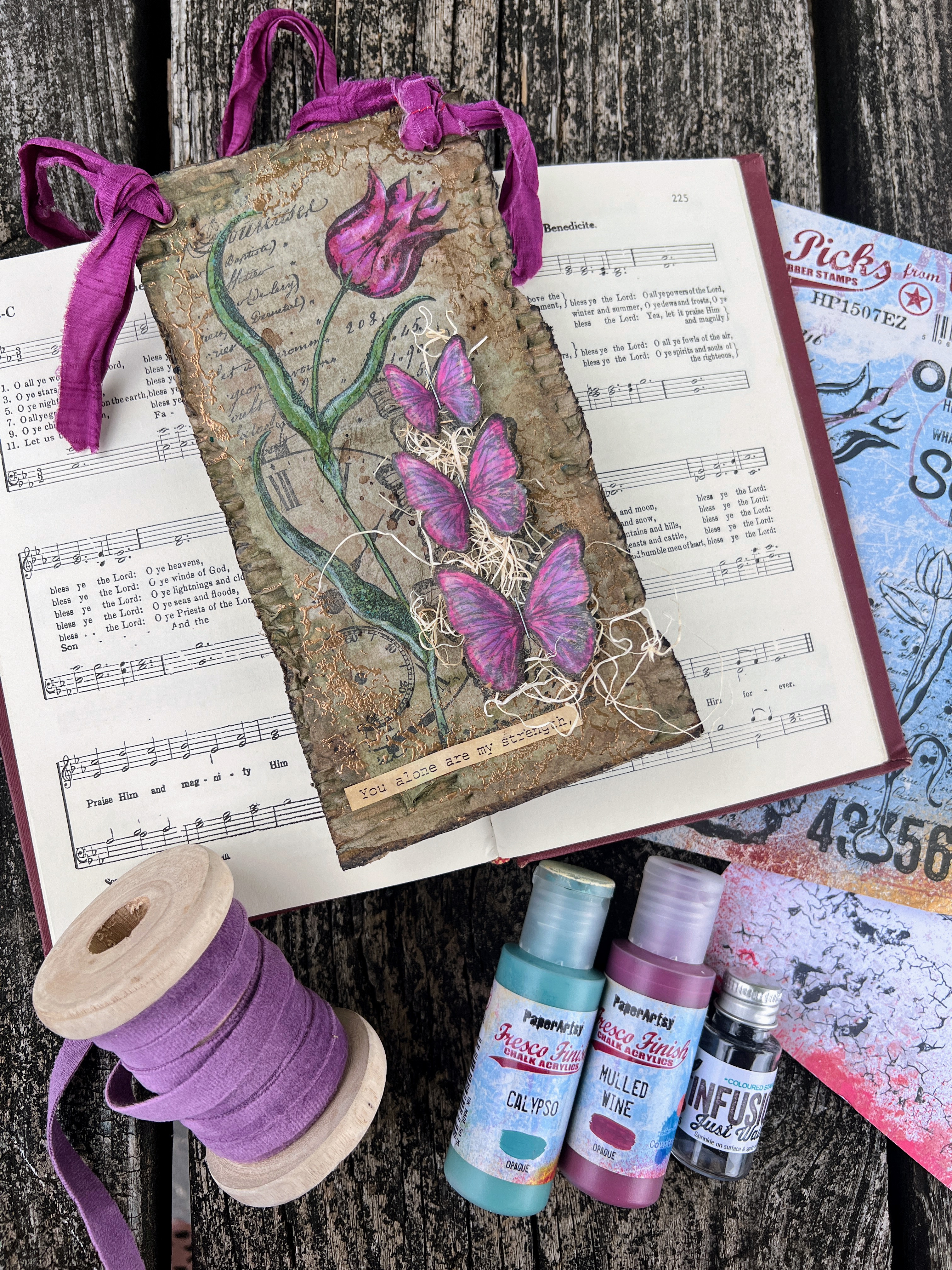
I pulled together a super simple palette of PaperArtsy Fresco Finish Chalk Acrylics in Calypso and Mulled Wine with Stone as my neutral.  My goal was to create an earthy brown glaze from Mattints in opposing colors: Squeezed and Dragonfly and I hoped to add some Just Walnut Infusions for good measure, since this is a Vintage Topic after all.  


You might tilt your head a bit when you see this color palette.  As beautifully styled as the photo is, the colors just don't go together do they?  I really had fun with this experiment and hope you will enjoy it just the same.


We've shown a lot of tissue paper techniques lately with the gorgeous range of PaperArtsy Printed Tissue evolving to include designs by Jofy, Tracy Scott, Alison Bomber, Seth Apter, Scrapcosy, Hot Picks and even Frames.  I decided to go old school and make my own Hot Picks tissue by stamping stamp set 1507 (HP1507) onto plain white upcycled gift tissue.  


Some tips on stamping your own tissue: always stamp over scrap paper to absorb the excess ink and always use permanent ink, which you heat set. The fun thing about working with tissue, whether stamped or printed, is having the ability to paint the reverse side for unusual effects.  I colored my tulips and butterflies with PaperArtsy Fresco Finish Chalk Acrylics in Calypso and Mulled Wine with a detail paint brush over scrap paper.  I did make the mistake of painting the front of some of my images, so I learned to tape down the tissue as not to confuse the front/back along the painting process.


A couple of years ago I shared another Hot Picks post, found HERE, where I showcased stamped tissue.  With the addition of Mattints to the PaperArtsy line, I've since posted on the beautiful stain/glaze facet of Mattints on THIS post and fallen in love with the tintability concept of glazes, which previously I had used untinted (i.e. ModPodge of matte medium).  I saw a post by our Mags Woodcock on the PaperArtsy People FB group mixing the various colors to create an unlimited array of tints.  Thanks for the inspo Mags!  I wanted to create an earthy brown, so I picked Dragonfly and its opposite on the color wheel, Squeezed, knowing that blue mixed with orange creates brown.  


Next, I tore the flap off of a cardboard package and used my mix to adhere my painted stamped tissue.  Waste not, want not, right?  If this was a total failure, what had I lost?  I did an equal mix of each color for this first test and found the Dragonfly was more dominant in pigment.


I thought some 3D embellishment would work well on the panel, so I fussy cut the butterflies, which I had colored with pencils on kraft card and given the same coat of mixed Mattints.  I stapled them over some sisal fibers.  Then I used the pencils to add a bit of highlight to the coloring work on the dried glazed tissue and edged the panel with Colorbox Chalk Ink in brown and black.


To add the final vintage touch, I dipped the panel in watered Infusions in Just Walnut for some good splotches of deep brown.  The sentiment is from a piece of printed music I found in the recycle bin at the church where I work.  :)


I wanted to use the other two pieces of painted stamped tissue I had created earlier, but was at a loss for a different type of substrate.  While procrastinating, I looked through my own blog posts labeled "vintage" and found a cool post from when Distress Oxides had just been introduced.  In the post, found HERE, I created an unusual effect by dipping my card into Oxide, then brayering over it with Fresco Finish Chalk Acrylics.  The result was the Oxide bled up into the painted layers.  I thought this would be fun to recreate.  I dipped a couple of kraft panels (to tie in with the brown from the cardboard) in Distress Oxide in Vintage Photo, then brayered with Fresco Acrylics in Stone.  After the paint dries, you can mist the panel and the Oxide will bleed up.  What a fun, mesmerizing process!


Now, in all honesty, during my procrastination a day had gone by and my Mattints mixture had dried up completely.  I thought it was a good chance to even out the brownness of the color and remixed using one part Dragonfly and two parts Squeezed.  You can see below how much warmer this mixture is and hopefully notice how the Oxide blends up into the glaze.  Now the cool part to me was that the Mattints glaze sealed in the Oxide.  When I misted these dried panels the Oxide did not bleed through.  And as I said in my last post, the paper like texture of the dried Mattints is AMAZING!  It's as if there is nothing on the surface, no glaze at all.  100% totally matte!  


I decided to add some embossing to all of these projects using the peeled paint texture stamp from PaperArtsy stamp set 03 by Courtney Franich (ECF03).  I used an old PSX brass embossing powder for this and love this color for a vintage vibe.  I added some sticker sentiments and sewn crinkle kraft paper.  

This one of those play by ear projects where I learned a lot.  The thing about playing this way is that the outcome may not always be our favorite work, but the techniques discovered usually become favorites indeed.  


These simple projects showcase some of my very favorite Hot Picks stamps and I hope the simplicity will inspire you to play with similar imagery, even if these stamps aren't part of your collection.  And I hope you will experiment with your own mixed glazes and paint combos.  After all, don't we all have a cardboard box lying around these days?  :)

It's always a pleasure to join you on the PaperArtsy blog.  Until next time...

Autumn


YouTube: SewPaperPaint
Facebook: Autumn Clark
Instagram: @sewpaperpaint
Pinterest: SewPaperPaint

Thursday, 24 March 2022

2022 Topic 05: Stamp Mash-up {by Nikki Acton} with Zinski, Kay Carley and Hot Picks stamps


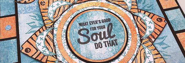
Hi everyone, it's Nikki from Addicted to Art with you today,  and I'm here to share with you a Mash Up of three PaperArtsy designers - Kay Carley, Hot Picks and Zinski Art. Three very different styles, floral, vintage and quirky!


I always say I love a Mash Up - but this one was a challenge! I try to feature all the designers in a mash up rather than using one (or two!) for backgrounds only - this time it wasn't easy. Anyone who follows me may have noticed I am stuck in a geometric phase at the moment - so I decided to stick with this style to construct my piece of wall art.


I began with some gel prints using the flower imagery from PaperArtsy Stamp Set EKC44 by Kay Carley. For some of my prints I stamped off the gel plate, for some I stamped onto it. As I used groups of colours of Fresco Chalk Acrylic paints for each colour this gave some subtle contrast and texture.


For most of the prints I used a small gel plate and built up my backgrounds in blocks. For the blue prints I used Fresco Chalk Acrylics - CeruleanBlue Moon and A Bit Fishy.
 

For the orange prints I chose FirebirdPersimmon and Butter. I have learned to always create more backgrounds than I think I need, as ideas develop (and things don't work!), there is nothing worse than running out of coordinating prints!
 

I mostly used the large flower stamp from Kay Carley Set 44 (EKC44) for my prints, but the smaller stamps were used later!
 

This was originally going to be my base layer until I decided on the additional square frames. I took one of the gel prints and marked some faint pencil lines through the middle to divide into 8. I then stamped part of the large stamp from Hot Picks Set HP1507.


You can see my stamp positioning was not perfect, but good enough as the central area was going to be covered. I used Ranger Archival ink (Aquamarine) to stamp the image. Look closely and you can see my pencil marks - which I erased later.
 
 
You might have noticed I cut into the stamp, rather than use it all. I do this sometimes when I know I want to use part of a stamp on their own rather than as the whole.
 

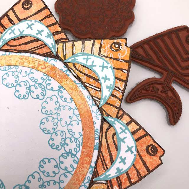
Next layer - my fish! I fussy cut the stamped fish (keeping the moon shaped tail for later) from Zinski Art Set 29 (ZA29).


These were layered onto a circle cut from white card and stamped with one of the flower stamps from Kay Carley. I also stamped some extra tails to add to this little collage.

 
I had stamped my fish onto two different background pieces which were slightly different, I added highlights with a white gel pen onto some of them to add to the contrast.
 

While positioning everything I decided I needed another layer so punched (or you could easily cut) some 1 inch squares which I mounted onto some greyboard that I had painted with PaperArtsy Fresco Acrylics.

Good job I had spare gel prints! Also used my hole punch to add a few mini circles.
 

There was always going to be one of the word stamps in the centre - but I could not decide which. I still haven't decided, and haven't adhered it! Any thoughts which looks best?


Mash-up's really challenge your creativity! I probably haven't used any of these stamp sets as the Designers intended them to be used - but that's ok. I have said this before, but I do find limiting myself to restricted supplies forces me to think 'outside the box'.
Nikki


Instagram: @a2a.craft
Pinterest: nikacton