Showing posts with label PaperArtsy Hot Picks. Show all posts

Friday, 11 July 2025

December Diary with NEW PaperArtsy products {by Jenny Marples}


Hi everyone, nice to be back with you again. Jenny Marples here with you.

This year on the blog, we have free reign to do a deep dive into a PaperArtsy product range of our choosing. For this post I have been exploring the new Hot Picks Xmas releases.

If you watched Leandra's recent video launch you'll have seen there are three new sets of stamps and some new Paper Tissue, great for making your seasonal cards. I decided to use them to create a way of recording the memories, activities and important details from each day leading up to the festivities on Christmas Day.


Rather than go down the usual route of creating a journal for this purpose I opted to make a set of index cards and challenged myself to use every stamp available. To find out if this was achieved and see how I created these cards keep reading.


The PaperArtsy Fresco Finish Chalk Paints chosen for this project leaned into a 'Scandi style' colour palette.


Let's get straight into building the background for the cards beginning with base layer, a random patchwork of Tinned Peas, Hey Pesto and Zucchini Fresco Finish Chalk Acrylic Paints. It's worth having three brushes on the go at the same time for this part.


I like to add extra layers in decreasing amounts and find scraping the Blue Moon and Marbles Fresco Finish Chalk Acrylic Paint from a gel plate with a spatula onto the background works well. It also means you can pull a print with any remaining paint from the gel plate 'palette', so no waste!


To finish the layering take turns with 'highlight' colours, Sand, Peachy Keen and Cloud 9 Fresco Finish Chalk Acrylic Paints rolling a small amount of each in turn across the gel plate with a brayer before running it lightly over the background.


Chop up your background into the size of cards needed, retaining some to decorate your box. Now it's time to start decorating the individual diary cards.


It can feel pretty daunting to be faced with 25 'blank' cards so break it down by using some of the new Printed Tissue PT12 'Script', tearing off pieces and adding them using Mattints which coordinate with the paint colours. Here you can see Fern Mattint produces a subtle look which is to be expected on a mainly green background.


Then try Shark Mattint to echo the blues already used. You'll notice I blended the tinted tissue into the background by scraping a little more Sand, Peachy Keen and Cloud 9 Fresco Finish Chalk Acrylic Paint over the top.


Ladybug Mattint again echoes the salmon pinks in the background but definitely provides more contrast.


Finally try using Nutty Mattint, again to provide more contrast. In hindsight I would have been less heavy-handed with this one but still like how it picks up some of the browns in the colour palette. Now it's time to get stamping with that challenge to use every image provided.


It was a joy reaching randomly for each stamp in turn from the new PaperArtsy Hot Picks sets HPXM10, HPXM11 and HPXM12I recommend using a stamping platform for this part as it allows you to re-stamp with extra ink if needed (we are stamping onto an uneven surface after all). It also means you can paint in the details and re-stamp over the top with ease. Along with the colours already used I added Chocolate Pudding and Scottish Salmon Fresco Finish Chalk Acrylic Paints into the mix.


You'll notice a simple 'faux stitched' border has been applied around the cards; it's my favourite 'no sew' option which involved running a pattern tracing wheel along the edges before following the lines with a permanent black pen.


Try stamping directly over the Printed Tissue sections to enhance each image. It means you can get away with using even the smallest images individually to help decorate each page. You might spot I even used the PaperArtsy car image which is included on the sheet of script.


To add visual impact with the tiniest images try repeat stamping them. I also used part of the sentiment from one set inside the decorative cartouche from another.


Since the idea of this project is to create a record of each day in December adding the dates is always helpful; I used the PaperArtsy Stencil PS021 for this, adding that slightly uneven look in the corner of every card.


To finish the set mount your decorated cards onto slightly larger plain ones, enabling you to add lists, reminders, photos, receipts and memories on the back. You can also make a few blank cards with pockets on the front to store these. For my diary box I used a CooKatzCraft kit which has a co-ordinating die set to cut the holes in the bottom of the cards.

Now your diary cards can be loaded into their box in readiness for December.


Here are some more of the completed cards;


I loved creating this set of diary cards and did indeed use all 26 of the stamps contained within the three new sets. As well as making your own record in a box (or book) you could also use this method to create cards, tags and gift bags.


Wednesday, 21 May 2025

A Journal page with Lynne Perrella and Hot Picks stamps {by Mags Woodcock}


Hi everyone, nice to be back with you again. Mags here with you today.

This year on the blog, we have free reign to do a deep dive into a PaperArtsy product ranges of our choosing. For this post I have used a mash up of Hot Picks stamps and Lynne Perrella  products. I'm looking forward to sharing how I created this journal page with lots of details and texture.


I love to create with a vintage colour palette, and this page was no exception, but I wanted a colourful but subtle element too. You'll see how I used the Mattints to achieve this easily.


You can get a taste of the colours I plan to use here, mixed with my favourite grungy, vintage style.


I began by removing the page from my ring bound journal, this is very easy to do, Just snip the paper at the top between the metal rings, and the page can be removed easily. To create interest in the background of the page, I adhered some of the Printed Tissue (PT07) with Matte Glaze (FF52)


Adding a watered down layer of Fresco Finish Chalk Acrylic, Chalk (FF83) knocked back the text a little. As it turned out later I should have made the layer thinner for the text to still show through.


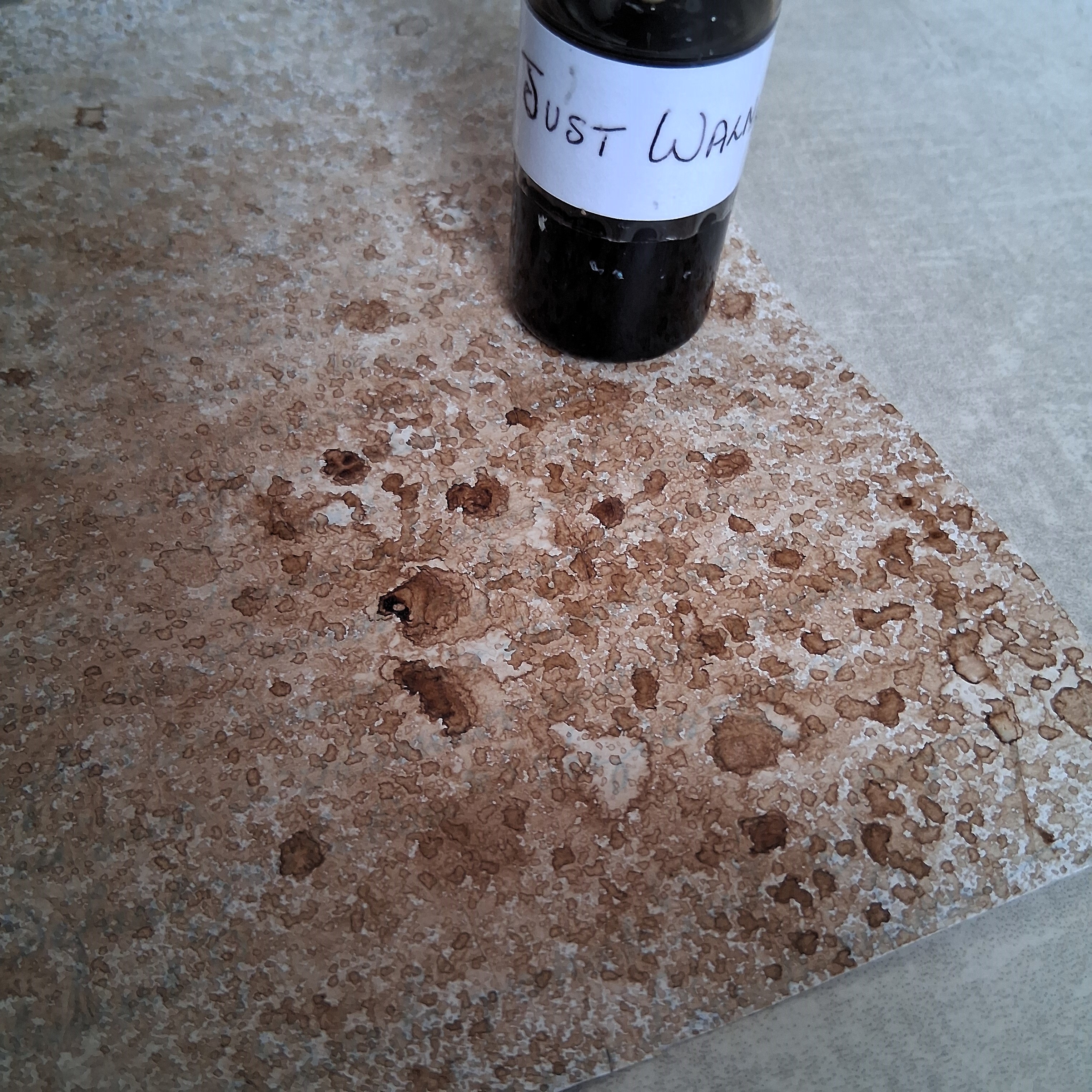
As you may, or may not know, I like to create sprays from The Infusions and use those in my work. It's a very simple process. In a glass jar mix some of the Infusions powder with enough water to fill a small spray bottle, keep stirring until all the powder is dissolved (the glass jar makes it easier to spot undissolved clumps) Decant the liquid into the spray bottle, and hey presto, you have an Infusions spray.

You can see here how I sprayed the Just Walnut Infusions (CS25) onto my page. Repeat applications built up a nice textured look.


I had an idea to use the grid from the recently released Hot Picks stamp set (HP2503) (available from a PaperArtsy stockist). Using Versafine Clair, Nocturne and a stamping platform made sure I got all the fine details from the stamp.

I was pleased with how the background was shaping up, but I was impatient to start adding texture and details.


It was now time to start using the Mini Mask (PM015) along with some Grunge Paste (GP190) which I had previously tinted with some Just Walnut Infusions. 

In fact I'll let you into a secret about how that happened. I had a pot of Grunge Paste that had been sitting out of site on my desk for quite a while. It had dried out a fair bit and I thought I would possibly have to throw it out. I hate waste, so decided to try to revive it. I gradually added small amounts of water, stirring well and working it into the paste. The paste was absorbing the water and coming back to life, wonderful! At this point my mini spray bottle of water ran out, so I swapped to using some diluted Just Walnut Infusions from my spray. The result was a nicely tinted paste with a vintage look. So a very happy accident. 

So back to our project. As you can see I positioned the Mini Mask above the stamped grid and masked off the bottom part with low tack tape. Using a palette knife I applied the Grunge Paste through the stencil onto the page, repeating a second time on the right.


I hope you can see where I'm going with this combination of stamped grid and Grunge Paste arches. I removed the centre of each square in the grid, thus creating windows.


The next step was to add some bricks to our scene. I stamped some squares from the Hot Picks stamp set, using Vintage Photo Archival Ink. Adding texture and dimension to some of the bricks was easy, a straight ended palette knife and grunge Paste did the trick.


I wanted the bricks and arches to have a grungy weathered look, so adding a small amount of black with a Stabilo All pencil and then activating with water, gave me the start of the look I wanted. The eagle eyed amongst you will have spotted that the arches had already had the grunge treatment. Sometimes I get carried away whilst creating and forget to take photos as I go along!


The next step to the grunge was to add some diluted Just Walnut Infusions, letting it settle into the texture. 

It was now time to move on to the image in the window.


I wanted a blend of subtle colours for the image and background, so I used a brayer to apply random areas of Mattints onto 240gsm Smoothy card (SCA4). I chose Squeezed (MT06), Dragonfly (MT07), The Pink (MT08) and Ladybug (MT12, available from a PaperArtsy stockist) for the Mattints.


Using a stamping platform and Versafine Ink made getting a crisp image of the Chatelaine from the Lynne Perrella stamp set (LPC063) easier, on the slightly textured background created by the Mattints.


After measuring the card to fit behind my newly created windows, I stamped more images onto the spare background card. These will be added to the scene within the window.


As you can see in this picture, I extended our figures shoulders to the bottom of the panel. It was at this point that I decided I wanted to tone down the background around the figure. I used a brush and a wash of Just walnut around her, but left her looking brighter.


As you see here, I stamped some stars from the Hot Picks stamp set and added those along with the additional details to our window scene. A little bit of additional shading around the masonry with a soft pencil and our page was complete.

I am very happy how my journal page turned out, I especially love the textured masonry and will be playing with that technique again I'm sure. I do wonder about the story behind our mystery Chatelaine in the window, is she happy, or sad, I'll let you decide.


Adding the stars across the page carried the colour through the composition.


Adding little details cut from the other stamps in the set.


The detail and texture on the Grunge Paste arches is lovely.


I can imagine a whole wall of these textured weathered bricks.


Adding a touch of Dragonfly Mattint to her cheeks made her face the focal point in the window.

I love how the Chatelaine seems to glow, as if in a brightly lit ballroom in the chateaux, looking out into a dreary world outside. There are many stamped images that would work well combined with the window. At one point I considered using several smaller images, each one in a square. In the end I am happy I chose just one, I feel it has more impact.

I hope you enjoyed seeing how I created my journal page and find inspiration from this blog post.

Happy crafting......... Mags x


Facebook: @ Mags Woodcock
Instagram: @Mags Woodcock
YouTube: Mags Woodcock