I'm sharing my take on the "Books and Journals" topic and as you can see from the header, it's a bit different. Instead of making a book or a journal, I used an old book in my make in four ways. As the quarterly theme is "Hidden", I hid the book in plain sight. Can you spot all four places where I included it?
Well, to tell you the truth this lady hare wasn't my first thought when I read the theme. I actually pitched for something completely different, but then ended up suggesting this project. I'm so happy that I did and that I was allocated this slot! I remember going through the topic material Dounia had but together and saw an altered old book in there, pages folded to a cone shape. That ignited my imagination as I saw the cone as a flowing dress! If I try to trace back my though process, I guess the Elizabethan era came to my mind out of the shape and then I started to think of Queen of Hearts. I pitched just the idea of an art doll with a skirt made out of old book paper, but Dounia challenged me to use the book more. I accepted the challenge as I then realized the possibilities I had.
I've been telling you before that I'm a costume designer by education. I've been always intrigued by historical costumes and did my thesis on 18th century women's fashion. So, while I had a general idea of the Elizabethan look, it wasn't my area of expertise. Luckily I own a small library of books on costume history and there's always the trusty Google, too. While flicking through the images, one in particular stood out. I was mesmerized by
"The Rainbow Portrait" (c.1600) of Queen Elizabeth I (link). There was something very striking about the posture and the dress and I actually ended up using that as an inspiration for the dress for my hare lady.

This project was such a joy to create. It allowed me to visit some old favorites of mine but also challenged me and let me explore something new. I also ended up doing something I haven't done for a long while, but probably should do more often! Find out what in the next paragraph!

Even at the risk of sounding like a parrot, as I mention it in many of my PaperArtsy posts, I often make my projects based on intuition rather than heavy planning. Of course I have a starting point and an idea where I might be headed, but often times that changes in the course of the project as I let that take the lead. This time it was different - like a proper clothing designer, I drew a sketch and then miraculously followed it through!
My first sketches were little doodles, just jotting the idea down. Usually I trust to remember the visual idea that emerges in my head when planning a project. This time I knew that there would be a bigger gap time-wise between the idea and the possibility to make it reality. So, I doodled a quick bunny with a flowing hem. Time went by and I then wanted to prepare myself better for the project, so I took a piece of paper, some markers and actually drew a more detailed, colored sketch for myself. As you can see from the ready make, I followed it quite closely. The sleeves are a bit different and there's a little alteration in the skirt, too. Also, you can see I hesitated when it came to the stand up collar in the sketch as I wasn't sure I would be able to pull it off. But then I realized I had the perfect material for the collar in this scale! More about that later.
I picked the perfect stamp set for the decoration of hem. At least I saw the motif perfect for the patterning. I thought that the stylized flowers by Elizabeth Borer from her set 09 (
EEB09) were just right for the job! Maybe their look is a bit more modern, but still echoes the florals of the Elizabethan era.
As I had been thinking about Queen of Hearts, red was an obvious color choice. I wanted the script to be partially readable and showing underneath the decorations, so I chose a translucent red paint Fresco Finish Cherry Red (
FF86) and paired that with a orange Mattint Squeezed (
MT06).
Before starting I also got other materials ready for my make: the polymer clay, the fabrics and the most important element of this book inspired make - an old book! I had two requirements for it. One - it needed to have a red spine and two - the title should be such that I could incorporate that. I went to a local flea market and found this beautiful old novel with the perfect red spine and lovely motifs on it as well. It wasn't until I was making the stomacher part for the doll that I actually read the author's name and realized, who he was. The novel was by Arvid Järnefelt - a brother of Finnish painter Eero Järnefelt and brother-in-law of composer Jean Sibelius!
This project didn't start by making a background. Or perhaps you could see the character as the background for the dress! So in that case, it did start with the crafting of the background!
I have a colleague at work (her Insta), who has been making dragon-shaped art dolls for years now. She's our in-house polymer clay master and I've been listening her tips keenly. When I made a couple of Easter bunnies this year (link) and had difficulties with their ears, I turned to her. I told her how I found it difficult to sculpt the head at the same time as the ears as the clay was so soft to the touch. She looked me with a blank expression for a while and then asked, why I didn't make the head and the ears separately. Doh! It never had occurred to me to do that! So, for this make I actually did just that - I made the head and the two ears separate and attached them before baking. For this make I also chose a harder polymer clay than I have used before and found it much better for my use.
I also made the hands for her using polymer clay and aluminum wire. I also colored her head before baking using soft pastels with a tiny brush.
I really liked how the pastels looked on her, but needed a bit more contrast especially to the eyes. Also her nose was a touch too pink for my taste, so that needed tweaking, too, After baking the head according to the packaging instructions and the advice from my colleague (white polymer clay might be sensitive to temperature - bake it in a lower temperature for a longer time to avoid discoloring), I then turned to PaperArtsy paints to finish the character. I used Fresco Finish Little Black Dress (FF19) around her eyes to get more dramatic contrast there. I included the paint also to her nostrils in order to make the shadowy part more darker.
To alter the bright pink nose and add some warm touches to the ears as well I used Mattint Squeezed (MT06). I found it perfect to add a bit of warmth to the nose especially and also to tie the project together with a cohesive color scheme.
Next it was time to start making the star of the show, the dress. I had bought some white linen and red wool for the sleeves and bodice, but mainly the dress would be made out of the book. I cut the spine of the book loose and turned that into a stomacher. A stomacher is a decorative triangular-shaped panel worn in front of a dress. I felt that the sturdy, flat piece of the spine would make a perfect stomacher! And the decorations on the spine worked wonderfully for it, too.
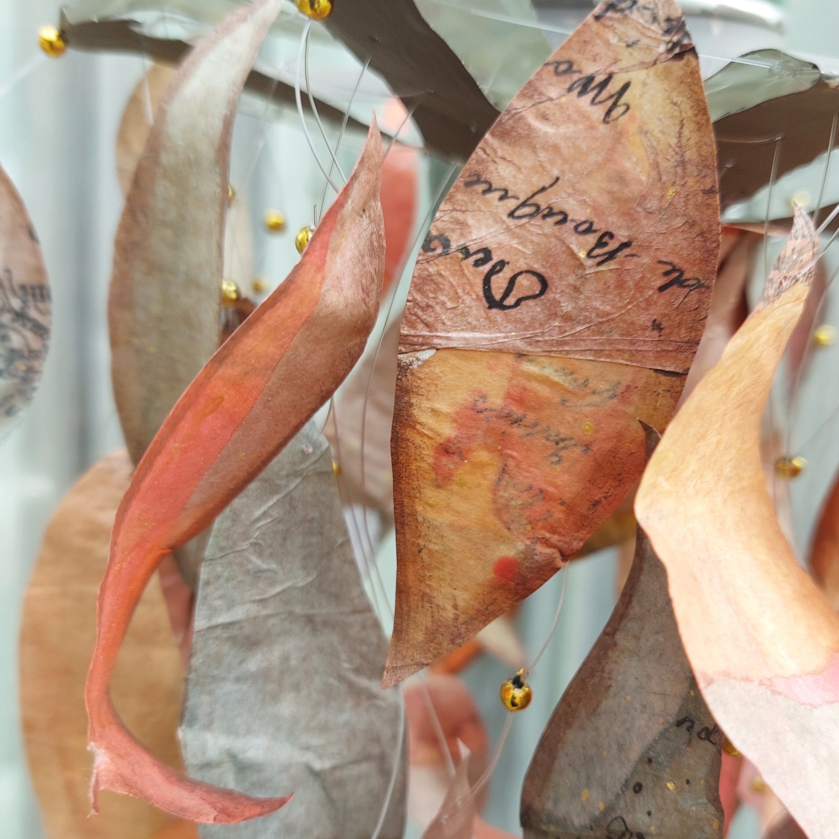
I also cut loose several pages of the book to be turned into the skirt. I chose pages that had writing through the whole length of the page as I wanted the hem to have a scripture pattern all over.
I was pondering how to do the skirt part for a while, but then decided to follow my gut and make it out of panels stitched on top of a piece of cotton. I thought that a full circle skirt would probably work the best for the dress. That way the waist wouldn't need much gathering (as I feared the paper couldn't handle it) and the hem would be very full and flowy still. I made a circle pattern using some scrap paper and then cut as wide a segment out of it as I could fit to the book page. I ended up needing 12 panels but I made 13 as I knew that instead of edge-to-edge I would sew them a bit overlapping and thus need more panels.

Then it was time to decorate the panels. I started by stamping one bloom to the middle of the bottom of the page - like I had drawn in my sketch. But then I looked at the shape of the flower again. It had a bit of a cone shape, growing wide in the top. Instead of following the natural growth orientation, I flipped the florals around, descending from her waist to the hem. I used a black ink for the stamping and swapped between different flowers in the set so each little panel is unique.
What I also like about my decision to change the direction is the text. I could have just scrapped the one page I stamped the flower to and start over, but I liked the idea of the text being upside down. That way it's not that easy to read what the page actually tells, the words become more like a pattern that actual text.
After stamping the patterns to all 13 pages, it was then coloring time. This step was the most time-consuming in the whole process! I mean, it took me a while to sculpt the head and sew the clothes, but I guess it was the repetition that made this step feel like ages! Real mindfulness as I needed to solely concentrate on the coloring, but still.
I used the two red colors I picked earlier to color the blooms. I used the darker red, Cherry Red (FF86), in the outer petals and Mattint Squeezed (MT06) in the inside the blooms. I also mixed the colors like adding the Cherry Red (FF86) near the center of the flower and then mixing it to Squeezed (MT06). I followed the same coloring idea throughout the sheets, but allowed the fact that they were hand-painted to show.
I have to be honest, I had a huge urge to add some splashes to the sheets but I managed to fight the desire! I mean, could you just think about red splashes on a skirt? That horror-story angle wasn't the look I was going for!
Now that I had my elements more or less done, it was time to start putting them together! I took my sewing machine out and threaded it ready.

I started the dress from the main part, the skirt. Like I wrote earlier, I had decided to make the skirt using panels so I cut the book pages with my segment pattern and then started to sew them to a full circle piece I cut out of light weight cotton. This was a tricky mission as I didn't want to use pins as they would make marks to the paper pieces. I ended up adding one pin near the waist and then just gripping the hem between my fingers as I laid it under my sewing machine. I used zigzag to attach the pieces in place going over the seam of the two panels.

Initially I thought to use a contrasting color like black for the stitching but I'm happy that I changed my mind and chose a beige tone quite near the color of the pages. This then makes the stamped pattern pop more. If I had used black, it would have drawn all the attention and left the floral pattern out of the limelight.
In order to fit the clothes to my bunny lady, I also added some padding to her. I used hot glue to add some polyester filling around her torso and then covered the fluff using masking tape.
I then sew a gathering to the waist of the skirt and tightened the skirt around her waist.

This next part made me chuckle! I honestly though about taking measurements out of the bunny and making a pattern, but I'm happy I decided against it and just went by my eye. The first pattern I drew was about twice the size I needed, so I just made it smaller and the second version was OK. I first made the bodice without the side and back seams, just sewing the shoulder seams together and then eyeballed the amount I needed to make the bodice tighter. I chose wool fabric for the bodice for two reasons. Firstly, I thought it would accentuate the sleek look of the skirt as it had a look of velvet but secondly, and most importantly, I didn't need to overlock the pieces and could use it unhemmed.
I also sew two sleeves. Or more truthfully, I sew two tubes, that I would use to make the sleeves. I added a gather to the end of the tube, passed her hands through, pulled the gather tight and then used hot glue to secure the sleeve in place.

It was fun to clothe her! I was so happy about the aluminum wire hands, when it came time to get the bodice on! It fitted snuggly and truth be told, I hadn't thought about how to get it on. Luckily it was OK, but a dread of needing to hand sew the whole thing on her crossed my mind.
After getting the bodice in place, I then added the bodice to the front and secured it with lacing. Well, I did use some glue, too. I also added two more gathers to the sleeves to make them puffy and shorter.
I now had the main elements of the dress made and on her, but the task wasn't done yet. The outfit needed more details! What captured my eye on "The Rainbow Portrait" was the elaborate ruffs and collars. The Queen is wearing three different collars in the painting. A small goffered frill one around her neck, then a bigger Medici collar styled attached to the dress and you can also see two large wired wing like pieces hovering behind her head. I wanted to repeat all three for my hare lady.
The first ruff I set out to do was the Medici styled one. For that I made a tape transfer out of the book pages. I used just wide packaging tape, laid it on top of the book page, adhering the page to the back and then used water and a sponge to remove the paper leaving just the script behind. I first soaked the piece for a while in a bucket to get the paper more easily removed.
I was first thinking using the transfer piece as such, transparent with the script, but it looked dull and too shiny. To turn it more into a lace-like piece, I used a Fresco Finish acrylic paint Chalk (FF83) to cover the back of the transfer. The shiny top part on the other hand I treated using a mat medium.
After letting the paint layers dry on top of the tape piece, I then added yet another gather to the other long edge. I tried to keep my stitches as equal length as possible, so when I then pulled the thread tighter, I created these waves that resembled the ruffle. I used drops of hot glue to secure the collar for my doll.

I wouldn't have known how to attempt the heart-like standing collar if I had been making a human sized dress. Probably tiny pieces and a lot of wires or boning! But luckily working on a smaller scale and especially a fantasy-piece like this offered an easy solution - vellum! To mimic the lace-like look, I used white acrylic paint to stamp a pattern to it. I used Fresco Finish Chalk (FF83) as the color and the same floral motifs from the stamp set (EEB09) I had used to decorate the dress. To make myself an ink pad of sorts, I used a gel printing plate, where I applied the paint with a brayer as a thin layer.
While letting the sheet of vellum to dry, I drew a pattern for the collar. Like with the bodice, my first go was way too big and I needed to have another try. I then traced my pattern to the vellum and cut the shape loose. I used tiny drops of hot glue to secure the collar to the dress.
After finishing the two bigger, more elaborate collars, I made the third one. For this tiny one, I just used thin lace gathered around her neck. I first thought to make it "the right way" by intricately sewing a long lace piece to a collar accordion style but then decided against it. It would have been a bit too fiddly on this scale!
Two finishing touches remained - a pearl necklace and a small book for her to hold. The necklace part was easy, just threading some white seed beads to a piece of twine, but the book needed a bit more work. I used the left-over book spine pieces for the front and back cover and made a fresh new, tiny spine out of colored cardstock. The inner pages of the book are accordion folded strips out of the same book that I used throughout the make.

Lastly I placed the pearl necklace around her neck and glued the tiny book to her hand. An art doll with four different ways to use an old book done!
May I introduce Lady Hara of the Green Leaf to you? She's the youngest daughter of Earl Green Leaf and quite a keen reader. She has had some schooling due to having two big brothers being home tutored. Most of the time you can see her ladyship walking around with a book on her hand. She's fascinated about the new plays by Shakespeare but also has had the privilege of catching some of his sonnets, too.
There she is, all done and dressed to impress! I really liked crafting this rod puppet -styled doll, like I mentioned before. The challenge of using the book more than one way tickled my imagination and I'm really happy with the sculpting on this doll, too. I definitely will use the harder clay for other dolls!
Oh, do you want to hear the story of her name, Lady Hara of the Green Leaf? I searched the old English word for a hare (hara) and then wanted something accompanying it. Lady Hara just seemed too short for such grandeur. I was first thinking of Green Leaves, a reference to Greensleeves, a traditional English folk song, but decided to Google in case that was an actual title of someone. The top results for me included Green Leaf, a flavored green tea by Finnish company Nordqvist. And you know what it contains in addition to green tea? Cherries and vanilla! She's a white hare with touches of black, like vanilla ice cream and I used Cherry Red Fresco Finish paint to the color of the dress motifs. With those things clicking, I just had to name her Green Leaf!

By the way, did you find all the four uses for the book before seeing the steps? I guess the skirt and the tiny book might have been easy to pick out, but what about the bodice and the ruff, did you catch those? I was thinking of including the cover pages somehow as well, but their color scheme didn't fit the rest of the doll.
A quick word about the book she's holding. I was able to remove the cloth of the spine in these pieces, cut the cardboard smaller and then attach the cloth pieces again on top. That way I could wrap the edges of the fabric around the cardboard piece for a more finished look. I made the spine more flexible and rounder by rolling the cardstock piece in my fingers a little before adhering it in place.

Above is a close-up of the three collars for you to see them a bit better. Especially the tape transfer can be slightly hard to spot in the bigger image. You might ask why I did a transfer when I then ended up painting the piece white anyway. Well, like I wrote in the steps, I thought to keep the piece transparent at first, but it didn't look the part. Also, the pages of the book I was using were yellowed by time and I wanted the collar to be a brighter white. Naturally I could have used another book, with whiter pages, but it was more fun to use pieces of the same book throughout. The finished transfer piece is more flexible and moldable, too.
If you want to use acrylic paint to stamp, like I did to pattern the heart-shaped wire collar, keep a jug of water nearby and toss the stamps there so the paint won't dry to your stamps. Remove any paint residue with care so your stamps will last longer and give a nice, crisp image.
If you are not keen on doing an art doll project, maybe you can draw inspiration out of this make in another way. Here's a couple of suggestions:
- Use an era or a painting to be inspired by. Try to capture the atmosphere, the colors or your thoughts about them.
- Pick an item to alter and try to think of multiple ways to use it in a make. Is it material, can it be used as a tool, or better yet - both!
- Try stamping with acrylic paint.
- Tape transfers can be a lot of fun! Use old book pages, magazines or laser prints. Soaking makes the paper soft and more easy to remove. Make a layered piece with added stenciling or different colors and use the tape as a decoration to a card or a way to start a background for a journal.
- Make a background for a card or a journaling project using old book paper and stamping. Use translucent paints to color the motif so the text is shown trough them.
Thank you so much for your visit today! I hope you were inspired by this lady!