2021 Topic 5: Find Your Vibe
Well, grab your hats, you are in for an absolute doozy of a blog post.
Jenny
has clung to elements that push her buttons: architecture, stitching,
gel plate printing and book making. Taking time to enjoy the proccess,
consider the elements, and how to pull them together, it is clear she
has thoroughly loved making this book to represent the architechture and
her memories of venice.
Jenny
has an eye for those incredible finishing touches - keys for a wrought
iron balcony look kind of clunky initially, but the delicacy when a
white pen adds some light-catching highlights, and watery shade pushes back into the shadows creates incredible
depth. But her starting point of making a worn, vintage paper gives an
impression of an old book, whihc is contrasted with bright pops of
vibrant, modern colour. Grab a cuppa and immerse yourself in this post!
~ Leandra
~ Leandra
Hi everyone, it's Jenny Marples (Pushing The Right Buttons) with
you today, and I'd like to share with you a handmade book that holds
five mixed media double-page spreads, They feature images from the new
Hot Picks stamp sets which have been used to enhance drawings of
architectural structures seen in Venice.
For
this topic Leandra has given us the challenge of expressing our unique,
individual creative styles in the pieces we make. This is something
which many people struggle to identify given that we usually develop our
initial skills by replicating the techniques demonstrated of those we
admire. If those creative 'heroes' come from an eclectic and varied mix
of styles then it often means our own projects can end up equally varied
so how do you know ultimately what your style is?
Having
thought about this for several years I've come to the conclusion that
actually you don't need to have a 'style' or unique 'voice'; the most
important thing is that you enjoy the process of creating and end up
feeling pleased with what you make. So for these pages I've gone with
what I love, namely architecture, gel plate printing, collage, stitching
and layering, all within the covers of a handmade book.
In
taking you through the stages of creating these pages I hope to share
with you some tips for what helps me to overcome some of the
'roadblocks' that inevitably crop up along the way, starting with that
dreaded 'blank page'.
Knowing
where to start puts many people off so I suggest taking large pieces of
card/paper that can withstand getting wet (we are talking A3, A2 or
even A1 size) and covering them with random smears of white gesso and
one of the palest Fresco Finish Paints with a brayer or spatula (for
this one I went with Cloud 9 but you could also use Snowflake, Chalk or
even one of the slightly darker neutral shades). Add stencilling, again
in random patches, using Grunge Paste and a PaperArtsy stencil of your
choice (the one used here is Sara Naumann's PS219).
When
dry I cover the whole lot with very weak solution of tea to add colour
to the unpainted areas and give it all a more vintage look but this is
step can be skipped if you'd like it to remain brighter.
After
drying the card/paper you can chop it up into smaller, more manageable
pieces and you have a starting point for a project. Look at where there
are spaces and where the stencilling is to help work out where to fit
the focal point of your design; I planned out a few sketches using some
of my personal photos for reference and drew in the outline of a doorway
(based on the entrance to the Scola Spagnola Synagogue in Venice)
between the stencilled dots using a regular pencil.
To
add colour without panicking about messing things up I've taken to
applying paint onto a small gel plate and pulling prints with wet
strength tissue which can then be layered onto your background when you
decide where you want them. You can end up with full blocks of colour on
some pieces of the tissue and patches on others as the printing session
progresses and layers build up. Save all these pieces of tissue in your
stash and you always have bits for backgrounds or something to stamp
on. You can see from the photo below I used a combination of Seaglass,
Aquamarine, Haystack, Caramel, Peachy Keen, Blush and Scottish Salmon
Fresco Finish Paints.
At
this point I used a couple of the stamps from Hot Picks sets HP2101 and
HP2102; whilst they have a science theme they can also be used to add
detailed patterns over and behind other non-scientific images. Again if
you feel nervous about this step try 'auditioning' the stamped images by
applying them first to a piece of clear packaging and holding them over
your project to see if they work.
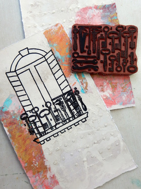
On
the second page below you'll see how I used part of the stamp to create
an intricate balcony for the window by masking off the bottom with some
copier paper - so much easier than drawing lots of fiddly bits of
wrought iron!
Back
to the doorway and I added some simple shading to the image with a
black Stabillo All Aquarellable Pencil, pulling out some of the colour
with a water brush. The same was done over the stamping at the top and
bottom of the pages.
On
the window below you'll see how colour was applied to the centre over
the shading; since the stamping, drawing and shading were done with
permanent ink/pen/pencil it meant I could then apply a layer of
watercolour paint over the top without moving any of the layers below.
You may also spot that an advantage of having started on an uneven base
is that the paint looks lighter in some areas and darker in others due
to the resist effect created by the gesso and paint underneath.
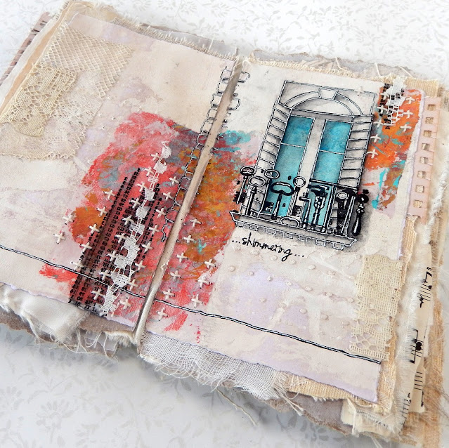
You
can see in the close ups of the first double-page spread how the
completed pages have been layered onto assorted, neutral coloured scraps
of paper and fabric. The pages were then added onto a hinged spine
inside a book cover made using the Eileen Hull Designs Pocket Notebook
Sizzix Scoreboards Die.
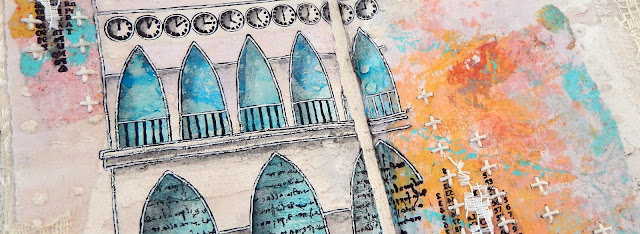
The
second layout is based on a photo of part of the Doge's Palace in St
Marks Square. The clocks at the top come from the Hot Picks stamp set
HP2102 and the script between the arches is from HP2103.
If
you don't feel entirely confident drawing arches freehand try creating
templates from folded pieces of paper that can be drawn around. You can
also mask off the outer parts of the arches by tracing over them onto
more transparent packaging, cutting out the arch areas and using this
over your drawing when stamping the script.
The
keys and tools from Hot Picks stamp set HP2101 look even more effective
as that metalwork balcony when the white pen is used to highlight parts
of them. And you can use a brickwork stencil as a guide when adding in
the corner of a building to your layout, remembering that most of the
buildings in Venice are crumbling in places so accuracy is discouraged!
With
the centre of the archway being so open it is easier to see here how
the various layers of paint and gesso have interact to create that
uneven, worn look with very little effort. You could try adding dilute
Infusions over the base to achieve a similar look.
To
add some detailing above the arches I used one of the larger circular
image from Hot Picks stamp set HP2102. When applying ink to the surface
of a stamp where you just need one of the images you can use washi tape
or masking tape over the ones you don't want seen, removing it before
applying the inked part of the stamp to the surface.
Hopefully
this post has given you a few tips, tricks and techniques to try when
making your own pieces. Try looking to use your stamps outside their
original context by adding them under and/or over your own drawings, and
with an idea for creating neutral backgrounds hopefully you won't need
to be faced with that fear of the 'blank page'.
Thanks so much for stopping by,
Jenny
Blog: https://pushingtherightbuttons.blogspot.co.uk/
Facebook: https://facebook.com/jenny.marples.73
Pinterest: https://www.pinterest.co.uk/jennymarples73/
Blog: https://pushingtherightbuttons.blogspot.co.uk/
Facebook: https://facebook.com/jenny.marples.73
Pinterest: https://www.pinterest.co.uk/jennymarples73/


21 comments:
Absolutely stunning Jenny. So many enthralling details in this.
WOW, Jenny, this rocks.. will read this post from A to Z as I want to know how you did it... beautiful!
Awesome artwork x
Such a clever use of the stamps
Utterly beautiful. Love the worn and wistful feel to the piece. It’s restrained and yet vibrant!! xx
Absolutely wonderful. I love the vintage, shabby look that you've created.
Thank you so much for the photos and the clear description of your creative process!
Stunningly gorgeous, with such attention to detail. And so 'Jenny Marples', with that soft, delicate vintage vibe! ~ Stef
the beauty of this project leaves me almost speechless - applause!
oh wow that is just beyond stunning Jenny x
This is spectacular. Love the way you incorporated the stamps to make them look like they are part of the architecture.
Oh, Jenny! This is magnificent, what a joy to see! Finding this post was like reconnecting with an old friend, I’ve always loved your work, but kind of lost touch with your artwork. Great to see again! Happy creating!♥️
Amazing, so inspirational, I love all the details and the colours. Brilliant x
Wow, this is amazing! So beautiful!🎨👍❤
Absolutely stunning work, Jenny. The colours, the aged papers, the recurring arches and beautiful detailed attention to colour and light and texture. This book is a treasure worthy of its subject, Venice. Magnificent.
Alison x
This is beautiful Jennie
This is absolutely spectacular!!!!!
I love everything in this project, utterly beautiful and beyond the words!!! Un immense BRAVO !
Well done, Jenny. And thank you for the wonderful inspiration! xx
WOWZA! there is so much to love and learn from this project....thank you so much!
I'm speechless Jenny! I love the way your shading and overstamping brought these drawings to life. Such inspiring pages...
Wouahhhhh it’s just amazing. So so beautiful ! I love it
Wouahhhhh it’s just amazing. So so beautiful ! I love it
Wouahhhhh it’s just amazing. So so beautiful ! I love it
Post a Comment