Showing posts with label Journaling Gratitude. Show all posts

Thursday, 30 December 2021

2021: PaperArtsy - A Year in Review {Topics 13 to 15}

  
Hello again from PaperArtsy HQ,

Here we are at our final post for the year. I hope you have enjoyed taking a look back at some of the blog highlights with us. It's amazing the variety of ideas that we have shared over the past year, and of course, we will be back with many more next year too!

As we round off the year, I would just like to offer a heartfelt thanks to all our bloggers, past and present, (and future) ! The projects they create for us, and of course for you, are always absolutely superb, we cannot thank them enough for their attention to detail and willingness to share their tricks, tips and creative secrets with you all.

To our designers who go from strength to strength, you are such a fun team, all so supportive of each other, and an absolute joy to work with! I know you all have your individual quirks, and work differently and that is why you are all so unique! We have missed seeing you all face to face at the trade shows, and look forward to spending time again hopefully in the not too distant future!
 
To our retailers around the world who have pulled out all the stops to offer classes, both online and face to face and who regularly order so that you have access to our brand in all your corners of the world... thank you for your friendship, support, feedback and encouragement, and especially your patience as we have adjusted to life in France and all the new systems we are still coming to grips with!
 
And to the lovely staff here at PA HQ, we thank you too for always picking orders accurately and shipping fast so that people don't have to wait too long for anything! I love how you are always thinking on your feet and make suggestions on how we can all improve and be more efficient. You guys have been so patient as we continue to try to get things set up in the new PAHQ spaces. Oh and also for the fun Friday after-work gin tastings!

To those of you who follow the blog, thank you for all your comments, we appreciate them all, it is so nice to know that there are people out there reading and following along, and that you find this blog a valuable tool and source of crafty inspiration!

So lets talk about today's topics we are remembering! We have picks from Topics 13: Tiny (News) Print, Topic 14:Mash Up (with LPC, EGL, EEV and EAB) and last of all Topic 15: Journaling Gratitude. These have all been beautifully written,and joyful ideas as we have come to the end of the year! Lets take a look back.

Leandra 

Topic 13 : Tiny (News) Print
Text and letters play a crucial part in creation, from titles and describing, to expressing what images cannot, or perhaps to play a role as the visual texture of a piece. Topics linked to writing, typography and letters are recurrent on the PaperArtsy Blog. This time we wanted to put a big focus on tiny letters. Newsprint is the obvious example but encyclopedias, telephone books (now a vintage memory), medication spec sheets or travel guides are also good candidates, as well as lots of stamps! Our bloggers run with the idea, sneaking snippets of text in their backgrounds, putting emotion in their sentiments, or creating embellishments out of printed pages. 

My first pick is this amazing vintage spool book by Jennie Atkinson. As she explains in her original blog post, this was not her initial plan but sometimes you have to go where your muse takes you. Tiny text is everywhere, from quotes to subtle stamping on the fabric. Yes, that text on the fabric looks part of the design but she actually added it to the pre-printed design! I love how all the elements are pulled together by the repeated use of limited colours.


And I hope you didn't miss Lynn Good's bright bouquet, a riot of colour in her art journal.The tiny letters are obvious here, busy filling the background. As Helen also shares in her original blog post, mixing different dictionaries, with a range of fonts, sizes and colours, is a fantastic idea to create easy and interesting backgrounds.The contrast between the subdued text and the vibrant flowers, aided by subtle shadowing, makes for a truly striking piece.


I adored how Jenny Marples took Seth Apter's rather abstract stamps, saw their architectural inspiration and translated it into a completely representative scene, full of texture and depth. The tiny print is quite discrete here, but her original blog post shows in detail how she transformed a text stamp into the stone wall. Genius! A real lesson in how to look at stamps differently and discover the other images hidden within.


Topic 14 : Mash Up with LPC, EGL, EEV and EAB
The end of the year comes near and with it the third and final of our Mash-Up topics. This time the participants are: Lynne Perrella, the original queen of collage, with her intricate characters, Gwen Lafleur, with her intricate and ethnical patterns, Ellen Vargo, with geometrics bold and delicate, and Alison Bomber, with inspiring words. As somewhat expected with this selection, the Lynne Perrella stamps often provided the focal people but it is always amazing to see how differently our bloggers are able to interpret the same stamps. Be it with colour, technique or composition, they beautifully merge together each with their own style.

First up is Alison Bomber with this magnificent wintery piece. I love how she looked past the first most obvious use for Gwen's and Ellen's stamps and translates them into crystals and snowflakes for a very atmospheric set-up. The Ice Queen  and King obviously come forward as the focal point but they are still perfectly integrated. Alison's original blog post explains all her process and is a wealth of inspiration and tricks for subtle texture and details.


Even with an LPC lady as the main image, Etsuko Noguchi truly showcased Ellen's stamps in this wall hanging. I love the association of the ghostly vintage character and the modern colourful background. I feel it really portrays the idea of an old soul lost in the current world. In her original blog post, Etsuko shares her technical inspiration for this piece and details her creation of the masterboard that becomes her background, quite the transformation!


Nikki Acton experimented with vellum and a royal colour palette, gold and purple! How she has used only parts of the stamps is so interesting, revealing new details and creating new combinations. I also love the text peaking through the face: is it a hint of their thoughts? Her original blog post is a fascinating look at how inspiration flows, how sometimes only one little idea drives a project, which then seems to advance almost by itself.


Topic 15 : Journaling Gratitude
The end of the year is approaching fast... This is our last topic! As tradition dictates, it is the time to reflect back on another strange year. Lots of crafters explain how creating helps them express, process and share their feelings, and provides a bit of balance in their life, making things more manageable. In these isolated and anxiety-inducing times, we should not forget the good things and be grateful for the small rays of sunshine or unanticipated joyful moments. We hoped this topic to be an occasion for the community to share tips for journaling, memories of the year and inspiration for positivity.

Autumn Clark made her journal from junk materials and leftovers from the year's projects, a great way of doing her year in review and expressing her hopes for the future. I love her use of the hands and rope, so clever and innovative! In her original blog post, she shares all her inspiration and tricks for this journal, as well as two other finished spreads. Her gel printed backgrounds are full of interest, making the pages easier to fill, battling blank-page anxiety. 


She might not be a regular journaler but Helen Chilton still wanted to celebrate positivity and did so in a heartwarming riot of colours and texture. The mix of Infusions and paints create so much variation and surprise combinations. I love how the colours swirl and mix within the images, revealing details and creating depth. Helen's techniques and process, detailed in her original blog post, are very intuitive and playful and could absolutely used in a journal.


Keren Baker focused on future gratitude and made this journal to practice thinking positively in the new year. What a great idea! She also ventured out of her comfort zone to try and paint a marble effect. Her experiment is wonderfully documented in her original blog post and the result is incredibly accurate! I love how it contrasts with the main colour of pinkish-red, which also makes an appearance on the inside pages for a soft cohesive look.

Thank you for joining us again today.

In 2022 we are adding a handful of newbies to the team, something we have not done for a few years, so we are very excited to be sharing with you who they are over the next week or so on our instagram @paperartsy . Wishing you a restful holiday season, and here's to 2022 being a key turning point for us all. Warm wishes to you all

 Leandra and the team at PaperArtsy 

Thursday, 16 December 2021

2021 Topic 15: Journaling Gratitude with ECF {by Jenny Marples}

2021 Topic 15: Journaling Gratitude


Have you tried stitching on your projects? Jenny has several options for you here, including a really fail-proof faux stitching one, that you can hardly tell isn't real! With lots of ideas for layering and beautiful paint effects, this flip up journal page will keep you engrossed for quite a while! 
~ Keren

Hi everyone, it's Jenny Marples (Pushing The Right Buttonswith you today, and I'm here to share a journal page which celebrates the Autumn and Winter seasons, helping to make me feel more grateful for them along the way.

Inspired by the beautiful needlework often seen in Keren Baker's work I've had a go at 'drawing' with machine stitching as well as coming up with a way of turning 'a negative into a positive' to create colourful Autumn leaves with Courtney Franich's gorgeous stamps.


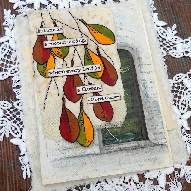
Flip up those Autumnal leaves to reveal a Wintery scene beneath.


This piece all started after an October morning walk where the leaves were changing colour from their familiar Summer green to jewel-like shades of yellow, red and brown. They brought to mind a photo of an old green door I'd seen the previous day and an idea was sparked.


Wanting to capture the visual magic of both the Autumn leaves and the door I came up with a layout 'sketch' which involved adding a 'flip up' element to a journal page using the smallest leaves from Courtney Franich's stamp set ECF05.


The main journal page was already prepped with a scrap of book page and some white gesso. To create the flip up piece I took a blank index card torn along the edges and cut some fabric to a similar size with the idea of sticking those two together. A way of adding extra texture to the surface of all of these is to apply wrinkled tissue paper with some gel medium; once paint is added those wrinkles come to life. When dry the index card was stuck to the fabric and attached to the top of the journal page with masking tape.
 
 
Laying down layers of paint that won't be totally visible in the end is key to getting surfaces with a look of depth and interest (think Seth Apter's incredible pieces as a perfect example of this). Adding a little Sand PaperArtsy Fresco Finish Chalk Acrylic Paint with a spatula over the crumpled tissue revealed the texture beneath: I avoided the area where the door would eventually go.


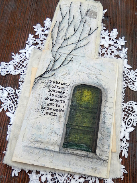
Up close you can see where the Sand paint was used through Kay Carley's PS061 stencil multiple times on top of the fabric to mimic the illusion of further tree branches being behind the stitched ones.


The doorway was drawn on the right side of the page to make sure part of it would be visible beneath the leaves; by providing a 'sneak peek' at what lies on the next page you encourage viewers to turn over (or in this case flip up!) and see more.


That layer of crumpled tissue really comes into its own at this stage. Add layers of paint (in this case from darkest to lightest shades) unevenly over the top, allowing some of what lies beneath to remain visible. For this page I chose French Roast, Stone, Heavy Cream and finally Cloud 9 PaperArtsy Fresco Finish Chalk Acrylic Paints. When dry use a sanding block to gently rub away the upper layers and reveal those wrinkles - be brave and rub harder to get the most out of those lower layers.


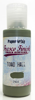
When it came to painting the door I found applying very thin layers with a small spatula helped control the application and allowed lower layers to show through - try scraping away some of the paint as well as adding more and think about leaving lighter areas as 'highlights'. I chose to use Guacamole, Toad Hall and Winter Green PaperArtsy Fresco Finish Chalk Acrylic Paints for this process with Hyde Park added over the kickboard at the bottom and French Roast used on the door frames.


You can 'shift' the colour and give the door a richer glow by painting on a very thin layer of the translucent Pumpkin Soup PaperArtsy Fresco Finish Chalk Acrylic Paint over the top - that's the beauty of having opaque, semi-opaque and translucent options. I added dimension using Stone around the edge and stopped the door from 'floating' by drawing a smudged line of French Roast below it.


Going back to the original sketch I'd drawn branches onto a piece of tissue and liked the design. Rather than transfer it with carbon paper and risk adding ink onto the fabric beneath I ran lines of gel medium along the drawn lines on the reverse and stuck the tissue to the fabric.


Having lines to machine stitch over helps immensely, and accuracy is definitely discouraged because in that way your finished look echoes the feel of delicate branches. You can see I carried the lines onto the attached page too. Remember, underneath the tissue is another layer of wrinkled tissue with gel medium and paint over it so it is now resistant to water. That's important because it means you can use water on a thin brush to help tear away the excess above.


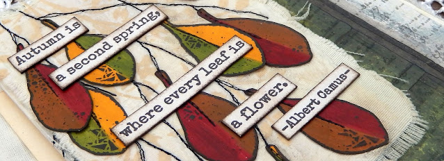
At the beginning I mentioned turning a negative to a positive - well here goes. Courtney's leaf designs are solid so when stamped they cover up what is below. I wanted the colour beneath to be visible so after painting a strip of paper with Blood Orange and Toffee PaperArtsy Fresco Finish Chalk Acrylic Paints I clear embossed them before painting over the top with the French Roast. Once dry rub over the leaves with a dry cloth to remove the paint from the embossed areas and reveal the design in reverse.


Repeat with Pumpkin Soup, Hey Pesto and French Roast PaperArtsy Fresco Finish Paints for the second set of leaves.


If you want to eliminate the shine of the embossing powder cover the leaves with layers of PaperArtsy Fresco Finish Acrylic Matte Glaze.


Glue the leaves onto the stitched branches using the sketch layout as a guide. I realised that it would look better to echo that stitching down the centre of the leaves but to run them through the machine at this stage could risk tearing them; in future would opt do this while they are still in situ on the painted strip. As the next best option I chose to 'fake it', using a tracing wheel to add indentations and drawing on the 'thread' with a narrow tipped black pen.


I love adding stamped detail over the top of hand drawn images to add extra interest; in this case I used the Courtney's script stamp from the same set over the door using grey permanent ink to keep it subtle.


Adding words can help to convey the intentions of the page; this sentiment from Sara Naumann's ESN42 stamp set spoke to my recognition of the understanding that whilst Autumn and Winter often fill me with a sense of sadness and dread these seasons have their own beauty, helping to make me even more appreciative of Spring and Summer. By stamping the words under the tree (in brown permanent ink) also means they are hidden from view until the leaves are 'removed'/raised. From a design perspective they also help lead the eye from the tree down to the door.


More words from Sara Naumann's ESN36 stamp set spoke to the beauty of the leaves seen on those October walks mentioned at the start of the post.
 

Here are some close ups of the finished journal page;


The hand stitching at the bottom of the page peeps out beneath the leaves.


Here you can see how the stitching was extended down from the index card flip onto the page underneath. Grey shadows were also added to one side of the stitching to give the branches more of a sense of dimension.


I stamped the postage stamp from Courtney's set in the top corner, blotting the brown ink to knock it back a bit. I also chose to over-stamp it with a postmark image from another of Courtney's stamp sets, ECF06, using grey ink. As an alternative you could re-use the circular element of the postage stamp on either side of the brown stamp.


Can you spot the 'hidden' expression of gratitude beneath the door? These words came from Sara Naumann's ESN43 stamp set and were deliberately made barely visible with blotted grey ink.


With lots of techniques and design ideas included in this post I hope you feel excited to give them a go. Whether drawing (or even tracing) a design on tissue and machine stitching over it or using crumpled tissue under your layers of paint and sanding it back, there are lots of ways to add texture to your journal pages. And if you have solid stamped images that you'd prefer to see through try using clear embossing powder as a paint resist.

Thank you so much for stopping by.
Jenny