Showing posts with label Claire Snowdon. Show all posts

Monday, 20 March 2023

2023 Topic 03: Focus on Seth Apter {by Claire Snowdon} with Seth Apter Products


Hi everyone, 

It's Claire Snowdon here with you today. 

I've been enjoying some creative time lately making smaller pieces of art for a change. This topic is all about Seth Apter - but I decided to have some fun and do a Seth Apter/Scrapcosy mash up post!  I'm really looking forward to sharing with you how I combined these two very special designers. 


I really loved creating using these playing cards as my starting point - I think they are just the perfect size to showcase these beautiful Scrapcosy flowers and vases.  I went for a slightly grungy look in the spirit of this being a Seth Apter topic!  However I have definitely managed to add in a more feminine twist on your typical grunge project.


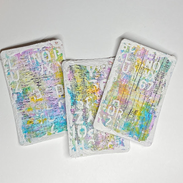
I started out with three playing cards and used my brayer to layer up PaperArtsy Fresco Finish Chalk Acrylic in Fuzzy Cactus and Cerulean.  I always feel using the brayer is a great way to start to break up that plain white background and just get some colour down. 


Once I had the PaperArtsy Fresco Finish Chalk Acrylic down on the cards in Fuzzy Cactus and Cerulean it soon became clear to me that these two colours alone were not the look I wanted - so to inject some more colour into my project I added Lily The Pink and Yellow Submarine.


I choose the Yellow Submarine for it's translucent qualities - it adds an amazing pop of colour to any project but without obscuring the layers underneath.


I added the additional two colours to my playing cards using the brayer.  Then to soften the background and get rid of any remaining white spaces I added some water to the remaining paint on my craft sheet and applied it gently to the cards using my fingers.


The Yellow Submarine really adds that pop of brightness - and there are much more muted versions of Lily The Pink, Cerulean and Fuzzy Cactus fading into the background which I think adds extra depth.


I stamped out a couple of the images - one from Seth Apter ESA35 and one from Scrapcosy ESC39 and started to play around with the composition.


Using stamped images in this way and layering them up on a project in various different compositions is one of my favourite ways to create any project - it allows you to visualize how the project will come together and what looks pleasing to the eye.
 

From my composition experiments I decided that using the amazing circle stamp from ESA35 was the one element I wanted to use across all three cards to unify them.

I stamped all my chosen images out from both ESA35 and ESC39 and cut everything out.  I wanted tiny pops of colour - but nothing too bright that could detract from my background.  So I used watered down paint from the same four colours to give the images a little bit of colour and take away some of the stark whiteness.


Time to add a bit more interest to these playing cards.....Seth's stamp plates always have the most amazing texture stamps - and I used one of each type of texture from ESA35 on each card.  I stamped them using a drier inkpad as I didn't want a really bold black background stamp being the focus.  These are my version of tracks running down the cards - which complements the current blog theme!

To add even more layers and textures I used Grunge Paste and stencil PS271 and then smooshed more Grunge Paste around the edge of each card to create a Grunge Paste border.


Here is a closer photo to show the texture that is achieved using a combination of Grunge Paste - which gives a 3D effect - but also by using the texture stamps designed by Seth.  Building up the layers is a great way to add additional interest to a project.


So these are the finished cards!  To bring everything together I edged the cards using blank ink and added some gold splatter.

I covered the vases in Glossy Accents to give them a really glass-like finish.  Then adhered all my elements to each card - using a combination of glue and 3D foam pads for extra dimension.

The finishing touch was a sentiment added to each card using Scrapcosy ESC39.


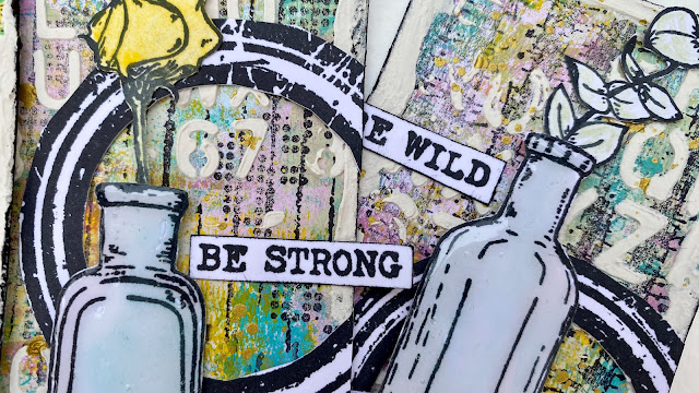
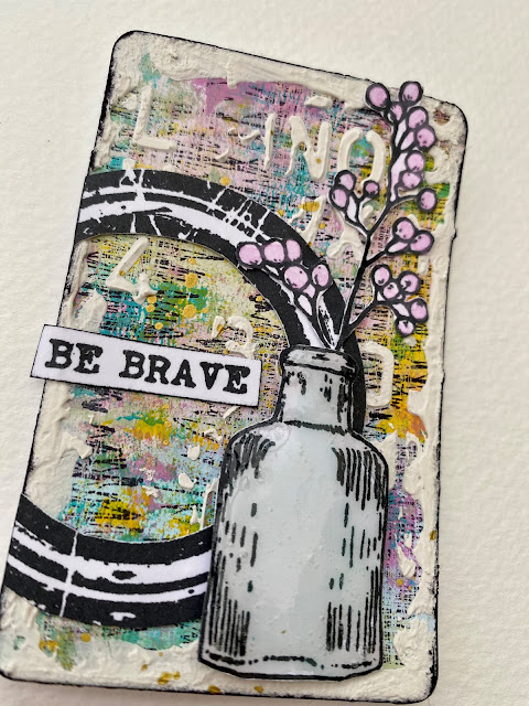
Here are some closer photos of each card on it's own - even though they are small I still think I've managed to fill each one up with plenty of interesting features and texture! 


This was such a fun project to make - I really enjoyed creating on a smaller format.  The idea of 'feminine grunge' really appealed to me and I hope you'll agree that I managed to pull it off!  Combining Seth and Scrapcosy's stamps was maybe not an obvious choice to start out with but I feel they work well together and this mash up of designers is maybe one you could try out for yourself. 

Claire x


Thursday, 12 May 2022

2022 Topic 07: Specimen Jar {by Claire Snowdon} with Sara Naumann stamps


Hi everyone, it's Claire Snowdon with you today, and I'm here to share with you my upcycled specimen jar project.


I really loved the sound of this topic.....thoughts of specimen jars with insects and brains etc started to fill my mind!!  Although typically my creations steer well away from the more gruesome topics and veer mainly towards flowers and prettier subjects!  So with all that in mind I decided upcycling a plain jar would be perfect for this post....


The jar I found was this rather plain glass jar with a plain wooden lid.....


My original plan was to fill the jar with moss, a fake tea light and images stamped on tissue paper from a variety of Sara Naumann stamp plates - however once I started to stamp images onto tissue and attaching them to the jar to see how they would all fit together another idea started to form in my mind.  I decided it would look much better if the jar was frosted glass and the images stamped onto the outside of the jar.
 
 
So the real starting point for my project was two light coats of PaperArtsy Frosting Glaze on the outside of the whole jar.  The Frosting Glaze dries really quickly, I love how it makes the glass opaque but you can still see a hint of what's going on inside the jar.  Another important reason why I choose to go down this route is that it gave some 'tooth' to the outside of the glass jar - this would make the stamping and painting much easier.



I used StazOn black ink to stamp directly onto the jar - this was a bit tricky due to the curved nature of the jar I couldn't use a stamping block so just had to be decisive when adding the stamp onto the jar!  All the images I used are from Sara Naumann stamp set ESN55.


I added twine around the neck of my jar whilst I was waiting for the StazOn to dry.  Then went in with some colour - I choose to use PaperArtsy Frescos in Glass BlueBeach HutYellow Submarine and Pumpkin Soup.  I choose these colours as they are all translucents - therefore they wouldn't obscure my stamping and would also allow light to flow out of the jar.


Next I tackled the lid of the jar - it needed an injection of colour!!  I gave it two coats of PaperArtsy Fresco paint in Caribbean Sea - which is a nice opaque paint.  I stamped some shell images, again from the same stamp plate, onto the lid in a blue ink.  Then I added quotation stamping to the top and around the edges of the lid in black ink.  The edges were again a little tricky due to the curves however I just didn't hesitate and committed to rolling the lid along the length of the stamp and it worked out well!



Once everything was dry I could add the lid back on and then look to see if it needed anything else....


So the next steps were to add the moss inside and the tealight - which I found did not work well at all.  So I added a small string of battery operated lights inside - mixed in with the moss.  I found this worked much better.
 

I really love the effect of the lights shining inside against the images of the shells and the text on the outside of the jar.  I also love how the colours I added to the shells is translucent and delicate so the whole project has an understated feel - it really allows the stamps to take centre stage.
 

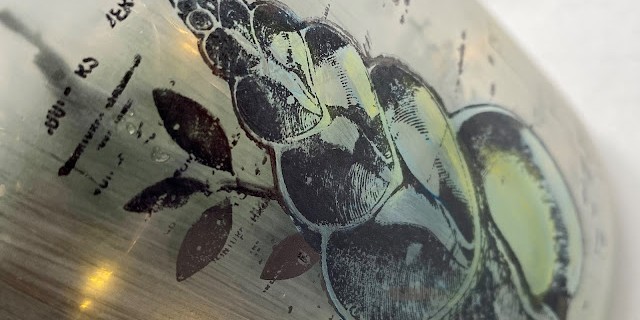
Here is a close up of one of the shells - nicely illuminated by the lights inside.


And a photo of how it looks inside during the daylight.....although I love the look of my jar in the daylight for me it comes alive in the dark!


I hope this project inspires you to look around your own home to see if there is anything you could upcycle!  Painting on glass is a wonderful technique and as long as you add the paint in light coats then it can create a lovely effect.
Make sure if you have a go to tag @paperartsy on your social media feeds so we can all see your beautiful creations too!

Claire Snowdon