Showing posts with label Nature's Treasure. Show all posts

Tuesday, 28 December 2021

2021: PaperArtsy - A Year in Review {Topics 7 to 9}

Hello again from PaperArtsy HQ,

We hope you are enjoying your daily walk down memory lane to see highlights from the PaperArtsy blog of 2021.

Dounia has selected another series of stunning ideas to share with you today, so sit back, relax and enjoy this review

Today we're sharing picks from Topics 7:Mash Up {with JoFY, Emma Godfrey, Sara Naumann and Ink & the Dog Minis}, Topic 8: Nature's Treasure and Topic 9:Baubles and Bling.

Leandra 

Topic 7 : Mash Up with JoFY, EEG, ESN and I&D Minis
Already half a year had gone by and it was time for our second Mash Up topic! Again we tried to propose a mix of designers/ collections that would bring both focal and background stamps, big and small patterns, open and detailed textures. This time our bloggers combined JoFY's bold florals, Emma Godfrey's funky geometrics, Sara Naumann's layered collages and Ink & the Dog Minis' vintage imagery. They approached this challenge each in their own way and it is so interesting to compare which aspect of the collections each of them focused on, for quite varied, wonderful and, sometimes, unexpected results.

My first pick is this beautiful journal cover by Ellie Knol. I love the contrast she was able to create with a very limited colour palette and no black or any truly dark colour. Her original blog post details her extensive use of stencils and Grunge Paste to achieve the gorgeous background texture. The patterns overlap and meld together to really unify the piece and highlight the focal JoFY butterfly (not a flower!).


Lynn Good went for bright and bold, and JoFY flowers. The stenciled background brings a vibrant jungle vibe, perfect to showcase the warm blooms. How great are the bird focals? They are starkly different from the rest of the piece, both in colour and style, but Lynn cleverly integrated them using the black border stamping. Her original blog post details the twists and turns of this project, a good example of how to adapt when your crafting does what it wants!


Thinking out of the box and going out of her comfort zone, Keren Baker was inspired by Sara's seashells to make this vintage art doll. I love how she diverted lots of the elements from their obvious use. The lovely textures of the dress and the wings really gives a 3D effect and makes the doll stand out. Be sure to go to Keren's original blog post to appreciate all the small details, like the cog heart in the frame or the stamping on the face.


Topic 8 : Nature's Treasure

In the middle of summer, this topic aimed to celebrate nature, her beauty and all the materials and inspiration she offers in crafting. The PaperArtsy collections are certainly full of leaves, seeds, flowers and other natural curiosities and our bloggers did not hesitate in showcasing their favorites. It was also an occasion to reflect on how those organic patterns we have internalized from contact with nature can emerge when crafting, or meld with more 'man-made' imagery. Finally, nature also offers us more physical gifts like leaves, twigs or barks, gorgeous and unique, that we can integrate in our art or use as tools.

Blue might not be the first colour that comes to mind in a topic about nature but Nikki Acton really pulled off the monochrome look in this gorgeous card. The tiled format allows her to display lots of Lin Brown's 'printed leaves', sparing her having to choose, as she explains in her original blog post. Using a different hue of blue for the quote and main leaf is a genius idea: it makes them pop from the background, while the subtle stamped dots anchor them.


Amanda Pink proved that natural textures and patterns can bloom even from abstract stamps like Seth Apter's. I am impressed how well she married grungy, industrial elements and vegetation inspiration. Her original blog post details how she achieved the fantastic texture of the background, reminiscent of bark. Watching the piece transform along the multiple steps of the process is mesmerizing! 


In her project, Dounia Large chose to use Nature's Treasures as tools and materials rather than images. Her not-a-book is lined and decorated with dyed cork. For the cover, she experimented with pressing leaves into the paper and revealing the patterns with Infusions. A delicate look with easily obtained materials! Go to her original blog post to discover the process and see all the details!


Topic 9 : Baubles and Bling

It's Christmas in August! This year, we tried to be good and propose inspiration well in advance of the Holiday season. Our bloggers ended spending the summer in tinsel, I am sure they are thanking us... This topic is a fun one, sure to appeal of the magpie inside all of us! Time to bring the glitter, tinsel and foil out of hiding place and indulge in all things shiny. We thought these elements would pair great with baubles: tiny versatile canvas where sparkles are not only acceptable but expected! Our bloggers did not hesitate to play with size, shape and texture for a wide range of cheerful atmospheres.

She might have chosen an usual colour palette, but Helen Chilton surely brought the baubles and the bling! She certainly understood the assignment! I love how the warm colours pop against the silver. In her original blog post, you can see all the little touches she added for cohesion and maximum sparkle! She also shares her foiling technique. I particularly like how it highlights the texture of her Grunge Paste stenciling, so interesting. 


PaperArtsy designer Tracy Scott came out to play, not surprising as this topic seemed to be made for her! She certainly loves a bit of bling. Her original blog post details all the layers that went into this gorgeous piece. I love her bokeh lights effect, both simple and effective, it is such a great idea. It creating a wonderful depth in the background and helps the baubles stand out and shine (figuratively and literally)!


In New Zealand, it was actually winter for Tracy Springer, which did not stop her project from being bright and warm, but with a fur coat touch!  Her baubles are fuzzy and her doggies are cheeky in this lovely series of cards and their holder. I love her colour palette, not classic but still close enough to 'feel' Christmassy. Go to her original blog post to meet all these cute critters in all their bling out glory. Get your sparkle out indeed!

 
Hang in there, as the review continues for another couple of days more, see you same time tomorrow!

Leandra
  

Saturday, 17 July 2021

2021 Topic 8: Nature's Treasure with HP {by Jenny Marples}

 2021 Topic 8: Nature's Treasure


Jenny really is offering a masterclass in how to build up an idea and then bring it to life, layer by layer with one of our Hot Picks floral vintage stamps as the focal point. This truly is an astonishing read and I love how she tells us how and why she adds all those scrummy details to each layer.
~ Leandra

Hi everyone, it's Jenny Marples (Pushing The Right Buttonswith you today, and I'm here to share an idea for creating a home decor piece which was inspired by memories of a trip to the Palm House at Kew Gardens, London. This remarkable glass and metal structure provides a wonderful home and backdrop for protecting and displaying some of nature's most beautiful botanical treasures - it is well worth a visit or three!

Following on from previous journal pieces I teamed a hand drawn sketch depicting part of the Palm House with Hot Picks stamps, used to create both focal points and subtle accents


The stamps have also been used to create decorative paper for the background, whilst some words and a stencil by Sara Naumann have added accents that help to build in those all important interesting little details.


Start with a sketch - I roughed out my design from photos using pencil marks before reproducing it on a piece of tea dyed paper. Use different nib sized pens (permanent ink of course!) to help emphasise some of the lines when you re-draw over the top of your original sketch lines.


Emphasise the important elements - whilst more recently I've been adding a little watercolour to help make the main structures stand out, for this sketch I've reflected the fact that the metal beams in the Palm House are painted white by using 'Snowflake' Fresco Finish Paint on the ones in the drawing.


Adding a touch of nature - a dramatic plant was needed to work with and compliment those strong vertical beams in the Palm House so I chose a strong architectural one from the Hot Picks HP1602 stamp set.


Test your positioning - try stamping onto a piece of transparent packaging to work out where you want to place your plant before committing to adding the ink.


Thinking ahead - I deliberately chose to stamp the flower heads over the edge of the sketch knowing that extra layered flower heads would be added next to fill in the missing detail.


Adding colour - single-ply tissue dyed with 'Violetta' Infusions has a wonderful mottled look which can be given a warm or cool hue by adding it to a cream or white card base with a gel medium. For this project I chose to stamp the flowers onto the warmer cream base.


Think outside the black - just because I'd used black ink to stamp the flower on the sketch didn't mean that had to be replicated on the coloured tissue card. Since there is a lot of shading detail incorporated into the stamp design I chose to use a purple ink to stamp more flower heads to compliment the card colour.


Cut, shape, layer - adding several layers of shaped flower heads brought dimension to the flat stamped image underneath. I also stamped the central sections onto a contrasting yellow coloured piece of card to create more of an exotic look for this dramatic plant, covering each one in some Glossy Accents.


Don't forget the foliage - there may be no leaves included on the original design but you can always embellish your flowers with some bespoke foliage. I die cut little leaves, painted them with 'Tinned Peas' Fresco Finish Paint and slipped them underneath the flowers, remembering to add the same colour to the stamped stem. A white gel pen was also used to add a little more definition to the edge of the flower heads.


'Gild the lily' - I've shown in previous posts how you can use different coloured inks with your stamps to add detail with a lower 'value'. Around the stem and flower heads I utilised more stamps from the HP1602 set in conjunction with grey and purple ink.


You'll also see below how Grunge Paste has been applied through Sara Naumann's stencil PS247 over the stamping. To finish the main panel I went on to add some hand stitching over the stamped sections.


Build a background - with the main panel complete I started work on the background, creating some bespoke vintage style decorative paper using Hot Picks stamp sets HP1301 and HP1501.


Some of the text based images from these sets were stamped over painted card with a mix of grey and black inks.


The Fresco Finish Paints used for this card all came from the same set and included 'Taupe', 'Truffle', 'Stone', 'Eggshell' and 'Chalk', all applied in random patches with well-worn household paint brushes and a spatula. By finishing with a loose brayered layer of 'Snowflake' Paint it brought the various colours and stamped images together.


Begin building - after covering a solid tag base with the stamped background paper I applied some more of the Infusions dyed tissue over the top.


Adding layers - by adding further layers of tea stained and gel printed paper on top of the tissue and under the main panel it helped with framing it. I also added a piece of fabric on top of a board painted with black gesso and edged with a gold pen to do the same. You can see below how more stamping and stencilling was applied to the bottom and top of the lower layers to match the ones on the top panel.


To finish the tag I added clusters of smaller die cut leaf stems at the top and bottom, various metal embellishments and a large bow.


The words 'nature's journey' can be found as part of Sara Naumann's ESN50 stamp set. I gold heat embossed them onto off-white card before mounting them over the flower stem to create a second focal point. Touches of gold wax were applied to the edges of the tag and over the leaf stems.


Here are some final close ups of the finished tag;


As with previous posts I hope that this post demonstrates how the images in your stamp collections can add to and enhance your drawings as well as helping to create your own backgrounds.

Thank you so much for stopping by.
Jenny

Blog: https://pushingtherightbuttons.blogspot.co.uk/
Facebook: https://facebook.com/jenny.marples.73

Thursday, 15 July 2021

2021 Topic 8: Nature's Treasure with EKD {by Claire Snowdon}

2021 Topic 8: Nature's Treasure


A cluster of dimensional flowers truly is a treasure. Claire's clever painted details really make the branches come to life and leap off the page. Using Crunchy Waxed Kraft paper creates a clever grounding and also a frame to focus the flower's painted beauty.
~ Keren

Hi everyone, it's Claire Snowdon with you today, and I'm here to share with you a mixed media panel I created for the Nature's Treasure topic.  I really enjoyed creating this panel - it could be easily adapted to a journal page.
 

My panel was created using an off-cut of kraft coloured mount board.  It's approximately 10 x 7 inches and is lovely and sturdy for this kind of project.  I used Fresco Chalk Acrylic (A Bit Fishy, Shutters, Aqua Duck Egg, Zucchini and Slimed) to start my background - I kept adding the colours and blending them on the mount board with a paint brush until I was happy with how it looked.


I then added this beautifully large leafy stencil in Grunge Paste to the panel - this stencil is by Lin Brown (PS043)


Whilst my Grunge Paste was drying I moved on to creating the extra elements needed for my panel.  I painted some Paperartsy Smoothy Card with Fresco Chalk Acrylics (ZucchiniTinned Peas and Slimed) and stamped out my leafy elements from Kim Dellow Set 5 and 6 (EKD05 and EKD06).  I created another painty panel using Fresco Chalk Acrylics (Tangerine TwistPersimmonFirebird and Cherry Red) and stamped the flower elements from Kim Dellow Set 6 (EKD06).


I then stamped the same flower elements out onto some Paperartsy Crunchy Waxed Kraft Paper and cut them out with a generous border to ensure they would be visible once layered onto the panel.  I fussy cut all the flower and leaf elements as well.


My Grunge Paste was now nice and dry so I sanded it back a little - then to grunge it up a little I added some watered down Fresco Chalk Acrylic (Mud Splat).
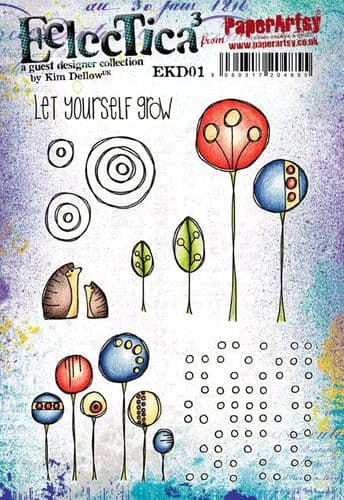
Then I gave the background some grungy attention by adding faint stenciling with Emma Godfrey stencil (PS015) and Fresco Finish Acrylic (Chalk). Some 2nd and 3rd generation stamping in Ranger Archival Ink (Jet Black and Potting Soil) and stamps from Kim Dellow Sets 1 and 5 (EKD01 and EKD05).
Of course the background wouldn't be complete without some nice splatter effect!  Here I used Fresco Finish Acrylic (Gold and Chalk).


I added a frame to my panel using Ranger Archival Ink (Jet Black) before I started to add any of the dimensional elements to my panel to make things a little easier.
 

I created the focal point of the panel by layering up all the elements - I scrunched up the Paperartsy Waxed Kraft Paper flowers to sit under the main flowers - I really love the extra depth, colour and texture this adds to the piece.
 

I added some gold and white pen work to the grunge paste tall leaf - the shadows and highlights this creates makes the 3D effect of the Grunge Paste pop even more.


As well as adding pen work to the Grunge Paste leaf I also added it to the flowers and leaves on the left hand side of the panel - this gives them just that little extra lift and draws the eye in.
 

I felt like this sentiment from Kim Dellow Set 1 (EKD01) was really fitting for this topic - I stamped it using Ranger Archival Ink (Jet Black) onto Paperartsy Smoothy Card and then mounted it onto black card.

 
The flower elements and the Kraft Waxed Paper underneath were all layered up using foam pads to really give this panel dimension.  The leafy elements were glued down with the tips of the leaves left unglued to create a more natural effect.


A few more extra photos of the final, finished product to show how dimensional it is :)


This panel really was such a joy to make!  Flowers are probably my number one images to create with - especially when I'm creating cards or art journal pages.  There is just something about them that draws me in and has done ever since I started crafting years ago.  It was nice to push myself out of my art journal comfort zone and create a panel instead - I would really love to encourage you to try and create something out of your comfort zone too!

Thanks for your company today,
Claire x