Showing posts with label Helen Chilton. Show all posts

Thursday, 30 December 2021

2021: PaperArtsy - A Year in Review {Topics 13 to 15}

  
Hello again from PaperArtsy HQ,

Here we are at our final post for the year. I hope you have enjoyed taking a look back at some of the blog highlights with us. It's amazing the variety of ideas that we have shared over the past year, and of course, we will be back with many more next year too!

As we round off the year, I would just like to offer a heartfelt thanks to all our bloggers, past and present, (and future) ! The projects they create for us, and of course for you, are always absolutely superb, we cannot thank them enough for their attention to detail and willingness to share their tricks, tips and creative secrets with you all.

To our designers who go from strength to strength, you are such a fun team, all so supportive of each other, and an absolute joy to work with! I know you all have your individual quirks, and work differently and that is why you are all so unique! We have missed seeing you all face to face at the trade shows, and look forward to spending time again hopefully in the not too distant future!
 
To our retailers around the world who have pulled out all the stops to offer classes, both online and face to face and who regularly order so that you have access to our brand in all your corners of the world... thank you for your friendship, support, feedback and encouragement, and especially your patience as we have adjusted to life in France and all the new systems we are still coming to grips with!
 
And to the lovely staff here at PA HQ, we thank you too for always picking orders accurately and shipping fast so that people don't have to wait too long for anything! I love how you are always thinking on your feet and make suggestions on how we can all improve and be more efficient. You guys have been so patient as we continue to try to get things set up in the new PAHQ spaces. Oh and also for the fun Friday after-work gin tastings!

To those of you who follow the blog, thank you for all your comments, we appreciate them all, it is so nice to know that there are people out there reading and following along, and that you find this blog a valuable tool and source of crafty inspiration!

So lets talk about today's topics we are remembering! We have picks from Topics 13: Tiny (News) Print, Topic 14:Mash Up (with LPC, EGL, EEV and EAB) and last of all Topic 15: Journaling Gratitude. These have all been beautifully written,and joyful ideas as we have come to the end of the year! Lets take a look back.

Leandra 

Topic 13 : Tiny (News) Print
Text and letters play a crucial part in creation, from titles and describing, to expressing what images cannot, or perhaps to play a role as the visual texture of a piece. Topics linked to writing, typography and letters are recurrent on the PaperArtsy Blog. This time we wanted to put a big focus on tiny letters. Newsprint is the obvious example but encyclopedias, telephone books (now a vintage memory), medication spec sheets or travel guides are also good candidates, as well as lots of stamps! Our bloggers run with the idea, sneaking snippets of text in their backgrounds, putting emotion in their sentiments, or creating embellishments out of printed pages. 

My first pick is this amazing vintage spool book by Jennie Atkinson. As she explains in her original blog post, this was not her initial plan but sometimes you have to go where your muse takes you. Tiny text is everywhere, from quotes to subtle stamping on the fabric. Yes, that text on the fabric looks part of the design but she actually added it to the pre-printed design! I love how all the elements are pulled together by the repeated use of limited colours.


And I hope you didn't miss Lynn Good's bright bouquet, a riot of colour in her art journal.The tiny letters are obvious here, busy filling the background. As Helen also shares in her original blog post, mixing different dictionaries, with a range of fonts, sizes and colours, is a fantastic idea to create easy and interesting backgrounds.The contrast between the subdued text and the vibrant flowers, aided by subtle shadowing, makes for a truly striking piece.


I adored how Jenny Marples took Seth Apter's rather abstract stamps, saw their architectural inspiration and translated it into a completely representative scene, full of texture and depth. The tiny print is quite discrete here, but her original blog post shows in detail how she transformed a text stamp into the stone wall. Genius! A real lesson in how to look at stamps differently and discover the other images hidden within.


Topic 14 : Mash Up with LPC, EGL, EEV and EAB
The end of the year comes near and with it the third and final of our Mash-Up topics. This time the participants are: Lynne Perrella, the original queen of collage, with her intricate characters, Gwen Lafleur, with her intricate and ethnical patterns, Ellen Vargo, with geometrics bold and delicate, and Alison Bomber, with inspiring words. As somewhat expected with this selection, the Lynne Perrella stamps often provided the focal people but it is always amazing to see how differently our bloggers are able to interpret the same stamps. Be it with colour, technique or composition, they beautifully merge together each with their own style.

First up is Alison Bomber with this magnificent wintery piece. I love how she looked past the first most obvious use for Gwen's and Ellen's stamps and translates them into crystals and snowflakes for a very atmospheric set-up. The Ice Queen  and King obviously come forward as the focal point but they are still perfectly integrated. Alison's original blog post explains all her process and is a wealth of inspiration and tricks for subtle texture and details.


Even with an LPC lady as the main image, Etsuko Noguchi truly showcased Ellen's stamps in this wall hanging. I love the association of the ghostly vintage character and the modern colourful background. I feel it really portrays the idea of an old soul lost in the current world. In her original blog post, Etsuko shares her technical inspiration for this piece and details her creation of the masterboard that becomes her background, quite the transformation!


Nikki Acton experimented with vellum and a royal colour palette, gold and purple! How she has used only parts of the stamps is so interesting, revealing new details and creating new combinations. I also love the text peaking through the face: is it a hint of their thoughts? Her original blog post is a fascinating look at how inspiration flows, how sometimes only one little idea drives a project, which then seems to advance almost by itself.


Topic 15 : Journaling Gratitude
The end of the year is approaching fast... This is our last topic! As tradition dictates, it is the time to reflect back on another strange year. Lots of crafters explain how creating helps them express, process and share their feelings, and provides a bit of balance in their life, making things more manageable. In these isolated and anxiety-inducing times, we should not forget the good things and be grateful for the small rays of sunshine or unanticipated joyful moments. We hoped this topic to be an occasion for the community to share tips for journaling, memories of the year and inspiration for positivity.

Autumn Clark made her journal from junk materials and leftovers from the year's projects, a great way of doing her year in review and expressing her hopes for the future. I love her use of the hands and rope, so clever and innovative! In her original blog post, she shares all her inspiration and tricks for this journal, as well as two other finished spreads. Her gel printed backgrounds are full of interest, making the pages easier to fill, battling blank-page anxiety. 


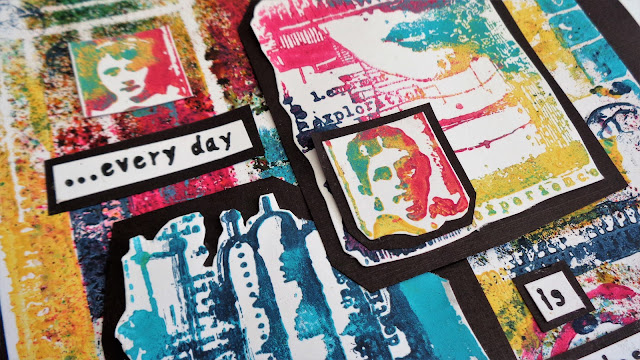
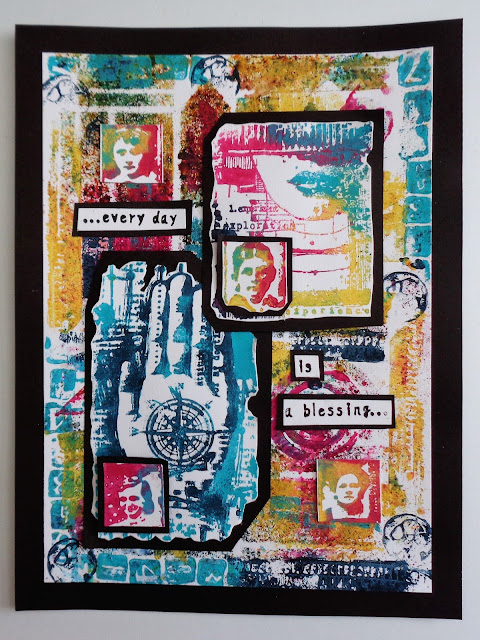
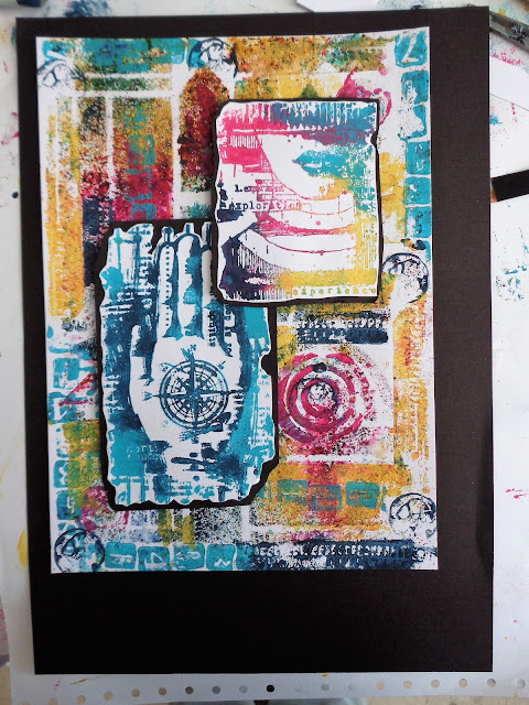
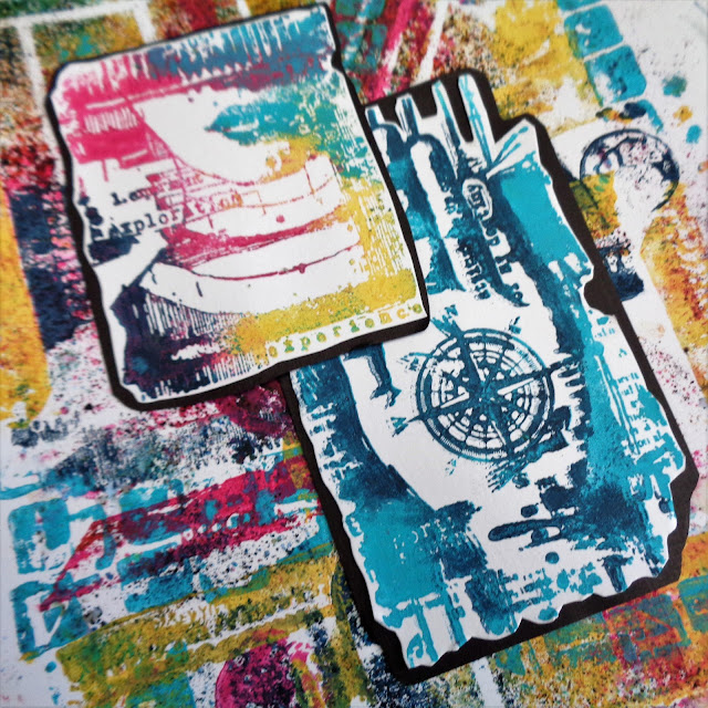
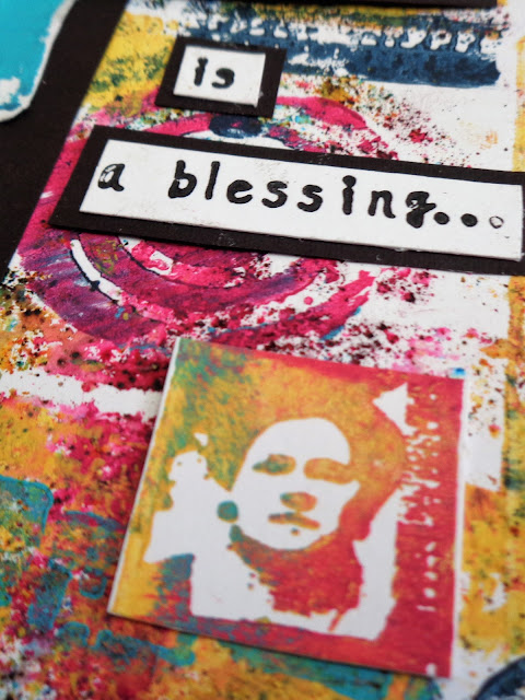
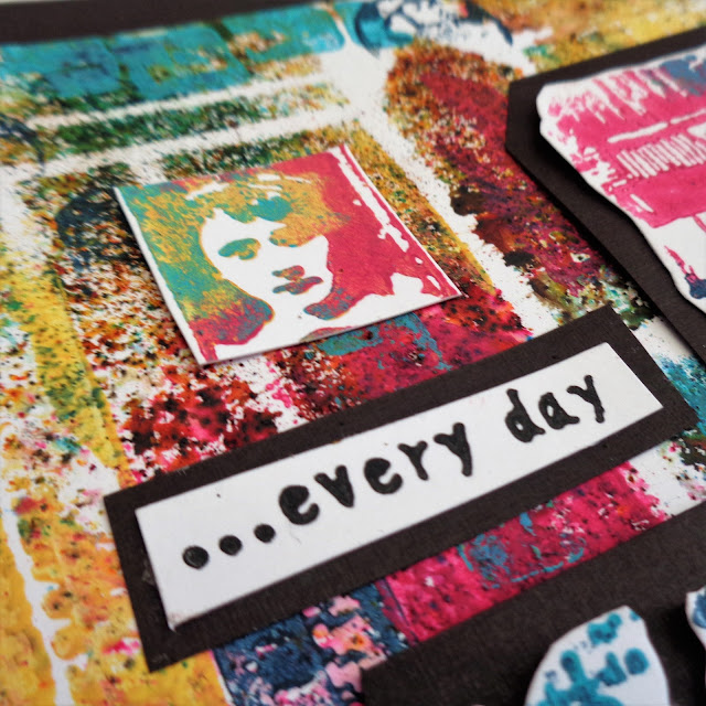
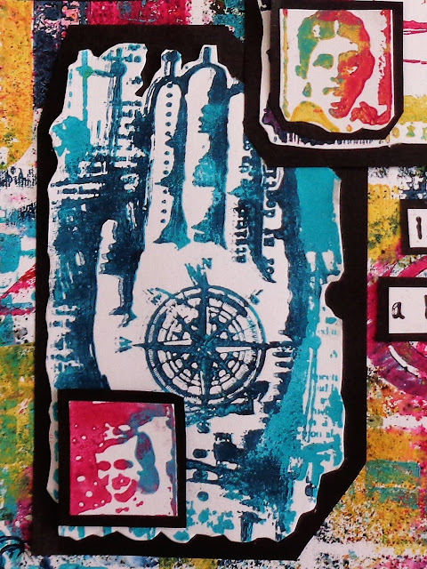
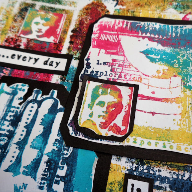
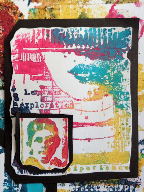
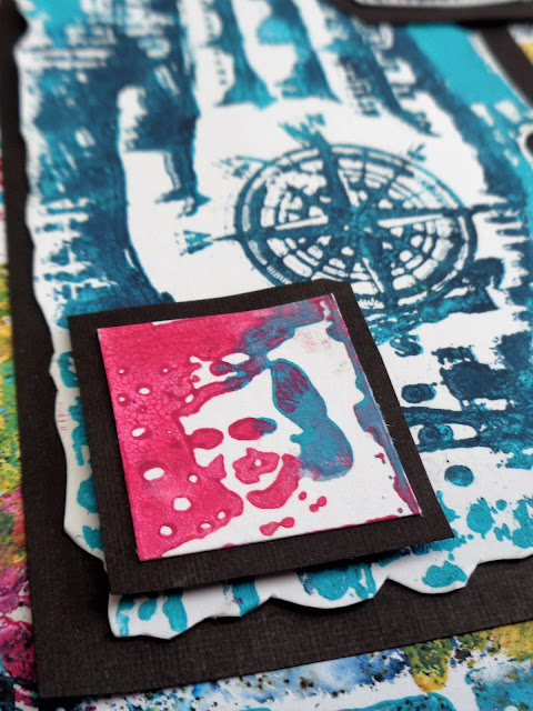
She might not be a regular journaler but Helen Chilton still wanted to celebrate positivity and did so in a heartwarming riot of colours and texture. The mix of Infusions and paints create so much variation and surprise combinations. I love how the colours swirl and mix within the images, revealing details and creating depth. Helen's techniques and process, detailed in her original blog post, are very intuitive and playful and could absolutely used in a journal.


Keren Baker focused on future gratitude and made this journal to practice thinking positively in the new year. What a great idea! She also ventured out of her comfort zone to try and paint a marble effect. Her experiment is wonderfully documented in her original blog post and the result is incredibly accurate! I love how it contrasts with the main colour of pinkish-red, which also makes an appearance on the inside pages for a soft cohesive look.

Thank you for joining us again today.

In 2022 we are adding a handful of newbies to the team, something we have not done for a few years, so we are very excited to be sharing with you who they are over the next week or so on our instagram @paperartsy . Wishing you a restful holiday season, and here's to 2022 being a key turning point for us all. Warm wishes to you all

 Leandra and the team at PaperArtsy 

Tuesday, 28 December 2021

2021: PaperArtsy - A Year in Review {Topics 7 to 9}

Hello again from PaperArtsy HQ,

We hope you are enjoying your daily walk down memory lane to see highlights from the PaperArtsy blog of 2021.

Dounia has selected another series of stunning ideas to share with you today, so sit back, relax and enjoy this review

Today we're sharing picks from Topics 7:Mash Up {with JoFY, Emma Godfrey, Sara Naumann and Ink & the Dog Minis}, Topic 8: Nature's Treasure and Topic 9:Baubles and Bling.

Leandra 

Topic 7 : Mash Up with JoFY, EEG, ESN and I&D Minis
Already half a year had gone by and it was time for our second Mash Up topic! Again we tried to propose a mix of designers/ collections that would bring both focal and background stamps, big and small patterns, open and detailed textures. This time our bloggers combined JoFY's bold florals, Emma Godfrey's funky geometrics, Sara Naumann's layered collages and Ink & the Dog Minis' vintage imagery. They approached this challenge each in their own way and it is so interesting to compare which aspect of the collections each of them focused on, for quite varied, wonderful and, sometimes, unexpected results.

My first pick is this beautiful journal cover by Ellie Knol. I love the contrast she was able to create with a very limited colour palette and no black or any truly dark colour. Her original blog post details her extensive use of stencils and Grunge Paste to achieve the gorgeous background texture. The patterns overlap and meld together to really unify the piece and highlight the focal JoFY butterfly (not a flower!).


Lynn Good went for bright and bold, and JoFY flowers. The stenciled background brings a vibrant jungle vibe, perfect to showcase the warm blooms. How great are the bird focals? They are starkly different from the rest of the piece, both in colour and style, but Lynn cleverly integrated them using the black border stamping. Her original blog post details the twists and turns of this project, a good example of how to adapt when your crafting does what it wants!


Thinking out of the box and going out of her comfort zone, Keren Baker was inspired by Sara's seashells to make this vintage art doll. I love how she diverted lots of the elements from their obvious use. The lovely textures of the dress and the wings really gives a 3D effect and makes the doll stand out. Be sure to go to Keren's original blog post to appreciate all the small details, like the cog heart in the frame or the stamping on the face.


Topic 8 : Nature's Treasure

In the middle of summer, this topic aimed to celebrate nature, her beauty and all the materials and inspiration she offers in crafting. The PaperArtsy collections are certainly full of leaves, seeds, flowers and other natural curiosities and our bloggers did not hesitate in showcasing their favorites. It was also an occasion to reflect on how those organic patterns we have internalized from contact with nature can emerge when crafting, or meld with more 'man-made' imagery. Finally, nature also offers us more physical gifts like leaves, twigs or barks, gorgeous and unique, that we can integrate in our art or use as tools.

Blue might not be the first colour that comes to mind in a topic about nature but Nikki Acton really pulled off the monochrome look in this gorgeous card. The tiled format allows her to display lots of Lin Brown's 'printed leaves', sparing her having to choose, as she explains in her original blog post. Using a different hue of blue for the quote and main leaf is a genius idea: it makes them pop from the background, while the subtle stamped dots anchor them.


Amanda Pink proved that natural textures and patterns can bloom even from abstract stamps like Seth Apter's. I am impressed how well she married grungy, industrial elements and vegetation inspiration. Her original blog post details how she achieved the fantastic texture of the background, reminiscent of bark. Watching the piece transform along the multiple steps of the process is mesmerizing! 


In her project, Dounia Large chose to use Nature's Treasures as tools and materials rather than images. Her not-a-book is lined and decorated with dyed cork. For the cover, she experimented with pressing leaves into the paper and revealing the patterns with Infusions. A delicate look with easily obtained materials! Go to her original blog post to discover the process and see all the details!


Topic 9 : Baubles and Bling

It's Christmas in August! This year, we tried to be good and propose inspiration well in advance of the Holiday season. Our bloggers ended spending the summer in tinsel, I am sure they are thanking us... This topic is a fun one, sure to appeal of the magpie inside all of us! Time to bring the glitter, tinsel and foil out of hiding place and indulge in all things shiny. We thought these elements would pair great with baubles: tiny versatile canvas where sparkles are not only acceptable but expected! Our bloggers did not hesitate to play with size, shape and texture for a wide range of cheerful atmospheres.

She might have chosen an usual colour palette, but Helen Chilton surely brought the baubles and the bling! She certainly understood the assignment! I love how the warm colours pop against the silver. In her original blog post, you can see all the little touches she added for cohesion and maximum sparkle! She also shares her foiling technique. I particularly like how it highlights the texture of her Grunge Paste stenciling, so interesting. 


PaperArtsy designer Tracy Scott came out to play, not surprising as this topic seemed to be made for her! She certainly loves a bit of bling. Her original blog post details all the layers that went into this gorgeous piece. I love her bokeh lights effect, both simple and effective, it is such a great idea. It creating a wonderful depth in the background and helps the baubles stand out and shine (figuratively and literally)!


In New Zealand, it was actually winter for Tracy Springer, which did not stop her project from being bright and warm, but with a fur coat touch!  Her baubles are fuzzy and her doggies are cheeky in this lovely series of cards and their holder. I love her colour palette, not classic but still close enough to 'feel' Christmassy. Go to her original blog post to meet all these cute critters in all their bling out glory. Get your sparkle out indeed!

 
Hang in there, as the review continues for another couple of days more, see you same time tomorrow!

Leandra
  

Sunday, 26 December 2021

2021: PaperArtsy - A Year in Review {Topics 1 to 3}


Hello from PaperArtsy HQ,

At this time of the year, we take a look back at some highlights of the 2021, and the amazing projects our bloggers have shared with you. 

I guess we could all agree that 2021 has be a year of living life a lot more 'virtually' than we normally do. Systems are more automated, education and online classes have become more accessible to us all. Did you learn something new this year? Did you achieve a personal goal, or tick something off the bucket list? 
 
It has been a tricky year for many of us. Less travel, less contact with loved ones, and a lot less hugging and physical contact! Were you challenged in ways you least expected? I guess all these things help us appreciate what we do have, as well as those we have lost, or things we can no longer do so easily. no one thought it would all go on this long, yet here we are. It is amazing how resilient we can be when we have no choice.

I suggest you grab a mug of something hot, some leftover food from yesterday, no doubt we all have some of that, and settle in for the first of a few days of review posts.

Today we are sharing my picks from Topics 1: Stamp Mash-Up {France Paipllon, Courtney Franich, Seth Apter and Ink & the Dog},  Topic 2: A Pocketful of... and Topic 3: The Creative Laboratory.
 
A big thanks to Dounia for curating these posts.

~ Leandra 

Topic 1: Mash Up {FP, ECF, ESA and I&D}
We started the new year with a new concept: stamp mash-ups... Lots of us often mix designers when creating, but this time, we are doing it on purpose! We tried to select distinct and different styles that we could see working together, from France Papillon's clean details, Courtney Franich's collaged textures, Ink & the Dog's vintage layers and Seth Apter's grungy abstracts. This topic is all about looking at those stamps (and stencils) to find out how they might interact differently, and maybe stepping a little outside of the comfort zone of your usual style to have some experimental fun!

My first pick is this amazing project by Nikki Acton which I feel really represents the mash-up concept on one small tag. Each collection is recognizable and has a place to shine, while still creating a cohesive whole. Playing on geometry, Seth's circles work really well with the I&D clock, despite being pretty much opposite styles. Nikki's explanation of her process is also an enlightening read, give it a go (link to original blog post)!


And I hope you didn't miss Corrie Herriman's very mad project (her words...). A true undertaking! On striking, striped backgrounds, the stamps coordinate beautifully, helped by the consistent use of the same background stamps and the careful choice of focal images. The recurring pointy hats really emphasize the fun vintage circus vibe. Corrie's attention to detail is amazing, so check the original blog post to see all sides of this gravity-defying project.


Now for something truly out of the box ... Keren Baker decided to paint a violin (and not for the first time either)! This is truly a study in layers, from the subtly crackled 'sky', to the transparent leaves and the number-stenciling across the focal images. The limited colour palette really makes the stamped images stand out and the pink really 'pops'. Be sure to go to the original blog post for more detail pictures of this project, as it is difficult to do the post justice with just one image.


Topic 2: A Pocketful of...

This topic was originally inspired by pocket journaling. It is quite a long-serving trend and several of our designers enjoy bullet journalling, or mini journals and have created stamps perfect for this theme. However we purposefully left the topic vague enough that other interpretations could be explored, from actual fabric pockets to a 'pocket of time'. Our idea was mainly to explore the relationship between the outside and the inside, the exposed and the secret. Our bloggers were sometime a bit mystified by this title but rallied quickly with wonderful ideas on how to squirrel secrets into pockets of all sizes.

Carol Fox obviously got the pocket journal inspiration for gorgeous tag book in sunset colours. Sara Naumann is a fan of journaling and pockets herself, making her stamps perfect for this type of project. Carol's balancing of warm and cool colours is masterful. Her careful layering of stencils and stamps results in backgrounds soft enough for her to record her vacation, yet striking enough to add and complement her photographs too. (original blog post)


Now, pockets do not have to hold cards or pictures, for Leandra Franich they can also hold... paper artdolls. Frankly I suspect Leandra really wanted to make the dolls and then made her pocket dollhouse to fit the topic. Art dolls and Lynne Perrella stamps is a concept that goes hand-in-hand from years ago, in fact most of what Lynne designs are a form of Art doll, but earlier this year it became a bit of an Instagram craze thanks to Meghan Whisner-Quinlan. With Leandra's make, we can still appreciate how transparent layers create both softness and complexity, while the recurring use of script in different forms allow the girls to link to each other while each has her own personality. Check the original blog post to meet them!


And now for a pocket party! Helen Chilton took Zinski Art's new Alpacas & Llamas collection and ran away with it. These stamp are made for bold and bright colours and this bunch seems to be having all the fun! The black and white phrases contrast beautifully with the pocket designs for maximum impact. This is actually an altered book and Helen describes the technique in detail in her original blog post.

 
Topic 3 : The Creative Laboratory

Another one of those open-to-interpretation topics... Aren't we creative each time we craft? So, let's bring some science in our creativity! This was an invitation to play around with scientific imagery but also to experiment. Maybe it is the occasion to try a new product or to attempt a unusual technique, to compare brands or contrast processes to get just the result you want, and maybe discover other things you like along the way. Of course, like our precise bloggers, you need to write your experiments down, that's what makes it science! 

First up, Jenny Marples played with clean colours and the science-inspired 2021 Hot Picks release for this striking pocket book. It is a gorgeous example of layering and balance of colour, as well as a great use of white as a contrast. This booklet is also filled with everything a little chemist might need, so do not hesitate to check Jenny's original blog post for more pictures.


Autumn Clark went with the 'experiment-and-discover' interpretation of the topic. You might call it a happy accident process! Following the scientific method, she theorised that the resist effect of Vaseline against paint could be applied to Infusions, then proceeded to very thoroughly prove her hypothesis with extensive experimentation, with amazing results! Truly a must try on your next 'lab' day, so go over to her original blog post to learn all the details.


I loved how Miriam Grazier reflected on the topic and built this 3D piece referencing school experiments. It melds science and craft beautifully, with the France Papillon DNA image and the magnifying glass along side the detailed shrunk animals and layered background. Miriam, like a scientist, also thinks beyond the obvious and employs ingenious upcycling. Her original blog post is an insight into her creative process, with its twists and turns and flashes of inspiration.


It is fun to look back on what our genius bloggers have shared with us over the course of a year. This year seems to have zapped by in a blink, but at least the blog remains the perfect reference tool.
 
Don't forget to save the posts that float your boat on pinterest. No excuse now, you'll hit the New Year with a dozen ideas to crack on with!

Leandra 

Tuesday, 7 December 2021

2021 Topic 15: Journaling Gratitude with EEA {by Helen Chilton}

2021 Topic 15: Journaling Gratitude


Infusions properties are the very epitome of surprise, and you can feel Helen's excitement as colours come to life in unexpected ways. She's managed colour so superbly and her page sings with life and vibrancy with the perfect thankful quote. ~ Keren

This is Helen's last post for PaperArtsy. She has been with us for many, many years as a long-serving blogger, amazing brand-supporter and teacher in stores with our products. We can't thank her enough for her wonderful loyalty and absolutely enthralling experimental posts, which I am sure you will all have enjoyed. Lynne Perrella stamps and a lot of our original Ink and the Dog have always been among her favourites, but we have always appreciated how versatile she is across all the PaperArtsy collections. She has been an absolute joy, a riot of colour and we thank her with all our hearts. xx ~ Leandra & Mark

Hi everyone, it's Helen with you today, and I'm here to share with you a project on the theme of journaling gratitude. 
I thought long and hard about this as I don't really 'journal' as such. In the end I decided on the products I wanted to use and thought I'd see where it took me!
My original thought was that I'd cut up the stencilled page into journaling cards but I liked it as a whole so much I couldn't bear to do that. Looking at the Everything Art stamps, I realized the pattern ones would fit really well onto the stencil design, so that was it, I was off!


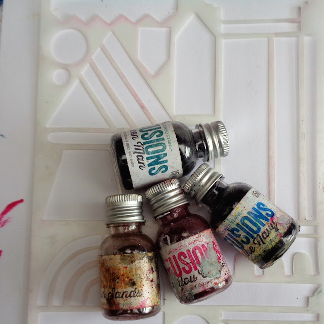
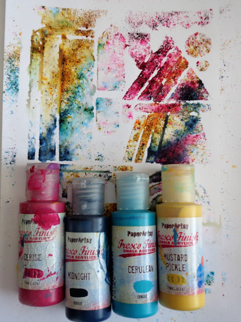
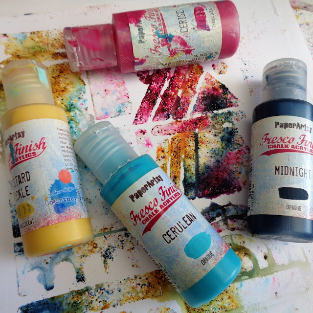
Out came my Infusions - Are You Cerise, Green Man, Golden Sands and In the Navy -  and one of Tracy Scott's latest stencils.


You can see they're well used and last for ages.


Here are the Infusions:


You can see Tracy's stencil - PS279 - in action on this blog post. List of stockists also available here.

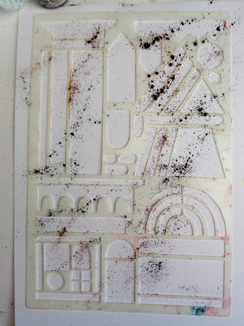
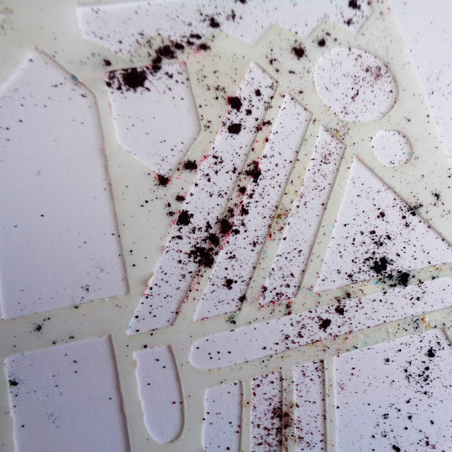
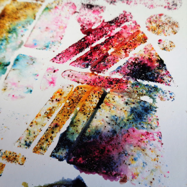
I've sprinkled the powders randomly.


Just go over the top of the stencil.


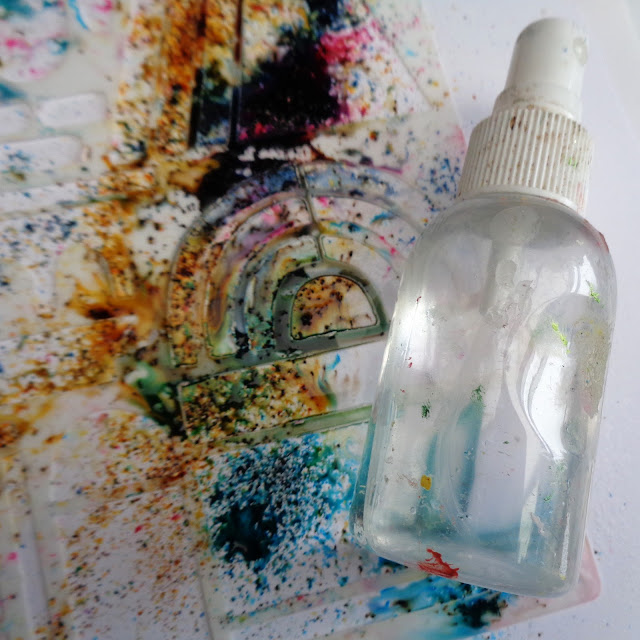
Then spritz!


How much water you add is up to you.


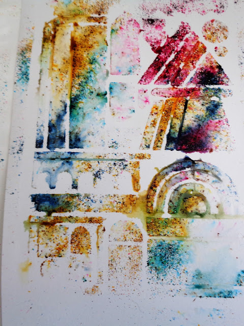
I blotted mine with kitchen paper as I wanted to keep the colours bright.


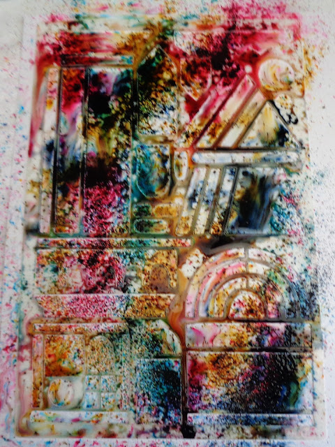
The colours are gorgeous.


It was at this point that I looked at my stamps, particularly this set. The shape of the designs fit really well onto the stencil pattern.


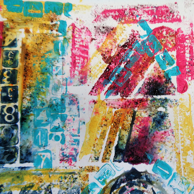
I wanted to stamp in Frescos so chose coordinating colours.


I started with colour on colour over the Infusions...


...and then added contrasting colour on top and also moved into the white spaces.


Then I looked at my other stamp sets.


I was thinking of stamping the main images in black, but decided to use the paints again, applying with a cheap, cut up sponge. By using a stamping platform, I could stamp a bit at a time and add details as I went along.


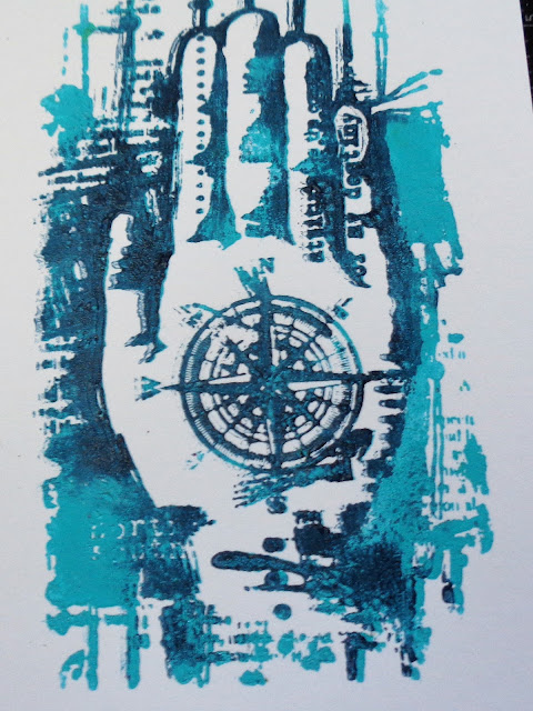
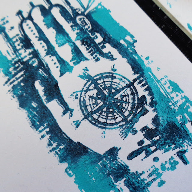
You can see I've added darker blue round the fingers to emphasize the shape.


All the images stamped really well, the paint picking up the smallest details.


You can mix colours as you go and also apply colour over colour.


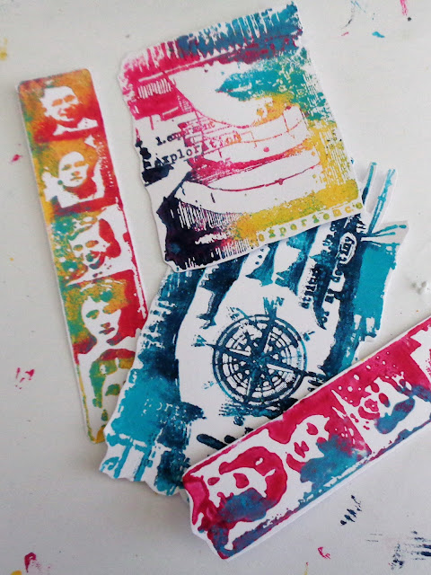
When I started to layer it all up, I felt it needed the contrast of the black behind it to make it pop. Otherwise the images got a bit lost.


I followed the contours of the image rather than a straight edged black mat.


The text is from one of Lin Brown's stamp sets ELB22 - it just seemed to fit.


This is also stamped in paint.


I've added some of the tiny portraits to finish it off. 


I liked the look of everything overlapping slightly.


Infusions are always exciting to use as you never quite know what you're going to get. I made up several stencilled images, including one with Grunge Paste, as I wasn't sure which way to go. I could have taken the background one step further by spritzing again once I'd added the painted stamped images - I chickened out as I didn't want to ruin it, but might try it with one of the spare pieces.
I was pleased that this turned out to be bright and cheerful as you know how I like my bright colours! If you want a more vintage look, just let the Infusions 'cure' for longer.

This is going to be my last PaperArtsy Blog post as I think it's time to step aside and let those who are more media savvy than I am take over! I have loved working with Leandra, Mark and all the team and will be following closely to see what other fantastic products and designs they come up with. Many, many thanks to you all.