Showing posts with label 2022 Year in Review. Show all posts

Thursday, 22 December 2022

2022: PaperArtsy - A Year in Review {Topics 13 to 16}

Hello from PaperArtsy HQ,

Well this is is the final wrap up of selected highlights from the 2022 PaperArtsy Blog. One of the highlights for me personally has been the series of colour topics we inserted into this year's blog program. I love helping people understand the WHY of anything to do with crafting. 

When we exhibited at shows, it was really common for people to need help choosing paint colours, and I realised that many of us struggle to decide what to use, how and why, and certainly the colour wheel seemed an elusive concept to many! We did not study this in a deep theoretical manner (as that is too boring for me) instead, we encourage bloggers to make some interesting colour wheels, and then choose the resulting colours as prompted by the topic. If you have not downloaded our printable colour wheel from the first of this series, then you should! And you should head back to look at the intro posts for each of the colour topics - they are very informative. Yes, it's not over yet, we have more planned for 2023 already!

A reminder 
Topic 1: Opposites Attract
Topic 8: Split Complementary
Topic 14: Triadic Colours 
All these links can also be found from our linktree here as can the colour wheel

Today Dounia has her picks for you from Topic 13: Fabric, Topic 14:Triads, Topic 15: Paper, Seeds, Twigs and Topic 16: Splosh.
 
Get ready for a twigs, puddles, threads and colour!!

Leandra


Here is a nice straightforward topic title! Ribbons and threads are already part of the base material for paper and mixed media crafters, not to mention those of us who also practice needle crafts or quilting and love to reuse fabric scraps in our projects. In this topic, we wanted to explore further the interchangeability between fabric and paper.

First think of fabric as a replacement for paper. Think of how you’d use paper normally – matting, journal pages etc, and substitute fibre-based products: lace instead of washi tape, calico instead of cardstock, image transfer instead of a photograph. How can you reinterpret paper using a woven or knitted substance? Fold fabric cleverly, slash it, use it to frame your focal image. Try stiffening fabric, embossing it, heat embossing it. The flip side is to use techniques traditionally reserved for fabric on paper. Adding stitching is a staple but what about dying? They are hundreds of reserve techniques around the world that could be adapted to paper. You could try pleating, braiding, weaving, layering, a whole world of possibilities! Head over to Keren's intro post for even more inspiring ideas.

First, Etsuko Noguchi worked fabric into her materials and her final object: she experimented with rusting fabric for this dainty and vintage needle book. I love how the rust rust spreads to to create a colouring effect while still keeping most of the intricate details of the stamp! Check her original blog post for a step by step of her technique and a look at the inside pages!


Jenny Marples shared with us her process to make journal mixing paper and fabric, for flexibility, and sturdiness, practicality and beauty! Funnily enough, the paper is stitched and embroidered and the fabric is glued! Go to her original blog post to admire her Venice and Shakespeare inspired pages and to follow her simple how-to. Her simple steps can very easily be adapted to your favorite style or colour palette, for a striking result!


Floss Nicholls rose to the challenge and adapted fabric slashing and reverse appliqué techniques, mixing paper and fabric for this removable notebook cover.  I love the texture of the finished project, and the subtle play between the reds and oranges, contrasting with the natural fabric. Go to her original blog post, it has everything: inspiration, experimentation and instructions, gel printing, stamping and stitching but also an example of the terrible dangers of crafting...


Liesbeth Fidder de Vos certainly covered all options to create a one of a kind, handmade paper fabric! It only involves classic stamping and painting techniques and results in a beautiful, sturdy and versatile sheet ready to be cut up for card, covers and other stitchy projects! I love how intuitive and organic her process is, mixing vintage imagery and bright colours. Her original blog post details of the step for a fun play time, easily duplicable, so do not hesitate to try it.


In round 3 of our colour wheel play, the focus is on another 3-colours scheme, called a triad. This time, you use 3 colours evenly spaced on the wheel. Those colours can distant of 3 wedges, 2 wedges or 1 wedge for 3 different atmospheres.

3 wedges apart                                 2 wedges apart                                 1 wedge apart

The most classic triad, where the colours are separated by 3 wedges, offers 4 possible combinations in a wheel: the 3 primaries, the 3 secondaries and 2 trios of tertiary colours. Those are very balanced schemes, with lots of clean colours contrast. When reducing the spacing to 2 wedges, you end up with two opposites and  a third colour balancing both. It is an easy way to soften and complexify the classic complementary contrast. Finally, with only 1 wedge between your colours, contrast is greatly reduced: you are basically ignoring half of your wheel! You can however play with layering similar tones and harmony is generally easier to achieve. For more details and lots of great examples of triads in art, go to Keren's intro post!

First up is Amanda Pink with a 3 wedges apart scheme. She used quite unusual starting colours for her wheel, which we love to see! The choice of a very dark blue against a soft yellow and pink creates gorgeous mid-tones with lots of different intensities.I love how well her project really showcases her chosen colours. Her blog post is also a great exploration of triads as she tried, and presents, all the possibles combinations from her wheel!


Nikki Acton chose a triad 2 wedges apart on her wheel. The dark wine and rustic orange are both on the warm side of this wheel with the cooler clean grass on the cold side of the wheel making for an original version of the red and green Christmas combo, perfect for her set of cards. Her original blog post helpfully describes her colour journey, and how she  avoids mud while gel printing with complementary colours.


For this grungy layered card, Kate Yetter uses a 1 wedge apart triad all made of tertiary colours. It is a bit crazy seeing the difference between the  bright blue pink and yellow start-colours for the wheel against the finished wheel and the final chosen tones, subtle and soft for some! This truly demonstrates the power, versatility and potential of colour mixing and making your own wheels. Also, despite being close-to-each-other colours, that purple really pops against the warm tones. Check Kate's original blog for a better look at all her yummy layers!


Continuing our exploration of sustainable crafting, we wanted in this topic to focus on both recycling and scavenging, but the direction was to use naturally foraged materials from your local area.

We are start gently with paper as the first element. I'm pretty sure we all keep and reuse bits of paper, old book pages or magazine images but what about unusual sources of recycled paper: bills, maps, or wrapping paper? Also the techniques for reusing paper are infinite: handmade paper to start but so much more! The second element we wanted to involve was natural resources and treasures: shapely leaves, delicate seeds, bold twigs… Do not see them just as embellishments! Cork or bark can be great substrates. You can weave straw or curl up leaves for texture. Unusual stalks and seeks can be one of a kind marking tools, stamps or resists. Check Keren's intro post for even more ideas and eye-candy. Our bloggers certainly did not lack inspiration, let's have a look!

Claudia Neubacher chose to celebrate nature treasures to the fullest with this beautiful autumnal display full of interesting pods and leaves (it sits under a domed glass cloche but is also lovely without the covering). Go to her original blog post to see how she personalised each part of this careful composition. I love how natural and stamped elements harmonise and play off of each other. Also those pops of turquoise really bring some zing and fun, catching the eye and creating breaks in the whole.


Etsuko Noguchi went full-on for this epic post, with not only a series of beautiful tags but also a intricately layered shadow box. For her, leaves and other natural materials were tools and pattern makers as she did an incredible series of ecoprints to use as base for her projects. Her original blog post helpfully details the process and her experimentation. I am impressed with how seamlessly she managed to colour match the different layers and blend her prints with stamped elements.


Autumn Clark also used leaves for pattern making but with a gel plate and paint to make a beautiful series of textures and layered backgrounds for her cards. Her original blog post contains a little video tutorial of this process (and some additional quick wooden tree ornaments)! She chose to pair them with some Sara Naumann botanical and birds, boldly embossed in gold. Those really make a statement! I love how the backgrounds and focals dialog with each other, playing with similar imagery but very different techniques.


Ellie was inspired by the topic to mix paper and twigs in a booking binding adventure. Her original blog post is a great example of how inspiration strikes in unexpected ways and projects evolve organically, sometimes to come back full circle to your original idea! Even if Ellie herself is not convinced, I love her subtle tones and textures, elevated by rusted metal elements. Her trick of scanning and printing her own work to have matching backgrounds is genius!


Already the last of topic of the year! We chose a open and fun one for a splashy finish...

This topic was all about fluid media and the fun ways to apply them. Ink sploshes, paint splats, colour washes, droplet lifts, spray textures, runaway drips. Our designers have numerous stamps and stencils mimicking ink splatters, coffee rings or paint puddles but you can of course make your own!  Let's have fun with inks, infusions, paints, watercolours, sprays … Sploshing media and tools available nowadays are quite varied: what is your favourite one? Have you tried the less classic ones techniques like bleaching, spinning or pouring? And after a messy, drippy play session, how do you mix your free flowing results with your more classic favourite papercraft? Keren's intro post has quite a few answers, and check our bloggers amazing projects:

My first pick comes from Amanda Pink. Amanda's love of pattern and bold contrasts is always evident in her crafty style, and for this post she surprised us all with the most wonderful 'spinning tool' she found. It's a kids turntable toy that zooms in circles fast to push the paint from the centre outwards. The spinning fun was clearly pretty addictive!  Check her original blog post


Floss Nicholls was all about the sploshed spots, but she also stumbled across a new technique in this post that had us transfixed. After a mammoth background-making session, she figured that the sweet-spot was to let sploshy infusions pool inside a stencil to dry (assisted gently by a heat tool a little). The result was some intense contrasts further enhanced by gesso resists. This seemed to work so well with circles and dark colours, but she made many other incredible prints along the way. Hop over to her original blog post to read about the process in depth.


Martha Ponsanesi's project was a fusion of recycled pages into a junk journal enhanced by Lynne Perrella imagery. As is the wont of our bloggers, she explored a variety of techniques, mostly with Alcohol inks on her gel-plates, some of which were lifted off with Fresco paint; almost like trapped sploshes. Colour was dripped, puffed, blotted and dribbled. One fabulous tip she suggested was to use satin glaze over these prints before stamping (PaperArtsy glazes are such a good surface to stamp on), and ohh the translucent vellums were stunning too!  You may just want to hop on over to the original blog post here!


Riikka Kovasin earlier in the year shared how to get the perfect swipe, and in this post she found how to make the perfect splosh. She goes on to add more colour and infusions layers with the splosh becoming the bright spot for her focal point. She works with the newest Scrapcosy release and shows how to pull together a fast and easy idea into the most stunning cards. I think this technique is perfect for those last minute Christmas cards .... or get in early for 2023! Here is the link to her blog post


Well, wasn't that a fabulous round off for the year! A huge thanks to our bloggers, designers, and of course the crew at PAHQ who do their best to ship fast and beautifully well packaged orders to shops and customers around the world!

If you want to stay in touch with PaperArtsy, sign up for the NEW PaperArtsy newsletter here . Historically, we are notoriously irregular at emailing customers, so the first PA New Year's resolution is to be better at monthly updates! 
While you are figuring out how best to stay in touch with us, (you won't want to miss out on the packed plan for the blog for 2023. Head on over to join our Facebook Community PaperArtsy People, or our Facebook page PaperArtsy

From all of us here at PaperArtsy, we wish you the very merriest of Christmases, Season's Greetings, enjoyable family fun and festivities and all the while may you be joyful and jolly! And a Happy New Year too! 

Warm wishes to you all

Mark, Leandra, Dounia, Ella, Millie & Hugo 

Wednesday, 21 December 2022

2022: PaperArtsy - A Year in Review {Topics 9 to 12}

Hello from PaperArtsy HQ,

How has 2022 been for you? We hope that you have found more time to be with friends and family than last year! Here at PA HQ there have been many comings and goings with people finally able to leave New Zealand after the border was closed for so long! So we have had quite a number of family and close friends come our way this year from NZ. It has been a revolving door from March to October, and as this was the first 'proper' summer here since we arrived in France, it has been awesome to enjoy many new experiences that we did not realise were 'normal' for the summer months. Days in the pool and every-meal eating outdoors in cool spots (or less hot ones). So many visits to scenic spots, kayaking on the Dordogne River, local food and 'line' dancing in the local village one the sun has set, plus many trips to picturesque villages nearby. It is a country full of the joy of celebrating regional differences, and we have thoroughly loved the chance to share the little things we are learning that are special to this region with others here on holiday. Still pinching ourselves about the location we find ourselves in, we were only looking for a property to suit  business functionality, but we daily celebrate how close we are to Bordeaux, Bergerac, Lalinde and Couze et Saint-Front, making it easy to enjoy daily bread from the village to city life and shoipping,  or wine tastings at local chateaux; we are so close to it all. 

One of the things I have missed a lot about England is designers and friends just dropping into PAHQ. We do have neighbours and friends constantly dropping in here, but I do miss Tracy and Jo who were our most frequent visitors, as they both lived not too far from us, and often popped into the 'vortex' as Jo would call it - that place where time weirdly evaporates when you come over to pick up or drop off something, and inadvertently find yourself becoming a helpful elf!

Today Dounia is sharing her picks from Topic 9: Leftovers, Topic 10: Up My Street, Topic 11: Mash up with Tracy, Nicci and Scrapcosy and Topic 12: Minimalism. 

Take your time to enjoy today's round up, there is so much goodness to remember from the incredible blog team this year. They really come up with so many beautiful ideas, and I hope you get a moment to take a look at their wonderful creativity, it is so inspirational!!

Leandra 


Keeping up with or focus on sustainability in crafting, we are this time focusing on all the little treasures created as a by product of creating!

You know what I am talking about. Even the most frugal and organised of us end up with scraps of papers, pieces of pictures and hints of die cuts that did not find a place in the finished project. But we can't throw them away, they are so pretty and could be useful later! Well, later is now. Time to bring out all your bags and boxes of carefully preserved pieces and have a play session. Keren's intro post gives lots of ideas for using tiny bits and bobs, and not just paper, textile, clay and paint also make an appearance! Our bloggers then rose to the challenge beautifully, sharing their treasure chests and combining them in creative ways. I don't know about you but I must admit seeing other people piles of leftovers also assuaged my guilty conscience about my own hoarding tendencies!

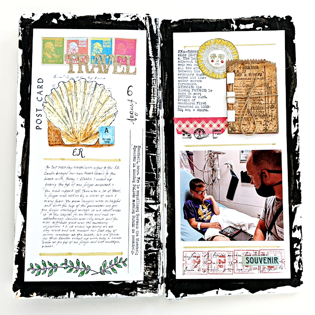
My first pick is striking summer journal by Kate Yetter. She went full on sustainability, even the base is recycled from lunch and gift bags! How impactful is that bold and texture black edge? I love how it grabs your attention and contrast with the detailed and colourful layouts. Be sure to check her original blog post for an insight into her process, quite different from her usual style, and for a look at all the varied pages.


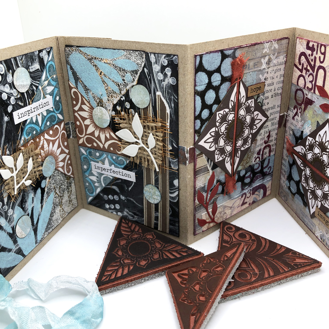
Nikki Acton chose to collage her leftovers on a little concertina book. Her original blog post is full of tips to make the mix of papers and textures look like a cohesive whole. More than just colour consistency and a focus on triangles, she also consistently used the same stencil and stamp set through the project! I love how she manages to make the pages obvious pairs that have their own story but also work all together.

Claudia Neubacher went 3D for her own project with this grungy home decor panel. In her original blog post, you can see it develop organically, with a few of the fails, twist and turns we all experience when creating. She also shares her beautiful collection of bits and bobs in their pretty containers! This piece is so dimensional with its clay stamping. I particularly like the tiny bottle: it is a vase of feathers but also evocates a soft brush!


What can we say about where we live? And what does it says about us? This topic revolves around the notion a home, of community but also the beauty of architecture.

To start you off, Keren's intro post is a beautiful poetic reflection of what make a neighborhood, a street, a house, a home, interspersed with inspiring pictures.

Autumn Clark took advantage of the numerous house, door and window stamps in the PaperArtsy collection for this colourful cascade book. I am always impressed by her talent at making work together colours that you would not think of mixing! Check her blog post for a better look at her rich and rustic palette and her fun gel printing session. It is also a great example of how sometimes art speaks to you, as she ended filling the book with photos of her hometown.


This topic was made for Jenny Marples, who regularly wows us with her architecturally inspired creations. Her pages are always impressive and this lot does not disappoint. This time she mixed classic stonework with Kim Dellow's retro pop designs for a surprising and whimsical look. I love how she married her realistic drawings with the abstract stamps and stencils, and made it look achievable. Go to her original blog post for two other wonderful pages!


Renata Peley also mixed hand drawn buildings and stamps but her result is completely different and totally striking! Her original blog explains the set backs she faced, as sometimes you first idea just does not work, but she regrouped and managed to achieve her vision! I love her use of colours, the contrast between washes and bright pop for great dimension. Her attention to details, with the stamped antennas and doodled cables, also bring this project to, another level.


Dounia Large put together a life map retracing all the places in France she has lived in and illustrating some them with Kay Carley's little houses stamps. Her original blog post beautifully shows the architectural diversity of her home country and explains her choices and inspiration. It is also a great example of how you can personalised stamp to suit different styles: from winter chalets to timbered medieval houses to 19th century buildings!


Back with another mash-up topic! Once again we tried to put together 3 universes full of fun and possibilities, backgrounds and focal images, stamps and stencils. See Keren's intro post for more visuals on our 3 designers.

While Tracy Scott might say her style is that she always changes styles, her stamps and stencils are definitely identifiable, with bold flowers, intricate mandalas and inventive pieces for pattern play. Raquel Burillo, AKA Scrapcosy, is all about vintage, mixing versatile elements like frames and labels with beautiful hand drawn fauna and flora. Nicci Battilana is the newest PaperArtsy designer, bringing a distinctive fun and gothic style, full of intricate characters and playful textures. As always, our blogging team was full of wonderful and unexpected ideas blending or contrasting the designs from these 3, have a look:

First, Laurie Case altered jumbo playing card into soft and grungy dimensional displays. As explained in her original blog post, this project was not smooth sailing, she had to start over twice, but you cannot argue with the result! I love all the techniques she packed on a rather small substrate, and her layering is gorgeous and effective. She had the idea to use a regular size playing card as the center, and to die cut it reveal the centre club, genius!


Ellie Knol went for a tag book with striking colour contrast. Her original blog post details how she made her bright masterboard. You can only see snippets here, but it also covers the other side of the tags. I love the functional stamp windows, you can slide the backgrounds in and out, and change them if you want! I like them as is, as they feel like windows to the other side of the project, but they would look amazing with photos for example! 


Renata Peley blended the 3 designers styles perfect in this vintage and soft journal page. The Scrapcosy flowers seem made to go with Nicci's pensive Rococo lady! I am impressed by how well she managed to marry the soft pastels of the focal point and the bold vintage browns of the background without them clashing. Check her original blog post for a better look at all the details and dimension she added to achieved the final look.


Less is more!

I must admit I was tempted to simply write 'Minimalism' in big letter and call that an on topic introduction... but you will have to bear with me prattling on a bit more. Minimalism is certainly achievable everywhere, check Keren's intro post for examples from fines arts, architecture, crafts and more. But what makes a craft project minimalist? Of course, we general think of composition: not too many elements, no clustering, clean lines etc... but we wanted our bloggers and you to think further than that: what about focusing on using of one colour? or maybe restraining oour use of supplies: just one stamp or just one stencil? This is a good opportunity to reflect about your style and creative process and find out which elements you can do without and which are crucial to make your work yours.

My first pick is this subtle scrapbooking layout, a rare treat on the PaperArtsy blog. Jennie Atkinson saw all our suggestions to achieve minimalism and said 'yes'! Careful composition, restrained colour palette, limited use of supplies, and more play together for a deceptively simple yet elegant look. Her original blog post really explores the mindset you need to achieve for this type of project, and how clean and simple does not necessarily mean quick and easy!


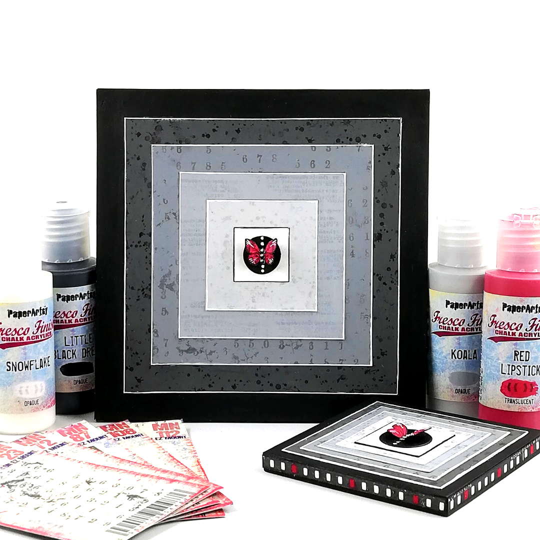
Minimalist does not mean soft colours! Amanda Pink chose a mainly black and white look and bold geometrics for her art block inspired by Frank Stella. What an impressive showcase for this tiny butterfly! A great example of effective compostion: The nestled squares and gradient of grays really focus the eye in the center to the pop of red bringing the piece alive. Check her original blog post for a deep dive into her process and a closer look at the subtle details of each non-layer.

Asia Marquet certainly seized to the (mainly) one stamp idea! Like quite a few of our bloggers, she had to face the terrible, and often avoided, challenge of careful planning, and the nerve-wracking pressure of clean crafting but the result is certainly worth it! I love the subtle colour variation between the impressions and the tiny numbers add-ons. Go to her  original blog post for all the details on her Infusion-stamping technique!


Who said you cannot be minimalistic with cute and detailed stamps? Victoria Wilding certainly proves that wrong with this series of ATCs. Her original blog post details all the steps for these subtly complex pieces: there is stenciling, brayering, stamping, embossing, layering, stitching! Proof that minimalism does not necessarily means having very few elements or colours, it is more about the general impression!


Well, wasn't that a beautiful selection of posts? We are so spoiled by our blogging team and the lengths they go to in their projects. I hope you can appreciate the time they put into each piece, but more importantly, how much they enjoy what they do while creating.

Dounia 

Tuesday, 20 December 2022

2022: PaperArtsy - A Year in Review {Topics 5 to 8}

Hello from PaperArtsy HQ,

We're here looking back on the blog topics of 2022, and tonight it's time to pay tribute to our fantastic designers. How lucky are we to work with such an inspirational group of creatives! They never cease to amaze me with the ideas they come up with, and it is the most exciting part of our jobs to see new products come to life!

They have been chomping at the bit to get out teaching this year. Many have dipped toes into the face to face classroom experience, if you have been able to take a class in the flesh then yahoo!! I happen to know there are lots more planned for 2023, and some international trips on the horizon too! How totally fabulous!

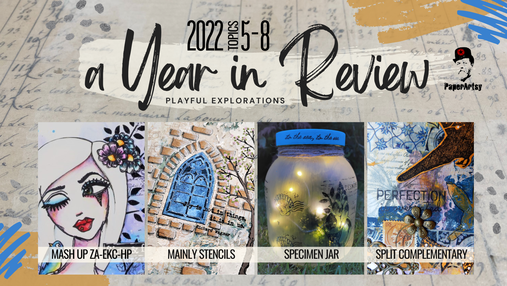
Today Dounia has her selection for you from Topic 5: Mash-up with Zinski Art, Kay Carley and Hot Picks, Topic 6: Mainly Stencils, Topic 7: Specimen Jar, and Topic 8: Split Complementary colours.
 
Are you ready??!

Leandra 


Mash ups were introduced last year and proved quite popular so they came back for a season 2! This time we are mixing three distinct universes, better presented in Keren's intro post

Elena Zinski Art's world is full of expressive critters, weird plants and witty quotes. Kay Carley is the queen of meadows, fulls of realistic or imaginary flowers, buzzing insects and whimsical fairy houses. Hot Picks is both the newest PaperArtsy in House collection, and the oldest of the three mashed here. Numerous themes have been explored over the years, with masculine and feminine imagery, background and focal stamps, pictures and words... but always with a vintage collage feel. It was a delight seen how our bloggers went about incorporating these different styles, with quite a few surprises!

My first pick is this gorgeous journal page by Renata Peley, full of soft colours and bold images. Renata was quick to notice that flowers are a staple here at PaperArtsy, and a great way to unify the 3 mashed collections. The Zinski pretty face certainly is the focus of this project! As you can see in her original blog post, Renata initially gave her lady a flowery hair but chose simplicity in the end. I love the use of white space and how it your eye to the face.


For her lovely accordion booklet, Liesbeth Fidder de Vos had fun experimenting with Infusions for an intricate background. Sprintzing, stamping, painting... the techniques are detailed in her original blog postThe focal stamps are singled out with her signature bleaching  and brought to life with only a few touches of colour. I love how she blended the collections. The Hot Picks Shrek lady really looks at home in the middle of Zinski's flower girls!


Now for something completely different: Nikki Acton took a look at those flowers and fishes and saw... A geometric pattern play piece! I love how the layering completely redirect your attention, making you forget the initial stamps. You can make it a game to spot the original images or head to her original blog post for a closer look at all the gorgeous and ingenious layers! (Have you noticed it is another example of complementary colours?)


They are the unsung heroes of crafting, often discreetly doing heavy lifting in the background... not this time! This topic is all about bringing stencils to the foreground and letting them shine!

Nowadays, all themes and styles have stencil representatives, from bold geometric figures to intricate filigrees, from abstract texture to realistic features, from organic patterns to architectural inspiration, you can find one (or two, or ten) that suits your creativity. This topic was an invitation to take a look at these humble members of your stash and realise all the ways you could use them, then invent new ones! The list of techniques involving stencils is probably endless: colour, texture, paper, doodling... pretty much everything can go through! Do not hesitate to look at Keren's into post and our bloggers projects for ideas...

Asia Marquet demonstrated how useful stencils are at building layers, from the subtle to the stark, and creating interest to bring a background to life. The easy part according to her! She also made the butterfly with a stencil, embossing and foiling at the same time. Check her blog post for details of this great technique. I'm impressed by her daring use of bold black contrasting with a calmer center, managing to make the page eye-catching while leaving it breath.


Jenny Marples' blog post truly is a mini master class using the latest PaperArtsy mini stencils. In total, you can admire 6 different pages, each with its own atmosphere and focus. A true feast for the eyes. And so many techniques! Classic stenciling, texturing, embossing, parchment craft, embroidery... She also shares lots of little tricks to cleverly use leftovers, to make you work appear more dimensional, or to integrate your designs easily into the page.


With these beautifully layered tags, Riikka Kovasin really makes stencils the focal images with Tracy Scott's bold leaves! But every step of her creative journey also includes some stencil use so check her original blog post to follow along! I had forgotten about rubbing but here it provides a subtle texture to the background. I love how Riikka truly mixes media and substrates but still achieves a harmonious cohesive look through her limited use of colour.


In her blog post, Laurie Case  did a two for one with a bright summer bag and a funky pouch. She reminds us that sometimes, simple is best! A canvas bag, a delicious colour palette, some colour blocs and straightforward stenciling and you have a unique and distinctive accessory. The pouch took a bit longer, as she embroidered each cross by hand. A true labor of love, accessible even for novice stitchers and with garanted impact! 


Art is already a display, of emotion, of beauty, of opinion but for this topic we are going literal and exploring what we consider worth preserving and the ways to exhibit it.

The title is just a indication, think further! From vintage curiosity cabinets, to natural museum displays or modern trinket shelves: would you shadow boxes be full of butterflies pinned on silk pillows or aligned rusted keys?, what is under your cloche, rare plants or collector toys?, are your vials full of mysterious critters suspended in strange liquids or a rainbow of glitter and gems? As shown in Keren's intro post, this type of project does not have to be 3D, we also have lots of stamps and stencils perfect for you to build your own flat displays, evoking beautiful containers with beloved contents and quirky or cryptic labels.

Claire Snowdon chose to stick very close to the topic title with this beach themed jar. However her specimens are on the outside of the jar rather than inside! I love how she played with transparency and opacity, pairing Frosting Glaze with translucent Fresco acrylic paints. The delicate design and colours are beautifully emphasized by the addition of fairy lights. Go to her original blog post to see the jar in different lightnings! 


Etsuko Noguchi went the flat(ish) road for this wall hanging with a circus freak show feel. The cat doll hybrid is articulated and swings around went you shake the piece, so much fun! I love how she blended several collections, originally with different styles, and subverted some stamps, for example making hearts and decorations out of bones! Be sure to check her original blog post as she also made an actual, 3D cloche housing the little cousin of the cat ballerina. (choose image)


Claudia Neubacher was inspired by vintage museum displays, and in particular the one in Salzburg's "House of Nature" and presented 3 bioluminescent fishes from the abysses. She played around with mini led lights and the fishes actually glow! Her original blog post has a lot more pictures, in different lights to get the full effect. I love hw she played with layers and transparency to recreate that underwater look.


Victoria Wilding chose flora over fauna with this delicate and feminine flower hoop. I love the use of 'white' space that give the composition movement and character. Victoria is the queen of fussy cutting and precise details. Have you noticed the dainty leaves or the cheeky bluebells peaking from behind the bigger flowers? Go to get original blog post for a better look and appreciate  all the little steps that really pull this project together.


In round 2 of our colour wheel play, the focus is on split complimentary colour combinations or using one colour from any position on the wheel buddied up with the two colours either side of its direct opposite, liked as a Y or a thin rectangle. But an picture is worth a thousand words so...


Compared to just using complementary colours, obviously we are adding a third colour, allowing more variations and nuances to build complexity. While not as high-contrast, this colour scheme still packs great impact, check the example in Keren's intro post. It's a slightly subtler version and an easy way to get colours that will match without looking like you've tried too hard. It is also interesting because the colours generally work together even when varying the ratios: you can use all three of them in equal amounts or make the tail of the Y the main colour with two tonally closed accents, or use the split colours as one main colour block, with accents of the third. And you get 12 different combinations on one wheel! Considering we have also been pushing you to experiment with unusual colour wheels, the possibilities are endless!

Let's start with the classics! Using the three bright Magenta/Yellow/Blue primary colours for her wheel, Martha Ponsanesi made a series of ATCs that truly demonstrate the possibilities of a split-complementary scheme. While all of them pop, changing the colour repartition directs the eye differently and gives each of these cat a unique personality! Check her original blog post to see all the layers of these deceptively simple look project.


Now, while she kept classic Red/Yellow/Blue primary colours as the base of her wheel, Liesbeth Fidder-de Vos went for a darker, more rustic atmosphere. Look at how the orange pops against the rich blues and purples. Her original blog post particularly details the creation of her background, playing colour contrast but also with opacity and transparency as well as the push and pull between light and dark layers.


Floss Nicholls chose to add a twist to her colour wheel: the blue primary has disappeared and been replaced by a neutral, completely altering the range of colours. The resulting split-complementaries are much tonally closer than usual, making for subtler contrast in her tags. Floss built most of her background on her gel plate, pulling all the layers in one print, including black stamping, so be sure to check her original blog post for her technique.


Well, wasn't that a fabulous array of wonderful!? We are so spoiled by our blogging team and the lengths they go to in their projects. I hope you can appreciate the time they put into each piece, but more importantly, how much they enjoy what they do while creating for our enjoyment.

Dounia