Tuesday 11 October 2022

2022 Topic 14 : Colour Study: Triads {by Amanda Pink} with Everything Art stamps


Hi everyone, it's Amanda Pink (ink-a-pink) with you today, and I'm here to share with you some colour wheel creativity using stamps designed by Everything Art.

This time we are focusing on Triads - colours that are equidistant from each other on the colour wheel.


With the festive season drawing ever closer I thought I'd make some kind of Christmas decoration. I wasn't sure exactly what when I started - maybe baubles, maybe a piece of home decor? It ended up being a blend of the two!

With this being a colour study topic I wanted my project to show off the triadic colours I worked with in their truest from and in their own right/in their own space while coming together as a whole to demonstrate how well they work / look together.

With regards the colours, I favoured the idea of moving away from the traditional Christmas colours of reds and green and going with a more contemporary colour palette - maybe blues and pinks.  I didn't know when I was thinking along these lines that they are actually some of the 'on trend' colours for Christmas 2022!!

I also thought I'd like to put emphasis on the 'filler' stamps that are on a stamp set as I think sometimes they can easily get overlooked but often end up being our trusty faithfuls - the real workhorses that we reach for time and time again!

So, with all this in mind I headed into some colour wheel creativity. Lets see what triadic colours I actually worked with.


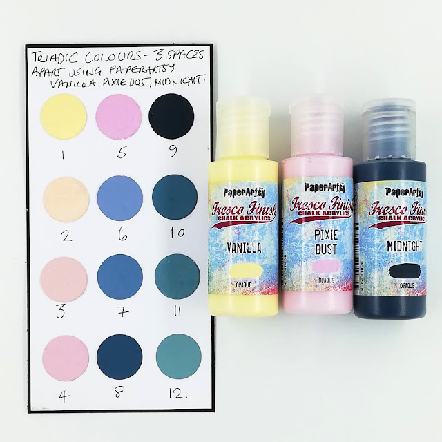
To help me decide on the triadic colours I would use for my creativity I began by making a few colour wheels using PaperArtsy's colour wheel template and various PaperArtsy Fresco Finish Chalk Acrylic colours that played to the basic triad colour palette: red, yellow, blue.  Truth be told I made more than a few and had a hard time choosing which one to go with but after lots of  umm ... maybe this one?' ... 'nope this one?' ...'oh, but what about that one?'  I settled on the one below made with PaperArtsy Fresco Finish Chalk Acrylics: Pixie Dust (FF113) (the red), Vanilla (FF65) (the yellow) and Midnight (FF123) (the blue).

Now to decide which triadic colour combinations to use ?? You've probably guessed I couldn't !! ;). In my defence, to my calculations (and please correct me if I'm wrong) there were 28 triadic combinations of 3 colours separated by either 1,2 or 3 spaces to choose from so it was a tough call for this indecisive Libran ;) However, I was getting a rough idea of how each of those colour combinations would look /work together from the colour wheel I thought I'd get a better sense of this if I made some triadic colour combination charts.

Here are the triadic colours combinations that are 3 spaces apart.


The triadic colour combinations that are 2 spaces apart.


 The triadic colour combinations 1 space apart.


Some lovely colour combinations there don't you think and all from just one colour wheel made using only 3 of all the many PaperArtsy Fresco Finish Chalk Acrylic colours there are ! Imagine the potential and how many new 'bespoke' colours could be mixed and the triadic combinations that could be made!!!!

Now that's a calculation for another day but for now .... the charts really did help me narrow the options down and finally settle on 4, 8 ,12 as my triadic colour combination (colours 3 spaces apart on the colour wheel) Oh but wait .... Just kidding ;D.
        
Why that combination?  Well, there's a blue and pink (colours I had in mind) the blue being dark, the pink light and I like to work with at least 1 light, 1 dark and a green, maybe not what I would have been inclined to choose or reach for if I was just choosing PaperArtsy Fresco Finish Chalk Acrylics straight from my stash but seeing it together on the chart with the other 2 convinced me they all play well together.

Did any of these triadic colour combinations catch your eye? Which do you think you would have chosen ?

As I have chosen 4,8,12 I would be mixing these colours by following the 'recipes' that are below the colour wheel on the template.


For colour 4 I mixed together PaperArtsy Fresco Finish Chalk Acrylic: Vanilla (FF65) and Pixie Dust (FF113) (which actually makes a secondary colour on a colour wheel) and then mixed in some more PaperArtsy Fresco Finish Chalk Acrylic Pixie Dust (FF113)


For colour 8 (the blue) the mix was PaperArtsy Fresco Finish Acrylic Pixie Dust (FF113) with PaperArtsy Fresco Finish Acrylic Midnight (FF123) (a secondary colour) and then some more PaperArtsy Fresco Finish Acrylic Midnight.(FF123)


For colour 12 (the green) I mixed PaperArtsy Fresco Finish Chalk Acrylic: Midnight (FF123) with PaperArtsy Fresco Finish Chalk Acrylic: Vanilla (FF65) (a secondary colour) and then mixed in some more PaperArtsy Fresco Finish Chalk Acrylic: Vanilla (FF65).


How much of each colour?
I'd say roughly similar amounts initially and then follow your own creative intuition and adjust accordingly as you'll find that some pigments are more dominant than others so its ok to add more of one colour if you feel its needed. That's all part of the 'colour mixing' fun!! Generally I guess you could say that you are trying to find a colour that sits at the mid point between it's 2 neighbours on the colour wheel.

You may have noticed from my colour mixing photos that as well as my triadic colour combo chart and my colour wheel I also made some little colour swatches of my chosen triadic colours. I felt this handy size with no white space around would enable me to hold it really close to the colour I was mixing and therefore improve the chances of a good match. Just remember that there can be a bit of colour shift from wet to dry, so you may need to tweak a bit to get the closest match to your original (dry) swatches; it may match when wet, but when dry it could look a shade lighter.


If you are covering a large area with your mixed colour you can always add a drop of PaperArtsy Drying Retarder (FF112) to extend the drying time. You only need one drop, a little of this stuff goes a very long way - and I'm sure you DO want your paint to dry at some point!


With my triadic colours chosen I was now ready to make a start on my Christmas decoration.
 
As I mentioned at the start I hoped to show of the colours in their truest form so I initially painted 3 sheets of  PaperArtsy Smoothy with my triadic colours (1 colour to each sheet) and as you'll see in the next few photos I also threw in a piece of PaperArtsy Smoothy  brayered with all 3 colours too. I wasn't sure If I'd use the brayered sheet but there was nothing to lose in making it as I had some mix of each colour left over.
Always worth having a spare piece of card/ paper at the side of you when you're working to mop up any leftovers!!


I was thinking along the lines of Christmas baubles by now so cut the card into various sized circles and adhered them to both sides of some greyboard circles. Although PaperArtsy Smoothy card is thick I wanted the baubles to be much thicker and have more rigidity.  I actually ended up doubling up each of the circles !

At this point I decided to omit the brayered circles. Although I liked them I didn't think the colours could be seen in their truest form like I'd wanted for this project.  So 'banked' them for another time.


To decorate the circles I introduced some stamp embossing.
 
At the start I talked about using 'filler' stamps from a stamp set and Everything Art stamp set 04 (EEA04) has a great selection that I thought lent themselves to my festive project.

I assigned each of the stamps to their own triadic coloured circles.


The cluster of stars for the blue shade (#8). Stars always feature somewhere or on something during the festive season.


The small text to the green ( #12) ! There's always room for some text in any creativity and this one is so detailed. I like how you can pick out some of the letters/ words but not all!  This is a real go to stamp for me and love how it looks embossed in white.


December! What can I say - the perfect fit!


I love how Seth Apter's White Cloud embossing powder plays with the 3 colours.


Now here's where my idea of the circles as baubles changed. After embossing the circles I gathered them together and stacked them on top of each other from largest to smallest (I can be a bit ocd like that ;) ) and instantly saw and thought "tree'!!
So, with the help of some painted reels to give some separation between the stacked circles the  once to be baubles morphed into a Tree!!

I had considered treating the reels to some PaperArtsy Crackle Glaze (FF22) but with the reels being so small the cracks were hardly noticeable so set the crackle to one side (for now ;))

I also ended up ditching the larger reel which I thought would be the trunk of the tree in favour  of a  festive tree 'skirt'!

Much like when I looked at the stacked circles and saw/ thought tree, the tree 'skirt' idea led me to think 'rosette' (don't ask....my mind!!!). I could use a rosette for my tree skirt and it's design would allow me to paint each of the 'folds' with one of my 3 triadic colours in a recurring sequence and use the stamps from Everything Art (EEA04) in the same way.


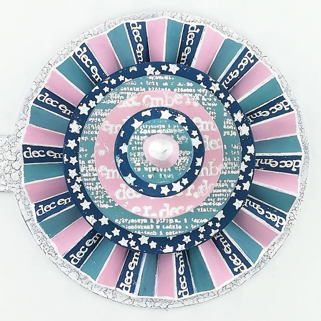
So I set about making the rosette using a couple of strips of PaperArtsy Smoothy that I scored to make the folding easier and more exact.
 

Although I had considered emboss-stamping in all the painted 'folds' of the rosette in the end I  limited it to just the blue (#8) as I felt all would be 'too much' with the embossed stamping on the circles aswell.


When I began pulling everything together I decided that I'd like to have a base for my tree and 'skirt' so it had its own space when its displayed amongst any other decorations.

As the circles were initially going to be baubles then I'd have a bauble base crackled with PaperArtsy Crackle Glaze (FF22) sandwiched between my triadic blue(#8) colour mix and PaperArtsy Fresco Finish Chalk Acrylic -Snowflake(FF15).

I like that there's a hanger on the bauble that I can use to move the tree around with ease.

Applying the paint and crackle with a sponge rather than a brush creates lovely small round cracks.


I shared more about PaperArtsy Crackle Glaze (FF22) on my blog post here and a lot of designers have shared about this fabulous product too throughout the blog so if you search PaperArtsy Crackle Glaze (in the sidebar) you'll be able to find lots of info, hints and tips etc.

You can also watch Leandra doing a great PaperArtsy Crackle Glaze tutorial here on PaperArtsy You Tube channel.


Here's a few photos of my festive tree bauble decoration!

The painted and embossed circles each stacked ( from large to small) between painted reels form the tree.


The tree is placed in the centre of a crackled bauble with the it's rosette tree 'skirt' wrapped around.  A small cone painted with my pink colour mix (#4) with a white embossed tip sits at the top of the tree.

The jury's still out as to whether I'll add a star to the top or tree or not!

I like this overhead shot! I think it shows off the triadic colours in the way I'd hope for when I began- in their truest form and in their own space while coming together as a whole to show how well they work / look together. 


I'm really enjoying PaperArtsy Colour Wheel topics finding them educational, informative and very insightful. Hope you are too.

I've enjoyed the challenge of creating with triadic colours and making my own PaperArtsy colour wheels (I'm hooked) with just 3 fresco colours. There's always a few surprise results from the colour mixing and when you mix a new colour that's a real beauty you can't help but smile.

I plan to continue to add to the PaperArtsy Colour Wheel's I've made already so eventually I have a folder full that I can easily reference when I'm creating.

Do you use a colour wheel when you're creating? Have you made any PaperArtsy Fresco Finish Fresco colour wheels?  if you haven't I'd really encourage you to give it a go.  It's a great way to spend some creative time.

We'd love for you to join us and get creative with your choice of triadic colours and we hope you'll share either in PaperArtsy's facebook group "PaperArtsy People' or use the hashtag #PaperArtsy on Instagram.

Thanks for spending time with me today/ tonight
Keep on Creating!
Amanda
x


Blog: ink-a-pink
Facebook: Amanda Pink
Instagram: p1nkart
Pinterest: PinkArt

2 comments:

Words and Pictures said...

An amazing dimensional creation, Amanda... I adore the cool colour tones and all that scrumptious white embossing.
Alison x

A Pink said...

Aww thank you so much , Alison . Really appreciate . I adored your journo pages and loved your colour choices. xx