Wednesday 30 November 2016

2016 #23 Pocket of Positivity {by Hazel Agnew}

 2016 Topic 23: Bleach Techniques

Hi everyone, Hazel Agnew from Mellifluous Meanderings here. I'd like to share with you this evening a post about using bleach to create interesting effects.

What a challenge to use bleach in my work. Especially for someone as messy as me. To be honest, when I accepted the challenge, I didn't have any experience of using bleach and played around for a while before I found the technique for me. 
I am so pleased that I did as I love what I have discovered.


Step One: First of all I sprayed a few tags with water and sprinkled on a variety of Paperartsy Infusions. I sprayed and dabbed to get the desired effect. I applied a dob of thick bleach to my Tear Off Palette, spread it around and dipped my stamp into it and straight onto the tag. Nervous at first and flying off to the sink to rinse the stamp but soon found that the stamp was very resilient. as you can see, the image bleaches out the infusions. In the photo is my pocket. A piece of packaging. 
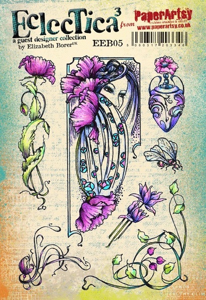
The stamp that I chose is HP1604.


HP1604.


Step Two: Next, for the pocket. I chose a selection of "fragile papers",which I glued to the outside  , front and back. I sprayed the surface with water and added Burnt Umber acrylic ink, dabbing with a baby wipe to control the amount of staining.


Step Three: Back to the tags. Distressed the edges with Black Soot, Threaded some fibrous wool, and backed them with paper stash that is suitable for writing on. I also added some positive thoughts from TH Small Talk.


Step Four: Back to the pocket. To the front I added one of the tags; a photo; some corrugated card for added texture; a large pin to which I added tassels; hessian; delicious rusty wire, and a little butterfly which, to me, signifies hope. 

On the back, there is a poignant poem by Rupert Brooke and a word band.


So, that is my pocket of positivity, where I intend to collect positive thoughts, events, phrases, poems etc. throughout the coming year. Something uplifting and encouraging. Hopefully, by this time next year, it will be stuffed full of encouragement and have new tags added.

This bleaching technique can be used as an interesting background for many styles of work. Experimenting with different colour mixes of infusions opened up lots of possibilities for future playing too!

I hope that this has inspired you in some way to get out the bleach for more creative activities than cleaning!

Don't forget that there will be lots more inspiration on bleaching techniques to come on this blog. Hazel Agnew, from Mellifluous Meanderings, aka Craftroomgran, signing out and thanking you for staying with me till the end.

Thanks Hazel for a wonderfully inspiring project, I look forward to seeing more photos of it once you have it stuffed full. We see so many inspiring quotes everyday it is hard to keep track, this is the perfect place to store them for those moments when you need lifting up. 
~Darcy

All of our bloggers love to see your twist on their ideas,  particularly if you were inspired directly by their post; so please spare a moment to comment or make your own creative item. They all love to see your feedback and what you can do more than you realise!

We would love to see how you interpret this Bleach Techniques topic by linking what you make to our 2016 Challenge #23: Bleach Techniques on this page HERE. The Bleach Techniques link will close 17:00 (London Time) Sunday, Dec 11th 2016. The winner will be announced 2  hours later at 19:00.

All links go in the draw to win a £50 voucher to spend on products of your choice from the PaperArtsy online store.   

Monday 28 November 2016

2016 #23 Dream Canvas {by Corrie Herriman}

2016 Topic 23: Bleach Techniques


Hi everyone Corrie from MadeByCHook here, joining you this evening with a post about the 'bleach' technique. I had great fun with this technique and used it on denim fabric with a stencil. I made a canvas using my bleached denim and added a little picture frame on top. Here's a picture of the finished project and the different steps of how to make this canvas. 


Step One: I used an old cheap canvas with a picture of a bird on it. It hung on my mothers balcony wall for a year and was totally faded. I took it home and gave it a coat of gesso to give it a bit of 'tooth'. I also made a little photo frame from cardboard which I got from the backside of one of my paper blocks. I always save these to recycle. 


Step Two: I used stencil (PS023) by Clare Lloyd and some Grunge Paste to add some texture to the front of the frame. 


Step Three: After the Grunge Paste had dried I painted the frame with Gesso and then with Fresco Paint. I used Inky Pool mixed with Southern Skies to get a colour close to the colour of the denim I was going to use. 


Step Four: After this had all dried (I used a heat tool because I am impatient) I painted the frame with Crackle glaze and then Fresco Paint Honey Dew. I also added beads and some paper flowers painted with the same mix of blues ie. Inky Pool and Southern Skies. 


Step Five: Next the denim. I used stencil (PS023) by Clare Lloyd, a sponge and bleach to get the flowers on the fabric. I washed and dried the fabric after this to get the smell out. 


Next I stamped the word 'dream' from stamp set (ECL03) also by Clare Lloyd with Cobalt Archival Ink in the middle of each bleached flower. I then adhered all the pieces to the canvas using a gel medium as glue. 

ECL03

Step Six: I used one of the lovely girls from Clare's (ECL03) stampset to go in my photoframe. I used Copic Markers to colour her. I used Fresco Paint in the colours Honey Dew and Sage to colour the background. I also used Clare's stencil again with Granny Smith Fresco paint to add the polka dots. When they had dried I used a white gel pen to doodle around each dot. 


Step Seven: When everything was to my liking and dry I added the coloured image to the frame and the frame to the canvas. I used gel medium as a glue for this. I also added the same polkadots to the edge of the canvas to give it a finished look. The little extra sentiment I did as an afterthought as I thought it needed something else. So I painted a piece of scrap paper the same way as the background behind the girl and stamped the word 'dream' once more with the Cobalt Archival ink. I then added this to the canvas as well. 


This technique is great fun even if you really don't like bleach like me. I did my bleaching outside so the house wouldn't smell of it. It is so much fun to see the colour just vanish. You could do this technique on paper too. For instance on an inked background. Why not try this too, I'm sure you'd enjoy it as well. 

I particularly enjoyed this project because it had so many different techniques in it. From the bleaching of the fabric, the making of the frame, the crackling and the colouring of the image. The nicest thing of all was putting it all together to make a pretty and cohesive canvas . 
Thank you for joining me today! 
Corrie 

Blog: MadeByCHook
Instagram : corrie.herriman
FaceBook : corrie.herriman
YouTube : Corrie Herriman

Thanks Corrie, this is a great combination of techniques. i love the bleached denim patchwork. i can see how that would work brilliantly in all sorts of projects. I am thinking i want a bag made with them. ~Darcy


All of our bloggers love to see your twist on their ideas, particularly if you were inspired directly by their post; so please spare a moment to comment or make your own creative item. They all love to see your feedback and what you can do more than you realise!

We would love to see how you interpret this Bleaching Techniques topic by linking what you make to our 2016 Challenge #23: Bleaching Techniques on this page HERE. The Bleaching Techniques link will close 17:00 (London Time) Sunday, Dec 11th 2016. The winner will be announced 2 hours later at 19:00.

All links go in the draw to win a £50 voucher to spend on products of your choice from the PaperArtsy online store.

Sunday 27 November 2016

2016 #23 Bleach Techniques {Challenge}

2016 Topic 23: Bleach Techniques


Hello everyone, Darcy here with our latest topic for you. This time we will be exploring the ways in which we can use bleach in art. i am sure many of you will at some point have accidentally splashed bleach onto clothing which results in lightened spots but have you used bleach deliberately on art projects? Over the next 2 weeks hopefully we can give you some ideas for discharging colour so your bleached bits are no longer just accidents. 

This next piece was done with Brushos but why don't you try bleach over PaperArtsy Infusions for some cool effects. 


Before we start, let's see who won the Topic 22: Alcohol Inks and Markers Challenge...
I was thrilled to see so many gorgeous alcohol ink pieces. Colouring in is so relaxing, team that up with your favourite stamps and it's a winning combination. Great to see you creating matching embellishments too, a little alcohol ink can transform almost anything. 

The winner of Alcohol Inks and Markers is: Etsuko  from My Favourite Things

Email Darcy to claim your prize. Darcydotneedles@gmail.com

A little history first, going right back to the Egyptians bleaching was employed to lighten fabrics. of course they did not have bleaching chemicals, but they knew all about sun bleaching and deliberately left wet linens out in the sun to lighten them. 

By the 12th century the Dutch had become the leaders in bleaching techniques, so much so that fabrics were sent over to Holland for bleaching from all over Europe. They use a mix of potash and sour milk, dipping the fabrics, soaking and drying several times over. this process was slow and after factoring in transport time it could take up to 8 months. in the 18th century the sour milk was replaced with sulphuric acid, this cut down the process time to around 4 months.

By 1799 a revolutionary discovery was made by a Scottish chemist,Charles Tennant, by combining chlorine and lime he created what we now know as bleaching powder. 


So how can we use bleach in artwork, well of course it can be used on fabric, to great effect. there are a ton of ways to use bleach on fabrics. Take this t shirt for starters, such an easy way to transform even the cheapest of shirts. 


Remember that bleach does not stop working, even after you wash the fabric, it will continue to eat into the fibres and will produce holes eventually. To slow down this process make sure to neutralise with a vinegar solution. 

Another fun thing to decorate is a tote bag, simple but effective. 


If you have tired old denim, why not give it a new lease of life.


Bleach can also be used on decorative items for around the house. Take a look at how Gail bleached some real leaves to use in an autumn project. 


Also check out these beautiful pine cones. I think this is one that I will be trying, don't they look so pretty. 


While hunting for bleach examples I found some gorgeous pieces of art, who knew humble bleach could look so good. This piece is done with ink and bleach.


This stunning bird's nest is by A J Dunne. This is a cyanotype, bleached out and then coloured with tea. 


.. and this gorgeous horse from Jenny Johnstone, this uses Quink and Miltons bleach. 


I love the simplicity of this piece, just ink and bleach but the shapes created are wonderful. 


Don't think that you have to just stick to black ink, you can go crazy with ink colours and then bleach out. This is a really effective greetings card done with ink, watercolour, bleach and metallic paint. 


Another card showing bleaching techniques, this time from Andrea Kidman. 


You can of course stamp with bleach directly into your inks, this video from Jessica Taylor shows you how. 


Remember that bleach is a toxic chemical, you must handle with care. Wear protective clothing and gloves, and make sure the room is well ventilated. Do not have any naked flames nearby and of course do not allow children to try this technique. When using bleach on your rubber stamps and stencils be sure to wash them thoroughly straight afterwards to avoid damage. 

If you do want to try 'bleach effect' projects with children then use lemon juice. These ATCS were done with watercolours and lemon juice and turned out brilliantly. 


You can also stamp out your images and colour them with bleach. Once the bleach is dry you can leave the card as it is or then go back into the bleached areas and recolour them with inks. 


This same stamping and bleach colouring technique can be used to create a background , in this video Renje shows how she create a journal page background. The detail is amazing and so pretty. 


Finally look out all your old photographs and try adding bleach to those, check out this blog post from Diane where she explains how she dips her photos. 


So many techniques, I do hope you find time to try a few of them, if you do be sure to link up and share your projects with us. 

Don't forget to follow Darcy and Leandra's Pinterest boards if this topic pushes your buttons, you will see plenty more examples to whet your appetite there! 

I am really looking forward to seeing what you create over the next 2 weeks!

Darcy

Topic 23: Bleach Techniques PaperArtsy Blog Challenge

We'd love you to share your ideas and link up your creative response to our current blog topic. Take a minute to read the challenge guidelines below.

All links go in the draw to win a voucher to spend on products of your choice from the PaperArtsy online store. The Bleach Techniques link will close 17:00 (London Time) Sunday, Dec 11th, winner will be announced 2 hours later at 19:00.


1. The challenge is a for you to show how you are inspired by the current blog topic.

Your entry should contain:
- a mention of which post inspired you and why, and 
- a link in your blog post to that original post on the PA blog.

The whole concept of this challenge is 'play along with us'. You are encouraged to put your own twist on ideas you see on our blog, do your own thing - whatever grabs you!

2. The link you put on our linky page must lead directly to the specific post on your blog where you have explored the technique/ idea mentioned in point 1 above. Don't link to the home page of your blog.

3. We prefer your challenge blog post is created exclusive to our challenge, but if our topic fits perfectly with another challenge, then you may link to both if appropriate.

4. You are most welcome to use stamps/ products/ substrates you have to hand from a variety of companies, we do not expect you to exclusively use PA products - it's lovely when you do though!

5. You can enter as many times as you like. We don't want to restrict your creativity! 

NB. Link closes at 17:00 Sunday Dec 11th (London Time)

6. The winner of the random draw will receive a £50 credit voucher to be redeemed on the PaperArtsy Website. The credit voucher includes VAT and postage. We request that one of your purchases is an A5 rubber stamp. You can add any other items to your basket, but the final total should not exceed £50.

7. Each fortnight on Sunday, the winner will be announced at 19:00 (London time). In the same post, the link for the next fortnight will be posted. 

8. It's your responsibility to claim your prize coupon from Darcy. 
email: darcydotneedles@gmail.com

Good Luck! If you have any questions, don't hesitate to ask!

Saturday 26 November 2016

2016 #22 Wild Flower Frame {by Caz Newton}

2016 Topic 22: Alcohol Inks and Pens


Hi Everyone! Caz here tonight with my project using alcohol inks in various forms and Elizabeth Borer stamps. I’d not done much with alcohol inks recently, so this was a good excuse to break out the pens, ink bottles, ink pads and various papers/cardstock and remind myself how these inks perform!

I was pleased to be asked to work with Liz’s stamps again after the last piece I did for the Paper Artsy blog – I do love how they lend themselves to lots of layers and I decided to do a piece with a Creative Frame wooden kit from Anna Marie Designs.


Step 1: Planning! I thought this time I’d work in a different way to normal and actually ‘plan’ what I wanted to make rather than just going with the flow, especially as I was going to need so many flowers for what I had in mind.
 So I chose stamp set EEB05 as my main source of images, some small flowers and corner image from EEB08, the words from EEB05 and the flower spray and bee from EEB04.

EEB04
I stamped loads of images on plain card to start with and cut them all out. After playing around with the placement for a while, I decided on this layout and took the photo so I wouldn’t forget!


Step 2: To help decide on the colour scheme, I laid down some swipes of colour on Ranger Alcohol Ink Cardstock with a blending tool. I then pounced on some bands of pearl mixitive, blending solution and then some isopropyl alcohol, just to check what effects I got and if it was what I wanted for the background.

 I loved the way the blending solution and isopropyl each worked slightly differently moving the colour around which I thought would be particularly useful for the sky. 


Step 3: So this decided the possible ink colours for my background. Using some very glossy paper which has “decoupage printing” on the packet – I have no idea where it came from but the alcohol inks seemed to behave well on it - I pounced the inks on blending the stripes as I worked up the paper: Clover and Limeade together blending into Patina and Limeade together, blending into Limeade then into the sky with Sail Boat Blue.

I added touches of Pearl Mixitive and blending solution to the sky, and then the cloudy effect was helped with drips of isopropyl alcohol being allowed to spread where they wanted.


Step 4: On to the frame images - I stamped the focal image from EEB05 with archival ink on plain card and also the small flowers and corner image from EEB08. I coloured these with a mixture of Promarkers and alcohol inks.
The poppies were done with Poppy and Maroon Promarkers and then I blended them with alcohol inks – Flamingo, Mountain Rose and Valencia - and helped the colours to blend with some blending solution...all this done with the window open! I love how using the pens and inks worked but you definitely need plenty of fresh air!

I used a selection of Cool Greys for the hair and used silver Promarker for the border. I then used Promarkers for the smaller frame flowers in China Blue, Cornflower and Pastel Blue. Finally the corner flower spray was done with the same reds as before, and I used Clover and Limeade alcohol inks for the leaves.

EEB05

Step 5: Now, as I was happy with the colours I was using, I moved on to the flowers for within the frame. I wanted to achieve depth without using layers this time so I decided to use Whiteout Clearly for Art so I could heat and bend it. I worked out how big an area I needed for each colour by using the original flower templates that I’d made.

The poppies this time were Flamingo and Watermelon alcohol inks with a little dash of Pearl and then some Raisin towards the bottom and Clover and Patina mixed for the leaves area with some drops of blending solution to add interest.

The lilies were Valencia and Sunshine Yellow mixed and I dragged Clover down for the stem area. I also made a patch of Silver and Pearl Mixitive for the urns. So here’s the Clearly for Art ready for the images to be stamped with black Stazon ink. (memo to self...using cheap felt to make replacement pads for the tools is not always a good idea as it leaves fibres everywhere!)


Step 6: Once I’d completed all the fussy cutting of all the flowers and leaves, I then gave all the pieces some ‘movement’ using the heat tool and a wooden prodder to bend them over. I love using Clearly for Art as it gives so much scope to make things like flowers and leaves more interesting.


Step 7: I made the frame covering by using Silver and Pearl mixitive again pounced on the same ‘decoupage paper’ as the background....this time I dripped some of the isopropyl alcohol on the blending tool afterwards and made swirling shapes into the silver to give it a different texture.


Step 8: The final elements of the bees and the band of flowers along the bottom were made with some clear Clearly for Art – I decided I wanted a more delicate flower than using the Whiteout and also the bees wings needed to be on clear. This stage took a little bit of head scratching – until I had a light-bulb moment and added some Snowcap to the Valencia and Sunshine Yellow to make them opaque and show up better on the surface!! Sometimes the obvious takes a little while to work out!! J

Step 9: Lastly, the sentiment was stamped with black Stazon ink onto plain card, cut out and edged with Maroon Promarker, and the sprays of flowers for the sides (EEB05) were stamped on the same card and coloured using the same ink colours as the poppies 


So here is everything ready to be put together:


Step 10: Everything was put together according to my trusty photo of the prototype......apart from some people may notice the final piece has flowers along the bottom not the top of the piece as I decided to have more of the sky showing and extra bees. I also changed the words to be cut out as a block as I felt it looked better with all the flowers around it. I’ve used Cosmic Shimmer glue for flat sticking and Pinflair Glue Gel for the layering. Some fluffy garden string added for a hanger and it was time to step back from the piece and stop fussing with it!


I really enjoyed this project as alcohol inks are not one of my normal ‘go to’ things and it was good to try them out again on different surfaces and remind myself how they reacted and the interesting effects that can be achieved. I’d not tried colouring using the Promarker/Alcohol Ink combination before and that is something I can see myself using again soon as I found this way of blending colours a lot easier. I’d also not used the Isopropyl alcohol before (donated from hubby’s shed – I didn’t ask what he usually uses it for!!). It was interesting to see how it ‘moved the ink’ around compared to the Blending Solution – Isopropyl seems to leave a more pronounced colour edge to where it spreads. 

Lots of ideas now for future projects and I hope you will have a play with alcohol inks now too
Happy Creating
Caz

Blog: Candelle Creations 

Wow Caz, so much fussy cutting, you are a star for doing all that. Definitely worth it though as the end result is stunning, all those resulting layers really pack a punch when it comes to the wow factor. Beautiful colouring, and curling the flowers and leaves works brilliantly. ~Darcy


All of our bloggers love to see your twist on their ideas, particularly if you were inspired directly by their post; so please spare a moment to comment or make your own creative item. They all love to see your feedback and what you can do more than you realise!

We would love to see how you interpret this Alcohol Ink and Pens topic by linking what you make to our 2016 Challenge #22: Alcohol Ink and Pens on this page HERE. The Alcohol Ink and Pens link will close 17:00 (London Time) Sunday, Nov 27th 2016. The winner will be announced 2 hours later at 19:00.

All links go in the draw to win a £50 voucher to spend on products of your choice from the PaperArtsy online store.