Thursday 28 December 2023

PaperArtsy Blog - 2023 Year in Review {Quarter 2, Topics 4 to 6}

Season's Greetings to you from PaperArtsy HQ,

It has been a crazy year here at PAHQ as we continue to adjust to life in France. We are feeling much more settled this year, and took time over summer to enjoy many of the 'Nocturne Marche' (evening markets) where a village comes together to eat, drink and dance in the warm summer weather. Many of the people who visited us this year were treated to this experience - only available in July and August when most of France is on holiday! Many of them here in our stunning South-Western corner of France.

We loved being back at our favourite show in Paris early spring: Version Scrap. It has always been one of the most enjoyable consumer shows to exhibit at, and one that we have exhibited at for every event except for the 2 just before and after covid. Sadly it is not on offer for 2024, but never fear, we do have events planned to be held on site here at PA HQ, so keep your eyes peeled for news of those happening in Spring 2024! It has always been my dream to host events here, so we cannot wait to bring that vision to pass!

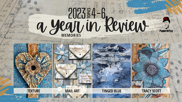
It's time for Part 2 in our instalment looking back at highlights from the PaperArtsy Blog in 2023. The theme overarching Topics 4-6 was Texture, and ohhhh how those of us with a penchant for mixed media love to add some texture to our layers, be it with pastes, papers or numerous other tactile layering options.

We have chosen posts from Topic 4: Mail Art, Topic 5: Tinged Blue, and Topic 6: Tracy Scott Designer Focus to share with you for this review. It's pretty hard to select just a few posts to showcase from each topic; our bloggers offer such a variety of ideas. If you are a regular blog follower, you will be aware how many incredibly creative ideas are on offer each week. Everything is linked below for you to head back for a deep dive into each post.

Get ready for blast of inspiration!

Leandra 


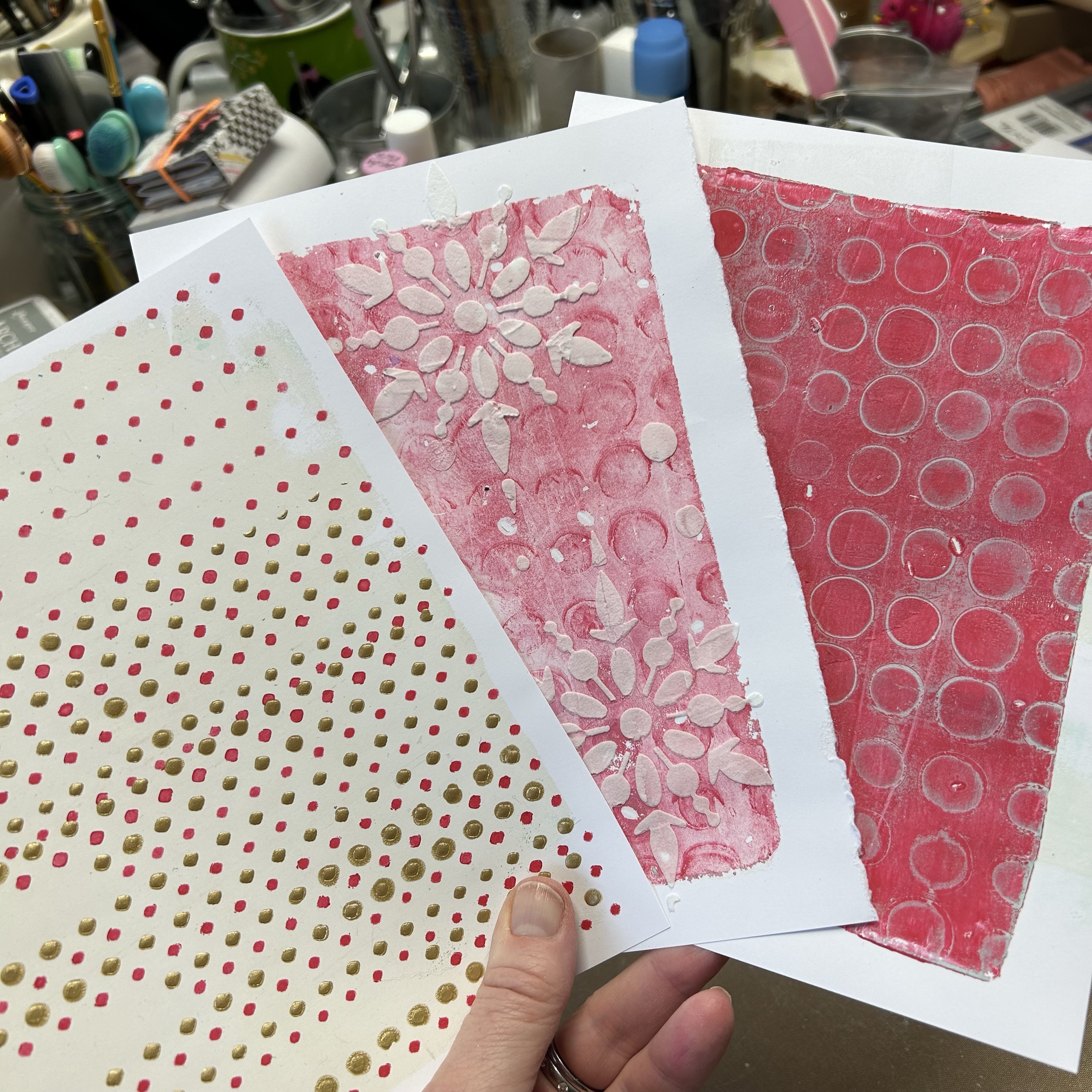
Our second theme for 2023 was Texture. this is a pretty easy and normal element to add into your work, especially if you are a mixed media buff! Sometimes having a brief helps narrow down the direction you might take in your creative journey, or helps you break a blank page. Here's the link to the Theme intro post... with plenty of ideas about how texture might be used in your creative exploration. 

While we are celebrating texture, here are a few amazing interpretations of this quarter's theme from a few of the blogging team...

I love this panel by Amanda Pink. She has stamped into PaperArtsy's Grunge Paste with various Tracy Scott mini stamps to create 9 segments which in combination make the whole background for this project. Sanding back through the dried paint to the paste was yet another contrast and added to the overall grunginess on offer. We love how she used a stencil as a template for the heart focal. If you would like to better understand how this came together, check out her  post here!


What about these fabulous envelopes created by Floss Nicholls? She used infusions onto cartridge paper - a sucky surface really pulls the colour in, and the ghostly looking stamped images were created by using bleach on her stamps.

The contrasting labels were made from fabric which had gesso randomly spread on the surface along with stamped script. The layers of PaperArtsy Printed Tissue are yet another gorgeous textural contrast thrown into the mix! Read all about it in her original post.


We were really pulled into the #cubemailproject highlighted by Martha Ponsanesi. Not only is the cube itself a texture, but by adding shiny embossing powder, gel printed paint layers and grunge paste, she made the cube surface tactile too.  Her original blog post is well worth a read!


Mail Art is something that has been around for generations long past, and as we become more entrenched in a digital world, we find that using our postal service for hand written and decorated papers or envelopes, is a beautiful, touching way to communicate with people you know in a very unexpected way. Getting something like these through the post is a happy mail day indeed! You can find the Topic intro post here with a wonderful look at the history of mail art, how it evolved and how varied it can be!

Jenny Marples has a super power- making books! For this Mail Art themed post her pages were formed from Post cards and envelopes tinted with Fresco Vanilla paint. Jenny is a big fan of Lynne Perrella stamps, and into this project was added many of the postage-stamp style designs Lynne has within her range. A nod to texture within the lacey layers is a perfect embellishment. You can see her blog post here!


Rikka's artistic background informs her creativity in many directions, and for this post she created postal buttons/ brooches. Not only did the frilly-fabric layers offer the touchy-feeley factor, but she also had collaged layers of postage stamps, and used Scrapcosy botanical stamps on tissue,  back-painted with frescos as the focal. But ohhh don't you think that gold postage partial-frame is an eye catching delight! Lots to enjoy
. Read all about it in her post here.


It's pretty cool when you can make something out of nothing - a talent many crafters love to exploit! This is a classic amazon envelope that has been altered beyond recognition! Crackle painted and stencilled layers, mini envelopes, Jofy Flowers, and some Alison Bomber words always add the perfect finishing touch.  Nikki Acton uses the classic blue/brown colour combo for that scrummy vintage vibe. Her original blog post is here if you would like to see more.


Topic 5 of 2023 was another colour exploration - Tinged Blue. We have been keen to show you how you can get more out of your paint colours by using a light or a dark colour to tint you paint into more colours. Using what you have to hand to create a wider range of colour is a big part of colour exploration. 

For this topic each blogger was allocated 'Surf's Up' Fresco as the core hue from which light to dark colour values were created using other fresco paints. This exercise was to show how your range can vary so much depending on the companion colours chosen for mixing. We don't often deliberately create light to dark values, so this was the challenge for the topic. We can create tints of a hue with white, and shades of a hue with black, but if we chose alternative colours to tint with we can make more new hues to play with too. You can read the Topic intro post here to get a better understanding where we offer a deeper explanation of these ideas.

Let's pick a couple of posts to highlight this process more clearly

Renata Peley worked with Surf's Up and Little Black Dress to create the classic shades as shown below. Look at those deep inky blues, aren't they fabulous!


Renata uses this colour palette on a canvas with Grunge paste underneath. In her blog post she tested different GP effects with texture tools and paint applied in different ways. Having chosen one of these background effects, she had created the perfect opportunity for a stormy background, with texture highlighted perfectly by the various shades of blue with white highlights. Check her original post here.
 

Liesbeth Fidder-de Vos chose the warm Seth Apter colour Buff for her mixer, and as the yellow dominates within this beige, in her test strip below, you can clearly see green emerge when mixed with Surf's Up. Isn't it surprising the range of colours she actually is able to develop with Buff and Surf's Up? Just 2 colours offering so much more! This is why we are so keen to share with you how to get more from the paints you have to hand, it adds value!


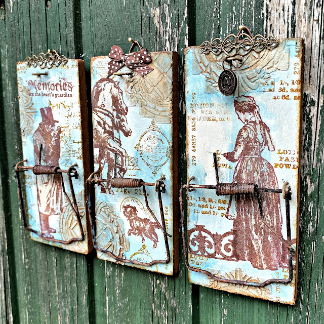
Liesbeth made altered rat traps with her new paint colours (!!!) that stencilled texture adds an interesting backdrop. The metal components were all rusted with PaperArtsy Rusting Powder, and that chimes in perfectly with the ink colour she used for the stamped images - these are all France Papillon designs. If you would like to see more of this post, you will find it here.


Heading in a softer direction, Victoria Wilding used Stardust with Nougat and Surf's Up to make triple layered butterflies for a frame-based project. You can see below her tests with each of the colours.


This is a gorgeous project to have on display, and keeping the colourway simple and structured is one way to restrict your choices so that you stay within a boundary. Sometimes more is not more, particularly for interior decor items where colours are often neutral, this approach can offer flexibility for display options. Here is the link to Victoria's original blog post.


Taking the 2 colour-mixing concept in a bolder direction, Alison Bomber chooses a light colour with Antarctic, and Green with Magic Moss. These 2 Fresco colours mixed with Surf's Up creates a gorgeous range of colours that chime beautifully with her rosemary stamp set.


I love how she has used a selection of the paint chips in her project too ...


You can read about Alison's post here, and she also shared more recently in one of her 'Fun Friday' lives a colour mixing explanation in our Facebook Group PaperArtsy People here, where she explains how to make watery versions of the colours which is often her preferred way to use our paints. Don't forget Alison is a 2024 Fodder School tutor, so keep an eye on her this year as she has lots of fresco and stamping tips to share.


For the final topic featured in this round up, we shine the spotlight on Tracy Scott, our designer who loves bright bold and geometric designs. Tracy always astonishes us in how she manages to create interesting and unexpected things with her products. She has only been art journalling since 2014, and we think her style is particularly unique. Perhaps this is because she has found her own way with paper crafting from the get-go, rather than be heavily influenced by the craft sector. If you would like to read about Tracy's creative journey and how she came to work with PaperArtsy, you should head to this link  

Our bloggers were charged with the task of using Tracy's products in ways that Tracy would not ... let's take a look at how they got on!!

Mags used her love of rust to inform her colour choice with a pop of blue to contrast. The tag envelopes are made from PaperArtsy Crunchy paper, which she has sewn at the edges. In fact adding stitching is the method she used to add texture to this project. You can read all about it in her blog post.


Also, I hope you did not miss this gorgeous booklet by Jennie Atkinson. Her blog post is well worth a read! Jennie is a textile queen, and uses Tracy's stamps in her typical muted colourway. She freestyle machine-stitched over the stamp design to create a re-interpetation, and added colour with watery Rusty Car Infusions.


Finally Autumn Clark loves to make gorgeous cards, and often adds stitching to the borders. She used torn sections of a Tracy Scott  lace booklet page which offers an amazing texture contrast, and PaperArtsy infusions are the colour of choice for these backgrounds. Read more here in Autumn's blog post.


Well, wasn't that a gorgeous selection full of interesting details. We know many of you love these end of year round up posts, and we so appreciate our bloggers who put their amazing twist onto our products.

Don't forget you can follow us year round on Instagram, or come and join our Facebook group PaperArtsy People

We'll be back in a few days with more highlights from the PaperArtsy Blog.

Tuesday 26 December 2023

PaperArtsy Blog - 2023 Year in Review {Quarter 1, Topics 1 to 3}


Season's Greetings from PaperArtsy HQ,

We hope you are relaxing after the crazy-busy lead up to this holiday period, and perhaps now is the time you get to chill a bit. For us, it is a chance to look back at the year that was, and remind you of some of the wonderful posts our bloggers have shared over the year!

This year, we changed up the blog structure a little, we added a theme to arch over the 3 topics of each quarter. We try to offer 3 types of topics: they might be project, colour or designer focused.

Dounia has selected some posts from Topics #1: Shrines, #2: Tetradic colours, & #3: Designer Focus on Seth Apter. It's agony choosing just a couple of posts to showcase each topic; there are just so many that really are incredible creative offerings! If you want to seek the entire topic, then she has included links to the topic intro, and you can go from there to look back at each of the posts, you might even like to leave a comment.

Get ready for a bit of bling, brightness, and blooming good fun as we look back on the first 3 topics of 2023!

Leandra


As mentioned above, we added quarterly themes as a 'red thread' across the topics for an additional layer of fun! It is a new tool for us (and you) to guide the creative process and spark inspiration. We hope they may prompt you, and our bloggers to try new things.

For Quarter one the theme was 'Tracks' which can be interpreted many ways: mark-making, eg. the tracks your tools leave in your art; paths, trails or perhaps maps; in a more literal sense it could be following railroad tracks; it could also relate to travel and adventure. Let's not forget more abstract meanings: following in someone’s tracks, or creating your own, going off the beaten track… The possibilities are vast! You can discover a few more, and a lot of eye-candy in the theme intro post. Our amazing bloggers did not disappoint in coming up with their own version of tracks, here are few examples:

Claire Snowdon's set of altered cards is a great example of tracks as mark-making. They are sprinkled in all the layers of the beautiful background. Be sure to check her original blog post to learn about her process and management of colour. I love the contrast between the grungy background and the simple and sharp focal elements. Her chosen sentiments can also be interpreted as building a path for yourself and reminding yourself to keep on track!


Jenny Maples took 'following a track' literally with a journal illustrating the buildings and birds seen along a walk in her town. She also added some mark making for good measure! These elements really help bring interest to the quiet areas of her pages to balance the focals. I love the contrasting mix of textured background, sharp buildings and whimsical birds. She makes it all work together! All the other beautiful pages are also shown in her original blog post


Renata Peley chose to go with 'tracking'. It could be an animal, a celebrity or your progress but in her case, it is fairies! She made a beautiful fairy tracker kit with all you might need in your search for the elusive magical creatures: reference portraits, instructions and even a vial of fairy dust! The creativity and attention to detail in her project is amazing! Discover all the elements of this intricate project in her original blog post.


Celebrating the new year, the first topic of 2023 was SHRINES here on the PaperArtsy Blog! Shrines are present in most cultures and religions, in an incredible range of size, styles and uses to honour gods, saints, ancestors. From pagan offering boxes crafted from natural materials to the intricate and bejewelled or metal embossed catholic reliquaries, everything is possible. 

Nowadays, personal shrines are popular among makers, a way to honour, preserve and display crucial pieces of our life. This topic was an opportunity to explore what we deem sacred or significant enough to be worthy of a special artistic display. For more artistic and crafty inspiration, check the Topic intro post!

Let's start with this modern and funky triptych by Etsuko Noguchi, inspired by Japanese spirit shrines and her history with PaperArtsy. That substrate certainly immediately brings 'shrine' to mind. Perfect for bird royalty! And how fun and fresh is this colour palette, playing on the complementary purple and yellow to make the birds pop! This shrine is intricately embellished on both sides so be sure to visit her original post to see al the details.


Perhaps you missed this series of matchbox mini shrines by Riikka Kovasin? A very personal piece inspired by Finnish mythology while also celebrating the members of her family. I love how she experimented with polymer clay to create these amazing half-erased stone icons partially hidden by greenery. So evocative! Her original blog post is certainly worth a read as the Finnish folklore tale is fascinating, plus a chance to peek inside the shrines - quite a surprise!


Let's not forget this beautiful fabric shrine by Victoria Wildings. She was inspired by Catholic pocket shrines to make to remember her mum with a deeply personal project, using mainly upcycled materials. To decorate it, she beautifully translated JoFY stamps into embroidered flowers contrasting nicely with the denim. It is such a labour of love so be sure to check her original blog post to see all her work.


In 2023, we are continuing our exploration of the colour wheel and all the possibilities it offers. As a reminder, in 2022, we had already covered:


Source: Alex Guzman


After exploring 2-colour and 3-colour schemes last year, it was time to discover 4 colour combinations within the realm of Tetrads. These are composed of two pairs of complementary (opposite) colours. You can see below this creates 3 different types of schemes, with varying levels of contrast and harmony: 

Source: Alex Guzman

This allows for endless possibilities, especially when using a non traditional colour wheel. However tetrads can be a bit troublesome to balance than with 4 colours to juggle, so be sure to check the Topic intro post for a lot of tips and tricks and some picture inspiration.

Ellie Knol chose rather classic starting colours: Yellow Submarine, Blueberry and Claret for her red. She then selected a 'skinny rectangle' scheme. In a skinny rectangle, there are the 2 pairs of complementary, and therefore contrasting colours, but they are right next to one another, allowing for subtle variations. The contrast is then between the warm and cool groups, rather than between the individual colours.


Ellie kicked off her project with a gel printing session. Be sure to check her process in her original blog post! The resulting prints were elevated in these notebooks covers. The colour contrast between the mainly warm warm print and the cool background is quite characteristic of tetradic colours in general and the skinny rectangle in particular. I love how she used the blue of her palette to create shadow and depth in her print and focal images.


Liesbeth Fidder-de Vos extracted a classic rectangle scheme from her wheel, made unique by her choice of muted non-primary starting colours: Key Lime (greenish yellow), Wisteria (purple) and Butternut (orange). The whole wheel is full of subtle, original tones! The rectangle is the most classic (and easy to use) tetrad; the four colours are quite distinct and contrasting but will still harmonise well.


Liesbeth used her colours to bring to life this very dimensional tunnel card. Each layer is mainly one of her chosen colours. This separation by layers is a good way to avoid clashing colours.  Her use of little touches of additional colour then brings everything together. The more you look at it, the more you notice all the textures and subtle details! Pictures of all the layers and, technical details and more are in her original blog post, so give it a read!


Martha Ponsanesi went a step further in wheel-customisation and chose a neutral, Nougat, as one of her starting colours, adding Berry Nice (purple) and Coral. Look at that wheel! She then chose a balanced square scheme full of soft and delicate colours! Among the tetrads, the square has the most colour contrast, with two spaces between all the colours. It creates palettes with a lot of 'pep', softened here by the creamy opaque Frescos that the Nougat creates.


With this beautiful palette, Martha built pages for a mini photo album. She went full production chain so be sure to check be sure her original blog post to see all the elements and pages! I love how she played with the different colour combinations inside her square scheme. She used one main colour per page with the others as accents. It is another great way to balance tetradic colours without your project looking gaudy or too busy.


Another new development on the blog for 2023 was to shine a spotlight on our amazing designers and their unique and varied styles. It was a chance to share with you more about their backgrounds, discuss their crafting philosophies and discover their design process. We invited our bloggers to explore the designers, and asked them to put their twist on the collection.

Already a confirmed artist, Seth Apter entered the PaperArtsy designing family in August 2016 and now has more than 35 A5 stamp sets, 30 minis and 30 paint colours, with 4 more coming early 2024. His grungy style is loaded with abstract elements, inspirational quotes and versatile textures - instantly recognisable. Learn all about his artistic start, his inspiration, and his creative process in the topic intro post as well as his live interview with Mrs PaperArtsy. Now let's see our bloggers' interpretation of his products!

We love this assemblage by Renata Peley. It was a project outside of her comfort zone, exciting to see our bloggers try a new groove! The 3D aspect caused her quite a bit of trouble but she prevailed! I love the attention to detail: every element is beautifully planned and finished. Go check her original post for a better look at all the amazing layers!


Going in a different direction, and proving Seth's products can be colourful and very feminine, what about this scrapbook layout by Asia Marquet? She certainly shares Seth's love of circles! I love how she manages to combine soft colours with bold designs and grungy elements with glitter. Keeping white space helps the striking portrait integrate with the rest of layout. Be sure to learn all of Asia's composition tricks in her original post.


Finally, I hope you did not miss Keren's sewing experminets: dyeing and paper-casting. what an eye opener to the possibilities! I know she was not a fan of the final colour of her dyed fabric but I personally love this colour palette with its soft contrasts and pops of colour. Each of her tags is a mini project with its own journey and techniques making her original blog post well worth a read!


Well, wasn't that a fabulous array of wonderful creativity!? We are so spoiled by our blogging team and the lengths they go to creating their projects. I hope you can appreciate the time they put into each piece, but more importantly, how much they enjoy what they do while creating.

We'll be back in a few days with more highlights from the PaperArtsy Blog, hope to see you again!

Wednesday 20 December 2023

2023 Topic 12: Designer Focus: JoFY {by Jo Firth-Young}


Hi everyone

Jo (jofy.co.uk) here with you today. Christmas can be a busy time so its nice to take some time out of the hustle, bustle and 'hohoho' to sit and create. When I began thinking about this blog post I knew I wanted to create something festive so to get me in the mood I turned on the Christmas tunes and festive films. Do you do the same?

I settled on creating Christmas cards using one of my new Christmas stamp sets JOFY131- but because I've used the main image (the wreath) quite a lot already I wanted to focus on the smaller images in the set. The  single berry motif is really versatile (cut off the holly leaves and it can be used all year), the tag is super cute & it would be shame not to use the teeny tiniest stamp I think I've ever designed (the berry 'centre') in some way!


I like to combine different elements when making cards so I gathered up a set of bold word dies, stencils for gel printing, paints and stamps (of course!) and started making what was needed to create the patchwork/collage cards I had in mind.


I began by selecting paints from the PaperArtsy Fresco range that reminded me of a 1950's Christmas colour scheme - colours that inspire me.

Pinterest is a great resource for colour schemes - lots of images to suit and inspire themes and projects like the one shown below. Its a wonderful colour resource.


The overall plan was to create gel printed papers, painted stamped motifs and die cut elements that I would assemble into patchwork backgrounds and assembled clusters on greeting cards. 


First I created bespoke background papers by pulling plain and patterned gel prints and adding stamping and mark-making to break the patterns up and make them 'daintier' and more detailed they needed this as they would be cut up in to small pieces.
I wanted the papers to mix and match so I used the above colours for background and details.


I printed lots of backgrounds, here are a few... I didn't use all of them for these cards but that's ok - they'll be used or upcycled for other projects.


Clean up/ghost prints are great as they often have lovely texture as shown above. I over-stamp prints with a background stamp (like this one from JOFY125) and use inks rather than paint (eg Crimson Archival ink).


This is a lovely background stamp - looks especially great when stamped and embossed in Gold, as shown below.


The Red Lipstick Fresco spotted print on a Cloud9 background (below) was quite bold so I tried to soften it by added painted spots and red & gold mini stars/flowers....


I printed a selection of pages:

.... in cream/gold... the Gold Fresco paint is fabulous when its gel printed!!


...and Aqua Duck Egg/ Caribbean Sea...
 

I added to detail to these gel prints by stenciling on top (PS313) and adding white dots (Cloud9 and Snowflake):


Stamping and embossing in white detail embossing powder gives a lovely crisp pattern:


I took the photo below while I was making the cards - its the pile of 'discarded'/waiting to be used bits and pieces - I loved how they looked together. Seeing different elements together like that can be quite inspiring. The dies ('Big Tidings' by Tim Holtz from Sizzix) were cut from gold and white cardstock - those 'neutral' colours would work really well with my colour scheme... and the gold card links nicely with the gold embossing and paint detail added to the gel prints.


I really like this way of creating - messing around with all the elements to see how they look together, which background papers work best and cutting and stamping other elements where necessary to add to the look/design of the cards.

Here are the cards I created - lets start with the 'pink' ones. Each of the cards features the berry motif painted in shades of pink/red, and a tag.


The addition of a wreath die-cut (Sizzix) give the card focus, and somewhere to place the berries and other embellishments. Embossing the pink card stock added texture to the piece.


I love how the white embossing looks against the kraft backround - so crisp and dainty at the same time.


Paint splats make great snowflakes don't they! lol The tag on this card is cut from a block of text I created by repeatedly stamping the word block from JOFY131.


Here are the 'aqua' cards:


The size of this word die allowed me to layer the die cuts and stamping on this card.


The panels of paper on this card have been attached with machine sewing - a similar effect can be achieved by hand sewing a simple running stitch or by drawing a stitched line with a white (or black) pen.


This is my 'less is more' card - I'm so happy with how it turned out.  Its big (7x7in), the metallic glaze stenciled snowflakes on the front are subtle and it has a lovely fresh look.


The 'Noel' die cut lays over an aperture allowing a peek into the interior of the card.


My creations aren't all cards - I had small bits and pieces of each of the background papers leftover and, as I don't like to see those go to waste,  I planned out a grid style greeting card on a black card base...


but I wasn't keen on that so I transferred all the pieces to a page in my grid journal- much nicer! (a grid journal is a great way to keep all those lovely bits and pieces out of the rubbish bin!)

And, as I still had pieces remaining, I made a grid inspired card too!


I embellished this with a wood snowflake, the greeting block from JOFY128, and a gold embossed print of the background stamp from JOFY125


There were even smaller scraps I couldn't see go to waste either - perfect for creating a little christmas tree to fit on a wood slice!! Great little project to add to a gift, a table setting or to hang on the Christmas tree.


I loved working with the bespoke papers I created, & teaming them with dies and stamps - I STILL have pieces left over!! The more I made the more I was inspired to change it up: add different greetings, add a snowflake here and there - slightly addictive - in a good way! Its fun to see how many cards can be created from relatively few supplies.


I encourage you to gather your supplies, turn on your Christmas tunes, wear your Christmas sweater if it will get you in the mood (lol) and get making!!!  Take a look at the smaller motifs in a stamp set and see what you can create with them - you'll be surprised!!

Finally - HAPPY CHRISTMAS!!  I wish you all the very best for the festive season - enjoy! See you next year.