Sunday 30 January 2022

2022 Topic 02: Pattern Play {by Claudia Neubacher} with Sara Naumann Stamps


Hi everyone, it's Claudia Neubacher from VonPappe II with you today, and I'm here to share with you an idea on how to use mainly text based stamp sets for pattern making - which isn't something that you would think of in the first (or maybe even second) place.


During my studies at Art University I also learned a lot about creating posters (back then these had to be done by hand!) and using single words, text lines or blocks and the patterns they also are (besides transporting a readable message) as a part of an artful composition. I especially enjoyed my weekly four-hour Friday classes on calligraphy and poster design. 

I didn't question the why back then, but today I'd say it is the rhythm and visual quality of a printed or beautifully handwritten text that not just relaxes and attracts me - because I am visually enjoying the rhythm and order. So when it came to combining the "Pattern Play" theme with some of the new stamp sets from Sara Naumann, I was immediately transported back to my happy times in poster design class and it was the idea of creating text based washi tapes to alter a journal cover which evolved!


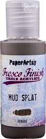
I gathered a blank Kraft journal I found in a dollar store (I am a hoarder of these honestly), a palette knife, stamping ink and a stamping block, PaperArtsy Fresco Finish Chalk Acrylics, a roll of masking tape, two of the beautiful new Eclectica Sara Naumann stamp sets and one of her new stencils and started with some experiments on repetitive text stamping.

I worked on a large non-stick Teflon sheet so the masking tape could be peeled off easily once finished to be used on my planned project. I started working at the top section of my craft sheet to have enough space to continue working while the first strips were drying.

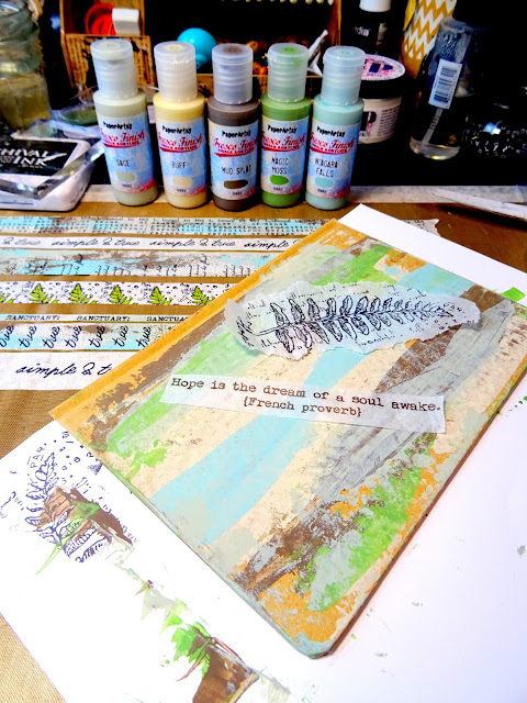
As the stamping ink takes some time to dry on the masking tape, I used that drying time to scrape my Fresco Finish Chalk Acrylics across four more strips of masking tape, creating layers until I was content with the look. 

 
For starters I used Fresco Finish Chalk Acrylics Sage (FF66), Niagra Falls (FF205) and Mud Splat (FF61). I made sure I let each layer dry before I added the next to avoid smudging the paints. The trick to creating these loose scrape patterns is to use very little paint, just the very tip of the palette knife and to hold it real flat while scraping. Lift off the palette knife now and then and continue to scrape in other spots. I usually add a little paint to a palette or directly on my craft mat and pick it up from there.


While the paints were drying, I coloured one of the stamped washi tapes with a green metallic marker (which I found was quite relaxing...it felt almost a bit like colouring a mandala, only not that annoyingly long...lol). For this particular washi tape I simply used the very top of the fern image from the new Eclectica Sara Naumann stamp set 56 (ESN56) and stamped that repeatedly, trying to keep the stamp at the same angle each time. But it is of course the little imperfections of the hand-made that make your mixed media art come to life! So I embraced any stamped fern top image that was a bit out of order.
 

In the meantime the tapes with the scraped on paints had dried and were ready to get stamped too. In this picture I am using a text stamp from the Eclectica Sara Naumann stamp set 56 (ESN56) and Ranger Archival ink (Jet Black). The lovely "simple & true" quote on one of the upper strips in the background comes from the Eclectica Sara Naumann stamp set 58 (ESN58) - the one with the beautiful tree and lots of inspiring quotes.


If you want to just use part of a stamp - like the "true" from this quote - and make sure it always goes in the same position, there's a simple trick: mark the spot where you want the border of the stamped image to align with the washi tape's edge on your acrylic stamping block! To do so just position the stamping block with the selected part of your stamp image face up on your washi tape in the position you want it to go and then mark the bottom of the washi tape edge with the masking tape directly on the acrylic block. When stamping you just need to align the upper edge of that masking tape with the washi tape you're stamping onto.


Finally I trimmed some of the washi tapes by gently sticking them to my cutting mat and carefully cutting along a metal ruler with a carpet knife. I then immediately returned the tapes to the Teflon sheet for later use. I will just sneak in a few close up of how they ended up fitting in on the cover.


I cut off part of some of the tape with the fern tops to make it narrower and I also just wanted the "SANCTUARY." as a single word instead of the whole text from that stamp. Here is how that ended up being used as a narrow strip ....


Once I found I had enough self made washi tape (and some more in case my text pattern experiments didn't fit the design I had in mind), it was time to tackle the journal cover!

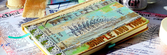
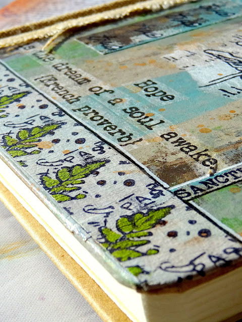
Pattern play for me also included playing with the patterns created by the tools used to apply the paint and by the substrate's texture - so my plan was to combine the stamped text patterns with the paint scraping patterns on the washi tape and cover backgrounds. Also I was inspired by the lovely fern image on one of the two Sara Naumann stamp sets (ESN56) that I fell in love with at first sight and wanted that as a focal image for a journal with affirmative and soothing character (as I seem to need a lot of calm and positive thinking these days).

I always like to have all the elements I want to play with at hand and to be able to move them around on my substrate to find the most pleasing design - so I stamped the fern image and the French proverb onto some deli paper and cut and tore the dry stamped images to size. The cover background was created by scraping on the Fresco Finish Chalk Acrylics I had already used on my washi tapes plus two more tones: Magic Moss (FF130) and Buff (FF96). To keep the journal from being stained during the process, I inserted a protective paper sheet behind the cover.


Using PaperArtsy Grunge Paste and Sara's PaperArtsy Stencil 297 (PS297), I added another version of the "simple and true" quote to the design (I already had one version stamped on tape and variation and repetition are always a good thing to have).

 
While the Grunge Paste was still wet I sprinkled on some PaperArtsy Rusting Powder and sprayed that with some table vinegar from a spray bottle to initiate the rusting process. I repeated spraying on more vinegar while I continued working on the cover. To protect the other areas of the cover I simply used a sheet of printer paper to kind of mask these while spraying. 
 

I played around with all my components and only loosely attached the washi tapes so I could remove them easily to try other spots for different designs until I was content with the design of my cover. 


In the meantime I kept spraying on vinegar and slowly but steadily the rusting process started to show just beautifully!


You can see how the rust colour travels with the vinegar liquid to rust-stain around the letters and into texture too...


During the designing process another benefit of using stamped images and quotes on tissue or deli paper started to show; I found that by cutting the stamped fern image and quote into sections I became even more flexible with my design! 


I found that my journal needed some haptic texture as well to go with the visual one, I added a strip of rough linen ribbon to the spine after I had glued all the stamped images and washi tape strips to their spots. I used DecoArt Americana Decou-Page (matte) and a wide soft brush to glue everything in place. I also covered the tape strips with a layer of the decoupage glue to make sure they stayed in place and wouldn't come off during use. 


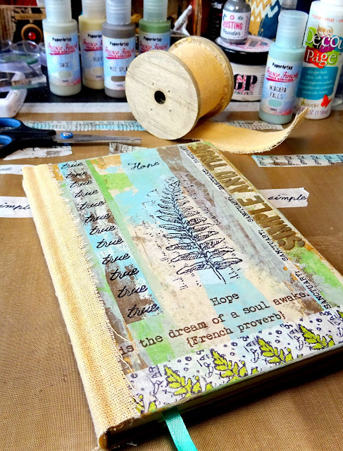
I also added some tape strips to the back cover and the insides of the covers to round up the look of the journal and bind it all in. Especially the cool flap pocket on the back cover's inside needed some special highlighting! 
 

This way even left overs of tape strips I had used on the cover were used up and also helped unify the design throughout the whole journal! 

It had all come together just beautifully! For final touches I went in with a white Sharpie and added little highlights to the fern image for a bit of depth and also coloured the little loops of the "e"s with every "true" on the self made washi tape - this way these became a kind of pattern on their own with the regularly recurring white dots in one vertical line! I also traced the edges of some of the added tape strips with the white Sharpie and a black ink marker to visually bind in the black and white from the stamped focal image and to emphasise the strip design.
 

I love how the texture from the scraped on background, the clean focal image and stamped repetitive words, the subtle white highlights and the grungy feel of the beautifully rusted quote all work together! 


The rhythm of the fern leaves gets repeated by the rhythm of the repetitive words on the hand made washi tapes! What a great match!


Combining textural media like the PaperArtsy Fresco Finish Chalk AcrylicsGrunge Paste and Rusting Powder with the linen ribbon and with applying the paints in a highly textural way I got a beautifully worn and weathered looking mixed media piece! I definitely love my new affirmative journal as it really gives me a soothing and calm nature feel in every way - and isn't that fern image just lovely! 


Using only sections of stamp images for repetitive stamping to create your own washi tapes is such a rewarding thing to do! Be daring - experiment! 


As I have, you will end up with some designs that don't work well enough to create striking patterns - but you will develop an eye for it! Looking at text as a shape or pattern instead of just seeing the message it transports will open up new possibilities for striking designs with that graphic intellectual touch! 

Claudia x

Thursday 27 January 2022

2022 Topic 02: Pattern Play {by Nikki Acton} with Tracy Scott Stamps


Hi everyone, it's Nikki from Addicted to Art with you today, and I'm here to share a piece of Wall Art using new stamps from Tracy Scott.


These stamps are ideal for our current topic of Pattern Play. I decided I wanted to incorporate one of the new stencils as well, so chose to create a paint stencilled background with the stamp images collaged on top.

I used a restricted palette - creating different 'tones' of the same colour by adding white and black. (Adding black is called a Shade, adding white is called a Tint.)


To begin I gathered my supplies to decorate my wooden panel (6x6inches). One colour - PaperArtsy Fresco Finish Chalk Acrylic - Blue Jeans (FF168) along with PaperArtsy Fresco Finish Chalk Acrylic - Snowflake (FF15) and PaperArtsy Fresco Finish Chalk Acrylic - Little Black Dress (FF19). To create the pattern I used PaperArtsy Stencil by Tracy Scott (PS307). To see the post showing her newest stamp and stencils released in January 2022, visit here.


Firstly I painted the panel black all over. The stencil contains several 'pie quarter' shapes, which can be used in many ways - including making a full circle. I started each quarter with my palest colour in the middle (Blue Jeans + Snowflake), then Blue Jeans, and finally Blue Jeans + Black towards the edges.


If you would like to see this process in more detail - there is a short video below.
 

You can see my sponging of colour is not perfect! The wooden panel isn't a smooth surface so if you are doing on paper it should be a little easier - but either way - with the additional layers that follow, you will soon see - it really doesn't need to be perfect!


The next step was to create my pattern of stamped images - to go on top of the stencilled panel. I felt I needed to do this BEFORE adding additional colour / highlights to the background - so that I highlighted the correct areas.


I stamped quite a few images from Tracy Scott stamp sets 66 and 68. (TS066 and TS068) (see the new post showing her new sets here).

This allowed me to play with patterns! Here is another one I am playing with - this helps me decide where I need to add some white and coloured highlights over my paint (and where I would be wasting my time as it is going to be covered up!)
 
 
Once I had decided on my pattern I added some shading and highlights with Prismacolour Premier coloured pencils in Light Aqua and True Green along with a Posca Pen in white.


Finally I added colour to my stamped images for my focal pattern using the same colour pencils.


These curved stamps are amazing - 4 of them fit perfectly to make a circle and the little flower is great on its own!
 
 
To finish, I adhered my shapes to the wooden panel.


When I get some new stamps, especially ones like this - I do like to stamp and fussy cut them out - this allows me to play around with patterns and shapes. I might take a photo of something and then that leads to me to trying something else.

Nikki