Hello from PaperArtsy HQ,
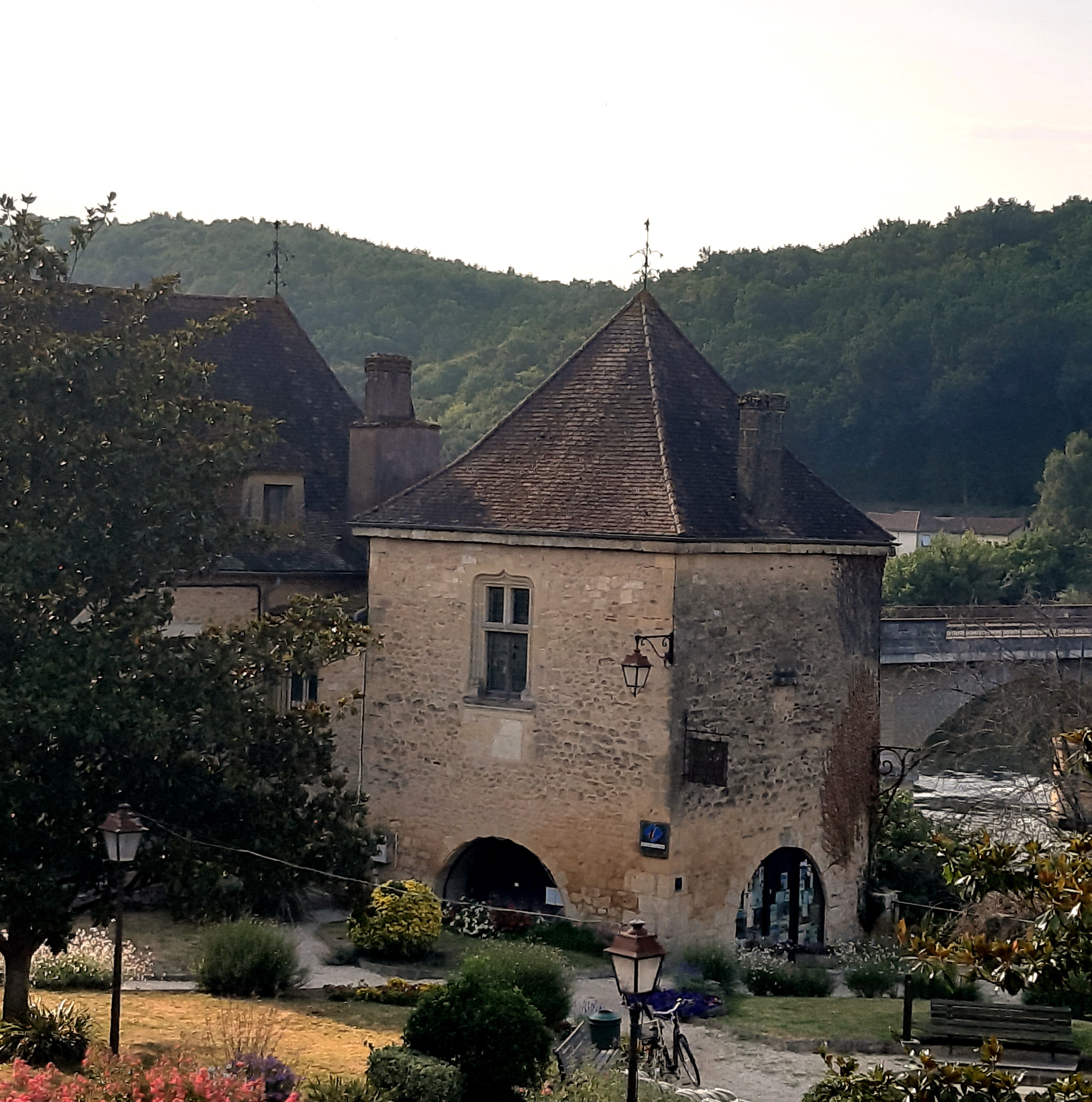
How has 2022 been for you? We hope that you have found more time to be with friends and family than last year! Here at PA HQ there have been many comings and goings with people finally able to leave New Zealand after the border was closed for so long! So we have had quite a number of family and close friends come our way this year from NZ. It has been a revolving door from March to October, and as this was the first 'proper' summer here since we arrived in France, it has been awesome to enjoy many new experiences that we did not realise were 'normal' for the summer months. Days in the pool and every-meal eating outdoors in cool spots (or less hot ones). So many visits to scenic spots, kayaking on the Dordogne River, local food and 'line' dancing in the local village one the sun has set, plus many trips to picturesque villages nearby. It is a country full of the joy of celebrating regional differences, and we have thoroughly loved the chance to share the little things we are learning that are special to this region with others here on holiday. Still pinching ourselves about the location we find ourselves in, we were only looking for a property to suit business functionality, but we daily celebrate how close we are to Bordeaux, Bergerac, Lalinde and Couze et Saint-Front, making it easy to enjoy daily bread from the village to city life and shoipping, or wine tastings at local chateaux; we are so close to it all.
One of the things I have missed a lot about England is designers and friends just dropping into PAHQ. We do have neighbours and friends constantly dropping in here, but I do miss Tracy and Jo who were our most frequent visitors, as they both lived not too far from us, and often popped into the 'vortex' as Jo would call it - that place where time weirdly evaporates when you come over to pick up or drop off something, and inadvertently find yourself becoming a helpful elf!
Today Dounia is sharing her picks from Topic 9: Leftovers, Topic 10: Up My Street, Topic 11: Mash up with Tracy, Nicci and Scrapcosy and Topic 12: Minimalism.
Take your time to enjoy today's round up, there is so much goodness to remember from the incredible blog team this year. They really come up with so many beautiful ideas, and I hope you get a moment to take a look at their wonderful creativity, it is so inspirational!!
Leandra

Keeping up with or focus on sustainability in crafting, we are this time focusing on all the little treasures created as a by product of creating!
You know what I am talking about. Even the most frugal and organised of us end up with scraps of papers, pieces of pictures and hints of die cuts that did not find a place in the finished project. But we can't throw them away, they are so pretty and could be useful later! Well, later is now. Time to bring out all your bags and boxes of carefully preserved pieces and have a play session. Keren's intro post gives lots of ideas for using tiny bits and bobs, and not just paper, textile, clay and paint also make an appearance! Our bloggers then rose to the challenge beautifully, sharing their treasure chests and combining them in creative ways. I don't know about you but I must admit seeing other people piles of leftovers also assuaged my guilty conscience about my own hoarding tendencies!
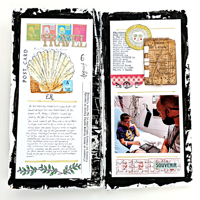
My first pick is striking summer journal by Kate Yetter. She went full on sustainability, even the base is recycled from lunch and gift bags! How impactful is that bold and texture black edge? I love how it grabs your attention and contrast with the detailed and colourful layouts. Be sure to check her original blog post for an insight into her process, quite different from her usual style, and for a look at all the varied pages.
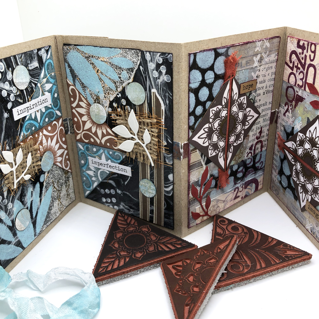
Nikki Acton chose to collage her leftovers on a little concertina book. Her original blog post is full of tips to make the mix of papers and textures look like a cohesive whole. More than just colour consistency and a focus on triangles, she also consistently used the same stencil and stamp set through the project! I love how she manages to make the pages obvious pairs that have their own story but also work all together.
Claudia Neubacher went 3D for her own project with this grungy home decor panel. In her original blog post, you can see it develop organically, with a few of the fails, twist and turns we all experience when creating. She also shares her beautiful collection of bits and bobs in their pretty containers! This piece is so dimensional with its clay stamping. I particularly like the tiny bottle: it is a vase of feathers but also evocates a soft brush!


What can we say about where we live? And what does it says about us? This topic revolves around the notion a home, of community but also the beauty of architecture.
To start you off, Keren's intro post is a beautiful poetic reflection of what make a neighborhood, a street, a house, a home, interspersed with inspiring pictures.
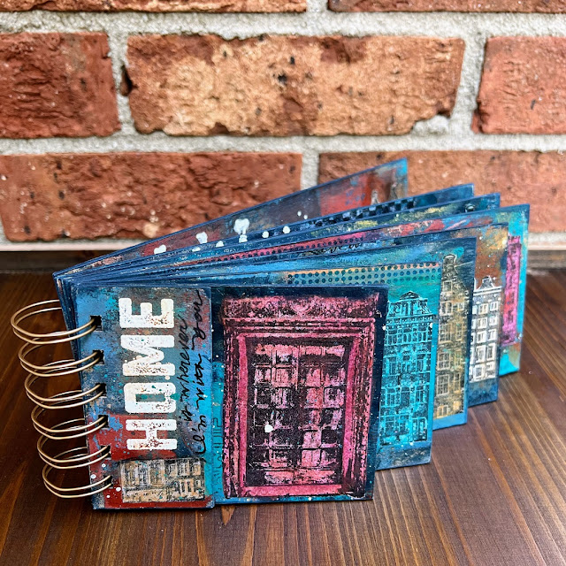
Autumn Clark took advantage of the numerous house, door and window stamps in the PaperArtsy collection for this colourful cascade book. I am always impressed by her talent at making work together colours that you would not think of mixing! Check her blog post for a better look at her rich and rustic palette and her fun gel printing session. It is also a great example of how sometimes art speaks to you, as she ended filling the book with photos of her hometown.
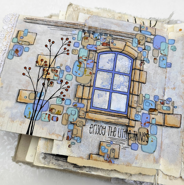
This topic was made for Jenny Marples, who regularly wows us with her architecturally inspired creations. Her pages are always impressive and this lot does not disappoint. This time she mixed classic stonework with Kim Dellow's retro pop designs for a surprising and whimsical look. I love how she married her realistic drawings with the abstract stamps and stencils, and made it look achievable. Go to her original blog post for two other wonderful pages!

To start you off, Keren's intro post is a beautiful poetic reflection of what make a neighborhood, a street, a house, a home, interspersed with inspiring pictures.

This topic was made for Jenny Marples, who regularly wows us with her architecturally inspired creations. Her pages are always impressive and this lot does not disappoint. This time she mixed classic stonework with Kim Dellow's retro pop designs for a surprising and whimsical look. I love how she married her realistic drawings with the abstract stamps and stencils, and made it look achievable. Go to her original blog post for two other wonderful pages!

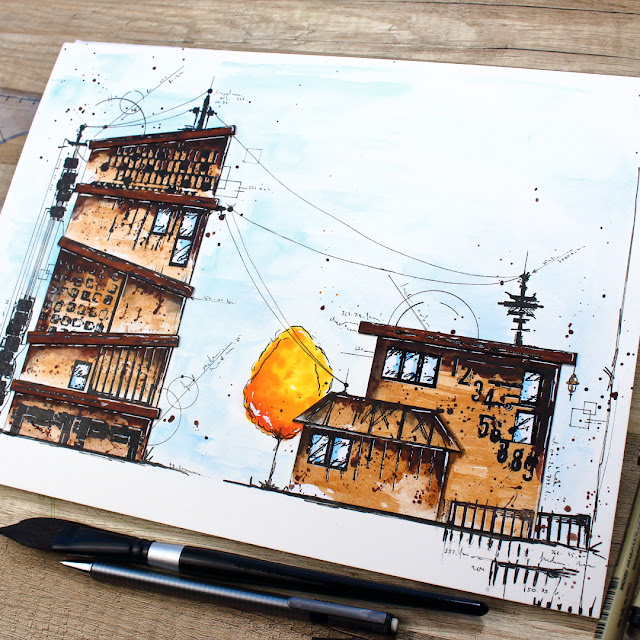
Renata Peley also mixed hand drawn buildings and stamps but her result is completely different and totally striking! Her original blog explains the set backs she faced, as sometimes you first idea just does not work, but she regrouped and managed to achieve her vision! I love her use of colours, the contrast between washes and bright pop for great dimension. Her attention to details, with the stamped antennas and doodled cables, also bring this project to, another level.

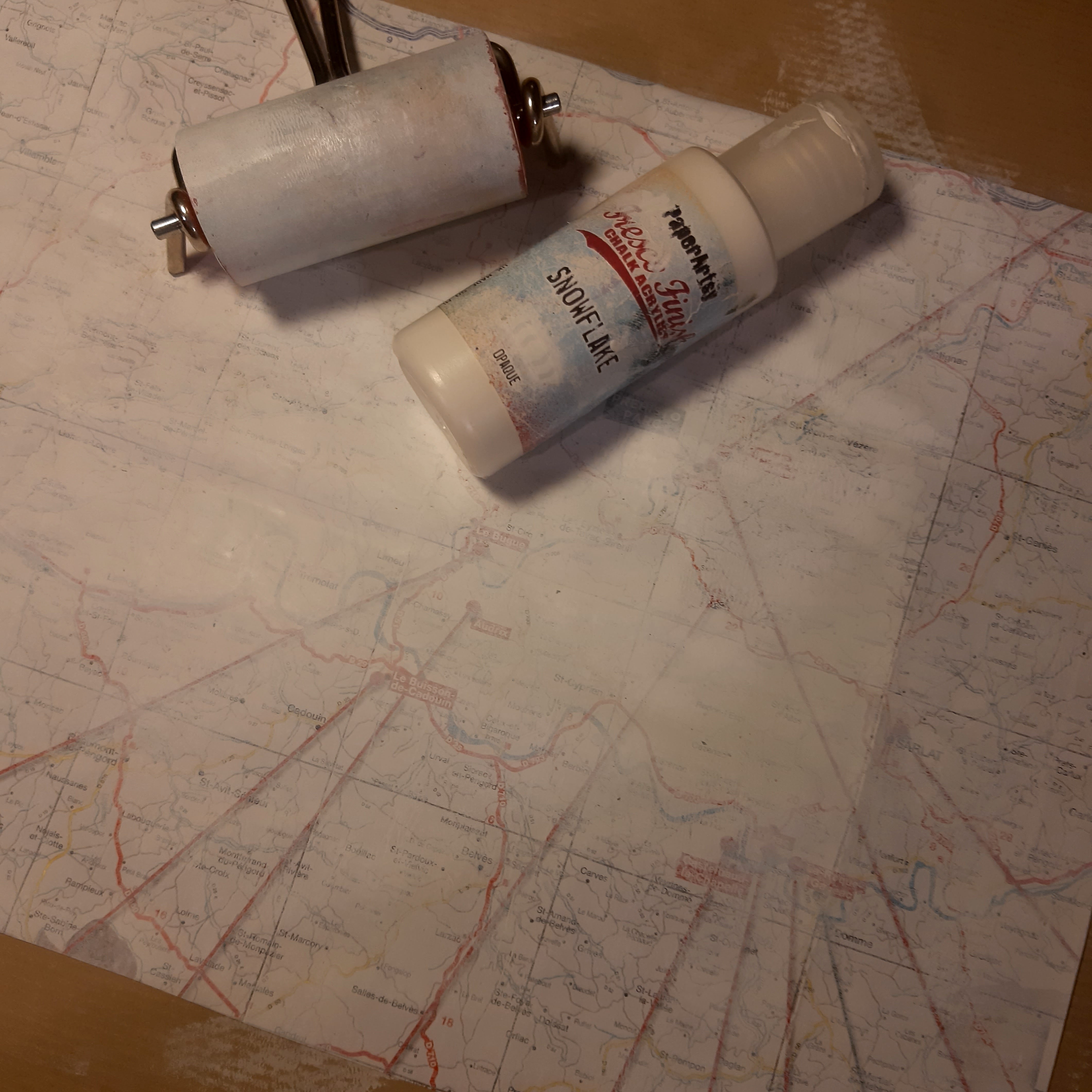
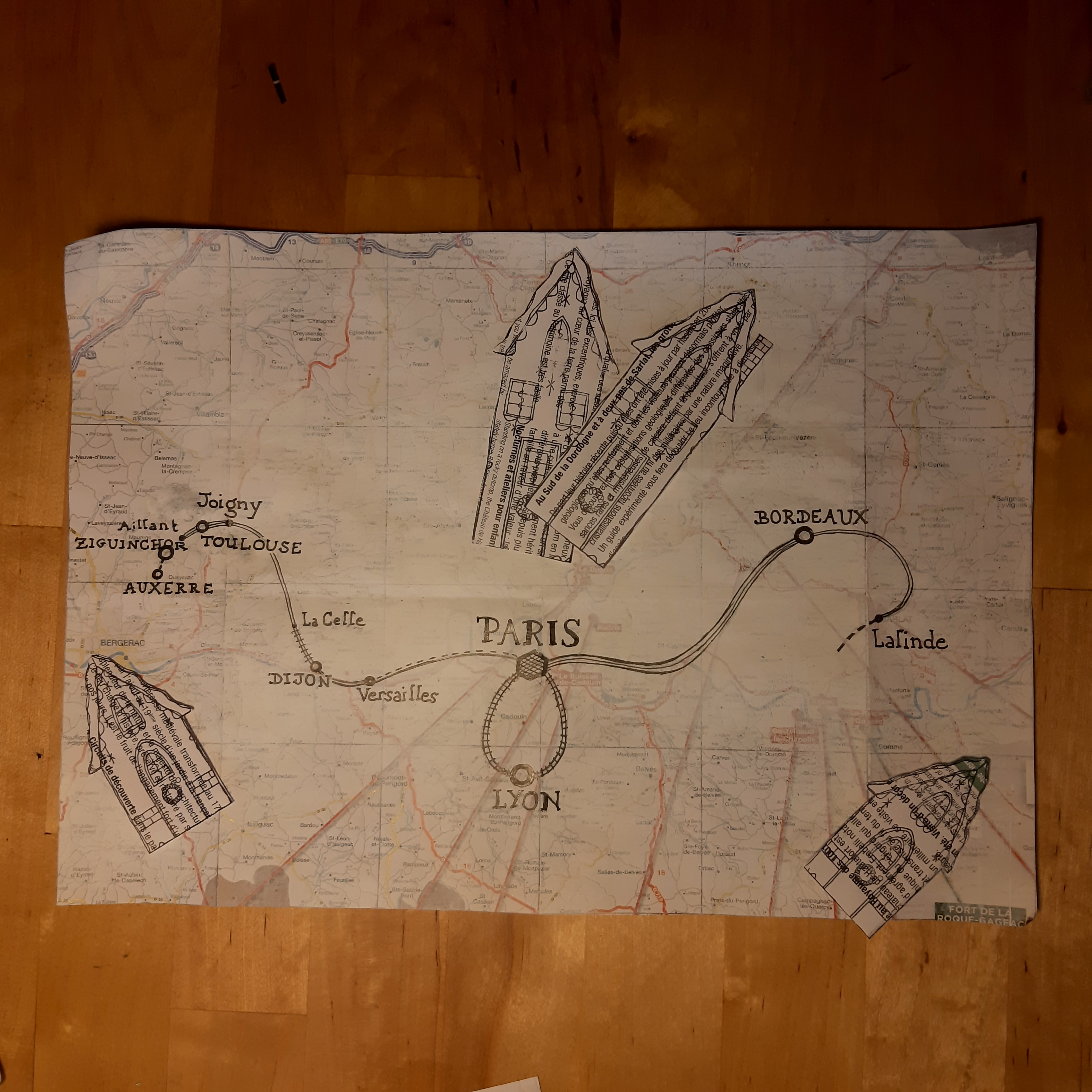
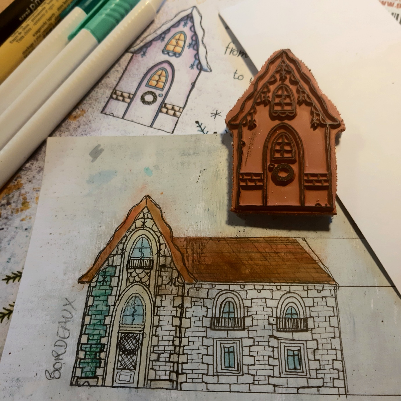
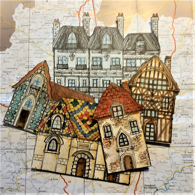
Dounia Large put together a life map retracing all the places in France she has lived in and illustrating some them with Kay Carley's little houses stamps. Her original blog post beautifully shows the architectural diversity of her home country and explains her choices and inspiration. It is also a great example of how you can personalised stamp to suit different styles: from winter chalets to timbered medieval houses to 19th century buildings!


Back with another mash-up topic! Once again we tried to put together 3 universes full of fun and possibilities, backgrounds and focal images, stamps and stencils. See Keren's intro post for more visuals on our 3 designers.
While Tracy Scott might say her style is that she always changes styles, her stamps and stencils are definitely identifiable, with bold flowers, intricate mandalas and inventive pieces for pattern play. Raquel Burillo, AKA Scrapcosy, is all about vintage, mixing versatile elements like frames and labels with beautiful hand drawn fauna and flora. Nicci Battilana is the newest PaperArtsy designer, bringing a distinctive fun and gothic style, full of intricate characters and playful textures. As always, our blogging team was full of wonderful and unexpected ideas blending or contrasting the designs from these 3, have a look:
While Tracy Scott might say her style is that she always changes styles, her stamps and stencils are definitely identifiable, with bold flowers, intricate mandalas and inventive pieces for pattern play. Raquel Burillo, AKA Scrapcosy, is all about vintage, mixing versatile elements like frames and labels with beautiful hand drawn fauna and flora. Nicci Battilana is the newest PaperArtsy designer, bringing a distinctive fun and gothic style, full of intricate characters and playful textures. As always, our blogging team was full of wonderful and unexpected ideas blending or contrasting the designs from these 3, have a look:
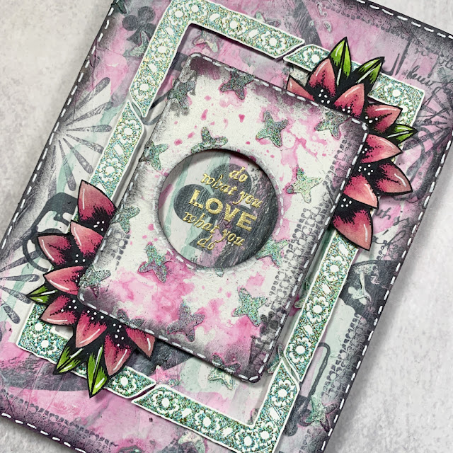
First, Laurie Case altered jumbo playing card into soft and grungy dimensional displays. As explained in her original blog post, this project was not smooth sailing, she had to start over twice, but you cannot argue with the result! I love all the techniques she packed on a rather small substrate, and her layering is gorgeous and effective. She had the idea to use a regular size playing card as the center, and to die cut it reveal the centre club, genius!

Ellie Knol went for a tag book with striking colour contrast. Her original blog post details how she made her bright masterboard. You can only see snippets here, but it also covers the other side of the tags. I love the functional stamp windows, you can slide the backgrounds in and out, and change them if you want! I like them as is, as they feel like windows to the other side of the project, but they would look amazing with photos for example!

Renata Peley blended the 3 designers styles perfect in this vintage and soft journal page. The Scrapcosy flowers seem made to go with Nicci's pensive Rococo lady! I am impressed by how well she managed to marry the soft pastels of the focal point and the bold vintage browns of the background without them clashing. Check her original blog post for a better look at all the details and dimension she added to achieved the final look.


Less is more!
I must admit I was tempted to simply write 'Minimalism' in big letter and call that an on topic introduction... but you will have to bear with me prattling on a bit more. Minimalism is certainly achievable everywhere, check Keren's intro post for examples from fines arts, architecture, crafts and more. But what makes a craft project minimalist? Of course, we general think of composition: not too many elements, no clustering, clean lines etc... but we wanted our bloggers and you to think further than that: what about focusing on using of one colour? or maybe restraining oour use of supplies: just one stamp or just one stencil? This is a good opportunity to reflect about your style and creative process and find out which elements you can do without and which are crucial to make your work yours.
My first pick is this subtle scrapbooking layout, a rare treat on the PaperArtsy blog. Jennie Atkinson saw all our suggestions to achieve minimalism and said 'yes'! Careful composition, restrained colour palette, limited use of supplies, and more play together for a deceptively simple yet elegant look. Her original blog post really explores the mindset you need to achieve for this type of project, and how clean and simple does not necessarily mean quick and easy!

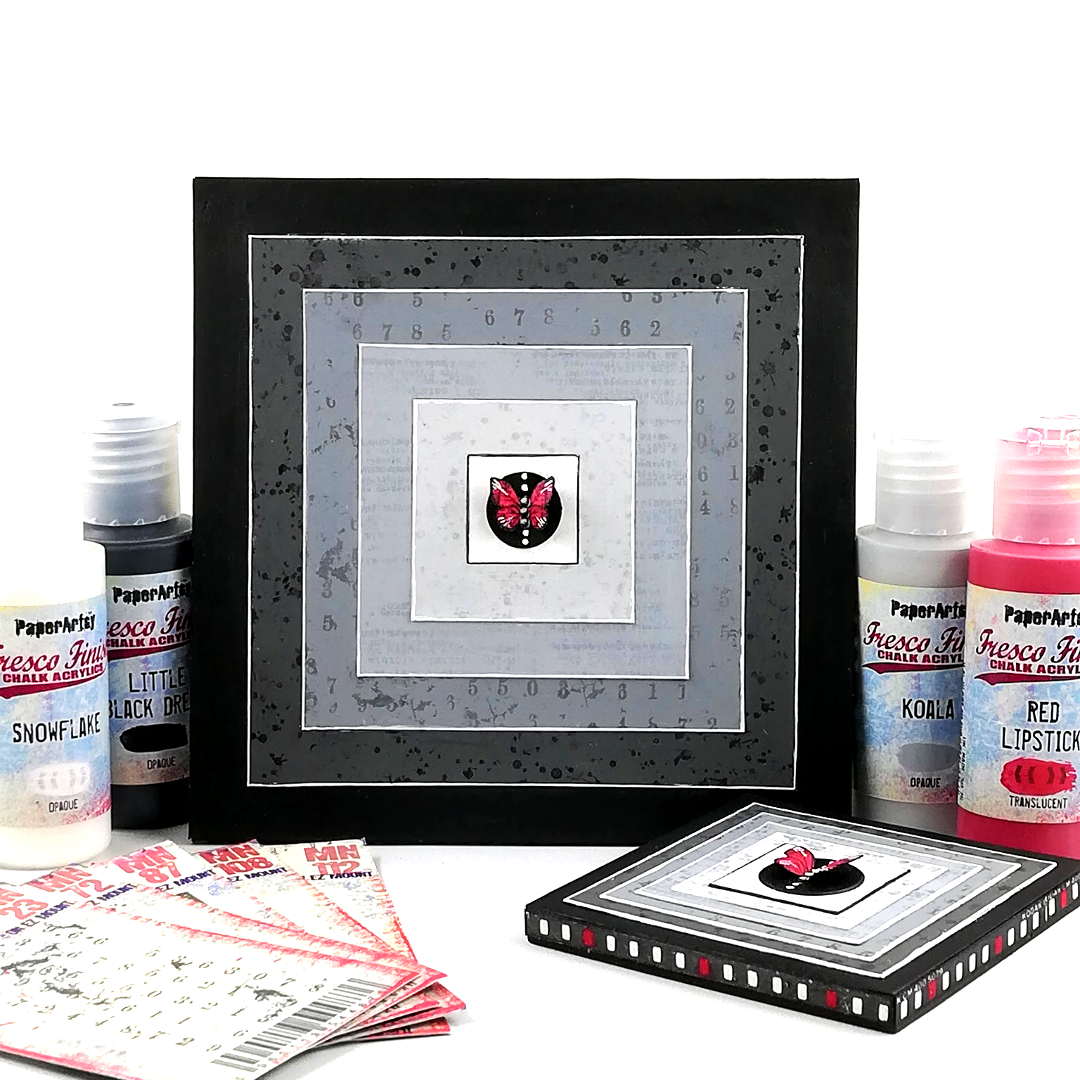
Minimalist does not mean soft colours! Amanda Pink chose a mainly black and white look and bold geometrics for her art block inspired by Frank Stella. What an impressive showcase for this tiny butterfly! A great example of effective compostion: The nestled squares and gradient of grays really focus the eye in the center to the pop of red bringing the piece alive. Check her original blog post for a deep dive into her process and a closer look at the subtle details of each non-layer.
Asia Marquet certainly seized to the (mainly) one stamp idea! Like quite a few of our bloggers, she had to face the terrible, and often avoided, challenge of careful planning, and the nerve-wracking pressure of clean crafting but the result is certainly worth it! I love the subtle colour variation between the impressions and the tiny numbers add-ons. Go to her original blog post for all the details on her Infusion-stamping technique!

Who said you cannot be minimalistic with cute and detailed stamps? Victoria Wilding certainly proves that wrong with this series of ATCs. Her original blog post details all the steps for these subtly complex pieces: there is stenciling, brayering, stamping, embossing, layering, stitching! Proof that minimalism does not necessarily means having very few elements or colours, it is more about the general impression!

Well, wasn't that a beautiful selection of posts? We are so spoiled by our blogging team and the lengths they go to in their projects. I hope you can appreciate the time they put into each piece, but more importantly, how much they enjoy what they do while creating.
Dounia