Hi everyone Dounia here with you today.
2022 is almost over, and for me, it is always a time to realise how fast time is flying and to reflect on the year gone by, which is often not the easiest. To put myself in the right mindset for the new year, and considering the current topic, I decided to make a shrine celebrating the passage of time. It is an inevitable aspect of life but I wanted to focus on its positives, playing with lights and warm colours. I'm also looking forward to sharing with you a few tricks for working with transparency.

I am really happy with how this turned out. It was a bumpy start but then the parts I was worried about actually ended up not being that hard! I am particularly pleased that it looks good both with and without the lights on! And the warm glow really works well with the texture, which I had fun creating. I hope this inspires you to try your own light up project.

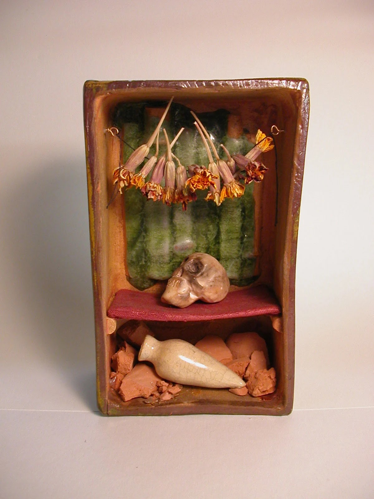
Being French, my experiences of actual religious shrines are mainly in Catholic churches, even the smallest of villages here will generally have an impressive Catholic church at its heart. Less in use than they once were, but a peaceful place to visit and soak in the art and history of the generations who have been within its four walls. One of the things I like about them is the gentle atmosphere created by the flicker of candles in semi-obscurity, revealing the relief and detail of the surrounding architecture. So when starting this project, I aimed to recreate a pocket of light and warmth but my idea was, in all sincerity, quite nebulous; I just knew I wanted my shrine to glow from the inside and planned to involve LED lights and warm colours.

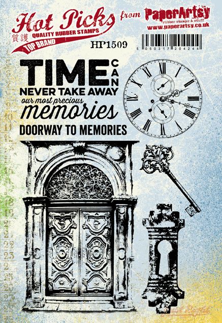
My 'vision' came together when choosing stamps to work with. I knew I wanted something either natural, with branches and leaves, or architectural. I then found these two stamps: Hot Picks stamp set 1509 (HP1509) and Hot Picks stamp set 1902 (HP1902) with their complementary collaged buildings. I loved the intricate details and repeating images and I imagined an ornate building with glowing windows.
For maximum contrast, I decide on white for the 'stone' parts and warm autumnal colours for the 'glass' parts. I also wanted to use mainly recycled materials so I gathered whatever transparent pieces I had hoarded, including acetate, tracing paper and pill packaging. The stamps sets also involve clocks, a pattern I favour, so I decided to make the shrine about time in some way, as keeping track of time would be nod to our quarterly theme: TRACKS. I remembered I had some clock parts in a drawer and added them to my pile of things to possibly use.

I initially planned to make the whole project out of a cardboard cereal box, but in my foraging, I found a watch box. It was white, the right size and connected to my time idea so I decided to make it the main substrate in the hope to make the shrine more sturdy and save me some building work. I came to curse this choice. Haphazard planning was a recurring theme during this project, as you will see!

As I wanted transparent doors and windows, I had to cut windows from the substrate. I first stamped my chosen elements from Hot Picks stamp set 1509 (HP1509) and Hot Picks stamp set 1902 (HP1902), the doors and clocks, on Smoothy stamping card.

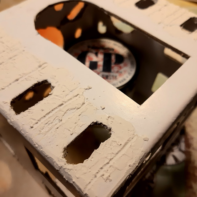
I cut out the parts I wanted to transform into windows. I used those templates to plan the placement of the architectural elements and trace the openings. To better integrate the stamped images and create a cohesive building, I added some lines to expand the patterns on the empty areas. For more opportunities for the light to shine out, I also sketched openings to insert the pill capsules, like tiny treasure windows.

Then came the time cut everything out... and the time for cursing! That box is made of greyboard and certainly much sturdier that a cereal box, making it awful and unwieldy to cut! You might notice the main door lost its horizontal barre. I was not fussing with that! But after sweat, tears and blood, I finally had my finished substrate...

Now for some texture! The empty areas were quite plain so I broke out the Grunge Paste to add relief and hint at stone work.

I spread it with a palette knife then drew the stones in it with a pointy tool. As the design is quite simple, I tried to not to be too neat when applying the Grunge Paste, to create nooks and crannies as the stone texture.

I did not forget the quarterly theme of TRACKS! For me, the texture and cracks in stone are the wrinkles of buildings: keeping track of their age and adding character and gravitas. To replicate them, I created more texture with a home made high-tech tool: a piece of cardboard patterned with pinking shears. It did the job handsomely but my next prototype will be made of acetate for better durability!
Finally, to harmonise and mattify all the surfaces, I sponged a nice layer of PaperArtsy Fresco Finish Acrylic in Chalk.

My base was complete! I was really happy with the addition of Grunge Paste, it really looked like an old white stone building.

All that lovely texture and it was so discrete! It needed to be revealed. I grabbed a lively palette of warm colours: Fresco Finish Acrylic Paint in Pumpkin Soup, Terracotta, Autumn Fire and Toffee.


The goal was to add colour in the grooves. I started by layering my paint with a stiff brush, being sure to push it in all the crevices.

Then I delicately wiped the paint sitting on top of the surface. I first used a pretty grungy baby wipe to get most of it off. This makes the gooves much more obvious but also leaves a tint on the white background. Some colours are easier to take off than others!

As I wanted a subtle look, I then came back with a clean(er) baby wipe to try and get most of the tint off. The result was not perfect but it at least homogenised the background instead of having patches of yellow, orange and brown.

I was quite happy with the results. My building looks gently aged, but in happy colours, and still clean enough not to distract from the main elements.


It was now time to take care of my windows. I had been as careful as possible keeping the base white while adding colour in the grooves but in the end the contrast with the white Smoothy was obvious. For them to match, would it have been clever to paint the card with Chalk paint before stamping? Yes. Did I think of that? No.
I therefore decided to cover the pieces with a very light wash of Fresco Finish Acrylic Paint in Terracotta. It is a translucent colour, so it did not obscure the stamped designs. I also added some pops of colour, using the same palette, to highlight the details of the stamps, and integrate them to the background.

The plan was to have the big door of the shrine open into a smaller niche. I cut that out of a cereal box, with its own windows. Much, much easier than grey-board! I painted those parts to match, adding lines to suggest stonework.
I used acetate for the windows and decided to paint it. First to add colour and warmth but also to make it less transparent. I hoped it would then diffuse light in an homogeneous glow instead of showing a point of light were each LED was. Fresco Finish Acrylic Paint do not need any prep or undercoat to work on non porous surfaces so I just brushed on blobs of my chosen colours - all translucent! - over the acetate.

The result was still too transparent for my taste, and the brush strokes were quite visible, so I came back with a layer of Fresco Finish Acrylic Paint in Mustard Pickle. I applied it with a sponge in the hope that the resulting stippled look would be better at frosting the acetate. The difference between the two coats is quite striking and I was quite pleased with the final opacity.

Another advantage to the paint layer was creating a rougher surface. I could then stamp on it with the same permanent ink as on the paper. Perfect match and no need to involve a solvent ink like Stazon.

The sponging resulted in a rather regular surface despite the brush strokes underneath. My stamping was not perfect but pretty darn good! The details came out very well.

With all my pieces complete, all that was left to do was put everything together!

I started with the inside niche. I added the pill capsules in the holes and filled them with iridescent snow for, hopefully, a bit of sparkle and pizzazz. I then glued the pieces together and covered them with the acetate. I put the the result under my desk lamp to simulate the future lights and was quite satisfied by the effect.

I must admit that focused the creation of this shrine, I had not really thought about what was going to be honoured in it... I had hoped the lights and the big clock would be enough to make the niche interesting but it ended up looking quite empty. Also, I used a piece of acetate for the floor, to add to the glow, but I again failed at planning: I glued it with the shiny and bright side visible while every other piece was showing the frosty painted side. It stood out way too much! (Looking at this picture, this could be a shrine all by itself!)

The niche was going to be stuck to the front of the shrine (somehow) but I had not planned any way to anchor it to the sides or bottom without getting in the way of the lights. It was just going to be floating in there so whatever I was going to put in there also needed to be light. I remembered the materials I had gathered at the start and extracted the clock parts from my desk. They were on theme! I found the spiral spring striking and wanted to feature it. I just added the hands and voilà! I love this semi-abstract representation of suspended time. It chimes so well with the clock in the background!

For the floor, I wanted something translucent to preserve the glow. I cut and curled strips of tracing paper, shoved them in there and bam! instant filling!
I glued the pieces, making sure to match the outsides and insides of the windows. I added tiny nuts in the round capsules as a reminder of the clock theme.

The oval capsules got an iridescent snow treatment. It is much more obvious catching the light outside than inside the niche. I also added a few pen lines to better meld together the stamped and textured parts.

Finally the lights! I was quite excited and a bit nervous as I could not really check if it would work before hand. I used a long string of tiny LEDs in warm white. My floating niche proved quite useful as I just had to wrap the string around it, no need to fuss! I still made sure a few of them were illuminating the big clock at the back. Much easier than I had anticipated!
And tada! I am thrilled with the result. The contrast between the warm glow and the white building really works like I hoped.

The top was a nightmare to cut but I really love it once finished. I think the capsules are really fun elements, helping bring even more dimension to the project.

Here is a close-up of the light up inside. I think it really embodies my initial idea! I like how the spiral and hands are silhouetted by the light from the clock face.


Taken all together this project was quite involved but each part was actually simple (if not always easy). My main take away is that I should plan more carefully for projects of this scope! I like that that my shrine has two different looks and atmospheres, depending on the lights. Without going full on, I think the concept is easily transferable to smaller pieces, like a light up card for example, with the LEDs between two layers of stiff paper.
I love the effect of the pill capsules. Using card and not grey-board, they are a quick way to create dimension for a polished look, and you can also fill them to display tiny treasures. For me, it was also therapeutic to make something associated with illness into beautiful art!
I hope this inspires you to give light up displays a try!
Stay creative
Dounia x