Showing posts with label Vintage Ink and the Dog Stamps. Show all posts

Monday, 6 May 2024

2024 Topic 3 : Vintage PaperArtsy Stamps {by Jenny Marples} on the PaperArtsy Blog


Hi everyone, Jenny Marples here with you today. I've been a fan of the work of Roxanne Evans Stout for many years now, enjoying the way she creates collage art pieces with multiple mediums and textures. So I decided to try out her methods for this post. I started with a sewing themed stamp set, a die cut embroidery hoop and a rough idea to create some kind of collage journal and let everything evolve from there.


The finished journal has a vintage feel to it and the collage pages inside are my own small tribute to Roxanne's art. I also used stuck to using one stamp set throughout, looking to use the images in different ways on multiple surfaces for a coordinated look.


For this journal my starting point was a PaperArtsy Vintage Ink And The Dog stamp set ID03. It was the button corner image that got me thinking about using it to 'frame' an embroidery frame. The choice of mainly primary colours came to me by chance - a beautiful quilt on the TV featured them together and that became the inspiration for the whole project. I'm also head over heels in love with using Just Walnut Infusions to add vintage looking stains to pretty much anything!


PaperArtsy Infusions were the starting point for me; I love to make up batches of dyed fabric scraps with different powder combinations. Try using hot water to dilute them in an old ceramic mug and leave your bits of calico, linen, lace, ribbon etc to soak in the liquid for at least a day. There will be wonderful imperfections in the finished pieces and if you are planning on stamping onto them I would recommend ironing them first.


For this piece a little Lemoncello Infusions was added to the Just Walnut Infusions to add some warmth and tone down the pinkish shades it produces.


Mark in pencil the area you want covered with stamping and use a permanent ink, testing first to make sure it doesn't bleed and blur the images. You can see here how multiple stamping quickly covered the circle on my fabric.


Things took a few turns at this stage which is why the colours shown being used on my journal covers didn't make it to the final supplies list! The important bit is to notice how I used a fine gold embossing powder with the button stamp to achieve a raised pattern on which to sit the die cut embroidery frame (one from Eileen Hull Designs). Stick to using the Chalk PaperArtsy Fresco Finish Acrylic Paint to give the covers a base coat.


Another twist here which will show how you should never give up on your art! I had the bright idea to use a dark dilute colour to contrast with the frame and fabric. In theory this will work, though it would be easier to use the new PaperArtsy Mattints to achieve it.


As I began to assemble the pages the dark colour on the covers felt wrong so I applied a couple of coats of white gesso and sanded back the embossed areas to produce this paler, worn finish. It contrasts with the stained fabric without overpowering it and proves that anything can be salvaged!


As a finishing touch, and with a nod to the whole 'glazed' theme, I highlighted some of the stamped buttons with some PaperArtsy Pearl Glaze which catches the light and contrasts beautifully with the rest of the matte surface.

Now on to those pages...
 

Having shown in previous posts how I use a range of papers to make basic backgrounds I'm concentrating this time on the next layers. I like to create bases for my focal points with pieces of tissue paper that cover at least a third of each page. Old dressmaking patterns are great for this and I also rely heavily on a gel plate for creating painted scraps with torn edges. 


Layer up your chosen paint colours on your gel plate to produce different hues and make sure to stamp onto/into the paint to add patterns to your backgrounds; you can do this whilst the paint is still on the gel plate or after you have 'pulled' your print. Add machine or hand stitching to draw the eye around the page and dribble diluted Just Walnut Infusions around each section for a vintage look. You'll see I have a permanent batch made up in a jar for just such an occasion!


Here you'll see how the gel printed tissues have been used to anchor and frame each collage cluster on the finished pages.


I mentioned at the start how the colours in a quilt inspired the paint selection for this project. In an attempt at being organised I store leftover papers, fabrics and trimmings in colour order, meaning I can more easily reach for bits that work with the chosen paints. If you are just starting out on your creative journey and need to build up a stash I would recommend going for the darker colours in the PaperArtsy sets, mixing them with a pale neutral like Chalk to create lighter shades as required. There is now a wealth of help available with colour mixing on the sidebar of this blog.


My 'primaries' selection of PaperArtsy Fresco Finish Chalk Acrylic Paints included Baltic Blue, Beanstalk, Cherry Red, Sand and Chalk.


Below you can see how the Cherry Red colour has been made less vibrant with the addition of a layer of Chalk behind it. This becomes a good base on which to stamp the tailor panel. Use the Baltic Blue with the Chalk to pull a paler blue gel print background and to highlight the letter tags at the bottom of the image. And finally mix the Beanstalk with the Chalk and dilute heavily to colour some torn fabric.


Returning to my original source of inspiration, in her books and online classes Roxanne shows how she has fun building clusters of different papers, fabrics and found objects on the way to creating her art.


I followed her methods, adding stamping and sheer netting to my page and bundling trims together to sit behind the focal point.


You can see from the finished page how each layer adds to the overall look of the finished page.


The Cherry Red painted fabric for my little Needle Book was enhanced with some stamping (using the Chalk paint) and a blanket stitched edge.


It opens to reveal more fabric scraps and a beaded pin.


The words from the stamp set were used throughout the journal, becoming their own cluster focal points.


By making each cluster before adding them to the backgrounds I could work out how best to place them to create a flow throughout the journal.


And before I knew it a set of pages had become a completed book.


And below are the remaining pages.


I hope this did Roxanne's art methods justice and that you feel inspired to give it a go too. Play with your paints, pull lots of prints with your gel plate, dig out your leftovers and supplies (including the 'non-crafty' ones) and most importantly have fun making up your own clusters.

Jenny

Sunday, 14 April 2024

2024 Topic 3 : Vintage PaperArtsy Stamps on the PaperArtsy Blog

Hi everyone, Leandra here

It is time for a new topic on the PaperArtsy Blog and for our designer focus, we are looking back at  some of the numerous PaperArtsy in-house/ older design lines. As we have evolved over the years, so have the collections we offer, but there is still a vintage undercurrent throughout. Hopefully after this post, you will have a better insight into some of these collections.

You may not be aware that as a brand, we launched in 2004 with the Ink and the Dog Collection, which was designed by Finnish designer Nea Nygard, in collaboration with Leandra. We came up with themes, and developed a series of 4-6 stamp sets within each theme. For example, Femme, Vintage Nudes, Man of Numbers, Words.... many of the stamp designs in these series were elements sourced from old ephemera that both Nea and Leandra had collected, and we then arranged these into 'collage style' designs. 

The Ink and the Dog collection were A6 stamps (1/4 plates) because back in 2003/4, ATC's were exceedingly popular, and so the stamp sets were small. As we never discontinue any product, those items are still available from PaperArtsy today. Vintage designs never age!

In 2004 we introduced Hot Picks. These are predominantly designed by Mark Franich, with some Leandra input, and as we had moved into journalling sized creativity, it was time to offer larger designs, and so the A5 stamp sets were offered.

Over the course of this topic, you might also be introduced to other stamp series in the PaperArtsy range, because there are many!

A reminder that the current theme is GLAZED. Glazing is an idea which can be explored in so many directions, here are just a few ideas for you, our bloggers will ensure this topic overarches their creations for this topic.


From Alison, some classic ATC sized art pieces using Ink and the Dog stamps, the eagle eyed will remember we also used to sell a gilded product called 'German Scrap' for many years, making the perfect trim with a bit of bling. Kids 6 (K6)

This, by Corrie showcases the Pierrot series, with a playful, humourous touch, although our vintage girls have that serious touch often seen in vintage photos. Pierrot 2 (PT2)


Jennie Atkinson

A beautifully decorated bottle by Jennie using some of her favourite stamps from Ink and the Dog. Ancestors 1 (ANC1)


Alison Hall

What better way to use your old paintbrushes than making them the focal point of your art! Man of Numbers 5 (MON5)


Leandra Franich

Ephemera is another of the Ink and the Dog stamp series, this has within it plenty of tickets, postmarks and scripty elements. Backgrounds 3(BG3), Words 4 (W4), Ephemera 3 (EA3). Ephemera 2 (EA2).


Looking for something for a masculine theme, the rugby boys might fit the bill in their wonderful striped rugby jerseys! Gentlemen 6 (G6)


Buttons is another of the stamp topics, and the theme is filled with sewing elements, mannequins and more. Buttons 6 (B6)


Kate Yetter

There are over 100 minis in the Ink and the Dog 'minis' collection, Kate used one to great effect on this piece. Travel 2 (T2)


Etsuko Noguchi

More Pierrot from Etsuko! Pierrot 3 (PT3)

Pam Thornburn

Within the Hot Picks there are a few called 'xtras' and the words on this plate can be found there. The cogs and wheels feature in Hot Picks, but also in the 'Time' series of Ink and the Dog. Clocks 5 (C5)

 
Amanda Pink

One of the more popular Femme stamp sets holds these piercing eyes. Femme 1 (F1)


Designed by Australian, Julie Harrington, the Urban Snapshots series of stamps was a response to her love of photography not just in her hometown of Brisbane, but also shares snapshots from her global travels.

Leandra Franich

This series has a romantic feel with the cottage gardens and Ivy coated buildings. Young Love 1 (USYL1)


The Nature series offers eggs and more. Nature 3 (USNT3)


But you will also find doorways, arches and architectural features too among Urban Snapshots stamps. Stage Lights 1 (USSL1), USNT3 (as above), Arched Apertures 2 (USAA2).


Julie Harrington

The 'Passing Time' series features urban youth, rocking a goth vibe which seems to be a thing that captures many generations beyond the 1970's/ 80's punk scene. Passing TIme 4 (USPT4)

Alison Bomber

Alison has always had a penchant for the Nature series within Urban Snapshots, there are a few Hot Picks in the mix too, but you can see how these would be part of her go-to stamps now that she is also a designer of botanical images. Nature2 & 4 (USNT2, USNT4).


Eli Persson

This Eiffel Tower stamp has to be one of the most popular designs in the range, timeless, elegant and the eroded script is perfect! Wrought Iron 3 (USWI3)


Autumn Clark

This tree was a feature on the farm we lived on in the UK, and we have many pictures of it through the seasons as a reminder of our time there. Nature 1 (USNT1)


Jenny Marples

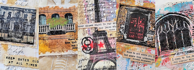
Various pages from one of Jenny's books showcase stamps from the Architecture series of Urban Snapshots stamps. Arched Apertures 2 (USAA2), 3 (USAA3),  Structures 2 (USST2)


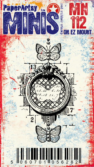
With over 100 Ink and the Dog minis to choose from, you have everything from scripty layers to bold fonts and focal images, there are some minis that to this day are my go-to stamps. 


These stamps are some of the first in the minis range, and are still well used by our bloggers. Mini 03, Mini 04, Mini 11, Mini 12


Alison Bomber

I love these skeleton fish, and how well do they work in white, really highlighting their 'bones'! Mini100, Mini101.


Etsuko Noguchi

Just the head from this design, and a new body was created by Etsuko - she has a Hawaiian Angel vibe to her with the grassy trim. Mini 10


The peek-through layers on this more recent mini release are arranged beautifully by Liesbeth. Mini110, Mini111, Mini124, Mini 125.


It might look simple, but see the pile of index sheets in the photo above, and you will realise that many minis were used in the making of this project by Amanda. MN23 (numbers) is a very popular stamp to this day. Mini 23, Mini72, Mini87, Mini108.


Jennie used many mini stamps when making this journal spread too, varius scripts, postal tickets and more came in handy. Mini 45 Mini 48, Mini79, Mini 75.


Leandra Franich

From the more recent releases, we had a series of postage inspired designs designed to layer and work as both background stamps or layers. Mini 129, Mini131, Mini132.


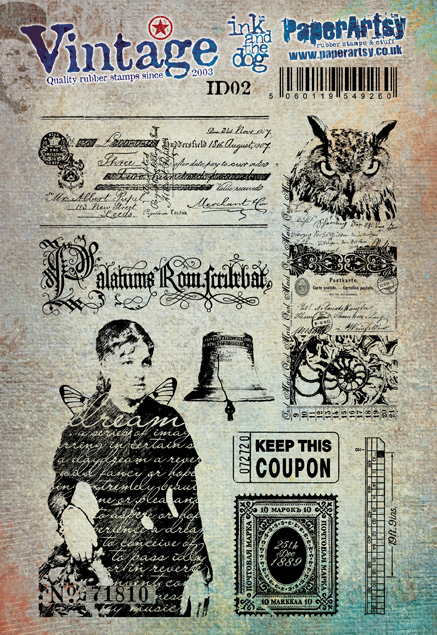
We reached a point where we decided to make available some of the Ink and the dog stamps in a larger size - tadaaa Vintage I&D was the result, A5 stamp sets of some of the most popular I&D imagery.
His piercing eyes might eb wise, but they also look like he will not tolerate fools! ID02


Kirsten Sheridan

Kirsten made this gorgeous sewing trunk with so many details within based around the tailor in the centre. A delightful creation. ID03


Lynne Moncrieff

This stamp was originally from the 'At Home' Ink & the Dog series and the larger version is within the vintage I&D series. Lynne used a snippet of the collaged tag, and it is a design that will always work in numerous circumstances. ID06


The 'Dream' lady is available in 3 sizes, Mini, Ink & the Dog and VIntage I&D size. Of all the Ink and the Dog originals, I think this design still stands out as one of my absolute favourites! ID02, OP2, MN09.


Liesbeth Fidder-de Vos

Again, this Mystery stamp comes from the Original 'Mystery' I&D Series .... but here again, in another size. ID05 


As I mentioned in the introduction, Hot Picks have been around for 10years now, and like all Vintage inspired designs, stand the test of time, not going out of style whatsoever!

ArtsyCrafts 2010

This layered frame was a class from ArtsyCrafts retreats we offered 2005-2011, and we created layers in the doorway using Ten Seconds Studio metal working techniques mixed in with canvas and painted layers. HP1011


This stunning arch frame makes a great focal or layering element. HP1601


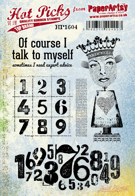
She's a bit shrek-like, maybe not the right colour on this occasion, but a super-fun creation by Lauren HP1604


A fabulous stamp set fropm the Hot Pick extras range, dates and numbers galore!


There are so many gorgeous flowers in the Hot Picks range, and this arrangement by Corrie is so effective. HP1109


I adore this fishy little number. HP2001


From one of the first HP stamp sets, and still stunning today! HP1009


I love these scientists, and Etsuko made a fabulous box of goodies for this! HP2101


Our celestial lady is such a fabulous design HP2102

Well that was a pretty amazing look back at some highlights from PaperArtsy stamp designs over the past 20 years, and in the next few weeks our bloggers will be using their picks from a range of these older stamp collections to bring you even more inspiration and creativity. 

Perhaps you'll get to play along with us! We would love to see what you get up to! 

You could tag us on Facebook, Instagram @paperartsy , Twitter, or post in PaperArtsy People Group on Facebook. We really love to hear about how the blog topics have inspired you, so don't be shy!!