"Hi
everyone, Pam Thorburn here excited to be doing my first post for PaperArtsy. I love to dabble in all kinds of papercrafts and mixed media
projects, but my first love is scrapbooking, so you can expect to see
scrapbook related projects from me.
This
week I'm going to show you how I've used PaperArtsy products to create
unique backgrounds for my scrapbook pages. I do hope that you will be
inspired to create your own unique backgrounds for your scrapbook pages, or any other crafting situation perhaps".
My project today is a scrapbook page featuring my niece’s
son, Lucas.

Although this photo is a tightly cropped portrait, the whole layout has
been inspired by where we were when I took the photo. Last July our very large
extended family gathered in our home town of Broken Hill, in outback Australia,
to celebrate my mother’s 90th
birthday. The photo of Lucas was taken in Silverton, just outside Broken Hill.
Silverton looks like this:

There is a lot of
rusty corrugated iron, which, along with the colours of the landscape, really became the starting
point for my layout. So I decided to cut a 12x12 piece of cardboard box for my
layout base. I wanted to
expose some of the corrugations of the card, but the outer paper layer was firmly stuck, so
I splashed some water on the card, waited a couple of minutes, and then the paper
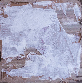
was suddenly much easier to peel away. The first thing I did was scrape some Fresco Chalk Acrylic Paint (Snowflake) roughly across the card.

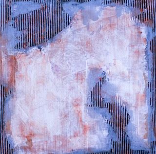
I painted the corrugations, rubbing some Little Black Dress into the valleys, then I painted Elephant across the peaks of the corrugations.

I then sponged Fresco Chalk Acrylic Paint (Brown Shed) over the peaks, then cleaned my sponge on the white surface.

Next came some Treasure Gold (Spanish Topaz) which I rubbed over the corrugations to give a rusty look.

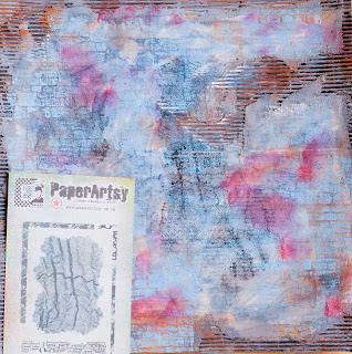
I wanted to build up some surface interest so I got out some PaperArtsy stamps: firstly the brick stamp (Ink and the Dog: Mini 95) which I used to stamp randomly around the page using Sky Fresco Paint.

Then the netting stamp (Ink and the Dog: Frames Plate 2) which I stamped with Stazon Ink, again just roughly and randomly around
the page. This just served to grunge up the page a bit, and make it
sort of dirty and masculine!

Continuing to build up surface interest I got out the Reverse Chicken Wire Stencil
and some Brown Shed paint. Using a chubby stippling
brush and an up and down motion, I stencilled through the template. When
stencilling with a brush it is important to dab off excess paint, so
that the brush is quite dry. This will stop paint from seeping under the
stencil.
At
this stage I was going to adhere my photo, but I felt it kinda got lost
on the background. To overcome this I added more Snowflake
paint around where I was going to place my photo. This lightened the
area and gave some separation of the photo from the background. I also
added some more stamping, this time using the cog stamp (Ink and the Dog:Mini 60).

To help the photo stand out better I decided to make a photo mat from a large manila tag. I used Sky and Brown Shed to paint the tag.
And I used the calendar stamp from (Eclectica: Sara Naumann 06) with Snowflake Fresco Chalk Acrylic Paint.
And I used the calendar stamp from (Eclectica: Sara Naumann 06) with Snowflake Fresco Chalk Acrylic Paint.
Then
it was time to start building up the other elements of my page. Again
when I placed my photo onto the background I still felt something was
missing-the photo just didn't seem grounded, so I stamped some
horizontal patterns using stamps, (I&D:Frames Plate 4) Love those stamps!! and adhered a strip of crunchy waxed paper.
I added interest to the photo with by wrapping some twine around it,
and tying it off in a bow. I saved the off cut from the large manila tag
to use later.

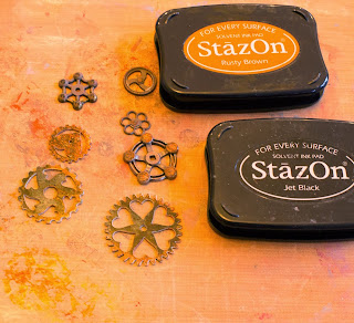
The Prima Mechanicals Gears cogs
were perfect embellishments for this page, but I wanted to change them
up a bit so I just rubbed over them with some Stazon Ink to change the
colour.

I used Hot Pick: Xtra 03 Sentiment Stamps
to add some words to the layout. These were stamped onto the left over
pieces of the large manila tag, and cut out. I decided my layout was a
bit dark in the bottom right hand corner, so to lighten it up I used the
chicken wire stencil again, using Snowflake.
I also flicked some of the paint onto the page.

I
adhered all the embellishments using glossy accents. As you can see I
clustered most of them in the one area, and also layered them on top of
each other. Finally I added the title.

So,
that's how I made this background, inspired by the landscape where the
photo was taken. I hope that's given you some ideas and look forward to
seeing your own backgrounds for your scrapbook pages.
~Pam~
Leandra Says: I really love how you built up the stamped background on such a tricky surface. Sometimes the corrugation underneath affects the stamping on top, but not here. The brick stamp is such fine detail, but it created a fabulous brick shadow that works a treat. A warm welcome, so great to have you on board Pam!
Gillian Says: Welcome Pam, such a beautiful composition, loving the corrugation background along with the mechanicals that pull everything together. Can't wait to see more.
If you would like to join in this week's challenge and play along with Pam's
techniques, then do link up your creativity here, and go in the draw to
win some PA stamps of your choice! You need to link your entry by
17:00, Sunday February 2nd 2014.


13 comments:
This is scrapbooking with a difference - very edgy and dramatic work! It is so interesting to learn about how and where you gained your inspiration. I love the link between corrugated iron and corrugated card! A really stunning composition and the background is just amazing. Your stepxsteps were terrific too. Julie Ann xxx
Fab page can't wait to have a go, never used that much paint on a scrapbook page!!
Cool layout Pam! Look forward to seeing more of your projects. xx
I've never done scrapbooking but this makes me want to have a go - wonderful layout, Pam - welcome to the PA family!!
Great page Pam, looking forward to seeing the rest of your projects.
Jo
x
Very cool page! I love all the layers of paint & texture.
What a fabulous page. Lucas looks a real character. Your page is full of energy, texture and inspiration. Looking forward to having a play.
Great page looking forward to seeing more xx
I am so pleased to see a layout on the PA blog! Might even push me into making a dent in my scrapbook to-do-list, so welcome Pam!
Welcome Pam! Thanks for sharing your wonderful layout & background idea, I love the texture of the corrugated packaging.
Alison xxx
What a fantastic layout - you had me from the corrugated cardboard! Stunning paint layers and colours, and the stamping is so cool... fabulous!
Alison x
That's a fantastic layout, full of wonderful elements and stamped/painted details, love it!!! Coco x
Stunning!
Post a Comment