Showing posts with label Lemoncello. Show all posts

Sunday, 27 October 2024

2024 Topic 9 : Alison Bomber {by Nikki Acton}


Hello everyone, Nikki (a2a.craft) here with you today sharing my project for our Designer Focus topic featuring Alison Bomber. Our theme this quarter is Nature, which I have included in several ways.

This is another of those projects that ended up quite differently to how I planned originally! Sometimes it is frustrating that the vision doesn't work out - but I do enjoy the journey of how differently things evolve.


This piece of wall art is mounted on 8x8 inch grey board with an additional 6 inch panel and a circle, both greyboard, creating some dimension.

In addition to Alison's quote stamp set - EAB14 - Happiness Edition, I have also used a stencil (PaperArtsy Stencil PS306 by Tracy Scott) to create the embossed leaves (with the text underneath - see more on this below) and also the fussy cut leaves. 


My main supplies are shown above - although I also used some PaperArtsy Printe Tissue paper. I chose earthy colours to reflect our Nature theme and some lovely Dragonfly Mattint for some contrast.


To start I took some PaperArtsy Smoothy Stamping Card and spritzed with water before sprinkling on Infusions Dye Stain - Lemocello and allowed this to dry.


I stamped over this with my selected quote from Alison's stamp set EAB14 using Ranger Archival Ink - Potting Soil. I then carefully sponged Versamark through stencil PS306 before heat embossing with clear powder. This seals the stencilled area allowing me to the add distress ink over the rest of card - keeping the stencilled area still showing the Infusions and stamped background.


I only added the embossing to half of this background.


For the larger panel and small circle - I added PaperArtsy Mattint (Dragonfly) before laying over a section (actually different leftover sections) from PaperArtsy Printed Tissue - Alison Bomber.


The first thing I decided to do with my layers was create a border / frame using the infusions/stencilled card stock. The was an A4 sheet - so I first cut it down to be 8x8 (the size of the large panel).  I then cut a 6x6 inch square from the middle to fit onto smaller grey board panel.


I highlighted the edges of my border/frame with a brown Sharpie before adhering to the larger panel.
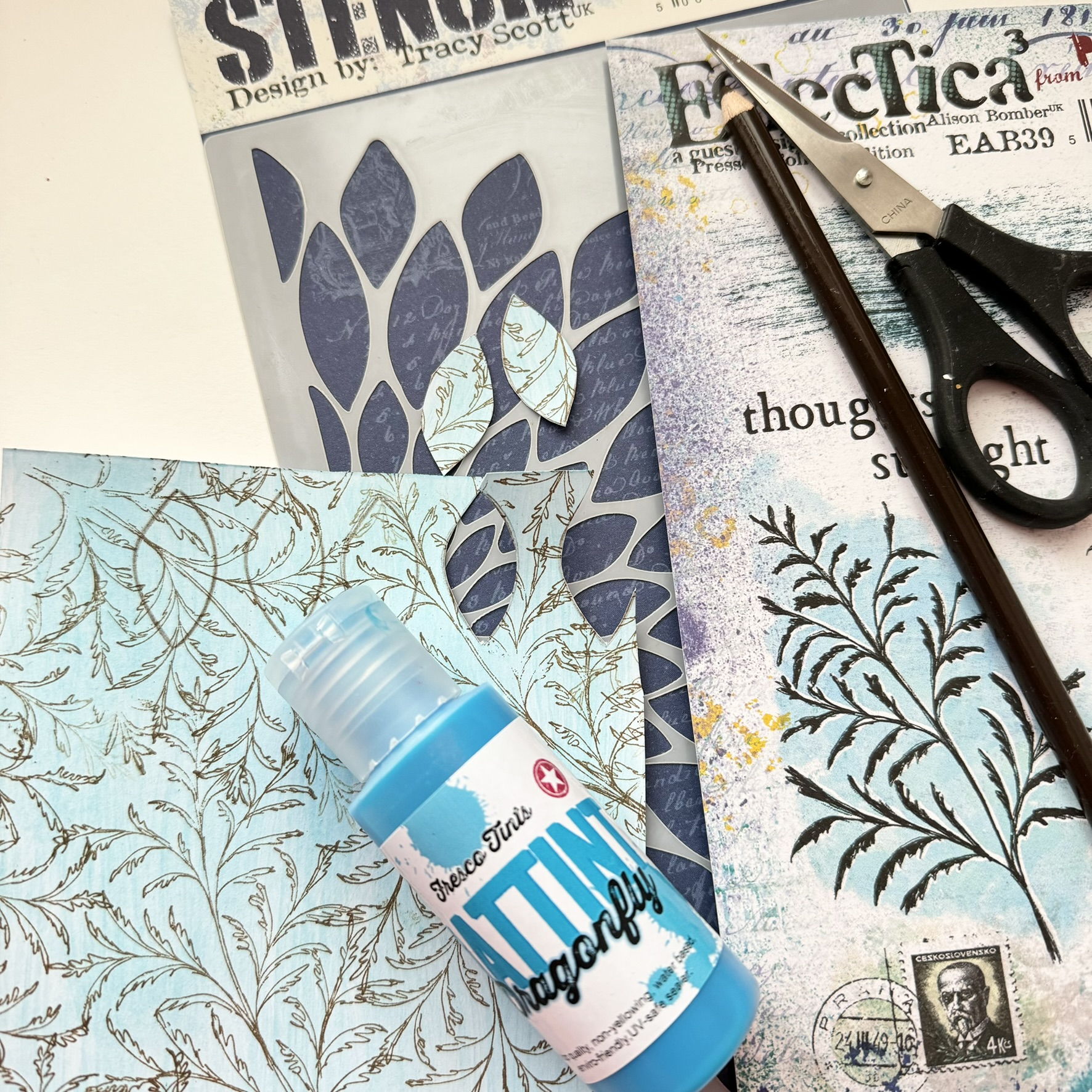

Time to create some embellishments. I took a piece of card and added some Dragonfly Mattint before randomly stamping one of the Pressed Foliage stamps from PaperArtsy Stamp Set EAB39 (by Alison Bomber).

I then used the stencil from Tracy Scott to create some leaves/petals.


I also used Tracy's stencil to make these corner embellishments.


I collected some leaves, shells, stones and twigs to potentially add for our Nature them - but decided to use the twigs and made them into bundles.


Finally the focal quote - this was stamped onto some torn card with some PaperArtsy Mattint (Glow) added. I distressed the edges with some Ranger Distress Ink (Ground Expresso).


I then started adhering it all together. The grey board panels naturally add dimension and I raised the quote further by using foam pads.


The final piece! A great quote from Vincent van Gogh and very relevant for the Nature theme. I have also tried to reflect this in all the elements, colours and tones I have used.


Monday, 6 May 2024

2024 Topic 3 : Vintage PaperArtsy Stamps {by Jenny Marples} on the PaperArtsy Blog


Hi everyone, Jenny Marples here with you today. I've been a fan of the work of Roxanne Evans Stout for many years now, enjoying the way she creates collage art pieces with multiple mediums and textures. So I decided to try out her methods for this post. I started with a sewing themed stamp set, a die cut embroidery hoop and a rough idea to create some kind of collage journal and let everything evolve from there.


The finished journal has a vintage feel to it and the collage pages inside are my own small tribute to Roxanne's art. I also used stuck to using one stamp set throughout, looking to use the images in different ways on multiple surfaces for a coordinated look.


For this journal my starting point was a PaperArtsy Vintage Ink And The Dog stamp set ID03. It was the button corner image that got me thinking about using it to 'frame' an embroidery frame. The choice of mainly primary colours came to me by chance - a beautiful quilt on the TV featured them together and that became the inspiration for the whole project. I'm also head over heels in love with using Just Walnut Infusions to add vintage looking stains to pretty much anything!


PaperArtsy Infusions were the starting point for me; I love to make up batches of dyed fabric scraps with different powder combinations. Try using hot water to dilute them in an old ceramic mug and leave your bits of calico, linen, lace, ribbon etc to soak in the liquid for at least a day. There will be wonderful imperfections in the finished pieces and if you are planning on stamping onto them I would recommend ironing them first.


For this piece a little Lemoncello Infusions was added to the Just Walnut Infusions to add some warmth and tone down the pinkish shades it produces.


Mark in pencil the area you want covered with stamping and use a permanent ink, testing first to make sure it doesn't bleed and blur the images. You can see here how multiple stamping quickly covered the circle on my fabric.


Things took a few turns at this stage which is why the colours shown being used on my journal covers didn't make it to the final supplies list! The important bit is to notice how I used a fine gold embossing powder with the button stamp to achieve a raised pattern on which to sit the die cut embroidery frame (one from Eileen Hull Designs). Stick to using the Chalk PaperArtsy Fresco Finish Acrylic Paint to give the covers a base coat.


Another twist here which will show how you should never give up on your art! I had the bright idea to use a dark dilute colour to contrast with the frame and fabric. In theory this will work, though it would be easier to use the new PaperArtsy Mattints to achieve it.


As I began to assemble the pages the dark colour on the covers felt wrong so I applied a couple of coats of white gesso and sanded back the embossed areas to produce this paler, worn finish. It contrasts with the stained fabric without overpowering it and proves that anything can be salvaged!


As a finishing touch, and with a nod to the whole 'glazed' theme, I highlighted some of the stamped buttons with some PaperArtsy Pearl Glaze which catches the light and contrasts beautifully with the rest of the matte surface.

Now on to those pages...
 

Having shown in previous posts how I use a range of papers to make basic backgrounds I'm concentrating this time on the next layers. I like to create bases for my focal points with pieces of tissue paper that cover at least a third of each page. Old dressmaking patterns are great for this and I also rely heavily on a gel plate for creating painted scraps with torn edges. 


Layer up your chosen paint colours on your gel plate to produce different hues and make sure to stamp onto/into the paint to add patterns to your backgrounds; you can do this whilst the paint is still on the gel plate or after you have 'pulled' your print. Add machine or hand stitching to draw the eye around the page and dribble diluted Just Walnut Infusions around each section for a vintage look. You'll see I have a permanent batch made up in a jar for just such an occasion!


Here you'll see how the gel printed tissues have been used to anchor and frame each collage cluster on the finished pages.


I mentioned at the start how the colours in a quilt inspired the paint selection for this project. In an attempt at being organised I store leftover papers, fabrics and trimmings in colour order, meaning I can more easily reach for bits that work with the chosen paints. If you are just starting out on your creative journey and need to build up a stash I would recommend going for the darker colours in the PaperArtsy sets, mixing them with a pale neutral like Chalk to create lighter shades as required. There is now a wealth of help available with colour mixing on the sidebar of this blog.


My 'primaries' selection of PaperArtsy Fresco Finish Chalk Acrylic Paints included Baltic Blue, Beanstalk, Cherry Red, Sand and Chalk.


Below you can see how the Cherry Red colour has been made less vibrant with the addition of a layer of Chalk behind it. This becomes a good base on which to stamp the tailor panel. Use the Baltic Blue with the Chalk to pull a paler blue gel print background and to highlight the letter tags at the bottom of the image. And finally mix the Beanstalk with the Chalk and dilute heavily to colour some torn fabric.


Returning to my original source of inspiration, in her books and online classes Roxanne shows how she has fun building clusters of different papers, fabrics and found objects on the way to creating her art.


I followed her methods, adding stamping and sheer netting to my page and bundling trims together to sit behind the focal point.


You can see from the finished page how each layer adds to the overall look of the finished page.


The Cherry Red painted fabric for my little Needle Book was enhanced with some stamping (using the Chalk paint) and a blanket stitched edge.


It opens to reveal more fabric scraps and a beaded pin.


The words from the stamp set were used throughout the journal, becoming their own cluster focal points.


By making each cluster before adding them to the backgrounds I could work out how best to place them to create a flow throughout the journal.


And before I knew it a set of pages had become a completed book.


And below are the remaining pages.


I hope this did Roxanne's art methods justice and that you feel inspired to give it a go too. Play with your paints, pull lots of prints with your gel plate, dig out your leftovers and supplies (including the 'non-crafty' ones) and most importantly have fun making up your own clusters.

Jenny