Showing posts with label Vintage PaperArtsy Stamps. Show all posts

Friday, 3 January 2025

2024 - Year in Review - Topics 1, 2, 3 {on the PaperArtsy Blog}


Greetings from PaperArtsy HQ,

We love this time of year as we take a look back at the wonderful contributions on the blog for the year that has just concluded.

Did you learn something new this year? Did you achieve a personal goal, or tick something off the bucket list? Were you challenged in ways you least expected? Every year seems to bring unexpected twists and turns, and we hope that you are finishing the year strong, happy and keen to learn more new crafty techniques and ideas from our capable bloggers. 

Today we look back at Topic 1: Miniature, Topic 2: Mattints and the designer focus for Topic 3 was Vintage PaperArtsy stamp collections.

The theme overarching these topics was Glazed. We used top layers, shiny or sparkly layers in so many ways. We do love a theme that is easy to apply to any topic, and throws another challenge in the direction of our bloggers. 

Speaking of challenges, this year we also introduced the concept of 'With 3 Things' where bloggers were sent 3 things and challenged to do something. For example, a colour, a stamp or a stencil. It is interesting to see how each blogger interprets similar products in their own creative way, highlighting how versatile products can be.

We are fortunate to have such wonderful bloggers who share stunning ideas. Let's take a look back at some of the highlights from these 3 topics.

Topic 1: Miniature

We started the year small, with miniature art! This is always a favourite. Why is it that we find all things small cute, like mini books, fairy gardens or decorated inchies? From scaled down projects to tiny magical worlds, this topic intro post is big on inspiration and mini eye-candy!

As mentioned above, a new format on the blog this year was 'With 3 Things', where 3 bloggers craft with 3 (almost identical) products. 'Miniature' was perfect to launch this concept!

In this first challenge, we particularly loved this decorated paper clip by newbie to the team, Mi Mii, who also brings a touch of French creativity to the blog. Head to her original post HERE to appreciate all the details of this little mash-up!


Speaking of trinkets, did you spot Renata Peley's amazing spread of shrink plastic critters? Super fun and vibrant. Be sure to check her original post HERE as she really breaks down the process and explores different shrink plastics and colouring media. Perfect to get you started!


We loved this 'world in a tin' by Riikka Kovasin (Paperiliitin). She beautifully included the 'Glazed' theme to add dimension to her elements. Check out how real that key looks! Her original post HERE is also well worth the read as an interesting example of the twists and turns a project can take along the way, and how different the outcome can be to what was initially planned.


We simply can't leave out everyone's favourite type of miniature project: mini books! This fantastic specimen is by the talented Jenny Marples.  It is barely 12cm, or one Fresco bottle, 
tall! There's so much to feast the eyes on as all the pages are delicately decorated. You can see all of them in her original post HERE.


Topic 2 : Mattints

Introduced at the end of 2023, Mattints are the newest PaperArtsy colour product. These tinted matte glazes (Mattint = Matte Tint) are also excellent glues and sealants and super versatile to pair with other products. Completely transparent, with a subtle buildable tint, they pair wonderfully with infusions, but naturally, we are still discovering a myriad of new ways to use them! Check a few of those ideas in the Topic intro post, as well as the release posts announcing the following 12 colours during the year:
  • November 2023: Warm fall colours with Glow, Nutty, Fern and Shark
  • February 2024: Bright summer colours with Squeezed, Jam, Dragonfly and The Pink
  • September 2024: Subtle winter colours with Greenstone, Ash, Ladybug and River Deep
Our first pick is this very educational exploration of Mattints by Amanda Pink (p1nkart). She shows the colours on many different substrates and also tries several way of applying them, as well as some colour mixing. So head to her original post HERE to get started!


We absolutely love this fantastic experimental pieces by Floss Nicholls (flossWORKSHOPart)One Mattint, so many techniques! Check her original post HERE for a full mixed media journey and her video HERE for more detail on her process.


Staying with tags, Nikki Acton (a2a.craft) created these two beautiful pieces with vibrant colours. Check out the contrast between the grungy images and the popping colours! Her original post HERE is an interesting read, exploring how to build colour, both in depth and complexity.


Let's not forget this sampler journal page by Victoria Wilding. She combines the Mattints with many other crafting staples to creates original and striking effects. Each square is well explained in her original blog post HERE so make sure to to give it a read!


Topic 3 : Focus on Vintage PaperArtsy stamp collections

PaperArtsy is now 20 years old! We thought this milestone was a great opportunity to celebrate our OG collections, the ones that started it all and coined the PaperArtsy style. From the initial A6 Ink & the Dog and Urban Snapshots stamp sets, to the continually expanding 'Minis' and 'Hot Picks' Collections, and let's not forget the 'bigger is better' Vintage Ink & the Dog series. You can check out the topic intro to learn more about PaperArtsy history and feast your eyes on some of the fabulous makes created along the way!

We hope you didn't miss this simple but very effective jewellery set by Ann Barnes (aksbarchitect CREATES). The stamp design certainly is the focus here - so striking! Her process is quite detailed so do not hesitate to head to her original blog post  for more info.


This super series of vintage cards by Autumn Clark (SewPaperPaint) really embody the mix of grunge and details characteristic of PaperArtsy stamps. There are two other pieces in this set, so take some time to enjoy the eye-candy in her original blog post HERE.


We can't leave out this fantastic 3D perpetual calendar by Etsuko Noguchi.  Notice how the celestial lady is peaking over the date! This is an involved project, with lots of (literally) moving parts, so check her original post  
for all the details and a reveal of the colourful interior.


All the projects were amazing and we could have picked so many to highlight, but in the end this series of mini houses full of quirky characters by Liesbeth Fidder-de Vos stole our hearts! Go to her original post 
HERE to see all the layers she used to create amazing depth. We really love the mica rooves!


This was a fantastic start to the year, full of ideas and colour! 

We are sure you'll find something to inspire you and entice you to visit some of the bloggers posts. 

Join us soon for part 2!

Monday, 20 May 2024

2024 Topic 3 : Vintage PaperArtsy Stamps {by Riikka Kovasin} on the PaperArtsy Blog


Hi there! It's Riikka from Paperiliitin blog here today to share my home decor project with a nautical touch with you. 
When pondering, what to pitch for, what kind of project to do, I was looking through the different vintage stamp collections by PaperArtsy. When I saw these sea inspired sets from the Hot Pick series, I immediately saw them as table decor pieces. I imagined the bigger elements perched on top of a metal wire with a spool as the base. Maybe it was the closing summer and sailing season that got me thinking that. I don't sail, but living in a coastal city with a glimpse of the sea from the windows, you start to notice sails emerging after hibernation when the coastal ice melts. These could also serve as a table numbers in a party either by changing the composition a little, leaving room for a number on the top, or then by adding a number to the top creature.

I covered the "vintage" part by simply choosing a stamp set, but tried to add a bit weathered, vintage feel to the project otherwise as well. When pitching this idea, I thought to incorporate the the quarterly theme of "Glace" by using a Mattint on the creatures but I ended up topping that by making a colored glace to age the spools and also for the "sand" I then added on top of them.


When I set to work, I started to hope I had drift wood to be used as the bases. There were two obstacles there - I had pitched for the spools and more importantly I didn't have any drift wood at hand! What the thought of that greyish weathered wood then caused was to turn those spools into the tones of drift wood and I like that even better! 


I chose two aquatic Hot Pick stamp sets for these decorations, HP1112 and HP1201. Combined they had enough big animals to make the focal points. I guess I could have gotten away by just using the latter, HP1201, but I really liked the crab on the second set. My star sign is cancer, so that also weighed in to pick two sets.


As you can see from the materials photo above, I took it after finishing the project. To be honest, when I started the only thing I knew for certain was the stamp sets! I was also relatively certain that I would use Mattint Shark (MT04), but otherwise I hadn't a specific Fresco Finish paints in my mind. In the end I chose to use just one color, Chalk (FF83) and color the creatures using brush tip markers. There's two reasons for this. For one, I had already stamped the images and should then have either chosen translucent colors or turn them into translucent by mixing them with a matte medium or equivalent in order not to cover the stamped details and lines. Secondly, I would have needed at least three colors, maybe even more and I didn't want to have an extensive list of materials. By using markers instead I was able to use several colors, hopefully give an idea and inspire how to combine different materials. Sometimes a simple kid's marker is all you need!


The first thing I needed to tackle, was to learn how to make mirrored images of the stamps. The other option was to make the decorations one sided but I didn't want the back to look unfinished. Especially as I thought these to be table decorations, to be viewed from all sides, I wanted them to look good from all angles. After a quick google, I thought to try a gel printing plate to get the image reversed. And it worked beautifully! The images weren't quite as crisp as the "real deal", but they were absolutely fine enough to be used to cover the back. 

What I did was to ink the stamp and then carefully stamp to the gel printing plate. While the ink was still wet I delicately placed a paper on top and pulled the print. The result was a mirror image of the original stamp! I learned that especially the pressure when pulling the print was key. If I pressed too hard, the image smudged. I used black, oil-based ink here but feel free to experiment with other inks as well! I assume that water-based inks might bead on top of the plate, though.


After tackling the mirror issue, I could then stamp the images the right way around. I also stamped a bunch of texts and three anchors. At this stage I thought to include them to the spools as decorations, not to the stems, so I only needed one side. I used the same black ink as in the mirror stamping.

Spoiler alert! If you want to re-create the decorations, stamp the anchors straight away as mirrored, too. 


The last preparation step was to turn the spools more weathered. For that I mixed Fresco Finish acrylic Chalk (FF83) with Mattint Shark (MT04). This created a lovely greyish glace, I then painted to my spools. In the picture underneath you can see one of the spools untreated and two treated with the glace. 

I used more Mattint Shark (MT04in the mix than the acrylic paint to keep the medium quite translucent. I also added a touch of white here and there undiluted when the surface was still wet and mixed it in on top of the surface of the spool. This created a beautiful uneven look.


The idea about the silvery wood came from the drift wood desire. Instead of going rummaging the (at the time frozen) shores, I turned something I had to resemble the thing I wanted. I found it quite remarkable how easy it was to change the mood of the spools with a touch of color. The impact of color keeps surprising me constantly! 

After letting the color medium dry, I wrapped some natural twine around each spool. I secured the start underneath a couple of loops of the twine and when I then had the whole spool covered with the twine, I glued the end as hidden as possible.


Now that I had all the elements started, it was time to go back to the stamped images and color them. The first thing I did was to add a layer of Mattint Shark (MT04) on top. This had two purposes. One, to create a wash to match each creature, make them a part of the series, but also to seal the surface. That then enabled me to play with the color without it getting absorbed into the paper straight away. I also remembered hearing or reading that the Mattints, even though acrylic, worked nicely as a ground for even water-based markers and pens, so I gave it a go.

I used a small paint brush to apply the medium, then let it dry and added the brush-tip marker on top. Subsequently I used the same brush to move the marker color around, give it more gradient transition. As you can see from the ready project or step photos further along, I didn't color the whole fish blue nor crab red, but instead added color to the edges and then pulled it towards the middle with a wet brush. I think this creates a lovely dimensional feel to the creature but also lets some of the Shark color to show.


Then it was time to cut! I carefully cut the crab, the fish and the seashell out of the sheet. I mainly used just scissors as I prefer those over a craft knife. The seashell was the easiest to cut, but both the crab and the fish had these teeny tiny details that took a while to cut. You can be a bit more rough around the edges, if you wish, but to me the beauty of the finished items is partly the delicate details.

I also inked the edges of each item twice. "Twice, what you mean?" you might ask. I first inked the stamped side with a delicate touch, my intention just masking the white edge of the paper after cutting. But to the flip side, the back side I added a bigger amount of color. This was to ensure that no white was peeking when I layered the two images back to back. As the other images, the mirrored ones, were a bit more smudged than the others, the measurements could have been a tad off but more importantly I cut the images loose by hand, so there was bound to be some differences. By using the same brown ink throughout, I hoped to hide the seam as well as I could. Naturally, you could use also an array of inks and follow the color scheme of the item with the ink. Blue for blue, red for red and so forth. I just thought the brown added a nice vintage touch to the elements.


Next I then mounted the focal points in place on top of wires. I used some foam tape in the middle of the element to make it a bit curved and dimensional, while the outlines were adhered together back to back. 

I mentioned earlier, that if you wanted to re-create these exact decorations, also mirror stamp the anchors. I hadn't done that, as I was thinking of adding the anchor to decorate the spool, but it was just way too big for that. My options then were either to leave the anchors off completely or add them to the stems as well. I wanted the decorations to have something more than just the spool and the focal elements, so I opted for the latter. That then meant I needed to mirror stamp the anchors as I couldn't leave those without a backing now that I had the creatures nicely done! Luckily I now knew how to proceed.


After stamping and coloring the additional anchors, I then adhered them to the wires as well. I then cut the wires to correct lengths and added several rounds of cotton tape to the ends to have them bulkier and thus easier to be adhered inside the spools. 

My mind was set to add some kind of embellishment to the spool, too. I could have done that many ways, but I craved for something grungy, yet nautical. I decided to make a bunch of tiny barnacles to be added to the spools. I used air-drying clay for those. I made a little sphere, pushed it down to a cone shape and then added the hole and some texture to the rim using a pencil as my sculpting tool.


While the barnacles were drying, I made some sandy touches to accompany them. I had these lightweight little pebbles in a couple of sizes, but they were white. While I know there's white sandy beaches in the world, I wanted a bit more contrast between the white barnacles and the sand. Luckily, there was an easy solution to my problem and that was to create a colored glace. This then allowed me not only to add color but to adhere the tiny texture pebbles in place. For the colored gel I used a matte medium and colored it using Infusions Just Walnut (CS25). I made a couple of batches of the sandy stuff with a varying amount of Infusion crystals added, so I could add a touch of variation in the color.


The last thing left then was to add the little barnacles in place. They took a surprisingly long time to dry even being so small! I like how the clay feels and looks "right" for these creatures, but I guess you could use drops of hot glue to make the shape as well, if you are in a hurry. Just use a non-stick surface, so you can re-melt the glue, should the end result not be what you wanted and paint the shapes using white acrylic after cooling.

I used regular craft glue to adhere the little details in place. As I wanted there to be contrast between the sand and the barnacles, I didn't color them anyway. In another project they could use a tad of darker paint added and wiped off to heighten the texture. 


After the glue dried, the decorations were done! I hope they echo my goal of a nautical, yet vintage feel.

Here they are! Three home decor pieces or table decorations for parties. I chose to go with a nautical combo of red, blue and white with added brown for the vintage feel, but you could adjust the palette to fit your preferences! 

Now thinking back, I could have added a wooden bead or two to each decoration. Those all could have been white, echoing the barnacles, but I could have gone with the nautical combo of blue, red, white as well.


I did this project a bit differently than I usually craft. Usually I finish a project in one sitting. This time, however, partly because of the short days of Finnish spring, I was forced to leave the project for a while and continue next day. While I was able to pick up where I left off, it made me realize once again that I really prefer a fast, stream-lined creating process! But, that being said, I think it's important to try to break the patterns at times, to try new things. It's the only way you can learn and improve! 


I'm mostly a paper crafter so my go to material is paper. I like how it behaved in this project, but you could do similar table decorations using air-drying clay in a more prominent role. Instead of stamping the characters on top of paper, you could stamp them to a circle of air-drying clay and thus have a completely different feel to the whole piece. Or you could use paper for the main creature, but use metal foil for the anchor, giving the decoration also a totally different look. 

To be honest, I even thought about using shrink plastic with the anchors at first, turning them into little charms for the spools. It was the vintage drive that changed my mind as I couldn't see a shiny piece of plastic as a part of the project. But maybe with a different color scheme that would be just the thing? Or coloring the piece with a metal color, turning the whole embellishment into a piece of jewelry would be the solution? 


What I really like about these decorations, is their vintage feel! That's mainly because of the vintage vibe of the stamps, but I also believe the fact how the color is applied, enhances the feel. I also loved working with Mattint and creating those tiny barnacles. They are such a tiny thing, but still have a lot of impact!  


Thank you for stopping by today! I hope you enjoyed the project!


Instagram: Paperiliitin
Facebook: Paperiliitin


Thursday, 16 May 2024

2024 Topic 3 : Vintage PaperArtsy Stamps {by Liesbeth Fidder-de Vos} on the PaperArtsy Blog


Hi everyone,

Liesbeth here with you today. At this  topic Vintage PaperArtsy Stamps we focus on the beautiful vintage style PaperArtsy collections! Read everything about the history here at the Blog. When I first started stamping about 18 years ago one of my first stamps was PaperArtsy Ink&The Dog Buttons, because I also like sewing very much. After that I bought more and more of them and I still love them very much! The vintage designs never age! 


The size of most Ink&The Dog stamps are small, perfect for small cards, ATC's and ...this tiny houses. And perfect to unleash your imagination!


When I made this picture I didn`t know yet what I would end up with...as always. But some ideas were already there: For our current quarter theme ,Glazed' I used some natural mica sheets, a nice, glossy and vintage product. I also used some PaperArtsy Fresco Paints and Mattints, and more I guess. For the houses I used a Sizzix-Tim Holtz die, called Tiny Houses. And the main material this time of course is the PaperArtsy Ink&The Dog stamp sets! Wings plate 1 (WGS1)Wings plate 2 (WGS2)Wings plate 3 (WGS3)Wings plate 4 (WGS4)


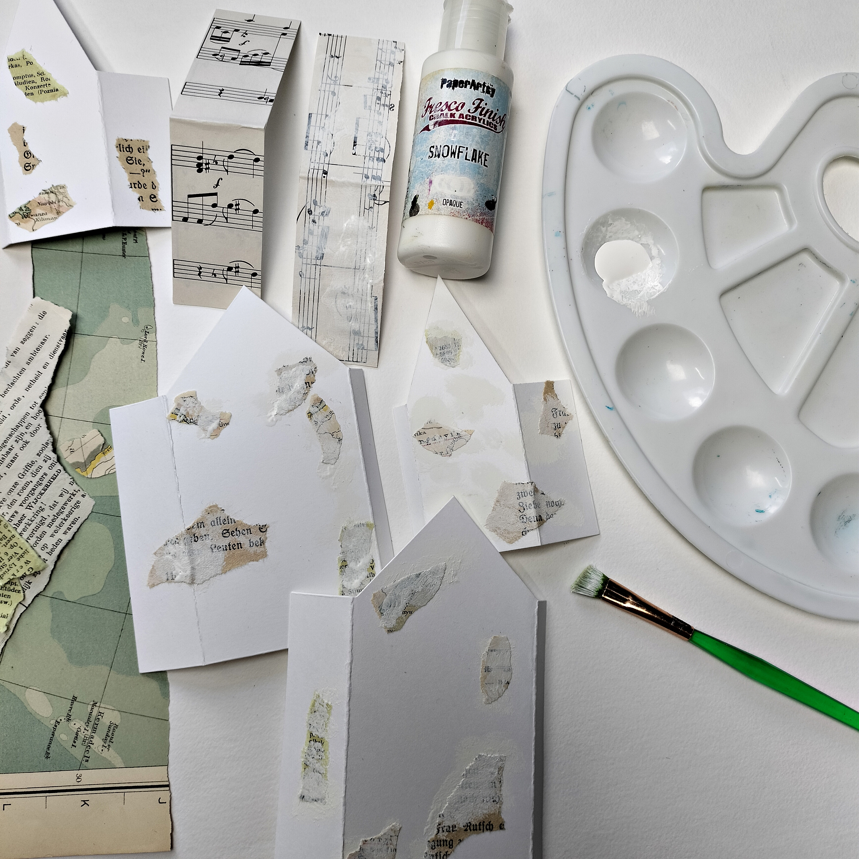
To keep everything clear of how I made the 5 houses I show you the first two houses I made. First I cut out a small one and a big one out of white cardstock. If you don't have a die you probably can drew them yourself. 


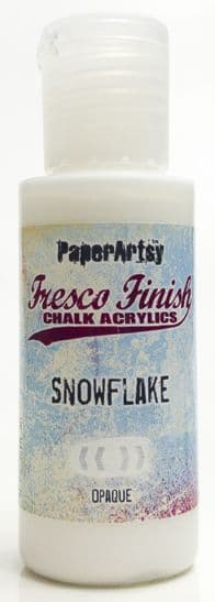
To create some texture, vintage feel and colour I tore out some small pieces of old bookpaper, music sheet and an old map and glued them on the cut out houses. I covered the two roofs with sheet music paper. I softened the tone a bit by adding some white Fresco paint here and there: PaperArtsy Fresco Finish- Snowflake.


Stamping, yesss! My goal was to use almost every stamp of the stamp sets! I used PaperArtsy Ink&the Dog Wings 3 for the small house and PaperArtsy Ink&the Dog Wings 4 for the bigger house. The ink I used was Ranger Archival: Jet Black, Sepia and Coffee. I also used Tsukineko Memento Luxe: Pistachio, the beige ink. It's not in the picture.


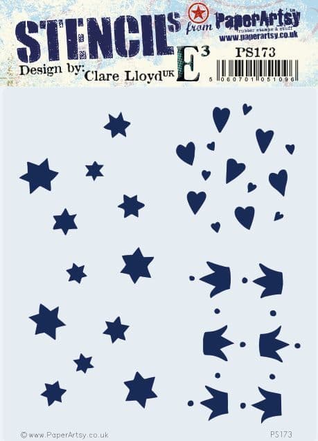
It needed a bit more, some extra texture.., so I made some beautiful stars here and there with PaperArtsy Grunge Paste and a stencil (173 PA Stencil).


This is what I did so far. I think the different images need a kind of connection..and colour of course!


My idea for connecting the different images was using some paint: PaperArtsy Fresco Finish: Sand.  Using my finger I added a bit here and there on the houses.


I used the amazing PaperArtsy Mattints as a paint this time! A great vintage and transparent look is guaranteed! I painted bigger pieces with Mattints: Glow and Nutty, and some small details with the blue Dragonfly. I coloured faces and skin with a pale pink marker and cheeks with a red colour pencil.


Almost time to put the houses together! First I used some Distress Ink: Walnut Stain to sponge the edges of every piece brown.  With pieces of mica and strong glue (Glossy Accents) I covered the roofs. After that I built the housed by sticking the glue strips together.


And..I glued the roofs onto the tiny houses with tacky glue.


And here both houses pose in front of ,their own' stamps, the stamps  they are made from!


In total I made five tiny houses as you can see on some pictures. Also this special one with a niche!


Therefore I cut  an arch out of the front of the house as shown here. I stamped the woman two times on a seperate piece of white cardstock with black ink, one to cut out the woman, and one to cut out the extra butterfly. I also coloured and stamped the inside of the niche/house before putting things together.


The final finishing touches I did was adding a tiny bit of gold wax, I rubbed a bit onto the stars and at the edges, and dots with a white gel pen on the very tiny branches.

And this is the result: the five tiny houses in a row! 


A detail. Here you can see how beautiful detailed the Ink&TheDog stamps are, with delicately lines!


A glimpse between two houses!

One of the mica roofs.... GLAZED!


Creating this kind of vintage project is always so much fun! I love to make new things old, and the amazing vintage style PaperArtsy Ink&TheDog stamps  are working so well for a good result! It was the first time I used Mattints just as a paint and I'm very happy with the way it turned out. 

Hope you like it to and give the vintage style a try yourself! Enjoy!

See you next time,

Liesbeth


Instagram: liesbeth_fidder

May 24-25-26  2024: I will teach 6 different workshops (stamping techniques) in Kouvola, Finland. Info HERE