2021 Topic 15: Journaling Gratitude
Hi everyone, it's Keren Baker with you today, and I'm here to share with you a marble experiment. It
wasn't something that I chose to do- I was looking at my Sara Naumann
sets and couldn't get the twig image out of my head and for some reason
it just looked like a vein in a piece of marble. I'm not the greatest
experimenter in the world, but my curiosity was piqued and I wondered
how hard it was to create a faux marble finish with Fresco Finish Chalk
Acrylics. Turns out it was a reasonable challenge...which I loved. This
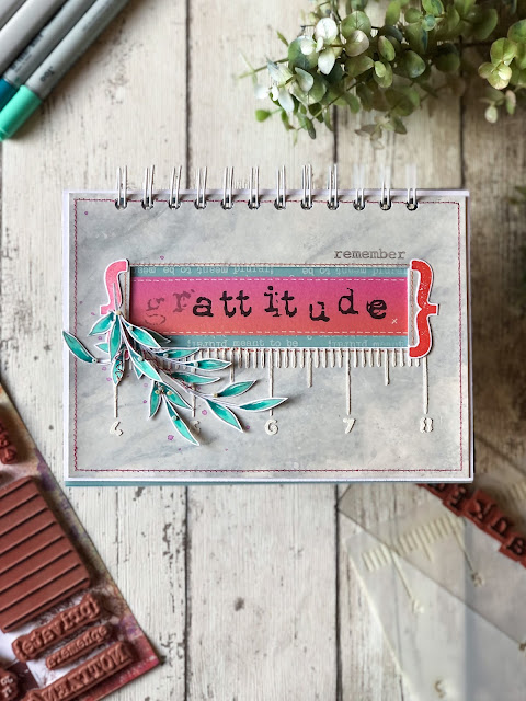
is what I ended up with, trying hard not to cover up all the marble
completely!
So
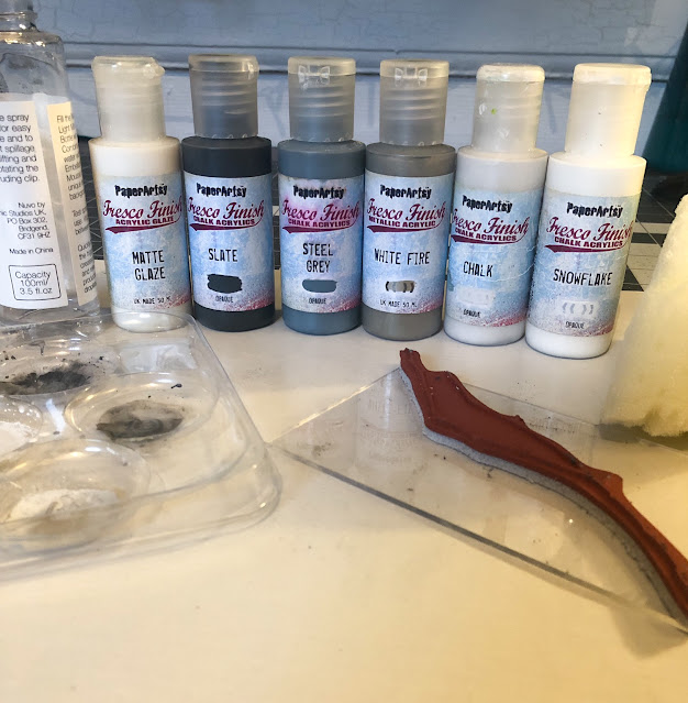
to begin with I pulled several supplies, which turned out NOT be all
the correct supplies, so here is my adjusted supply picture (with the
exception of Drying Retarder (which turned out to be very important).
Please
excuse the lack of colour on the following step by step photos.
Honestly I struggled with it so much as I love colour, but rainbow
marble really isn't a thing so I persevered. I was really helped by a
video by Amy Howard.
I didn't have the same supplies but learned a tonne from her and just
fiddled with what I had until I ended up with something resembling
marble. So you need to paint some Heavyweight Smoothy with
two layers of Snowflake (and with the amount of paint you're going to
throw at this, you really want the Heavyweight!). You have to create a
'scumble' with paint, water and a glaze. It's an equal parts combo for
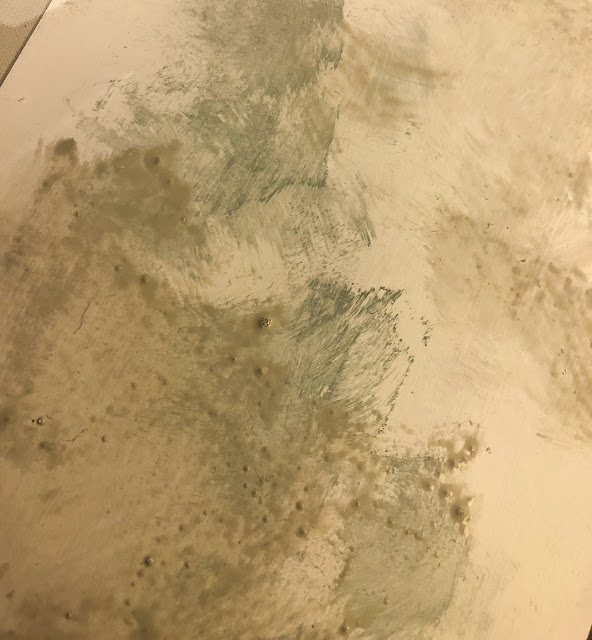
all three of them. So I dabbed the paint on and tried to drag it with my
fake 'natural sponge' and despite having 2 layers of Snowflake on the
Smoothy it literally drank it up instantly. You can see that in the
centre with the blue gray paint; the paint just didn't stay wet long
enough to be moved around.
I
needed more open time. The glaze is to make the paint more transparent
without losing colour but it was drying too quickly, so I got out my
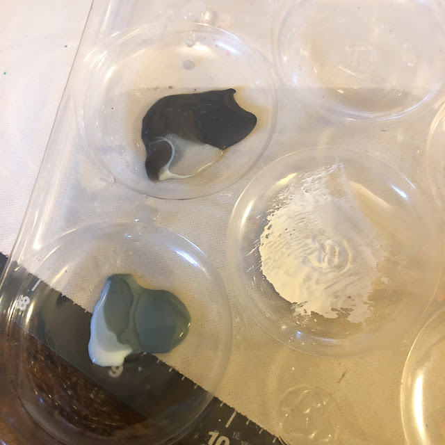
bottle of Drying Retarder. I did one part water, one part Matt Glaze,
one part paint and a drop of Drying Retarder. Oh, and if you like Hotel
Chocolat Super Thin Mint Truffles, their leftover layers make awesome paint palettes!!
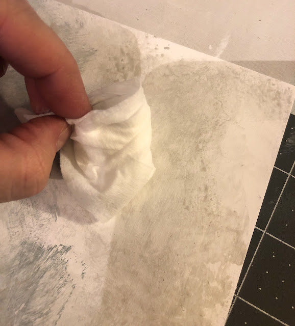
You're
literally dabbing the paint mix with a sponge (but directionally
diagonally) and then supposed to soften the edges with a lint free
cloth. I just used baby wipes as I needed something that would help the
paint to move and it seemed to work.
The
idea is to create layers. I added in some White Fire and a little
Elephant to make a different toned scumble and continued the sponging
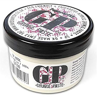
and blending.
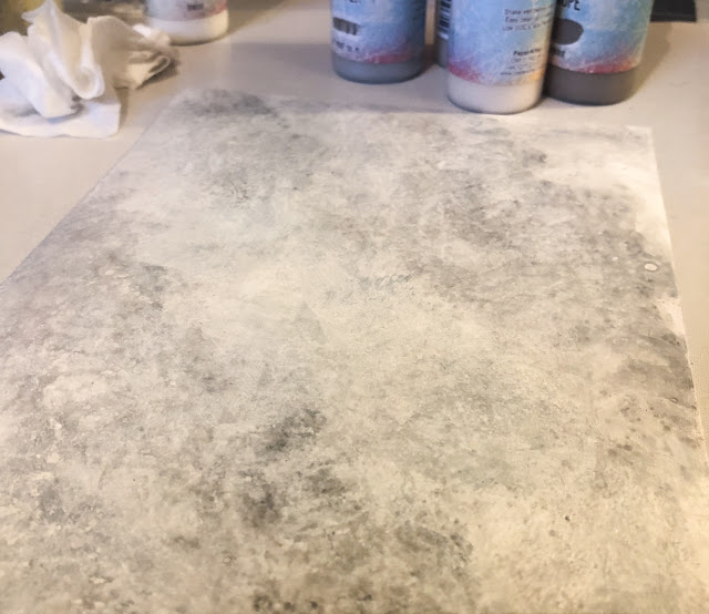
Now you need to add a layer of Snowflake scumble- exactly the same proportions. You're making a softer, more homogenous layer of paint effect.
Literally
dabble, dab and sponge. Until you're happy and now it's time for
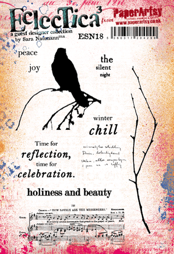
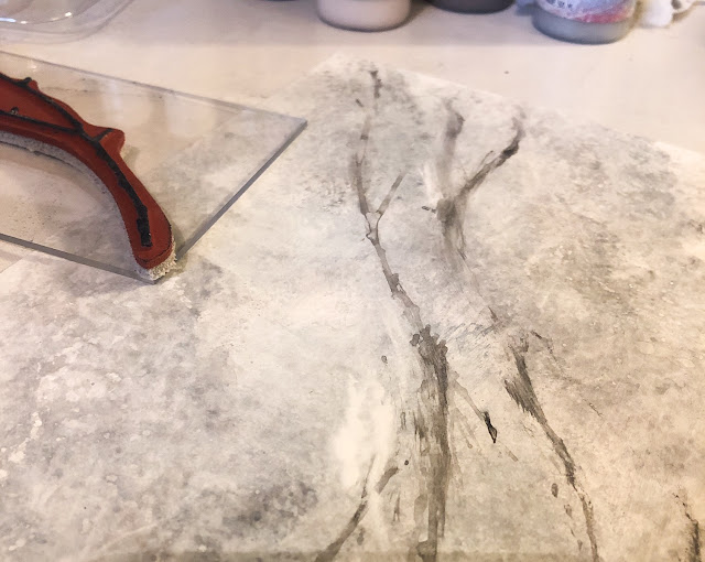
veining. Forget the recommended turkey feathers- I had my secret
weapon...my Sara Naumann stamp from ESN18
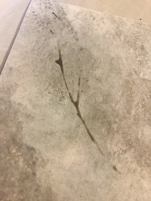
I
presumed that you'd use a more neat paint mix as the veining is more
obvious- but no, you just use a scumble of a darker colour, and blend it
with a dry brush. I'd say move reasonably quickly when you've stamped
your image onto some scumble mix on your craft mat, but the Drying
Retarder does an awesome job of buying you time!
Don't
like what you've done? No worries, add another layer of Snowflake and
then more veining. A few videos I saw recommended that veining is kept
to one direction and not to have lots of branching off it. But I reckon
it's your project, so who cares?! You can see below I've added some more
neat Snowflake if I really wanted to erase a dodgy area.
Here
came the surprising part of the experiment. I had really given my piece
of Smoothy a battering and it was pretty warped. I couldn't be bothered
to wait overnight placing it under some weights, so I just stuck it
between cutting plates and rolled it through my die cutting machine
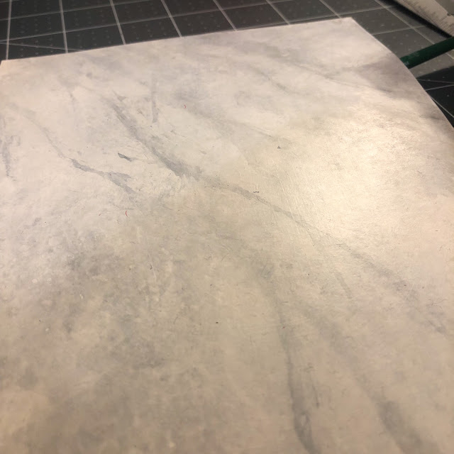
twice. I opened it up, and it suddenly had the loveliest sheen (which I
struggled to capture in this photo). If your plates are marked, don't
worry, it just gives more texture to the piece. I ran it through a few
more times and the piece transformed into having a soft sheeny effect
which really astonished me.
Here
was the challenging part..creating something to fit in with the topic!!
A few years back I made gratitude journals for friends and family so I
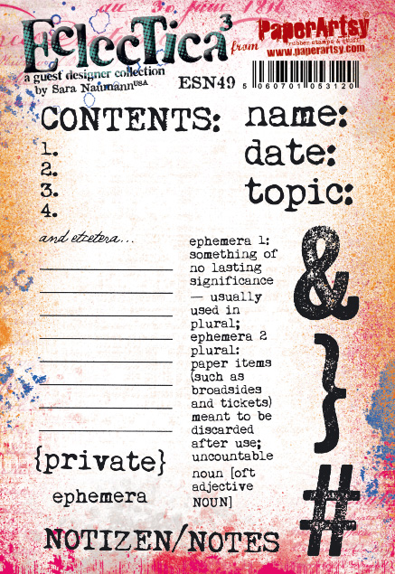
thought something similar might be useful. I had chosen Sara's ESN49 set as it fitted perfectly with journalling gratitude.
I
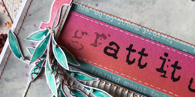
needed another alphabet to spell out gratitude - keeping the 'gr' a
lighter colour I wanted to spell attitude out correctly (even though
grattitude is obviously not spelled like that) as isn't it all about our
attitude to our circumstances that results in our gratitude and
thankfulness? I used Words 2 from Ink & The Dog which
I normally use as a complete stamp but I had to chop it up to make it
spell the sentiment (I'm now going to have to buy the stamp again so I
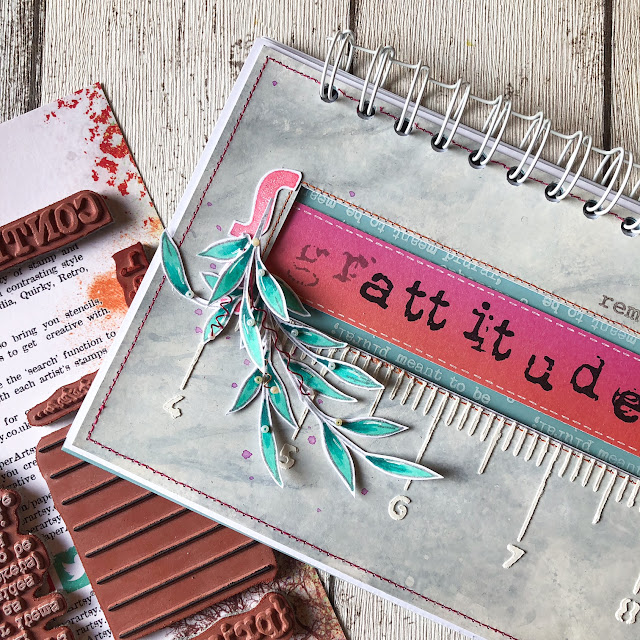
can keep one as a background stamp!). I cut out an aperture, stamped some of the brackets from the set above and set about creating a front cover for my journal.
You
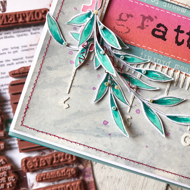
can see several of the details; the sewn edging (which if I'd realised,
I'd have sewn after I punched the holes for the ring binding, and
notice the Grunge Paste I added through stencil PS247.
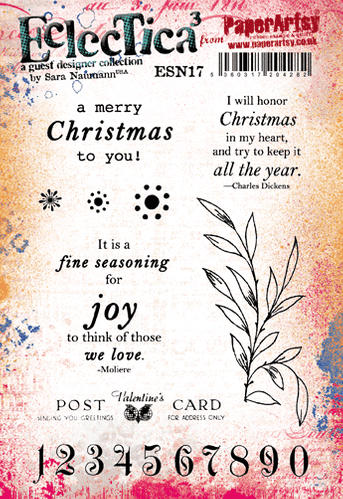
It still looked a little bare, so I added a spray of leaves from ESN17 by colouring with Copic Markers, trimming out, adding highlights, beads and wire spirals!
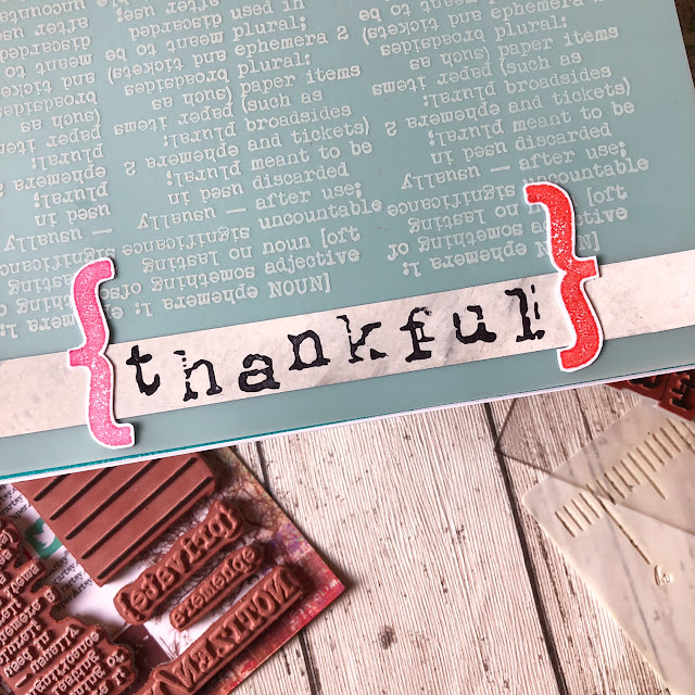
To
encourage people to write down what they were thankful for, I wanted to
add lines and numbers. The more things we feel thankful for, the
better. This page would be seen through the front aperture so after
stamping on Duralar Matt, I added a turquoise page to give a hint of
colour that you can just see through the front cover.
The pages were simple to construct, just using stamps from Sara's different set and using the original I&D Words 2 Alphabet to spell 'thankful'. All of the images are from ESN01, ESN17 and ESN18.
I
just had to remember to stamp the right way when turning over the pages
so the book 'read' the right way..it's a shame I didn't take more care
when stamping the musical notes image at the bottom!! Absolutely love
the post card stamp from ESN17; sooo useful!
Gratitude
is a practice, it's a way of life, it's a discipline and it makes
everything else seem more in focus and balanced. I find it easy to slump
into criticism or negativity if I'm not careful and something like this
book really helps me to count my blessings. Commit to 28 days of
gratitude and see how your mindset changes by the end of it- that's my
challenge to you! I am also glad of chance to experiment and play with
paint as I feel that it's an area I really to need to improve and work
on, so this project gave me a chance to try something new. Paint effects
are not needing to be stuck in the 1980's - I reckon this one is fine
being dragged into today (although maybe not on my lounge walls!!)
Lovely to be with you again, have a thankful day.
Keren x
Blog:
Twitter:@craftstampink
Instagram: @craftstampink
Pinterest: @craftstampink