Showing posts with label EKD05. Show all posts

Thursday, 15 July 2021

2021 Topic 8: Nature's Treasure with EKD {by Claire Snowdon}

2021 Topic 8: Nature's Treasure


A cluster of dimensional flowers truly is a treasure. Claire's clever painted details really make the branches come to life and leap off the page. Using Crunchy Waxed Kraft paper creates a clever grounding and also a frame to focus the flower's painted beauty.
~ Keren

Hi everyone, it's Claire Snowdon with you today, and I'm here to share with you a mixed media panel I created for the Nature's Treasure topic.  I really enjoyed creating this panel - it could be easily adapted to a journal page.
 

My panel was created using an off-cut of kraft coloured mount board.  It's approximately 10 x 7 inches and is lovely and sturdy for this kind of project.  I used Fresco Chalk Acrylic (A Bit Fishy, Shutters, Aqua Duck Egg, Zucchini and Slimed) to start my background - I kept adding the colours and blending them on the mount board with a paint brush until I was happy with how it looked.


I then added this beautifully large leafy stencil in Grunge Paste to the panel - this stencil is by Lin Brown (PS043)


Whilst my Grunge Paste was drying I moved on to creating the extra elements needed for my panel.  I painted some Paperartsy Smoothy Card with Fresco Chalk Acrylics (ZucchiniTinned Peas and Slimed) and stamped out my leafy elements from Kim Dellow Set 5 and 6 (EKD05 and EKD06).  I created another painty panel using Fresco Chalk Acrylics (Tangerine TwistPersimmonFirebird and Cherry Red) and stamped the flower elements from Kim Dellow Set 6 (EKD06).


I then stamped the same flower elements out onto some Paperartsy Crunchy Waxed Kraft Paper and cut them out with a generous border to ensure they would be visible once layered onto the panel.  I fussy cut all the flower and leaf elements as well.


My Grunge Paste was now nice and dry so I sanded it back a little - then to grunge it up a little I added some watered down Fresco Chalk Acrylic (Mud Splat).
Then I gave the background some grungy attention by adding faint stenciling with Emma Godfrey stencil (PS015) and Fresco Finish Acrylic (Chalk). Some 2nd and 3rd generation stamping in Ranger Archival Ink (Jet Black and Potting Soil) and stamps from Kim Dellow Sets 1 and 5 (EKD01 and EKD05).
Of course the background wouldn't be complete without some nice splatter effect!  Here I used Fresco Finish Acrylic (Gold and Chalk).


I added a frame to my panel using Ranger Archival Ink (Jet Black) before I started to add any of the dimensional elements to my panel to make things a little easier.
 

I created the focal point of the panel by layering up all the elements - I scrunched up the Paperartsy Waxed Kraft Paper flowers to sit under the main flowers - I really love the extra depth, colour and texture this adds to the piece.
 

I added some gold and white pen work to the grunge paste tall leaf - the shadows and highlights this creates makes the 3D effect of the Grunge Paste pop even more.


As well as adding pen work to the Grunge Paste leaf I also added it to the flowers and leaves on the left hand side of the panel - this gives them just that little extra lift and draws the eye in.
 

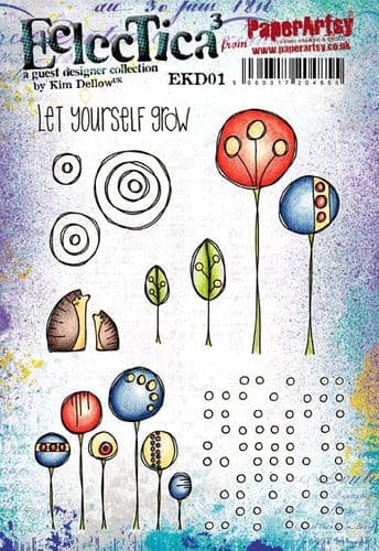
I felt like this sentiment from Kim Dellow Set 1 (EKD01) was really fitting for this topic - I stamped it using Ranger Archival Ink (Jet Black) onto Paperartsy Smoothy Card and then mounted it onto black card.

 
The flower elements and the Kraft Waxed Paper underneath were all layered up using foam pads to really give this panel dimension.  The leafy elements were glued down with the tips of the leaves left unglued to create a more natural effect.


A few more extra photos of the final, finished product to show how dimensional it is :)


This panel really was such a joy to make!  Flowers are probably my number one images to create with - especially when I'm creating cards or art journal pages.  There is just something about them that draws me in and has done ever since I started crafting years ago.  It was nice to push myself out of my art journal comfort zone and create a panel instead - I would really love to encourage you to try and create something out of your comfort zone too!

Thanks for your company today,
Claire x


Saturday, 30 May 2020

2020 #9 Reconstituted Flower with EKD {by Dounia Large}

2020 Topic 9: Collage It


There are so many inspiring ideas in this post. Dounia has some simply stunning ideas for incorporating magazine pages into your art. I also love her idea about when in doubt, add some white dots- I think that's the story of my creative process too!
~ Keren

Hi everyone, it's Dounia with you today, and I'd like to share with you some of my experiments with collaged papers.

I love collage: it was one of the first artistic techniques I practiced with my mom when little, so it brings back a lot of good memories. As I'm also currently separated from my paper stash, I decided to take the opportunity provided by this topic to create my own patterned papers and backgrounds.


Sometimes I find myself low on inspiration or really indecisive on what I want to achieve. I then like to turn toward techniques that focus on the process and motion of craft and required little "artistic" decision making. It gives me a sense of accomplishment without stressing about every little thing. I would like to share a couple of them with you here. They are nothing new or revolutionary but I think they can be fun additions to one's creative palette.

First, magazines are full of big pictures. They can be good or interesting - or not, but they rarely are easily useable as such. However you can chop them up then create a new image simply by rearranging the order of the pieces on a piece of card. The result is a lot more random than the original and can be used as a background without distracting from the main elements.


Regular stripes are the simplest to manage but you can change width or try different shapes for a more random pattern. I find the process of systematically cutting and glue-ing almost meditative and calming. I was in the mood for a striking pattern, and generally contrasted and/colorful images work best for that.


 .
Here I found the first glued images still too homogeneous and recognisable so I reiterated the process with lengthwise stripes. The colors are now better distributed and I like the tessellated pattern.

To contrast with this very organised background I next went on a tearing spree! I selected parts of magazine pictures with relatively plain colors and tore them in strips and pieces.  That part is pretty therapeutic! These touches of color can be used carefully to create new images, like painting with paper, but I was more into slapping them together to make gradients.


The color variations in the strips provide great texture. I often make too many pieces for one project so I put all the remaining ones in a box to draw blindly and glue. It forces me to release control and the results can be pretty interesting.

To make an actual project, I needed stamps able to stand up to such busy papers. I went for the clear lines and organic shapes of Kim Dellow. The EDK05 set had all I needed for a nature scene:


The leaves doubled as templates for petals cut in my collaged strips. I tried stamping on the front but it covered the color variations too much for my taste.


However I wanted to keep the details on the butterflies so I stamped them directly on pictures with interesting patterns.


Contrasted against the other elements, the leaf one won. I also liked the idea that both the petals and the butterfly were made of leaves!


For the flower centre, the big flower stamp was an obvious choice and the middle somewhat looks like an eye so I ran with that idea. I love collaging eyes, they're so recognisable and always make an impression.


I tried to match both the yellow green of the first butterfly and the eyes with this frog butterfly. The result was a bit plain so I added the vellum layers to isolate the elements and celebrate the graphics of the stamps. The white and black dots also really bring things together. When in doubt, add white dots!


Here is one project finished despite creative block, and I have lots of other backgrounds to play with! I hope this gave you a few ideas to try with magazine pictures. It's very cheap in both materials and tools needed and quite effective! It is also a great way to use those paper scraps we all are hoarding, or can be applied to book pages for very graphic results.

Have fun and stay creative!
Dounia x


Tuesday, 5 May 2020

2020 #8 Popping Pink: Trio of Cards with EKD {by Claire Snowdon}

2020 Topic 8: Popping Pink


It's easy to assume that you need lots of colours to make impactful art but here, using a plethora of pinks in this beautiful trio of cards, Claire has woven them together to create a gorgeous masterboard. The gold splatters are the perfect finishing touch!
~ Keren

Hi everyone, it's Claire Snowdon with you today, and I'd like to share with you a trio of Popping Pink birthday cards I made.  Of course these cards could be used for any occasion - but it's always handy to have a few birthday cards prepped and ready to go!

I chose to create some masterboards as the basis for my cards - masterboards are great as I have loads remaining to create more cards or to use in collages or art journalling.....the options are endless.


I started by creating some backgrounds on a couple of pieces of white A4.  I did this by blending lots of Fresco Finish paints in various shades of pink with a paintbrush until I was happy with how they looked.  I probably spent more time playing at this stage of the project, adding and covering sections,  more and more paint layers than I did on the rest of the cards put together! 


These are all the shades of pink I had in my Fresco Finish collection.....and I used every single one somewhere in these cards!  :)


The next stage of the masterboards was to add stamping and stenciling.  I used some of the lighter pink shades to do the stenciling with a The Crafters Workshop stencil and PS015.  Then used elements from EKD01, EKD03, EKD05 and EKD06 to add background stamping with a few different pink inks I found in my stash - Distress Oxide (Picked Raspberry), Archival (Pink Peony) and Archival (Cactus Flower).


Once I was happy with the masterboards I cut them up and added stamping using Black Versafine ink and stamps from EKD05 and EKD06.


I tried to play around with the placement of the stamps and also varied the stamps for each card so that each of them are unique.  Then I added some paint splatters in white and gold....I love the combo of pink and gold together. 


I layered up the stamped pieces onto kraft card, added to a card blank and added the happy birthday sentiment from JOFY14 - it's an oldie but a goodie!!


These cards are pretty easy to make - the fun part is creating the masterboards.  There are no rules to creating masterboards so just have a go and let your imagination run wild!!

Thanks for joining me here today,
Claire x

Blog
Instagram
Pinterest

Monday, 6 May 2019

2019 #7: Turquoise & Orange & Pink with EKD [By Corrie Herriman}

2019 Topic 7: Turquoise


Corrie is with us today creating a type of project she doesn't always do and with her favourite colours too. With lots of stencilling and Copic colouring, she's ended up with quadruple the amount of gorgeousness!

Hi everyone, it's Corrie here with you today, and I'd like to share my project that I made for the Turquoise topic with you.

I made 4 cards this time. I love turquoise; it is one of my favourite colours, add pink and orange and I am in heaven. So that is what I did; I combined all my favourite colours together.


I really enjoyed making these cards. I don't often make cards but usually enjoy the process when I do. Basically they are just small Art Journal pages or they could be! The most important thing is that you enjoy what you do.


I decided that I wanted to use my Gel press plate to make the backgrounds. I used PaperArtsy Fresco Finish Chalk Acrylics in the colours Snowflake, Turquoise and Mermaid. For the card panels I used PaperArtsy card Smoothy Heavyweight.


This was the first layer of paints for which I used PaperArtsy Fresco Finish Chalk Acrylics Snowflake and Mermaid.


For the third and final layer I used PaperArtsy Fresco Finish Chalk Acrylic in Turquoise and a stencil by Kim Dellow PS034.


The next step was to add more interest with stamps. I used two PaperArtsy stamp sets: EKD05 and EKD06 both designed by Kim Dellow. I used different colours ink but also different types of ink. Sometimes, when you don't have all the colours, you will have to improvise. I used Distress Oxide Inks for the pink {Pink Raspberry}, orange {Carved Pumpkin} and turquoise {Peacock Feathers} stamping. For black I used Versafine ink {Onyx Black}.


Here I am deciding which stamp I want on which card as a focal image. I looked at how much white space there was and where I stamped. Basically I looked for the placement that was most pleasing to the eye.


After stamping the images on white card stock I coloured them with my Copic Markers, choosing pinks and oranges, which I think go so very well with turquoise.


I also stamped the focals on the cards. I then cut out the flowers, leaves and butterfly and started putting the cards together. I decided to add some more stamping in the backgrounds too. I used another image from Kim's sets and used a gray Stazon ink Dove Gray because that was the gray I wanted. For the stems I just coloured some strips of paper with black stripes and cut them out.


All card panels were adhered onto a white card base. I decided to just add some words from a Tim Holtz Big Chat sticker book but you could easily turn these cards into birthday cards or thank you cards or something.


I think they turned out really nice. I love the pink and orange with the turquoise. Another colour that goes really well with turquoise is brown but I wasn't in the mood for Vintage today !


It is strangely satisfying to do something that you normally don't do very much. So why not try yourself. Do an art journal spread if you don't do that very often, or if you are a card maker try making some ATC's or tags. The outcome can be surprisingly nice! I just combined a lot of favourite things into one project and that way it becomes very enjoyable!

Corrie

Thank you so much for stopping by my post today ! I hope you'll come round and stop by my other locations too: