Showing posts with label 2021 Topic 8. Show all posts

Saturday, 17 July 2021

2021 Topic 8: Nature's Treasure with HP {by Jenny Marples}

 2021 Topic 8: Nature's Treasure


Jenny really is offering a masterclass in how to build up an idea and then bring it to life, layer by layer with one of our Hot Picks floral vintage stamps as the focal point. This truly is an astonishing read and I love how she tells us how and why she adds all those scrummy details to each layer.
~ Leandra

Hi everyone, it's Jenny Marples (Pushing The Right Buttonswith you today, and I'm here to share an idea for creating a home decor piece which was inspired by memories of a trip to the Palm House at Kew Gardens, London. This remarkable glass and metal structure provides a wonderful home and backdrop for protecting and displaying some of nature's most beautiful botanical treasures - it is well worth a visit or three!

Following on from previous journal pieces I teamed a hand drawn sketch depicting part of the Palm House with Hot Picks stamps, used to create both focal points and subtle accents


The stamps have also been used to create decorative paper for the background, whilst some words and a stencil by Sara Naumann have added accents that help to build in those all important interesting little details.


Start with a sketch - I roughed out my design from photos using pencil marks before reproducing it on a piece of tea dyed paper. Use different nib sized pens (permanent ink of course!) to help emphasise some of the lines when you re-draw over the top of your original sketch lines.


Emphasise the important elements - whilst more recently I've been adding a little watercolour to help make the main structures stand out, for this sketch I've reflected the fact that the metal beams in the Palm House are painted white by using 'Snowflake' Fresco Finish Paint on the ones in the drawing.


Adding a touch of nature - a dramatic plant was needed to work with and compliment those strong vertical beams in the Palm House so I chose a strong architectural one from the Hot Picks HP1602 stamp set.


Test your positioning - try stamping onto a piece of transparent packaging to work out where you want to place your plant before committing to adding the ink.


Thinking ahead - I deliberately chose to stamp the flower heads over the edge of the sketch knowing that extra layered flower heads would be added next to fill in the missing detail.


Adding colour - single-ply tissue dyed with 'Violetta' Infusions has a wonderful mottled look which can be given a warm or cool hue by adding it to a cream or white card base with a gel medium. For this project I chose to stamp the flowers onto the warmer cream base.


Think outside the black - just because I'd used black ink to stamp the flower on the sketch didn't mean that had to be replicated on the coloured tissue card. Since there is a lot of shading detail incorporated into the stamp design I chose to use a purple ink to stamp more flower heads to compliment the card colour.


Cut, shape, layer - adding several layers of shaped flower heads brought dimension to the flat stamped image underneath. I also stamped the central sections onto a contrasting yellow coloured piece of card to create more of an exotic look for this dramatic plant, covering each one in some Glossy Accents.


Don't forget the foliage - there may be no leaves included on the original design but you can always embellish your flowers with some bespoke foliage. I die cut little leaves, painted them with 'Tinned Peas' Fresco Finish Paint and slipped them underneath the flowers, remembering to add the same colour to the stamped stem. A white gel pen was also used to add a little more definition to the edge of the flower heads.


'Gild the lily' - I've shown in previous posts how you can use different coloured inks with your stamps to add detail with a lower 'value'. Around the stem and flower heads I utilised more stamps from the HP1602 set in conjunction with grey and purple ink.


You'll also see below how Grunge Paste has been applied through Sara Naumann's stencil PS247 over the stamping. To finish the main panel I went on to add some hand stitching over the stamped sections.


Build a background - with the main panel complete I started work on the background, creating some bespoke vintage style decorative paper using Hot Picks stamp sets HP1301 and HP1501.


Some of the text based images from these sets were stamped over painted card with a mix of grey and black inks.


The Fresco Finish Paints used for this card all came from the same set and included 'Taupe', 'Truffle', 'Stone', 'Eggshell' and 'Chalk', all applied in random patches with well-worn household paint brushes and a spatula. By finishing with a loose brayered layer of 'Snowflake' Paint it brought the various colours and stamped images together.


Begin building - after covering a solid tag base with the stamped background paper I applied some more of the Infusions dyed tissue over the top.


Adding layers - by adding further layers of tea stained and gel printed paper on top of the tissue and under the main panel it helped with framing it. I also added a piece of fabric on top of a board painted with black gesso and edged with a gold pen to do the same. You can see below how more stamping and stencilling was applied to the bottom and top of the lower layers to match the ones on the top panel.


To finish the tag I added clusters of smaller die cut leaf stems at the top and bottom, various metal embellishments and a large bow.


The words 'nature's journey' can be found as part of Sara Naumann's ESN50 stamp set. I gold heat embossed them onto off-white card before mounting them over the flower stem to create a second focal point. Touches of gold wax were applied to the edges of the tag and over the leaf stems.


Here are some final close ups of the finished tag;


As with previous posts I hope that this post demonstrates how the images in your stamp collections can add to and enhance your drawings as well as helping to create your own backgrounds.

Thank you so much for stopping by.
Jenny

Blog: https://pushingtherightbuttons.blogspot.co.uk/
Facebook: https://facebook.com/jenny.marples.73

Thursday, 15 July 2021

2021 Topic 8: Nature's Treasure with EKD {by Claire Snowdon}

2021 Topic 8: Nature's Treasure


A cluster of dimensional flowers truly is a treasure. Claire's clever painted details really make the branches come to life and leap off the page. Using Crunchy Waxed Kraft paper creates a clever grounding and also a frame to focus the flower's painted beauty.
~ Keren

Hi everyone, it's Claire Snowdon with you today, and I'm here to share with you a mixed media panel I created for the Nature's Treasure topic.  I really enjoyed creating this panel - it could be easily adapted to a journal page.
 

My panel was created using an off-cut of kraft coloured mount board.  It's approximately 10 x 7 inches and is lovely and sturdy for this kind of project.  I used Fresco Chalk Acrylic (A Bit Fishy, Shutters, Aqua Duck Egg, Zucchini and Slimed) to start my background - I kept adding the colours and blending them on the mount board with a paint brush until I was happy with how it looked.


I then added this beautifully large leafy stencil in Grunge Paste to the panel - this stencil is by Lin Brown (PS043)


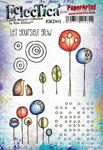
Whilst my Grunge Paste was drying I moved on to creating the extra elements needed for my panel.  I painted some Paperartsy Smoothy Card with Fresco Chalk Acrylics (ZucchiniTinned Peas and Slimed) and stamped out my leafy elements from Kim Dellow Set 5 and 6 (EKD05 and EKD06).  I created another painty panel using Fresco Chalk Acrylics (Tangerine TwistPersimmonFirebird and Cherry Red) and stamped the flower elements from Kim Dellow Set 6 (EKD06).


I then stamped the same flower elements out onto some Paperartsy Crunchy Waxed Kraft Paper and cut them out with a generous border to ensure they would be visible once layered onto the panel.  I fussy cut all the flower and leaf elements as well.


My Grunge Paste was now nice and dry so I sanded it back a little - then to grunge it up a little I added some watered down Fresco Chalk Acrylic (Mud Splat).
Then I gave the background some grungy attention by adding faint stenciling with Emma Godfrey stencil (PS015) and Fresco Finish Acrylic (Chalk). Some 2nd and 3rd generation stamping in Ranger Archival Ink (Jet Black and Potting Soil) and stamps from Kim Dellow Sets 1 and 5 (EKD01 and EKD05).
Of course the background wouldn't be complete without some nice splatter effect!  Here I used Fresco Finish Acrylic (Gold and Chalk).


I added a frame to my panel using Ranger Archival Ink (Jet Black) before I started to add any of the dimensional elements to my panel to make things a little easier.
 

I created the focal point of the panel by layering up all the elements - I scrunched up the Paperartsy Waxed Kraft Paper flowers to sit under the main flowers - I really love the extra depth, colour and texture this adds to the piece.
 

I added some gold and white pen work to the grunge paste tall leaf - the shadows and highlights this creates makes the 3D effect of the Grunge Paste pop even more.


As well as adding pen work to the Grunge Paste leaf I also added it to the flowers and leaves on the left hand side of the panel - this gives them just that little extra lift and draws the eye in.
 

I felt like this sentiment from Kim Dellow Set 1 (EKD01) was really fitting for this topic - I stamped it using Ranger Archival Ink (Jet Black) onto Paperartsy Smoothy Card and then mounted it onto black card.

 
The flower elements and the Kraft Waxed Paper underneath were all layered up using foam pads to really give this panel dimension.  The leafy elements were glued down with the tips of the leaves left unglued to create a more natural effect.


A few more extra photos of the final, finished product to show how dimensional it is :)


This panel really was such a joy to make!  Flowers are probably my number one images to create with - especially when I'm creating cards or art journal pages.  There is just something about them that draws me in and has done ever since I started crafting years ago.  It was nice to push myself out of my art journal comfort zone and create a panel instead - I would really love to encourage you to try and create something out of your comfort zone too!

Thanks for your company today,
Claire x


Tuesday, 13 July 2021
2021 Topic 8: Adopt the pace of Nature.... with ESA {by Amanda Pink}

2021 Topic 8: Nature's Treasure

 
Amanda makes the most amazing Grunge Paste Textured backgrounds, and on this occasion both infusions and paints build up the depth for a bespoke Seth Apter flower to sit on top and how cool is that rustic flower centre!
~ Leandra

Hi everyone, it's Amanda Pink (ink-a-pink) with you today, and I'm here to share with you a mixed media art panel that I've created for the current topic: Natures Treasures. 

Surrounded by so many of 'Natures Treasures', inspiration for this topic is definitely in abundance but I knew that what ever I made would be influenced to some degree by the stamps I would be creating with. They were Seth Apters new release (June 2021). Lucky me!! I'm always happy to create with Seths stamps but at first glance I wasn't sure how I would use them as they didn't seem (to me) to lend themselves to the topic, especially in any obvious way. Then I looked closer! I could create a flower with one of the stamps and possibly a textural 'tree bark' effect with another which would tie in with my leaning to create something inspired by my woodland walks and all the texture beauty and earthy rustic colour that surround me as I walk. 

Unbeknown to each other and miles apart, it turns out both Seth and I created flowers using  the same stamp from his new stamp sets.  Our flowers do differ though, guess that's nature, right? You can see Seths flower here and it really is a beaut! 


My creativity began with the background panel.  


Wanting this to bear some semblance to textured tree bark when finished I covered a piece of thick kraft card with PaperArtsy Grunge Paste, not worrying about even coverage as I wanted it to be rough and rugged. 


I then stamped into the grunge paste using the stamp I thought might create the effect of tree bark from PaperArtsy Seth Apter (ESA22).


 Being able to stamp into Grunge Paste offers so much creative potential.


I guess I would be considered a 'newbie' to this technique (I know where have I been hiding) as I've only tried it a few times before and seldom with pleasing results. From what I understand to get the best results it helps if you lightly spritz the stamp you're using with water first so thats what I did. I also used an acrylic block which helped too as it allowed me to firmly press the stamp into the paste.  


The result certainly pleased me this time. 

Note: When you're finished stamping be sure to clean your stamps of any debris.

 
PaperArtsy Infusions are a great medium to use to colour textured Grunge Paste. I used Rusty Car and Black Knight for those earthy rustic colours. 


Their water reactive properties allow them to be dripped down and moved around the background with ease. 


Those water reactive properties also allow for seamless blending when the infusions merge together. 


I especially love how they seep into the peaks and troughs of the texture creating a natural sense of light and shadow. 


To enrich and strengthen the depth of colour I also blended in (quite randomly) some PaperArtsy Fresco Chalk Acrylics 


My choice of colours were  (MahoganyInky PoolFrench Roast). All three are either translucent or semi- opaque so due to these properties they will still allow the infusion colours already laid down to be seen. To accentuate the stamped texture I caught the 'lumps' and 'bumps' with PaperArtsy Fresco Chalk Acrylics (Fuzzy Cactus,Gold Rush) and a very light touch of gold gilding wax.   
 

The 'broken text' stamp, also from PaperArtsy Seth Apter Set 22 (ESA22) stamped in PaperArtsy Fresco Chalk Acrylics (Gold Rush) provided a touch of extra detail and interest. 

Note: Clean your stamps straight away after stamping with frescos. 


The photo above gets you closer to the depth and layers of colour /tone and their nuances as well as the lumpy bumpy texture and stamped detail.  


Moving onto the flower.


In contrast to the richness of the texture and colour of the 'tree bark' effect background I wanted the flower to be more delicate and neutral but I also wanted some unity between the two. 
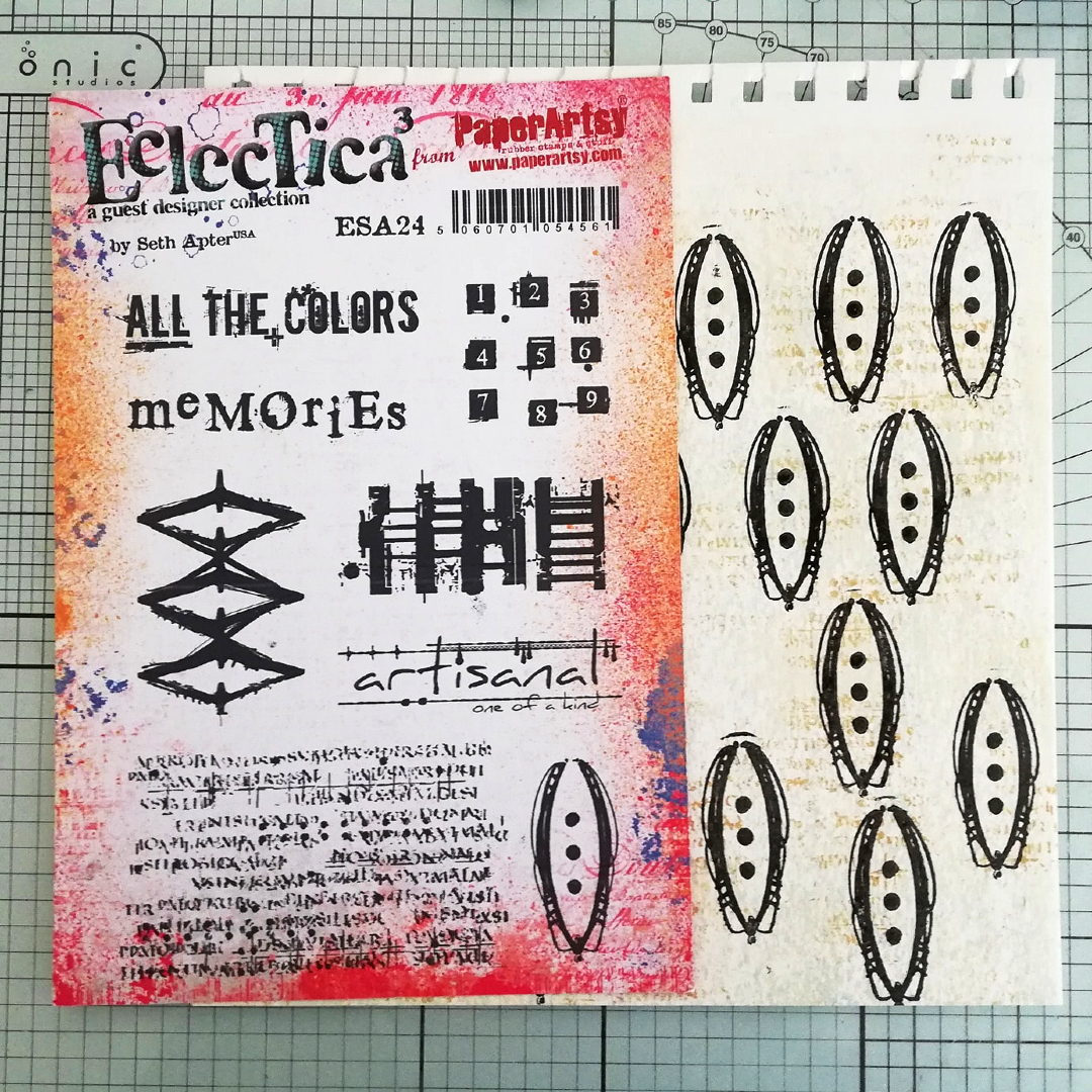
So I brayered a piece of PaperArtsy Smoothy with PaperArtsy Fresco Chalk Acrylics (Heavy Cream, Honey Dew, Blue Moon) and added some detail using PaperArtsy Fresco Chalk Acrylic (Gold Rush) with one of the stamps from PaperArtsy Seth Apter set 24 (ESA24). 


The brayered card was then repeatly stamped with the 'pod' design stamp from PaperArtsy Seth Apter Set 24 (ESA24) . My flower was to be multi layered / dimensional so I needed  to make sure I had enough. 
The design of the 'pod' was easy to cut out, but I have to hold my hands up and say that  for 'my own' flower I did cut away the outer fine lines (hope you don't mind? Seth).  


The 'pod' petals were given some additional PaperArtsy Fresco Chalk Acrylic (Gold Rush) touches before being transformed into a flower. 


Now for a few featured words that became my projects title. 


 I stamped one of the Nature quotes from PaperArtsy newly released Alison Bomber Set 21 (EAB21) onto a leftover piece of the brayered card I'd used for the flower. 


I chose to split the quote up so when situated in opposing corners of the background panel it gave balance to the finished design. 


It's something I really like about Alison's quote stamps. You can cut them anywhere within the quote or between the lines of the quote and there will still be space between the cutting points.  


Finally, the finishing touches. 


The flower was speckled with some PaperArtsy Fresco Chalk Acrylic (Mahogany)  splatters and embellished at its centre with some rusty hardware. These are from my stash of 'street swag' (as I call it) - naturally rusted and (to me) real treasure!


I enjoyed creating my 'Natures Treasures' mixed media panel and was pleased with how it turned out.  I'm always happy playing around with texture and colour and love creating projects like this that are the sum of a few parts.
I was impressed with how the dimensional flower turned out, and all from just one stamp!! 
I think I managed to create a kind of 'tree bark effect' with the stamps and mediums used but I guess you'll be the better judge of that !? 
So glad I gave the Grunge Paste stamping another go. The water proved to be a game changer. If you haven't tried it yet, or you have but (like me) with limited success I encourage you to give it a go / another go. 
Have fun playing around with Infusions too. They really are little bottles of magic that have all kinds of creative potential. They're really good friends with water too!

Thanks for spending time with me today/ tonight. 
Keep on Creating 
Take Care 
Amanda
x

Blog: ink-a-pink
Facebook: Amanda Pink
Instagram: p1nkart
Pinterest: PinkArt