
2021 Topic 15: Journaling Gratitude
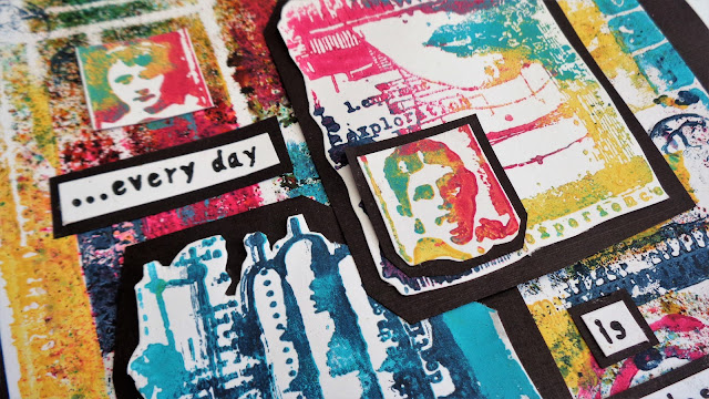
Infusions
properties are the very epitome of surprise, and you can feel Helen's
excitement as colours come to life in unexpected ways. She's managed
colour so superbly and her page sings with life and vibrancy with the
perfect thankful quote. ~ Keren
This is Helen's last post for PaperArtsy. She has been with us for many, many years as a long-serving blogger, amazing brand-supporter and teacher in stores with our products. We can't thank her enough for her wonderful loyalty and absolutely enthralling experimental posts, which I am sure you will all have enjoyed. Lynne Perrella stamps and a lot of our original Ink and the Dog have always been among her favourites, but we have always appreciated how versatile she is across all the PaperArtsy collections. She has been an absolute joy, a riot of colour and we thank her with all our hearts. xx ~ Leandra & Mark
Hi everyone, it's Helen with you today, and I'm here to share with you a project on the theme of journaling gratitude.
I
thought long and hard about this as I don't really 'journal' as such.
In the end I decided on the products I wanted to use and thought I'd see
where it took me!
My
original thought was that I'd cut up the stencilled page into
journaling cards but I liked it as a whole so much I couldn't bear to do
that. Looking at the Everything Art stamps, I realized the pattern ones
would fit really well onto the stencil design, so that was it, I was
off!
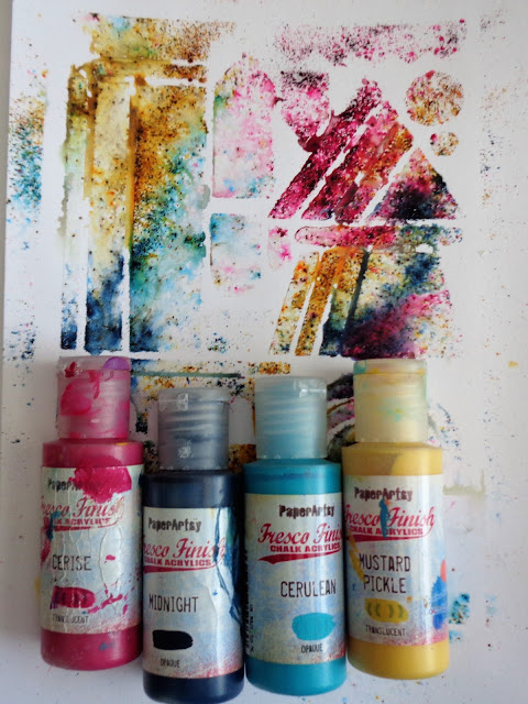
Out came my Infusions - Are You Cerise, Green Man, Golden Sands and In the Navy - and one of Tracy Scott's latest stencils.

You can see they're well used and last for ages.

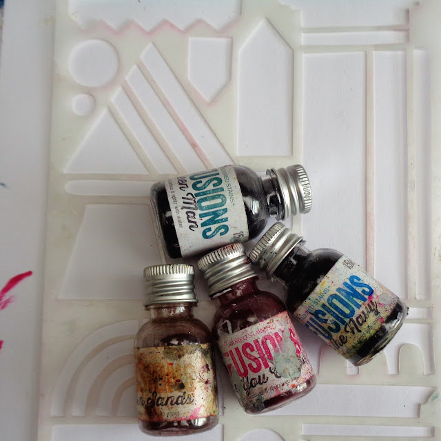
Here are the Infusions:


You can see Tracy's stencil - PS279 - in action on this blog post. List of stockists also available here.
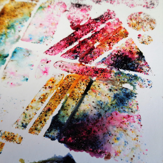
I've sprinkled the powders randomly.
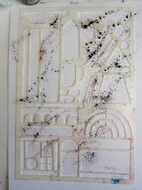
Just go over the top of the stencil.
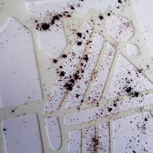
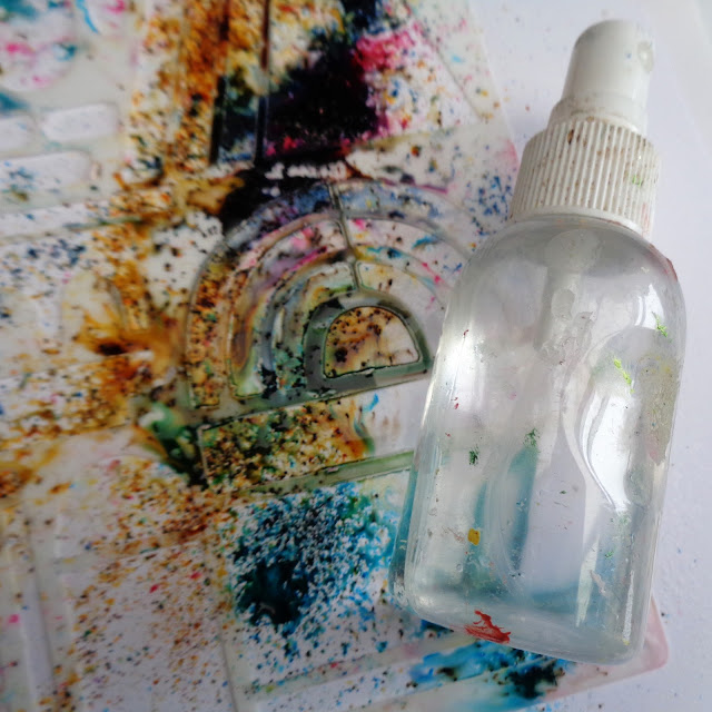
Then spritz!
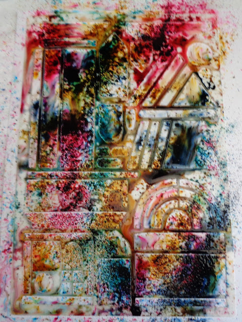
How much water you add is up to you.
I blotted mine with kitchen paper as I wanted to keep the colours bright.
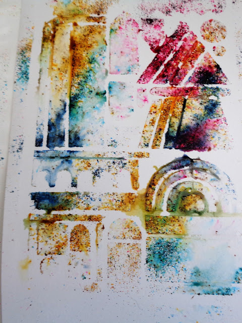
The colours are gorgeous.

I wanted to stamp in Frescos so chose coordinating colours.
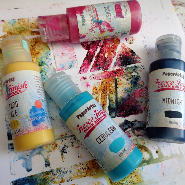
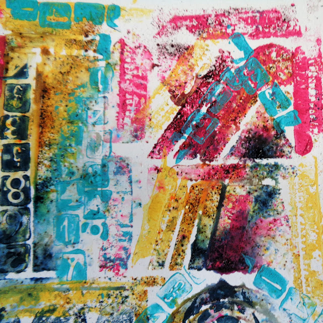
I started with colour on colour over the Infusions...

...and then added contrasting colour on top and also moved into the white spaces.
Then I looked at my other stamp sets.


I
was thinking of stamping the main images in black, but decided to use
the paints again, applying with a cheap, cut up sponge. By using a
stamping platform, I could stamp a bit at a time and add details as I
went along.
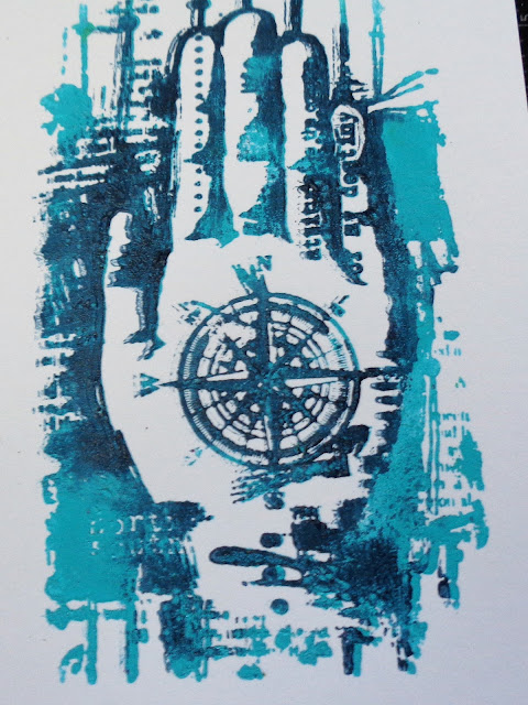
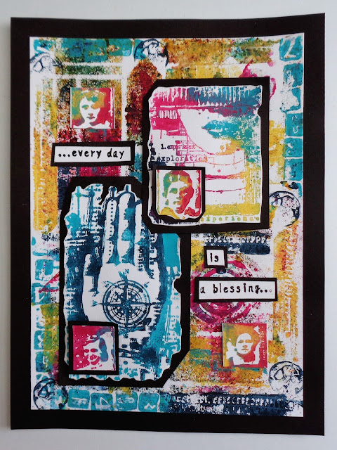
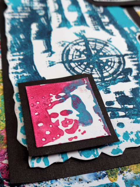
You can see I've added darker blue round the fingers to emphasize the shape.
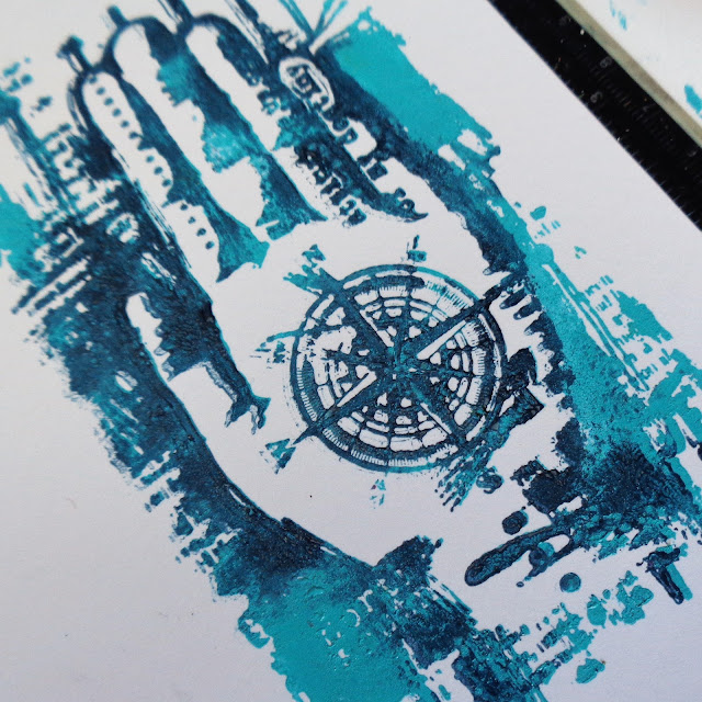
All the images stamped really well, the paint picking up the smallest details.
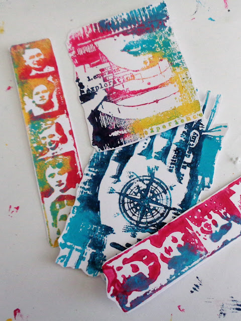
You can mix colours as you go and also apply colour over colour.

When
I started to layer it all up, I felt it needed the contrast of the
black behind it to make it pop. Otherwise the images got a bit lost.
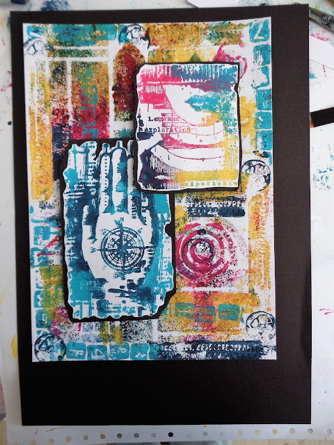
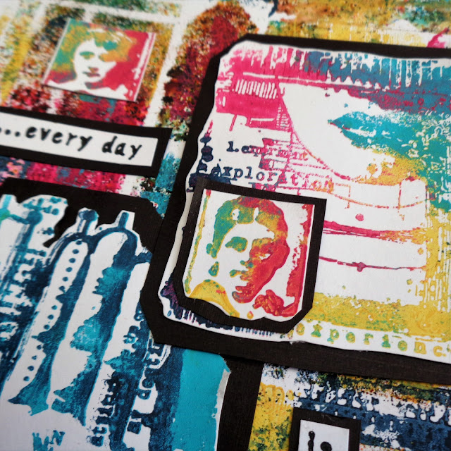
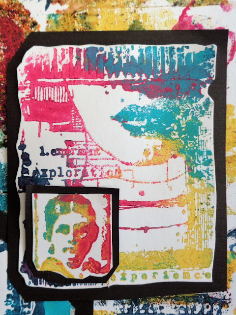
I followed the contours of the image rather than a straight edged black mat.
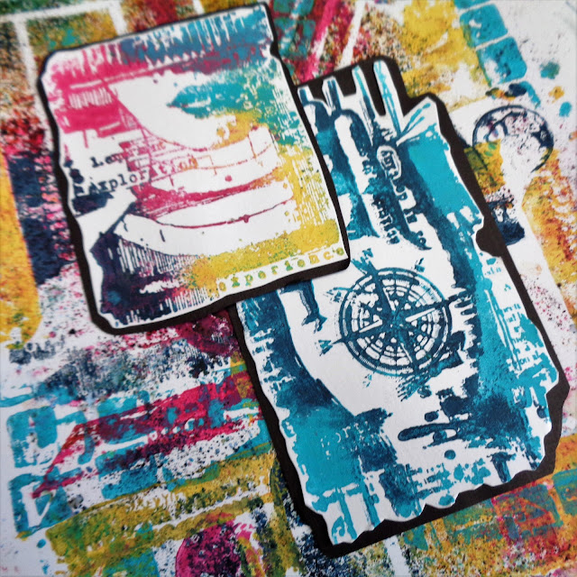
The text is from one of Lin Brown's stamp sets ELB22 - it just seemed to fit.

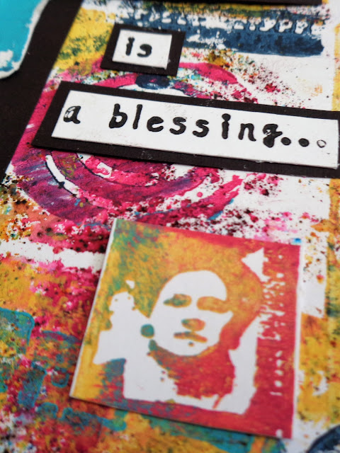
This is also stamped in paint.
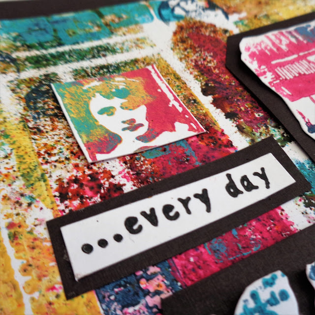
I've added some of the tiny portraits to finish it off.
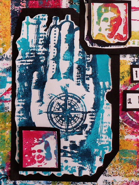
I liked the look of everything overlapping slightly.
Infusions
are always exciting to use as you never quite know what you're going to
get. I made up several stencilled images, including one with Grunge
Paste, as I wasn't sure which way to go. I could have taken the
background one step further by spritzing again once I'd added the
painted stamped images - I chickened out as I didn't want to ruin it,
but might try it with one of the spare pieces.
I
was pleased that this turned out to be bright and cheerful as you know
how I like my bright colours! If you want a more vintage look, just let
the Infusions 'cure' for longer.
This
is going to be my last PaperArtsy Blog post as I think it's time to
step aside and let those who are more media savvy than I am take over! I
have loved working with Leandra, Mark and all the team and will be
following closely to see what other fantastic products and designs they
come up with. Many, many thanks to you all.


