Season's Greetings to you from PaperArtsy HQ,
It has been a crazy year here at PAHQ as we continue to adjust to life in France. We are feeling much more settled this year, and took time over summer to enjoy many of the 'Nocturne Marche' (evening markets) where a village comes together to eat, drink and dance in the warm summer weather. Many of the people who visited us this year were treated to this experience - only available in July and August when most of France is on holiday! Many of them here in our stunning South-Western corner of France.
We loved being back at our favourite show in Paris early spring: Version Scrap. It has always been one of the most enjoyable consumer shows to exhibit at, and one that we have exhibited at for every event except for the 2 just before and after covid. Sadly it is not on offer for 2024, but never fear, we do have events planned to be held on site here at PA HQ, so keep your eyes peeled for news of those happening in Spring 2024! It has always been my dream to host events here, so we cannot wait to bring that vision to pass!
It's time for Part 2 in our instalment looking back at highlights from the PaperArtsy Blog in 2023. The theme overarching Topics 4-6 was Texture, and ohhhh how those of us with a penchant for mixed media love to add some texture to our layers, be it with pastes, papers or numerous other tactile layering options.
We have chosen posts from Topic 4: Mail Art, Topic 5: Tinged Blue, and Topic 6: Tracy Scott Designer Focus to share with you for this review. It's pretty hard to select just a few posts to showcase from each topic; our bloggers offer such a variety of ideas. If you are a regular blog follower, you will be aware how many incredibly creative ideas are on offer each week. Everything is linked below for you to head back for a deep dive into each post.
Get ready for blast of inspiration!
Leandra

Our second theme for 2023 was Texture. this is a pretty easy and normal element to add into your work, especially if you are a mixed media buff! Sometimes having a brief helps narrow down the direction you might take in your creative journey, or helps you break a blank page. Here's the link to the Theme intro post... with plenty of ideas about how texture might be used in your creative exploration.
While we are celebrating texture, here are a few amazing interpretations of this quarter's theme from a few of the blogging team...
I love this panel by Amanda Pink. She has stamped into PaperArtsy's Grunge Paste with various Tracy Scott mini stamps to create 9 segments which in combination make the whole background for this project. Sanding back through the dried paint to the paste was yet another contrast and added to the overall grunginess on offer. We love how she used a stencil as a template for the heart focal. If you would like to better understand how this came together, check out her post here!

What about these fabulous envelopes created by Floss Nicholls? She used infusions onto cartridge paper - a sucky surface really pulls the colour in, and the ghostly looking stamped images were created by using bleach on her stamps.
The contrasting labels were made from fabric which had gesso randomly spread on the surface along with stamped script. The layers of PaperArtsy Printed Tissue are yet another gorgeous textural contrast thrown into the mix! Read all about it in her original post.

We were really pulled into the #cubemailproject highlighted by Martha Ponsanesi. Not only is the cube itself a texture, but by adding shiny embossing powder, gel printed paint layers and grunge paste, she made the cube surface tactile too. Her original blog post is well worth a read!


Mail Art is something that has been around for generations long past, and as we become more entrenched in a digital world, we find that using our postal service for hand written and decorated papers or envelopes, is a beautiful, touching way to communicate with people you know in a very unexpected way. Getting something like these through the post is a happy mail day indeed! You can find the Topic intro post here with a wonderful look at the history of mail art, how it evolved and how varied it can be!
Jenny Marples has a super power- making books! For this Mail Art themed post her pages were formed from Post cards and envelopes tinted with Fresco Vanilla paint. Jenny is a big fan of Lynne Perrella stamps, and into this project was added many of the postage-stamp style designs Lynne has within her range. A nod to texture within the lacey layers is a perfect embellishment. You can see her blog post here!

Rikka's artistic background informs her creativity in many directions, and for this post she created postal buttons/ brooches. Not only did the frilly-fabric layers offer the touchy-feeley factor, but she also had collaged layers of postage stamps, and used Scrapcosy botanical stamps on tissue, back-painted with frescos as the focal. But ohhh don't you think that gold postage partial-frame is an eye catching delight! Lots to enjoy. Read all about it in her post here.

It's pretty cool when you can make something out of nothing - a talent many crafters love to exploit! This is a classic amazon envelope that has been altered beyond recognition! Crackle painted and stencilled layers, mini envelopes, Jofy Flowers, and some Alison Bomber words always add the perfect finishing touch. Nikki Acton uses the classic blue/brown colour combo for that scrummy vintage vibe. Her original blog post is here if you would like to see more.


Topic 5 of 2023 was another colour exploration - Tinged Blue. We have been keen to show you how you can get more out of your paint colours by using a light or a dark colour to tint you paint into more colours. Using what you have to hand to create a wider range of colour is a big part of colour exploration.
For this topic each blogger was allocated 'Surf's Up' Fresco as the core hue from which light to dark colour values were created using other fresco paints. This exercise was to show how your range can vary so much depending on the companion colours chosen for mixing. We don't often deliberately create light to dark values, so this was the challenge for the topic. We can create tints of a hue with white, and shades of a hue with black, but if we chose alternative colours to tint with we can make more new hues to play with too. You can read the Topic intro post here to get a better understanding where we offer a deeper explanation of these ideas.
Let's pick a couple of posts to highlight this process more clearly
Renata Peley worked with Surf's Up and Little Black Dress to create the classic shades as shown below. Look at those deep inky blues, aren't they fabulous!

Renata uses this colour palette on a canvas with Grunge paste underneath. In her blog post she tested different GP effects with texture tools and paint applied in different ways. Having chosen one of these background effects, she had created the perfect opportunity for a stormy background, with texture highlighted perfectly by the various shades of blue with white highlights. Check her original post here.

Liesbeth Fidder-de Vos chose the warm Seth Apter colour Buff for her mixer, and as the yellow dominates within this beige, in her test strip below, you can clearly see green emerge when mixed with Surf's Up. Isn't it surprising the range of colours she actually is able to develop with Buff and Surf's Up? Just 2 colours offering so much more! This is why we are so keen to share with you how to get more from the paints you have to hand, it adds value!

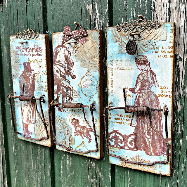
Liesbeth made altered rat traps with her new paint colours (!!!) that stencilled texture adds an interesting backdrop. The metal components were all rusted with PaperArtsy Rusting Powder, and that chimes in perfectly with the ink colour she used for the stamped images - these are all France Papillon designs. If you would like to see more of this post, you will find it here.
Heading in a softer direction, Victoria Wilding used Stardust with Nougat and Surf's Up to make triple layered butterflies for a frame-based project. You can see below her tests with each of the colours.

This is a gorgeous project to have on display, and keeping the colourway simple and structured is one way to restrict your choices so that you stay within a boundary. Sometimes more is not more, particularly for interior decor items where colours are often neutral, this approach can offer flexibility for display options. Here is the link to Victoria's original blog post.

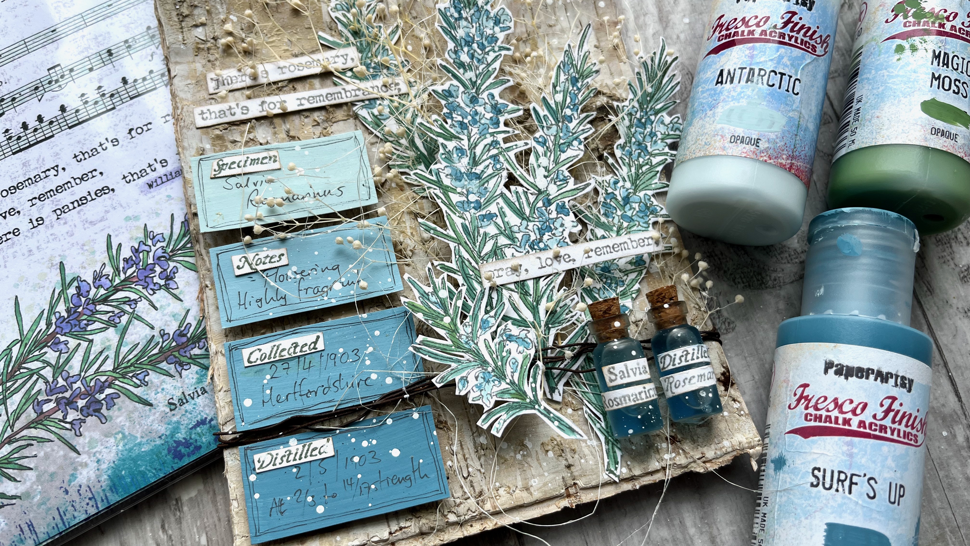
Taking the 2 colour-mixing concept in a bolder direction, Alison Bomber chooses a light colour with Antarctic, and Green with Magic Moss. These 2 Fresco colours mixed with Surf's Up creates a gorgeous range of colours that chime beautifully with her rosemary stamp set.

I love how she has used a selection of the paint chips in her project too ...

You can read about Alison's post here, and she also shared more recently in one of her 'Fun Friday' lives a colour mixing explanation in our Facebook Group PaperArtsy People here, where she explains how to make watery versions of the colours which is often her preferred way to use our paints. Don't forget Alison is a 2024 Fodder School tutor, so keep an eye on her this year as she has lots of fresco and stamping tips to share.

For the final topic featured in this round up, we shine the spotlight on Tracy Scott, our designer who loves bright bold and geometric designs. Tracy always astonishes us in how she manages to create interesting and unexpected things with her products. She has only been art journalling since 2014, and we think her style is particularly unique. Perhaps this is because she has found her own way with paper crafting from the get-go, rather than be heavily influenced by the craft sector. If you would like to read about Tracy's creative journey and how she came to work with PaperArtsy, you should head to this link
Our bloggers were charged with the task of using Tracy's products in ways that Tracy would not ... let's take a look at how they got on!!
Mags used her love of rust to inform her colour choice with a pop of blue to contrast. The tag envelopes are made from PaperArtsy Crunchy paper, which she has sewn at the edges. In fact adding stitching is the method she used to add texture to this project. You can read all about it in her blog post.

Also, I hope you did not miss this gorgeous booklet by Jennie Atkinson. Her blog post is well worth a read! Jennie is a textile queen, and uses Tracy's stamps in her typical muted colourway. She freestyle machine-stitched over the stamp design to create a re-interpetation, and added colour with watery Rusty Car Infusions.

Finally Autumn Clark loves to make gorgeous cards, and often adds stitching to the borders. She used torn sections of a Tracy Scott lace booklet page which offers an amazing texture contrast, and PaperArtsy infusions are the colour of choice for these backgrounds. Read more here in Autumn's blog post.

Well, wasn't that a gorgeous selection full of interesting details. We know many of you love these end of year round up posts, and we so appreciate our bloggers who put their amazing twist onto our products.
Don't forget you can follow us year round on Instagram, or come and join our Facebook group PaperArtsy People.
We'll be back in a few days with more highlights from the PaperArtsy Blog.