Showing posts with label Tinged Blue. Show all posts

Thursday, 18 May 2023

2023 Topic 5 : Tinged Blue {by Alison Bomber} with Alison Bomber stamps


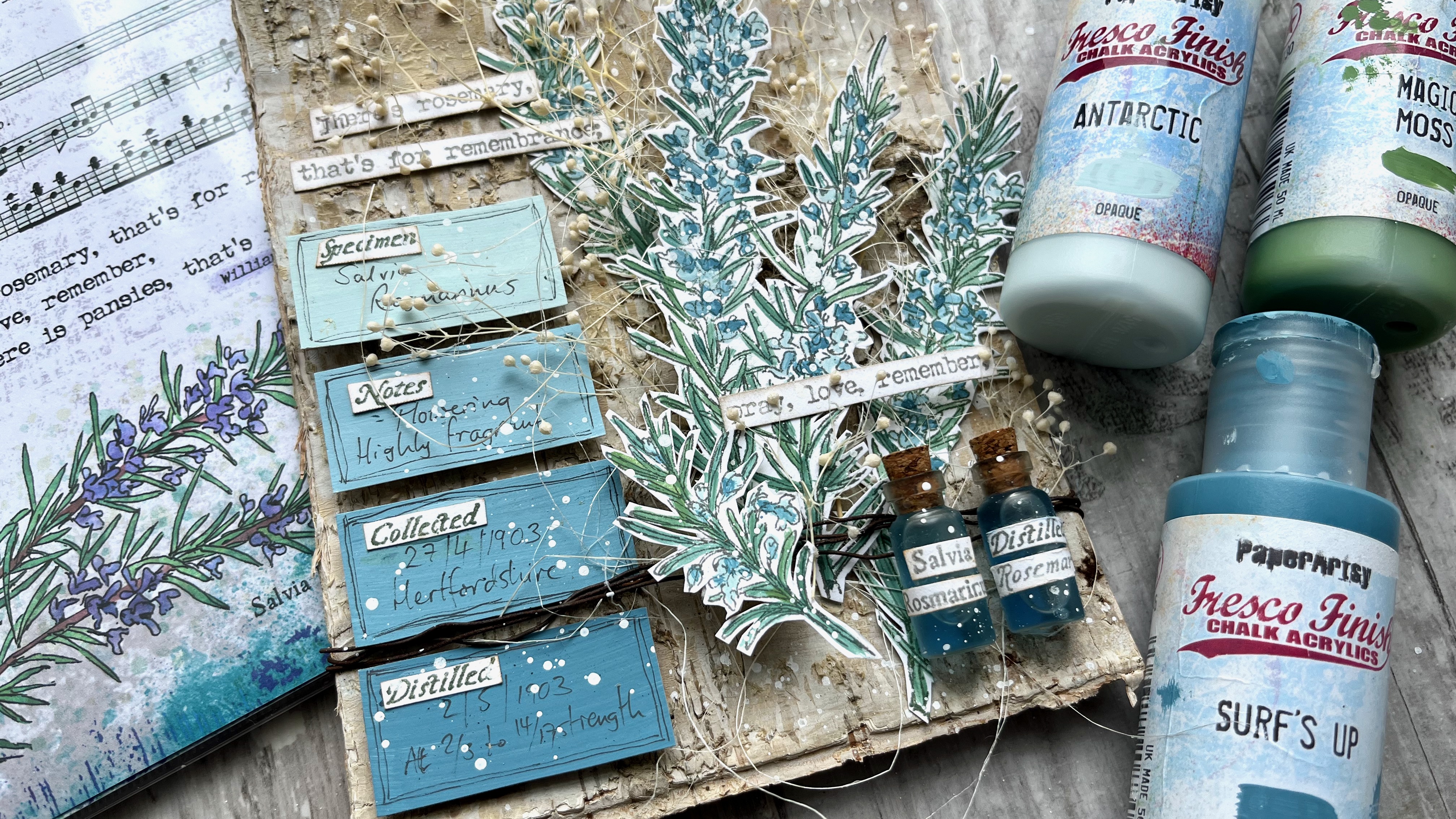
Hello all, Alison here from Words and Pictures.  I loved the idea of mixing up some paint variations on Surf's Up - so much so that I ended up doing it with two different colours!  The plan was to work with Antarctic and create some tinges of blue that would suit the tiny flowers on my EAB32 Rosemary Edition stems.  

But I really wanted some greens for the needles too, so rather than just adding a green paint, I decided to mix that green paint with Surf's Up too.  And the results have made me very happy.  See what you think...


I love that all the colours are related to each other via Surf's Up - it gives the whole piece a really soothing harmonious feeling.  And I'm thrilled with my little apothecary bottles full of distilled rosemary tincture (!) - one of PaperArtsy's brilliant glazes gave them just the right twist.  Read on to find out more.


So, with my three colours - Fresco Chalk Acrylic Surf's Up, FF146, Antarctic FF67 and Magic Moss FF130  - the first step was to see what kinds of tinges of blue I would get with my Surf's Up + Antarctic or Surf's Up + Magic Moss (my chosen green) combinations.  

And then, just out of curiosity really - but also because I thought I might want some paler greens for highlighting - I added in an Antarctic + Magic Moss column (far left).  Lots of lovely icy blues and smoky, silvery blue-greens...heaven!


Rosemary as a plant does have silvery, soft colour tones, so I knew I was on to a good thing with this colour palette to play with in combination with my EAB32 Rosemary Edition stamps.


In any case, it's always such fun seeing the colours shift as you add just a few drops more of one paint or the other!


I really wanted to see how the rosemary looked with these gorgeous muted greens and blues, so I stamped the large stems using my stamping platform (so that I would be able to stamp again to retrieve any detail lost in the painting stage), and got to work with my water brush and my three paint colours.


I like working with my Fresco paints in washes, so I generally put a dot or puddle of the paint directly onto the craft mat and then give it a spritz of water.  And I use a water brush just because that's what works for me.  When I'm painting something like the rosemary needles, I use the finest one in my set of three, and it's useful how the moisture helps it keep its point for this detailed work.  It also makes it really easy to mix the paints, using the mat as my palette.


I realised as I was painting that the flowers are really only a small part of the image... with all those needles, the main colour tinges were definitely mostly green by the time I'd finished.  Since my original brief was to work with the Surf's Up/Antarctic combination (and since I really loved those colour mixes), I decided to deploy them to create some labels to go alongside the rosemary sprigs.  I painted four simple blocks of colour (straight Antarctic at the top, straight Surf's Up at the bottom, and two mixes in between) ready to create my labels later on.


The idea for those labels changed my thinking about where the project was headed.  For the over-arching Texture theme this quarter, I'd decided to use a wonderful birch bark panel as my substrate, and originally I'd thought the whole thing would be very organic and natural.  

But with those labels underway, I started to take a turn towards something with a touch of the apothecary about it.  After all, my botanical sets are heavily influenced by the medicinal powers and properties of the plants I sketch - with all the details provided by Culpeper's Herbal (1653).  So that's what led me to the next part of the creation.
 

Obviously the rosemary sprigs are the main focal point of the piece, but the labels added this new apothecary dimension, so I decided they needed something to balance and back them up in that idea.  What better than a couple of little apothecary jars?  

These were bought at a cheapy shop (they were full of glitter or glass crystals or something - six for a pound), and I decided to give them a little makeover with some of the PaperArtsy Frosting Glaze FF111.  I dabbed it on with a sponge, aiming for some more texture for the theme...


Unfortunately, the Frosting Glaze was way too clever for me, and it dried to this beautiful smooth frosted finish.  It looks so good that I forgave it for stealing my texture!  I've put one of the unglazed jars on the left so you can see the difference. It gives the glass a beautifully aged, antique look.


And then I had a brainwave about labelling the bottles.  My botanical stamp sets are full of little words... the Latin name of the plant attached to the large sketch; Culpeper's name for the plant attached to the small sketch; and of course the four different botanical collector words that are also next to the large sketches in these latest sets.  So I used all those, stamped, trimmed and stuck on, to create my apothecary jar labels.

Inside is a weak solution of blue ink and water - and apologies that you can still see the glue drying around the cork lids. I thought it would be safest to glue them to prevent leaks, but I was so excited about the look that I couldn't wait to let it dry before photographing them!  Again, the unaltered jar is there for comparison.


Then it was on to the labels... I had a similar plan to use the individual words from the stamp set... the four botanist's words, one for each label.  And then I handwrote in some details from my "botanist's studies" of their subject, and doodled simple lines around the edge to frame them.


The labels and the jars together really gave me that element of the apothecary or botanist's experiments that I wanted, and balanced with the organic textured birch bark behind, I thought I was pretty much there.


I wanted to add some more organic elements, so the sprigs of dried baby's breath and the sisal fibres were waiting in the wings to play their part.  That meant I needed to layer up the rosemary to give all that real plant material space in between my painted stems.  So the rosemary is mounted on padded tape to create those dimensional layers.  


I found to my delight that it was possible to cut the two main stems apart with only one needle getting chopped off completely... so the two separated stems are glued direct to the bark substrate, while the two that are still joined together are mounted on padded tape with the natural materials in between.  And then the smaller sprig is mounted over the top of some rusty wire wrapped round the bark (with more padded tape to support it hidden away). 


I had planned to let the labels speak for themselves, but there's a reason I'm known as "Words and Pictures", and I was craving some extra words.  Luckily, the stamp set has a quote ready and waiting (well, it's not luck, it's because that's the way I chose to design the sets!), so I stamped and trimmed that to add to the dimensional collage.


It's partially obscured by the baby's breath (which also makes it really hard to get the camera to focus on the thing you want!), but I really don't mind that.  They are the beautiful words Ophelia speaks in Hamlet as she is grieving for her father, but I think they can also have a lovely romantic slant to them if you prefer.


The stamping is mostly done in Ranger Watering Can Archival ink so that it doesn't steal focus from the delicate Surf's Up blues and greens of the rosemary stems. 

The fibres and the baby's breath give everything a real sense of movement and organic randomness, but I can never resist just a touch of random splatter to finish things off.  I find it gives a kind of life and energy to a creation.  And I really adore how the tiny speckles of Fresco Snowflake (the perfect white spatter paint, with a touch of water added, of course) look on my apothecary jars. The glue is dry now, you'll notice, and completely invisible. 


And the layering of the textured substrate and the natural embellishments with the Surf's Up tinged rosemary stems works just as I had imagined it.


I can even cope with the presence of my own handwriting on my ombre botanist's labels!


The combination of the original organic idea with the expansion into the world of the apothecary, not to mention the last-minute addition of some unplanned words, all adds up to a dimensional collage panel which makes me really happy.  Who knew what paint mixing could lead to?!


It was so interesting to set out on this journey with colour as the starting point.  That's not really how I usually start off.  Maybe that's why there were so many unexpected twists and turns for me in this project - although, having said that, I rarely know exactly where things are going when I'm creating!  But my original idea of a rosemary growing against a tree now has so much more detail and interest with the added botanist's labels and apothecary jars.  And I think the rosemary flowers and needles look beautiful in their Surf's Up tinges.  

It's really worth using paint mixing to create a harmonious look.  If each colour you use in a project has just a little of one central colour mixed into it, they will all blend and work together, helping to create that calm, soothing atmosphere.  And you'll feel so calm and happy that you'll be ready to follow wherever the artistic muse takes you!

Thanks, as always, for your company on this creative journey.
Happy crafting, all! 
Alison x


Instagram: @w0rdsandp1ctures


Monday, 15 May 2023

2023 Topic 5 : Tinged Blue {by Victoria Wilding} with Seth Apter stamps


Hi everyone

Victoria back with you today and I'm so excited to share with you my project for the Tinged Blue topic. Blue is one of my go to colours for creating and features heavily in many of my makes, so as soon as I saw this topic, I knew I would be diving in to explore Surf's Up in more detail.Dounia's introduction to the Tinged Blue topic provides a great overview of Surf's Up colour theory and show's the great variety of colour variations you can get from a single colour. 

I've been wanting to create some art for a box frame I've had hanging around, for well over a year, so decided to create a project using that. Creating a piece of wall art without a specific final hanging location in mind, I wanted to keep things as neutral and simple as possible, so that it would meld nicely with a range of interior decor. I decided to create a series of background papers, which layered a range of the colour mixes and use these to create some butterflies, providing a modern twist on a specimen display box. 


The different elements of this project were so enjoyable. Simple, uncomplicated and playful art which was the grown up version of those colour mixing classes way back in junior school! I love the visual texture the stamping creates when combined with the different colour mixes. So let's take a look at those colours in more detail.


To create my printed papers I selected my PaperArtsy products, a mixing palette and a small gel plate and brayer. Seth Apter's designs are perfect for adding abstract background details to add visual texture without detracting from the main subject of a piece, so his stamp sets ESA35 and ESA36 were a natural choice for this project and helped tie my project into the quarter's theme. With their mix of lines, circles and tiny text the stamps provide the perfect subtle background texture for butterfly wings which don't deviate too far from natures markings. I also selected Sara Naumann's stencil PS122  to trace my butterfly shapes. 


I was tasked with creating a range of different tones with neutral colour mixes, but since I'm always keen to push the boundaries, I decided to go for a coloured grey and coloured neutral as my mixing colours. The PaperArtsy Fresco Finish Chalk Acrylic's I selected (Surf's Up - FF146, Stardust - FF222, Nougat FF39) push the colour mixes towards the blue-green space of the colour wheel.


Colour swatching and mixing colours is such a great way to get the creative juices flowing and spark ideas. A while ago I started to keep a colour journal for this very reason, so before cracking on with my project, I decided to take a closer look at some of the mixes my three colours would create and test out the results on paper, in my journal. 


I squeezed out small blobs of each colour into my mixing palette and added varying amounts of Stardust and Nougat to Surf's Up, mixing with my paintbrush. 


These are some of the swatches I created from those mixes. The swatches on the top row are the pure colours, straight from the bottle, with the two rows underneath showing the mix of Surf's Up with each of the additional colours in varying quantities. The swatches to the left have the least amount of the 2nd colour added, with the swatches on the right of the page having the most amount added. You can clearly see that as more of the 2nd colour is added, the colour hue of the blue changes, with Stardust creating blue-grey tones, whilst Nougat creates a softer, muddier hue which leans towards sea green.


I can never resist bringing some pretty to my colour swatching, so to see how the different mixes play together, I created some quick loose florals on the adjacent page. The mix of darker and lighter tones work so nicely together and create enough variety to give the composition depth. I was confident that they were going to create a colour scheme pleasing to the eye and restful enough to make a nice interior piece of art. 


Next it was time to put some of those colour mixes to use and create my project. The first step was creating the background papers for my butterflies. Rather than premix the colours and then add to the gel plate, I decided to take the lazy approach and let the gel plate do all the work! 


I squeezed a small amount of surf's up and stardust onto the plate, mixing as I spread out the colours with the brayer. I like the uneven, random colour mixes this application creates, with the papers have interesting, grungy texture right from the off. I then repeat this process using Surf's Up and Nougat.


With the papers dry, I then used a variety of the mixes to add some stamping details to the papers, using numerous stamps from the sets for more diversity in the patterns.
 

At this stage I decided that the papers needed another layer of contrast, so I added one final layer of stamping using Archival Ink (Faded Jeans).


With the background papers created, it was time to make the butterflies. When initially planning the project, I thought I would use a single butterfly, possibly hand drawn, however, after deciding to use the stencil, the size of the largest butterfly was too small for the frame, so I opted to use multiples of different sizes. I traced out the butterflies on top of my background papers, selecting different areas of interest on the papers to include.


I fussy cut these out and then had a little play with composition on a plan piece of card. It was at this stage that I decided to layer the different sizes on top of each other, so I arranged them into sets of three. 


I then stitched down the centre to stack the three butterflies on top of each other. By only attaching them in the centre, this allowed the wings to be teased out, creating extra dimension once placed in the frame. 


Here are the completed butterflies ready for the final part of the project. 


The combination of different colour mixes and stamping details, provides so much contrast, leading the eye through all the details when looking at with these little butterflies. Each one is  completely unique, whilst also being similar enough to the others to provide harmony in the final design.

The final part of the project was to create a piece of background card to attached the butterflies to. To tie into the overall colour scheme, I used a range of mixes of Surf's Up, Stardust and Nougat, lightly braying the colours in layers to the outside edges of the card.


A final bit of detail was added with some stamping in Archival Ink (Cornflower Blue).
 

To complete, I mounted the four butterflies to the centre of the card using foam squares to lift them off the page for extra dimension.
 

I placed the piece in the box frame and voila, the project was complete!


The final piece is just lovely, if I do say so myself! The little bit of detail to the outer edges of the card, draws the eye right into the butterflies where you are in for a visual treat with lots of subtle colour and textural details. If your budget is a little tight, you could definitely create this using just one of the step sets and you could draw the butterfly (or butterflies by hand). You could mix it up by using different multiples of butterflies in the final piece, changing up the composition for different effects, the possibilities are almost endless!

I hope this has inspired you to give colour mixing a go and demonstrated how easy it is to use that to your advantage in a project. If you're inspired to have a go, I'd love to see what you make, so don't forget to tag me on socials.

Wishing you a creative, happy week!

Victoria