Showing posts with label Frosting Glaze. Show all posts

Wednesday, 17 April 2024

2024 With 3 things: Vintage Panel {by Mags Woodcock}

Hello, Mags here with you today. 

I'm excited to share with you my project for the next round of the 3 things challenge here on the PaperArtsy blog. I must admit I'm not normally a fan of surprises, mainly because I am a bit of a control freak ! but I do love a challenge ! When I was younger I loved watching "Ready Steady Cook", a UK television series where two chefs were given mystery ingredients and told to come up with something wonderful. This challenge is in a similar vein, but with art supplies.


When the parcel arrived with the three supplies for the challenge, I couldn't wait to open it and get started. What a lovely surprise! A fabulous Ink And The Dog stamp set, which fits perfectly with the current blog Topic - VIntage/Old School PaperArtsy stamps - so Clocks plate 2 was lovely (C2EZ). A heart die (PAD-TF) and some PaperArtsy Fresco Finish Frosting Glaze (FF111). The parcel also contained a PaperArtsy postcard with a nice note from the team at HQ, more about that later.
 

My first thoughts when seeing the supplies were to create a journal page with layers of stamped images and die cut rusty hearts, but where would the Frosting Glaze come in ? So I quickly changed my mind and decided to create a hanging element for a vintage style canvas or board. I had some Shrink Plastic which a friend had sent me and decided to use that as part of my plan. I also wanted to make use of that lovely postcard which was in the parcel.

I began the project by choosing a vintage book board as a base and stamped the images from the set onto Cotton rag paper and PaperArtsy smooth card. Creating a spray with the Just Walnut Infusions is one of my favourite things to do, it adds a lovely vintage feel to any paper or card. I sprayed the postcard and stamped images and set aside to dry, before spraying the reverse of the postcard too.


It was now time to move on to creating elements to decorate the book board part of the project. I mixed a tiny amount of Just Walnut Infusions with some of the Frosting Glaze and dabbed it onto a sheet of acetate with a large brush. I didn't want brush strokes, more of a mottled look as you can see below.


When the glaze was dry I cut out the clock faces and combined with the sprayed paper images using a brad.


I had chosen a vintage cabinet card as my focal image for the project, but I didn't have the right kind of wonderful Ink and The Dog images of people that might work, I just didn't have any among my collection of PaperArtsy stamps. So the next step was to build my composition. 
Remember that postcard which I had aged with just walnut ? Well it was time for it to come into play. I cut part as a backdrop for my image and also cut out several small elements from the other side to use in the composition. Below you can see the postage stamp, the tiny gauge and the hot air balloon, along with the aged clock faces from the previous technique. You can also see a peek of the next stage of the project, created using the shrink plastic.


So it was time to have fun with that Shrink plastic, I painted each side with the Frosting Glaze and then stamped the images from the stamp set onto the plastic with Ranger, Archival ink, Jet Black. Because the plastic was now matte from the Frosting Glaze, and had a great surface to take the ink I didn't need to use my Stazon ink pad.
I cut out the clock faces and words, then used the die to cut into the large grid image. Not wanting to waste any of the plastic I also cut the remaining bits into strips.. Adding punched holes to the heart, clock faces and strips was easy with a hole punch.


It is so much fun watching the plastic curl and twist as it shrinks, I used my heat gun, but it can also be done in an oven.


I have a fair stash of vintage costume jewellery and beads and decided to incorporate some of this with the now tiny glazed clocks, heart and grid strips. The shiny beads and metal are a nice contrast to the frosty glaze of the mini items. Adding a touch of Vintage photo Archival ink with a sponge added to the vintage look. It was easy to create a lovely dangling element to add to my project.


I added the dangle to my project by using a vintage safety pin and mini bull dog clip along with an eyelet through the paper in the background. I love how the dangle and clock faces echo the chaps hidden pocket watch and chain.


I will definitely be using the frosting Glaze again, probably to age some bottles and then add some rusty dangling elements. I can also see me using the stamp set a lot too.

I hope you have enjoyed seeing my project and it inspires you to have a go at combining supplies in surprising ways.  Take care and happy crafting

Mags x

Tuesday, 16 April 2024

2024 With 3 things: See Through ATC's {by Riikka Kovasin}


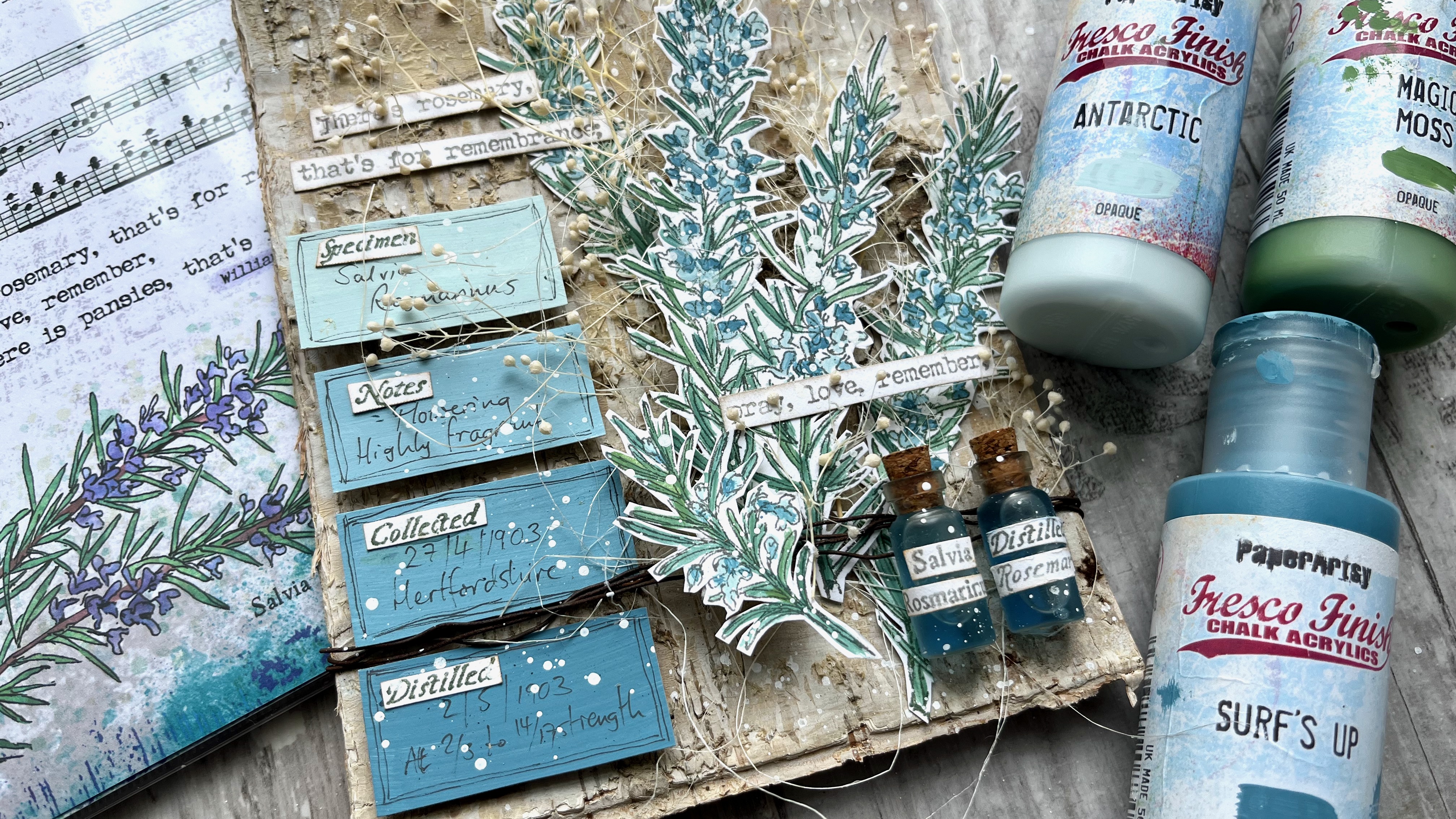
Hi there everyone! It's Riikka from Paperiliitin here today to share with you my make with 3 things! The three things I received were Ink & The Dog Collection (Buttons 4) stamp set (B4EZ), Tall Heart die (PAD-TH) and Fresco Finish Frosting Glaze (FF111).

Frosting Glaze (FF111) was a new product for me, but as soon as I read the description in the card that was with the package, I had the idea of doing transparent ATCs. I've done some before and I really like the floating effect the transparent base creates. There's something magical about the substrate and it's always fun to think different ways to tie the foreground to the background.


The note in the package mentioned the glaze creating a sand-blasted glass effect on a glossy surface and I thought to play with the combination of the treated and untreated areas in my ATCs. One of the three products received also provided me a way to do that - I decided to use the heart die to make a stencil or a mask, which to use to apply the glaze. When I then started creating, I ended up using both - a mask and a stencil - to have a varying effect on the cards. Although I have to be honest, it was partly due to me not being able to decide which one I preferred!


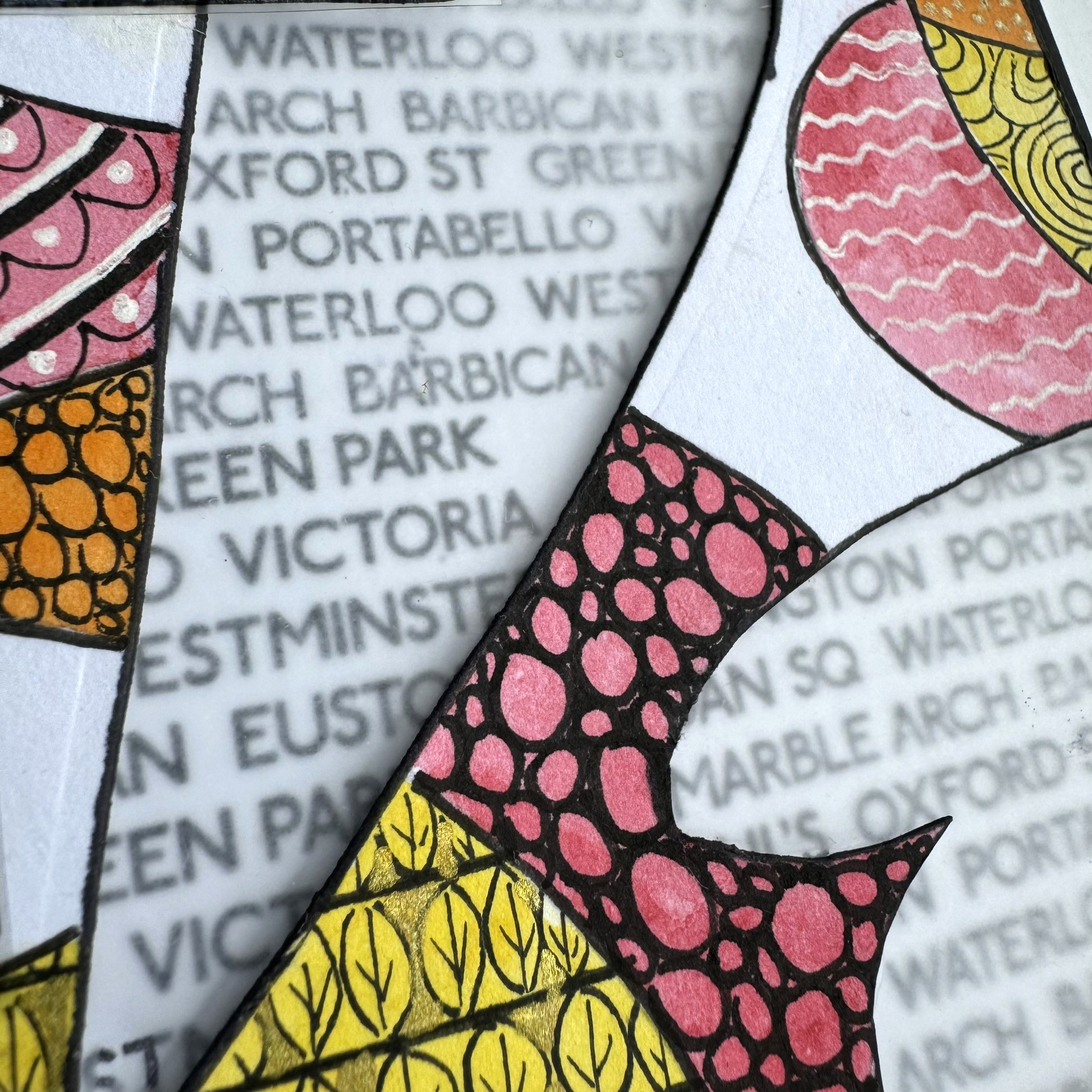
Like I wrote earlier, I decided to use the Tall Heart die (PAD-TH) to make a tool rather as a way to create an embellishment or another element. I had this vision of a heart background and then a cluster on top, but when I then started creating it became painfully obvious that my vision wouldn't work in full detail - the heart was too long to fit to the ATC size! I still decided to be a bit stubborn and followed the idea even though the heart was now partly cut. But I think it still echoes the shape and thus works.

I also cut the ATC sized bits at this stage after having a little ponder. If the heart would have been smaller and fitted inside the ATC, I could have made a master board more easily but as I knew I needed to crop the shape anyway, I thought it would be easier to do on top of the correct ATC size. I cut the bases out of overhead transparency. It's a bit thin, but I've used it before as the base material and it has worked ok.


As I used a piece of scrap paper to make my stencil and mask, they started reacting to the moisture of the Fresco Finish Frosting Glace (FF111) almost immediately. If I would do another set now, I would probably opt for a thicker cardstock or even use a thin plastic like the overhead transparency to make the stencil and mask. If you are creating something similar and decide to use cardstock as the means to make the mask and stencil, make sure the color won't bleed when wet. On the other hand, that might also create a great effect!

I used a sponge to apply the glaze as I thought that might be the best tool to get the sanded effect. In my mind the brush strokes might have ruined the sand-blasted look, but I have to say, that I didn't even try applying the glaze with a brush! But what I can say is the sponge worked fantastically!


Next I then turned my attention to the Buttons 4 stamp set (B4EZ). I just love the vintage vibe of the stamp! The ladies in the set were going to be the focal point quite obviously for me as I love to use old photos as my key element and conjure stories to accompany them. I decided to call this ATC set "Sewing circle" connected to the words added into the stamp set.

I first stamped the image using black Archival Ink but I wasn't happy the way it acted with the tiny details. As that's the only black ink I own, I then tried embossing powder instead, which was a bit weird solution, if you think of it. Especially so, if I mention that I only had regular grain sized embossing powder in black! But I think it was the combination on the raised effect and the added blur that convinced me that embossing powder version was better and I went with that. I mean even though the Archival version was maybe actually more detailed, the domed look of the embossing powder carried the fuzzy look better than the flat image. I stamped the ladies a couple of times as I realized I would need extra to be able to cut out the individuals loose.

To make a full use of the Buttons 4 stamp set (B4EZ), I also stamped the labels to a piece of cardstock. For those I used the Archival Ink as these were going to be background pieces anyway. I also stamped the little words in the set. I mounted all of them to my stamping block and stamped the lot a couple of times so I would have options to choose from.


I wanted to highlight the vintage vibe by using brown. Lately I've been favoring this coffee-toned brown ink, so it felt quite natural to grab it from the shelf again. I inked the labels, the cut out characters and the little word labels. I used scissors to cut all the elements and didn't mind if they weren't perfectly straight when it came to the labels.

As I was cutting the ladies loose, I realized that I could only use the seated individuals for the cards as the ladies standing behind them were too obscured by the dresses of the sitters. Luckily, I had stamped the group three times, so I had individuals to choose from. I included the barcode on the bottom of the images to them in order to have the images a bit bigger.


I now had a label and the center of attention along with a little word, but the cluster needed more. The inspiration for the additional elements came from three places - the postcard in the package, the stamp set itself and my go-to supplies.

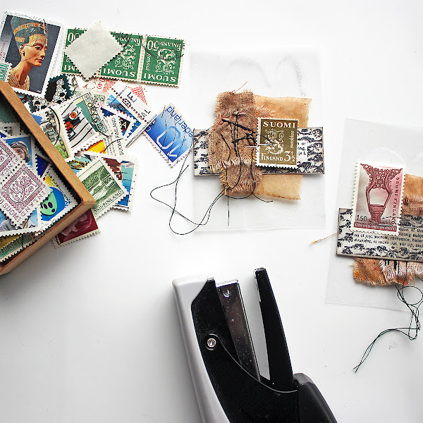
The postcard in the package inspired me to use postage stamps as a decorative element in the cluster. I used quite monotone Finnish stamps in each, adding a touch of color to the otherwise brown card this way. I rummaged through my stash of old stamps and picked six different ones, one to each card. Even though I was making a series, I wanted each card to have something unique about them.

The stamp set provided me with an idea to use sewn elements. I had these little fabric decorations ready made, so I added one to each card. The decorations are self-made out of dyed cotton, torn and sewn together. The white cotton in these is dyed using Just Walnut (CS25), by the way.

The third element to be added was a go-to thing - a used and dried teabag. I have a bunch of these ready to be used and whenever I need a delicate layer with a vintage tone, I reach and grab some. I just love the gauze-like material and then uneven dye!

To attach the layers to the card, I used my favorite way and just stapled them in place. This allows the layers to be a bit fluffy and loose, but still attached to the base. It also provides me an easy way to add something between the layers, if I want. As the elements are secured only from the center, I can alter the composition by adding layers and elements in easily just by tucking them between the existing layers! Sometimes I even leave the staples in plain view, but this time I mainly covered them with the focal elements coming on top.


Then it was time to add the ladies in place. For them, I used foam tape to raise those characters from the background a little. As I did the clusters without thinking the specific character on top, just following my eye, I now needed to choose which lady to use to which card. I had the rough idea, but I now made sure that the over all composition would be nice. I tried to follow some kind of triangle in my placement, especially so that the higher side of the composition was towards their back, not their face, so they wouldn't look caged. I also added the tiny text labels in using double sided tape.


After adding all the layers, the cards seemed still quite bare. I mean I love to add little details for the viewer to study and find. I had the postage stamp, I had the different textures and the loose flowing threads, but still the look was quite monotone and flat. Luckily the name of the stamp set offered a solution - Buttons 4 (B4EZ). Buttons!

I rummaged through my stash of old buttons and matched the button to the color of the postal stamp. Well, I did have a couple of exceptions as the bag I had at hand didn't have any red ones, but otherwise I used green for green and blue for blue. To highlight the fact that this is a set of cards, I used a vibrant pink thread to sew each button. It also added another touch of color to the cards with the red stamps and white buttons.

Sometimes I add the stitches to the buttons before adding them to the project with a drop of glue. That's an easy way so you don't have to sew through paper and if you are making a piece on top of a sturdy base, it might be the only way. This time, however, I in fact wanted the buttons to be sewn in and used just the thread to secure them in place.


After sewing the buttons in, I was happy with what I had created! A set of of six transparent ATCs with a vintage cluster on top! Three of them have the masked heart in the background and three are with the stenciled one. When writing this, I noticed that I've managed to mix and match the elements so, that the same lady is on a masked and stenciled background. That wasn't my goal or even on my mind when creating, but it does make a lot of sense and balances the set.

As you can see from the photo below, I used three ladies on the cards - the ones sitting. I had hoped to use all of them, but as I mentioned earlier, the dresses of the ones sitting hid too much of the others. I tried to cut them out, but they just looked weird as it wasn't just the skirt that was hidden but their hands, too.


Even though I used the same ladies twice in the set, I wanted to make each card unique. One of the ways I used was the added speck of color, but the other one was the little word label. While choosing which word goes to which card, I tried to study the expression and stance of the character in the card in question. For example the lady in the green cards "Needles" and "Sew" seemed more stern and older to my eye than the two others. The lady in the red cards "Thimble" and "Pins" then again appeared more alert, while the "Lace" and "Button" lady was more meek.


What I find interesting in these cards is the juxtaposition of the modern and old. The modern, plastic background and the vintage feel of the other layers. Now thinking about it, I guess one of the reasons that the embossing powder seemed more appropriate for the focal points, might got to do with bringing something from the background to the foreground. I'm talking about the shiny plastic! While the photo itself is old, with added brown to highlight the vintage air, the stamping medium is a modern finely ground plastic.

I also like the combination of the different materials, different textures. There's the sleekness of the plastic, the weave of the cotton, the smoothness of the paper, and the gauze-like softness of the tea bag.


You know another fun thing about these ATCs? I'm giving them away! If you want to receive one, please send me your mailing address via email. My address is rkovasin(a)gmail.com - just use an @ to replace the (a). We can swap, too, but that's not a requirement. I'm doing this in a "first come, first served" basis and only from the emails sent to me. I'll mail anywhere in the world, though there are a few countries where the transport connections are currently cut off, according to Finnish postal company. Should that be the case, I'll let you know.

Thank you for stopping by today! I hope you enjoyed reading the post - I enjoyed writing it!

Xoxo Riikka

Facebook: Paperiliitin
Instagram: Paperiliitin


Monday, 15 April 2024

2024 With 3 things: Patterned Shapes {by Nikki Acton}


Hi everyone, Nikki here today with my 'With 3 things' project.

The products I was sent were PaperArtsy Frosting Glaze (FF11), PaperArtsy Die - Tall Heart and PaperArtsy Ink and the Dog - London 2 (LN2) stamp set.


At first I was not quite sure how I was going to bring these together. I have been following some Zentangle style posts on Instagram lately and I am always happy working with geometric shapes so decided to create a journal page using the heart die both as a shape to draw around but also to create some translucent windows.

To start I created a stencil out of my die and outlined some hearts. I added some circles using a compass. I then highlighted the 'hearts' that would become windows and die cut these.


For the base layer I cut some card slightly bigger than the first and stamped using the PaperArtsy Ink and the Dog - London 2 stamp set.


I decided to use watercolours to add colour to my shapes, and once complete started adding various patterns.


I found some acetate in my stash and added PaperArtsy Frosting Glaze (FF11) to create my frosted windows. (This was adhered to the back of the heart apertures.) I added 2 layers using cut and dry foam.


For the patterns I used black, white and gold pens - either gel or paint pens. I also added dots using PaperArtsy Fresco Acrylic in Chalk (FF83)


The London place names were stamped onto acetate using StazOn and one layer of Frosting Glaze adding to the rear.


This was a really fun project to make, I hope you like it.

Nikki x


Thursday, 18 May 2023

2023 Topic 5 : Tinged Blue {by Alison Bomber} with Alison Bomber stamps


Hello all, Alison here from Words and Pictures.  I loved the idea of mixing up some paint variations on Surf's Up - so much so that I ended up doing it with two different colours!  The plan was to work with Antarctic and create some tinges of blue that would suit the tiny flowers on my EAB32 Rosemary Edition stems.  

But I really wanted some greens for the needles too, so rather than just adding a green paint, I decided to mix that green paint with Surf's Up too.  And the results have made me very happy.  See what you think...


I love that all the colours are related to each other via Surf's Up - it gives the whole piece a really soothing harmonious feeling.  And I'm thrilled with my little apothecary bottles full of distilled rosemary tincture (!) - one of PaperArtsy's brilliant glazes gave them just the right twist.  Read on to find out more.


So, with my three colours - Fresco Chalk Acrylic Surf's Up, FF146, Antarctic FF67 and Magic Moss FF130  - the first step was to see what kinds of tinges of blue I would get with my Surf's Up + Antarctic or Surf's Up + Magic Moss (my chosen green) combinations.  

And then, just out of curiosity really - but also because I thought I might want some paler greens for highlighting - I added in an Antarctic + Magic Moss column (far left).  Lots of lovely icy blues and smoky, silvery blue-greens...heaven!


Rosemary as a plant does have silvery, soft colour tones, so I knew I was on to a good thing with this colour palette to play with in combination with my EAB32 Rosemary Edition stamps.


In any case, it's always such fun seeing the colours shift as you add just a few drops more of one paint or the other!


I really wanted to see how the rosemary looked with these gorgeous muted greens and blues, so I stamped the large stems using my stamping platform (so that I would be able to stamp again to retrieve any detail lost in the painting stage), and got to work with my water brush and my three paint colours.


I like working with my Fresco paints in washes, so I generally put a dot or puddle of the paint directly onto the craft mat and then give it a spritz of water.  And I use a water brush just because that's what works for me.  When I'm painting something like the rosemary needles, I use the finest one in my set of three, and it's useful how the moisture helps it keep its point for this detailed work.  It also makes it really easy to mix the paints, using the mat as my palette.


I realised as I was painting that the flowers are really only a small part of the image... with all those needles, the main colour tinges were definitely mostly green by the time I'd finished.  Since my original brief was to work with the Surf's Up/Antarctic combination (and since I really loved those colour mixes), I decided to deploy them to create some labels to go alongside the rosemary sprigs.  I painted four simple blocks of colour (straight Antarctic at the top, straight Surf's Up at the bottom, and two mixes in between) ready to create my labels later on.


The idea for those labels changed my thinking about where the project was headed.  For the over-arching Texture theme this quarter, I'd decided to use a wonderful birch bark panel as my substrate, and originally I'd thought the whole thing would be very organic and natural.  

But with those labels underway, I started to take a turn towards something with a touch of the apothecary about it.  After all, my botanical sets are heavily influenced by the medicinal powers and properties of the plants I sketch - with all the details provided by Culpeper's Herbal (1653).  So that's what led me to the next part of the creation.
 

Obviously the rosemary sprigs are the main focal point of the piece, but the labels added this new apothecary dimension, so I decided they needed something to balance and back them up in that idea.  What better than a couple of little apothecary jars?  

These were bought at a cheapy shop (they were full of glitter or glass crystals or something - six for a pound), and I decided to give them a little makeover with some of the PaperArtsy Frosting Glaze FF111.  I dabbed it on with a sponge, aiming for some more texture for the theme...


Unfortunately, the Frosting Glaze was way too clever for me, and it dried to this beautiful smooth frosted finish.  It looks so good that I forgave it for stealing my texture!  I've put one of the unglazed jars on the left so you can see the difference. It gives the glass a beautifully aged, antique look.


And then I had a brainwave about labelling the bottles.  My botanical stamp sets are full of little words... the Latin name of the plant attached to the large sketch; Culpeper's name for the plant attached to the small sketch; and of course the four different botanical collector words that are also next to the large sketches in these latest sets.  So I used all those, stamped, trimmed and stuck on, to create my apothecary jar labels.

Inside is a weak solution of blue ink and water - and apologies that you can still see the glue drying around the cork lids. I thought it would be safest to glue them to prevent leaks, but I was so excited about the look that I couldn't wait to let it dry before photographing them!  Again, the unaltered jar is there for comparison.


Then it was on to the labels... I had a similar plan to use the individual words from the stamp set... the four botanist's words, one for each label.  And then I handwrote in some details from my "botanist's studies" of their subject, and doodled simple lines around the edge to frame them.


The labels and the jars together really gave me that element of the apothecary or botanist's experiments that I wanted, and balanced with the organic textured birch bark behind, I thought I was pretty much there.


I wanted to add some more organic elements, so the sprigs of dried baby's breath and the sisal fibres were waiting in the wings to play their part.  That meant I needed to layer up the rosemary to give all that real plant material space in between my painted stems.  So the rosemary is mounted on padded tape to create those dimensional layers.  


I found to my delight that it was possible to cut the two main stems apart with only one needle getting chopped off completely... so the two separated stems are glued direct to the bark substrate, while the two that are still joined together are mounted on padded tape with the natural materials in between.  And then the smaller sprig is mounted over the top of some rusty wire wrapped round the bark (with more padded tape to support it hidden away). 


I had planned to let the labels speak for themselves, but there's a reason I'm known as "Words and Pictures", and I was craving some extra words.  Luckily, the stamp set has a quote ready and waiting (well, it's not luck, it's because that's the way I chose to design the sets!), so I stamped and trimmed that to add to the dimensional collage.


It's partially obscured by the baby's breath (which also makes it really hard to get the camera to focus on the thing you want!), but I really don't mind that.  They are the beautiful words Ophelia speaks in Hamlet as she is grieving for her father, but I think they can also have a lovely romantic slant to them if you prefer.


The stamping is mostly done in Ranger Watering Can Archival ink so that it doesn't steal focus from the delicate Surf's Up blues and greens of the rosemary stems. 

The fibres and the baby's breath give everything a real sense of movement and organic randomness, but I can never resist just a touch of random splatter to finish things off.  I find it gives a kind of life and energy to a creation.  And I really adore how the tiny speckles of Fresco Snowflake (the perfect white spatter paint, with a touch of water added, of course) look on my apothecary jars. The glue is dry now, you'll notice, and completely invisible. 


And the layering of the textured substrate and the natural embellishments with the Surf's Up tinged rosemary stems works just as I had imagined it.


I can even cope with the presence of my own handwriting on my ombre botanist's labels!


The combination of the original organic idea with the expansion into the world of the apothecary, not to mention the last-minute addition of some unplanned words, all adds up to a dimensional collage panel which makes me really happy.  Who knew what paint mixing could lead to?!


It was so interesting to set out on this journey with colour as the starting point.  That's not really how I usually start off.  Maybe that's why there were so many unexpected twists and turns for me in this project - although, having said that, I rarely know exactly where things are going when I'm creating!  But my original idea of a rosemary growing against a tree now has so much more detail and interest with the added botanist's labels and apothecary jars.  And I think the rosemary flowers and needles look beautiful in their Surf's Up tinges.  

It's really worth using paint mixing to create a harmonious look.  If each colour you use in a project has just a little of one central colour mixed into it, they will all blend and work together, helping to create that calm, soothing atmosphere.  And you'll feel so calm and happy that you'll be ready to follow wherever the artistic muse takes you!

Thanks, as always, for your company on this creative journey.
Happy crafting, all! 
Alison x


Instagram: @w0rdsandp1ctures


More Posts to Enjoy