Showing posts with label Tint. Show all posts

Thursday, 18 May 2023

2023 Topic 5 : Tinged Blue {by Alison Bomber} with Alison Bomber stamps


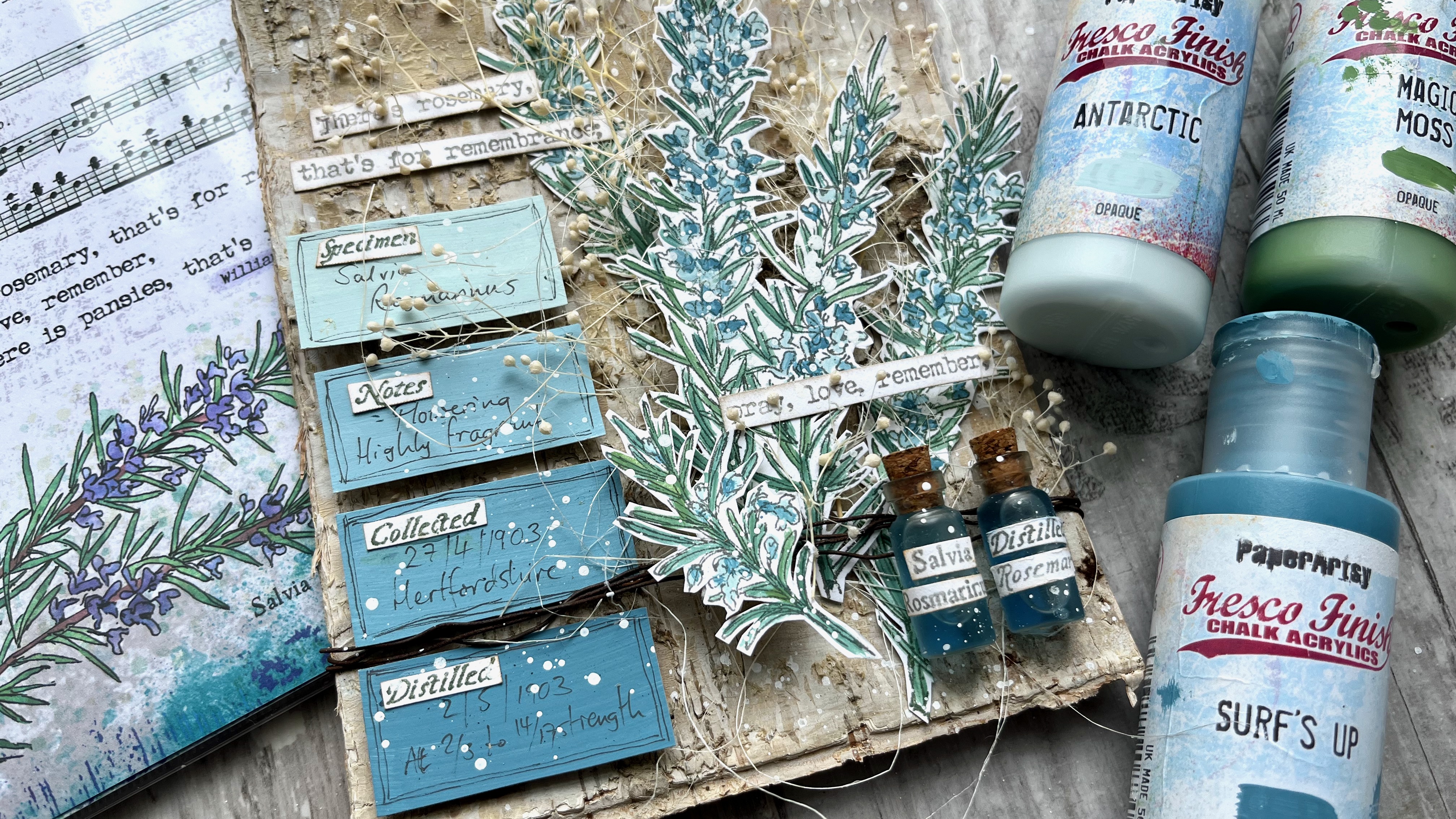
Hello all, Alison here from Words and Pictures.  I loved the idea of mixing up some paint variations on Surf's Up - so much so that I ended up doing it with two different colours!  The plan was to work with Antarctic and create some tinges of blue that would suit the tiny flowers on my EAB32 Rosemary Edition stems.  

But I really wanted some greens for the needles too, so rather than just adding a green paint, I decided to mix that green paint with Surf's Up too.  And the results have made me very happy.  See what you think...


I love that all the colours are related to each other via Surf's Up - it gives the whole piece a really soothing harmonious feeling.  And I'm thrilled with my little apothecary bottles full of distilled rosemary tincture (!) - one of PaperArtsy's brilliant glazes gave them just the right twist.  Read on to find out more.


So, with my three colours - Fresco Chalk Acrylic Surf's Up, FF146, Antarctic FF67 and Magic Moss FF130  - the first step was to see what kinds of tinges of blue I would get with my Surf's Up + Antarctic or Surf's Up + Magic Moss (my chosen green) combinations.  

And then, just out of curiosity really - but also because I thought I might want some paler greens for highlighting - I added in an Antarctic + Magic Moss column (far left).  Lots of lovely icy blues and smoky, silvery blue-greens...heaven!


Rosemary as a plant does have silvery, soft colour tones, so I knew I was on to a good thing with this colour palette to play with in combination with my EAB32 Rosemary Edition stamps.


In any case, it's always such fun seeing the colours shift as you add just a few drops more of one paint or the other!


I really wanted to see how the rosemary looked with these gorgeous muted greens and blues, so I stamped the large stems using my stamping platform (so that I would be able to stamp again to retrieve any detail lost in the painting stage), and got to work with my water brush and my three paint colours.


I like working with my Fresco paints in washes, so I generally put a dot or puddle of the paint directly onto the craft mat and then give it a spritz of water.  And I use a water brush just because that's what works for me.  When I'm painting something like the rosemary needles, I use the finest one in my set of three, and it's useful how the moisture helps it keep its point for this detailed work.  It also makes it really easy to mix the paints, using the mat as my palette.


I realised as I was painting that the flowers are really only a small part of the image... with all those needles, the main colour tinges were definitely mostly green by the time I'd finished.  Since my original brief was to work with the Surf's Up/Antarctic combination (and since I really loved those colour mixes), I decided to deploy them to create some labels to go alongside the rosemary sprigs.  I painted four simple blocks of colour (straight Antarctic at the top, straight Surf's Up at the bottom, and two mixes in between) ready to create my labels later on.


The idea for those labels changed my thinking about where the project was headed.  For the over-arching Texture theme this quarter, I'd decided to use a wonderful birch bark panel as my substrate, and originally I'd thought the whole thing would be very organic and natural.  

But with those labels underway, I started to take a turn towards something with a touch of the apothecary about it.  After all, my botanical sets are heavily influenced by the medicinal powers and properties of the plants I sketch - with all the details provided by Culpeper's Herbal (1653).  So that's what led me to the next part of the creation.
 

Obviously the rosemary sprigs are the main focal point of the piece, but the labels added this new apothecary dimension, so I decided they needed something to balance and back them up in that idea.  What better than a couple of little apothecary jars?  

These were bought at a cheapy shop (they were full of glitter or glass crystals or something - six for a pound), and I decided to give them a little makeover with some of the PaperArtsy Frosting Glaze FF111.  I dabbed it on with a sponge, aiming for some more texture for the theme...


Unfortunately, the Frosting Glaze was way too clever for me, and it dried to this beautiful smooth frosted finish.  It looks so good that I forgave it for stealing my texture!  I've put one of the unglazed jars on the left so you can see the difference. It gives the glass a beautifully aged, antique look.


And then I had a brainwave about labelling the bottles.  My botanical stamp sets are full of little words... the Latin name of the plant attached to the large sketch; Culpeper's name for the plant attached to the small sketch; and of course the four different botanical collector words that are also next to the large sketches in these latest sets.  So I used all those, stamped, trimmed and stuck on, to create my apothecary jar labels.

Inside is a weak solution of blue ink and water - and apologies that you can still see the glue drying around the cork lids. I thought it would be safest to glue them to prevent leaks, but I was so excited about the look that I couldn't wait to let it dry before photographing them!  Again, the unaltered jar is there for comparison.


Then it was on to the labels... I had a similar plan to use the individual words from the stamp set... the four botanist's words, one for each label.  And then I handwrote in some details from my "botanist's studies" of their subject, and doodled simple lines around the edge to frame them.


The labels and the jars together really gave me that element of the apothecary or botanist's experiments that I wanted, and balanced with the organic textured birch bark behind, I thought I was pretty much there.


I wanted to add some more organic elements, so the sprigs of dried baby's breath and the sisal fibres were waiting in the wings to play their part.  That meant I needed to layer up the rosemary to give all that real plant material space in between my painted stems.  So the rosemary is mounted on padded tape to create those dimensional layers.  


I found to my delight that it was possible to cut the two main stems apart with only one needle getting chopped off completely... so the two separated stems are glued direct to the bark substrate, while the two that are still joined together are mounted on padded tape with the natural materials in between.  And then the smaller sprig is mounted over the top of some rusty wire wrapped round the bark (with more padded tape to support it hidden away). 


I had planned to let the labels speak for themselves, but there's a reason I'm known as "Words and Pictures", and I was craving some extra words.  Luckily, the stamp set has a quote ready and waiting (well, it's not luck, it's because that's the way I chose to design the sets!), so I stamped and trimmed that to add to the dimensional collage.


It's partially obscured by the baby's breath (which also makes it really hard to get the camera to focus on the thing you want!), but I really don't mind that.  They are the beautiful words Ophelia speaks in Hamlet as she is grieving for her father, but I think they can also have a lovely romantic slant to them if you prefer.


The stamping is mostly done in Ranger Watering Can Archival ink so that it doesn't steal focus from the delicate Surf's Up blues and greens of the rosemary stems. 

The fibres and the baby's breath give everything a real sense of movement and organic randomness, but I can never resist just a touch of random splatter to finish things off.  I find it gives a kind of life and energy to a creation.  And I really adore how the tiny speckles of Fresco Snowflake (the perfect white spatter paint, with a touch of water added, of course) look on my apothecary jars. The glue is dry now, you'll notice, and completely invisible. 


And the layering of the textured substrate and the natural embellishments with the Surf's Up tinged rosemary stems works just as I had imagined it.


I can even cope with the presence of my own handwriting on my ombre botanist's labels!


The combination of the original organic idea with the expansion into the world of the apothecary, not to mention the last-minute addition of some unplanned words, all adds up to a dimensional collage panel which makes me really happy.  Who knew what paint mixing could lead to?!


It was so interesting to set out on this journey with colour as the starting point.  That's not really how I usually start off.  Maybe that's why there were so many unexpected twists and turns for me in this project - although, having said that, I rarely know exactly where things are going when I'm creating!  But my original idea of a rosemary growing against a tree now has so much more detail and interest with the added botanist's labels and apothecary jars.  And I think the rosemary flowers and needles look beautiful in their Surf's Up tinges.  

It's really worth using paint mixing to create a harmonious look.  If each colour you use in a project has just a little of one central colour mixed into it, they will all blend and work together, helping to create that calm, soothing atmosphere.  And you'll feel so calm and happy that you'll be ready to follow wherever the artistic muse takes you!

Thanks, as always, for your company on this creative journey.
Happy crafting, all! 
Alison x


Instagram: @w0rdsandp1ctures


Thursday, 27 April 2023

2023 Topic 5 : Tinged Blue {by Autumn Clark} with Kay Carley stamps


Hi everyone it's Autumn Clark from SewPaperPaint here with you today.  I am such a fan of Kay Carley's stamps and am always delighted to get to share a creation using them.  


I'm equally excited about this color mixing topic.  These days its more practical than ever to explore color theory and mix up paint colors, thus stretching our art supplies further.  What better way to start than to explore "tints"  Mixing any color with white will create various 'tints' to lighten the core hue, in this case Surf's Up. 

As was explained in the Topic Introduction, Surf's Up is the color all bloggers will be using this topic so you can see how one color can be edited in many directions without compromising the hue. If you want to brush up on the idea of color tinting, then go brush up your understanding and read the topic introduction. It is packed with details of tints, shades, tone and saturation.
  
As I said, for this topic we are working primarily with PaperArtsy Fresco Finish Chalk Acrylic in Surf's Up.  I decided to create an impressionistic background to show off the various tints I created with the white, Cloud 9 and really enjoyed adding in some favorite Kay Carley stamps.  I hope it inspires you today to mix up some tints of your own and have a play!


I always purchase odd sized canvases when I come across them and have had a couple of long skinny canvases in my stash for some time, waiting for just the right project.  Quite often, I begin my projects by sketching out the finished design.  This helps me get from point A to point B without being distracted.


Once I had my design concept, I grabbed some color.  I have to say, my most beloved Fresco Finish Chalk Acrylic is Cloud 9.  It's the perfect shade of white for me and ends up in 90% of all that I do.  What a perfect mate it is for Surf's Up!


I pulled out my trusty, crusty paint palette and gradually added more and more Cloud 9 to a base amount of Surf's Up.  I spritzed the paint surface with water occasionally to keep the paints from drying out while I worked.  


I mixed my colors and and painted out the results on a scrap of paper.  


As you can see, the result is a beautiful ombre of color.  

I really wanted to add texture to my canvas by adding each color as a blob and building layer upon layer so that the top of the canvas would be lighter than the bottom.  This way, the tint was visible not only in the mixed colors themselves, but the tint would help create the illusion of depth in the finished project. 


You can see, I literally painted blobs of paint all over, what a fun, therapeutic way to create!  As a bonus, the paint dries with a great texture.
 

At this point, I was really excited and decided to get to stamping!  I started with PaperArtsy Eclectica³ stamp set 6 by Kay Carley (EKC06).  


I watercolored my images in varying depths of each color by adding different amounts of water. This would let the white backgrounds show and create various versions of the same color to allow for different levels of color saturation. You can see the variations within my colored images.


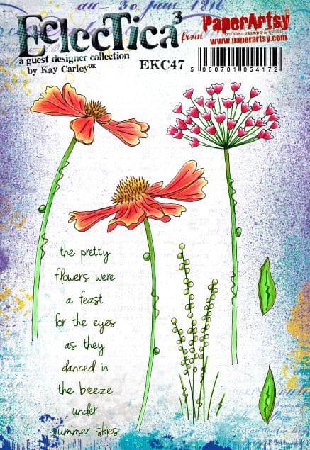
I only wanted to use the grasses from PaperArtsy Eclectica³ stamp set 47 by Kay Carley (EKC47), and gave them a light wash.  


I did a LOT of fussy cutting and carefully mounted all of my flowers onto my painted canvas BEFORE I had stamped my focal sentiment, also from EKC47.  And then I smudged it!  Imagine my horror!  Luckily, I had all of that beautiful paint mixed up and had continued to spritz it with water, so I was able to make some gel prints from the leftover paint.  That saved my project!  I stamped the sentiment onto a gel print and cut it out to cover my mistake, whew!


Everyone makes mistakes when crafting and it can be very frustrating, but there is always a way to save something, even if not in the originally intended way.  I actually like how the words pop off of the canvas after I cooled down for a few days, ha ha!  All of the paint layers and mounted flowers come together to create really nice texture.  

I love giving my finished pieces a splash of black or white and this time added splashes of watered down Cloud 9.  


I was really pleased with how the flowers grow up to frame the sentiment.


You can see that I used the darker tinted flowers closer to the bottom of my canvas.  


I enjoyed this particular color mix and think it will work beautifully with any of Kay's stamps in any other color, besides purple.  I really liked making the impressionistic background and think I will explore the idea further by making some ATC backgrounds with different primary shades.  I'm looking forward to seeing what the other bloggers share during this topic and hope you are too!


YouTube: SewPaperPaint
Facebook: Autumn Clark
Instagram: @sewpaperpaint
Pinterest: SewPaperPaint