Hello from PaperArtsy HQ,
Well this is is the final wrap up of selected highlights from the 2022 PaperArtsy Blog. One of the highlights for me personally has been the series of colour topics we inserted into this year's blog program. I love helping people understand the WHY of anything to do with crafting.
When we exhibited at shows, it was really common for people to need help choosing paint colours, and I realised that many of us struggle to decide what to use, how and why, and certainly the colour wheel seemed an elusive concept to many! We did not study this in a deep theoretical manner (as that is too boring for me) instead, we encourage bloggers to make some interesting colour wheels, and then choose the resulting colours as prompted by the topic. If you have not downloaded our printable colour wheel from the first of this series, then you should! And you should head back to look at the intro posts for each of the colour topics - they are very informative. Yes, it's not over yet, we have more planned for 2023 already!
A reminder
All these links can also be found from our linktree here as can the colour wheel
Today Dounia has her picks for you from Topic 13: Fabric, Topic 14:Triads, Topic 15: Paper, Seeds, Twigs and Topic 16: Splosh.
Get ready for a twigs, puddles, threads and colour!!
Here is a nice straightforward topic title! Ribbons and threads are already part of the base material for paper and mixed media crafters, not to mention those of us who also practice needle crafts or quilting and love to reuse fabric scraps in our projects. In this topic, we wanted to explore further the interchangeability between fabric and paper.
First think of fabric as a replacement for paper. Think of how you’d use paper normally – matting, journal pages etc, and substitute fibre-based products: lace instead of washi tape, calico instead of cardstock, image transfer instead of a photograph. How can you reinterpret paper using a woven or knitted substance? Fold fabric cleverly, slash it, use it to frame your focal image. Try stiffening fabric, embossing it, heat embossing it. The flip side is to use techniques traditionally reserved for fabric on paper. Adding stitching is a staple but what about dying? They are hundreds of reserve techniques around the world that could be adapted to paper. You could try pleating, braiding, weaving, layering, a whole world of possibilities! Head over to Keren's intro post for even more inspiring ideas.
First, Etsuko Noguchi worked fabric into her materials and her final object: she experimented with rusting fabric for this dainty and vintage needle book. I love how the rust rust spreads to to create a colouring effect while still keeping most of the intricate details of the stamp! Check her original blog post for a step by step of her technique and a look at the inside pages!
Jenny Marples shared with us her process to make journal mixing paper and fabric, for flexibility, and sturdiness, practicality and beauty! Funnily enough, the paper is stitched and embroidered and the fabric is glued! Go to her original blog post to admire her Venice and Shakespeare inspired pages and to follow her simple how-to. Her simple steps can very easily be adapted to your favorite style or colour palette, for a striking result!
Floss Nicholls rose to the challenge and adapted fabric slashing and reverse appliqué techniques, mixing paper and fabric for this removable notebook cover. I love the texture of the finished project, and the subtle play between the reds and oranges, contrasting with the natural fabric. Go to her original blog post, it has everything: inspiration, experimentation and instructions, gel printing, stamping and stitching but also an example of the terrible dangers of crafting...
Liesbeth Fidder de Vos certainly covered all options to create a one of a kind, handmade paper fabric! It only involves classic stamping and painting techniques and results in a beautiful, sturdy and versatile sheet ready to be cut up for card, covers and other stitchy projects! I love how intuitive and organic her process is, mixing vintage imagery and bright colours. Her original blog post details of the step for a fun play time, easily duplicable, so do not hesitate to try it. In round 3 of our colour wheel play, the focus is on another 3-colours scheme, called a triad. This time, you use 3 colours evenly spaced on the wheel. Those colours can distant of 3 wedges, 2 wedges or 1 wedge for 3 different atmospheres.
3 wedges apart 2 wedges apart 1 wedge apart
The most classic triad, where the colours are separated by 3 wedges, offers 4 possible combinations in a wheel: the 3 primaries, the 3 secondaries and 2 trios of tertiary colours. Those are very balanced schemes, with lots of clean colours contrast. When reducing the spacing to 2 wedges, you end up with two opposites and a third colour balancing both. It is an easy way to soften and complexify the classic complementary contrast. Finally, with only 1 wedge between your colours, contrast is greatly reduced: you are basically ignoring half of your wheel! You can however play with layering similar tones and harmony is generally easier to achieve. For more details and lots of great examples of triads in art, go to Keren's intro post! First up is Amanda Pink with a 3 wedges apart scheme. She used quite unusual starting colours for her wheel, which we love to see! The choice of a very dark blue against a soft yellow and pink creates gorgeous mid-tones with lots of different intensities.I love how well her project really showcases her chosen colours. Her blog post is also a great exploration of triads as she tried, and presents, all the possibles combinations from her wheel!
Nikki Acton chose a triad 2 wedges apart on her wheel. The dark wine and rustic orange are both on the warm side of this wheel with the cooler clean grass on the cold side of the wheel making for an original version of the red and green Christmas combo, perfect for her set of cards. Her original blog post helpfully describes her colour journey, and how she avoids mud while gel printing with complementary colours.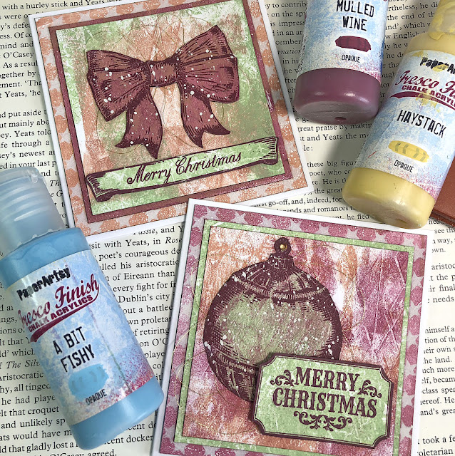
For this grungy layered card, Kate Yetter uses a 1 wedge apart triad all made of tertiary colours. It is a bit crazy seeing the difference between the bright blue pink and yellow start-colours for the wheel against the finished wheel and the final chosen tones, subtle and soft for some! This truly demonstrates the power, versatility and potential of colour mixing and making your own wheels. Also, despite being close-to-each-other colours, that purple really pops against the warm tones. Check Kate's original blog for a better look at all her yummy layers!
Continuing our exploration of sustainable crafting, we wanted in this topic to focus on both recycling and scavenging, but the direction was to use naturally foraged materials from your local area.
We are start gently with paper as the first element. I'm pretty sure we all keep and reuse bits of paper, old book pages or magazine images but what about unusual sources of recycled paper: bills, maps, or wrapping paper? Also the techniques for reusing paper are infinite: handmade paper to start but so much more! The second element we wanted to involve was natural resources and treasures: shapely leaves, delicate seeds, bold twigs… Do not see them just as embellishments! Cork or bark can be great substrates. You can weave straw or curl up leaves for texture. Unusual stalks and seeks can be one of a kind marking tools, stamps or resists. Check Keren's intro post for even more ideas and eye-candy. Our bloggers certainly did not lack inspiration, let's have a look!
Claudia Neubacher chose to celebrate nature treasures to the fullest with this beautiful autumnal display full of interesting pods and leaves (it sits under a domed glass cloche but is also lovely without the covering). Go to her original blog post to see how she personalised each part of this careful composition. I love how natural and stamped elements harmonise and play off of each other. Also those pops of turquoise really bring some zing and fun, catching the eye and creating breaks in the whole.
Etsuko Noguchi went full-on for this epic post, with not only a series of beautiful tags but also a intricately layered shadow box. For her, leaves and other natural materials were tools and pattern makers as she did an incredible series of ecoprints to use as base for her projects. Her
original blog post helpfully details the process and her experimentation. I am impressed with how seamlessly she managed to colour match the different layers and blend her prints with stamped elements.
Autumn Clark also used leaves for pattern making but with a gel plate and paint to make a beautiful series of textures and layered backgrounds for her cards. Her
original blog post contains a little video tutorial of this process (and some additional quick wooden tree ornaments)! She chose to pair them with some Sara Naumann botanical and birds, boldly embossed in gold. Those really make a statement! I love how the backgrounds and focals dialog with each other, playing with similar imagery but very different techniques.
Ellie was inspired by the topic to mix paper and twigs in a booking binding adventure. Her
original blog post is a great example of how inspiration strikes in unexpected ways and projects evolve organically, sometimes to come back full circle to your original idea! Even if Ellie herself is not convinced, I love her subtle tones and textures, elevated by rusted metal elements. Her trick of scanning and printing her own work to have matching backgrounds is genius!
Already the last of topic of the year! We chose a open and fun one for a splashy finish...
This topic was all about fluid media and the fun ways to apply them. Ink sploshes, paint splats, colour washes, droplet lifts, spray textures, runaway drips. Our designers have numerous stamps and stencils mimicking ink splatters, coffee rings or paint puddles but you can of course make your own! Let's have fun with inks, infusions, paints, watercolours, sprays … Sploshing media and tools available nowadays are quite varied: what is your favourite one? Have you tried the less classic ones techniques like bleaching, spinning or pouring? And after a messy, drippy play session, how do you mix your free flowing results with your more classic favourite papercraft? Keren's intro post has quite a few answers, and check our bloggers amazing projects:
My first pick comes from Amanda Pink. Amanda's love of pattern and bold contrasts is always evident in her crafty style, and for this post she surprised us all with the most wonderful 'spinning tool' she found. It's a kids turntable toy that zooms in circles fast to push the paint from the centre outwards. The spinning fun was clearly pretty addictive! Check her original blog post
Floss Nicholls was all about the sploshed spots, but she also stumbled across a new technique in this post that had us transfixed. After a mammoth background-making session, she figured that the sweet-spot was to let sploshy infusions pool inside a stencil to dry (assisted gently by a heat tool a little). The result was some intense contrasts further enhanced by gesso resists. This seemed to work so well with circles and dark colours, but she made many other incredible prints along the way. Hop over to her original blog post to read about the process in depth.
Martha Ponsanesi's project was a fusion of recycled pages into a junk journal enhanced by Lynne Perrella imagery. As is the wont of our bloggers, she explored a variety of techniques, mostly with Alcohol inks on her gel-plates, some of which were lifted off with Fresco paint; almost like trapped sploshes. Colour was dripped, puffed, blotted and dribbled. One fabulous tip she suggested was to use satin glaze over these prints before stamping (PaperArtsy glazes are such a good surface to stamp on), and ohh the translucent vellums were stunning too! You may just want to hop on over to the
original blog post here!
Riikka Kovasin earlier in the year shared how to get the perfect swipe, and in this post she found how to make the perfect splosh. She goes on to add more colour and infusions layers with the splosh becoming the bright spot for her focal point. She works with the newest Scrapcosy release and shows how to pull together a fast and easy idea into the most stunning cards. I think this technique is perfect for those last minute Christmas cards .... or get in early for 2023! Here is the link to her blog post.
Well, wasn't that a fabulous round off for the year! A huge thanks to our bloggers, designers, and of course the crew at PAHQ who do their best to ship fast and beautifully well packaged orders to shops and customers around the world!
If you want to stay in touch with PaperArtsy, sign up for the NEW PaperArtsy newsletter here . Historically, we are notoriously irregular at emailing customers, so the first PA New Year's resolution is to be better at monthly updates! While you are figuring out how best to stay in touch with us, (you won't want to miss out on the packed plan for the blog for 2023. Head on over to join our Facebook Community PaperArtsy People, or our Facebook page PaperArtsy
From all of us here at PaperArtsy, we wish you the very merriest of Christmases, Season's Greetings, enjoyable family fun and festivities and all the while may you be joyful and jolly! And a Happy New Year too!
Warm wishes to you all
Mark, Leandra, Dounia, Ella, Millie & Hugo


.jpg)


.png)

