
2021 Topic 13: Tiny (News) Print

If
you wanted some pointers on how to build layers, Ellie has got some
great ideas for you. Inserting tiny type into the background layers plus
cleverly spotting some words in JOFY stamps that's she used to great
effect. With splashes of lovely Infusions she's created some soft and
textural panels.
~ Keren
Hi everyone, it's Ellie Knol with
you today, and I'm here to share with you these four panels with script
and tiny words just everywhere: in the background, stamped into grunge
paste, into gesso, on a tag, and also part of the stamped image.
I LOVE mixed media. My process is all about depth and contrast with lots of layering. I also have been collecting of pictures and pretty papers for a while and I thought using them in this project would be a good way to add interest to the layers.
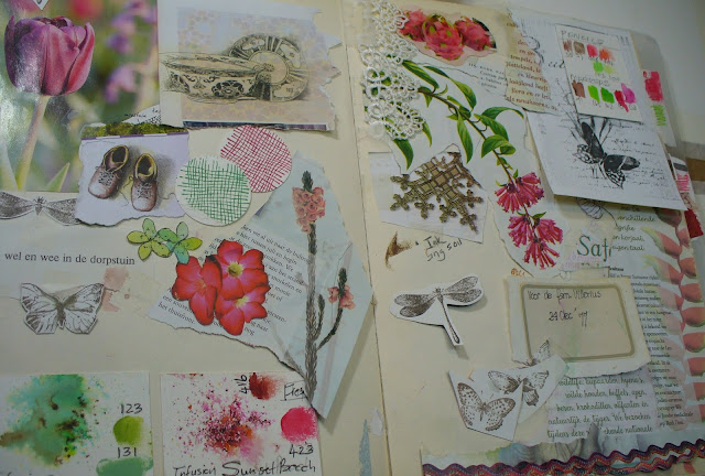
My
inspiration was this custom made mood board I created a while ago. Red
and green are obviously the main colours and I also chose dark brown for
a good contrast. I then got all my colour charts out to see what in my
stash was in this range.
The base panels were taped to a sturdy cardboard. Among all fitting my colour palette, I selected all the papers I wanted to use and tore each of them into 4 pieces, one for each panel.
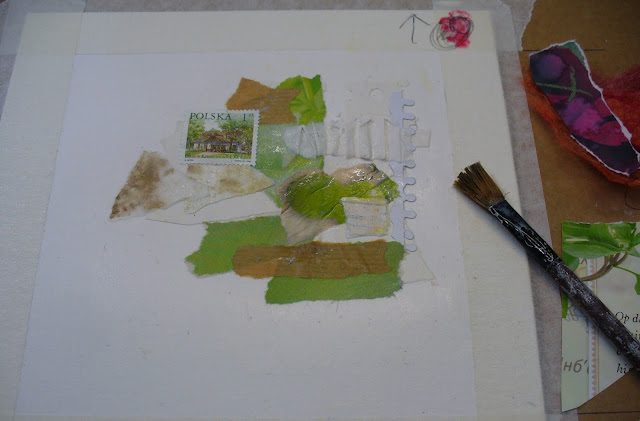
The
real fun could then begin: tearing the papers and and gluing them on
the panels. I mostly place them randomly (they only are the first layer
after all) but started with the neutrals and greens. If a bit stymied,
it helps to switch between panels to refresh your eye. At this point, my
only plan I had here was to achieve a focal area in selected corners. I
had marked those chosen corners with red dots and arrows. That way I
could orient my pieces with text to be 'readable'.
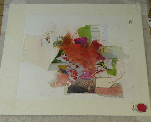
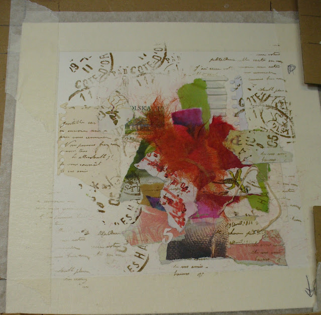
Here
is the same panel with the red papers added for a finished collage
layer. This had then to dry before advancing to the next step: stamping!
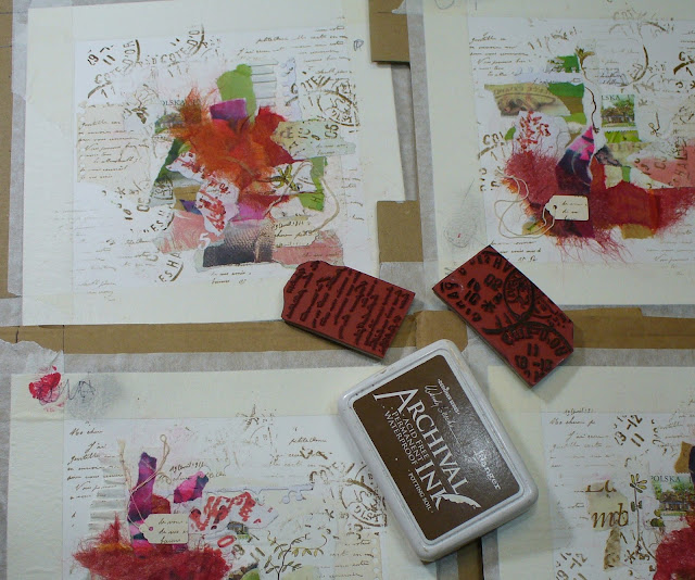
I
chose to stamp with brown ink, my contrast colour, onto the background
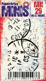
and plainer areas to give them some interest and depth. I have used Ink & the Dog Minis 29 and 61, both full of tiny text! I like to only use part of the stamp for a random look. Don't hesitate to overlap!

The same panel, now with stamping. Time for some Infusions!

Here I have to apologize as I got in the flow and forgot to take pictures of the next step. This step consisted in adding colour with Infusions, Sunset Beach and Emerald Isle; then knocking it back with some gesso
applied with my fingers or a pallet knife. I added some scribbling in
the mix of gesso and wet colour, gave it some time to dry then more
gesso, then more colour, rinse and repeat until I was satisfied. I like
that the scripts and words are still peaking through. Some of the bright
colours from the torn pieces of paper and Infusions were knocked back
but I prefer it that way as it creates a softer backdrop for the focal
images to shine!
I had planned one more layer before adding the focal stamps. I wanted to add Grunge Paste through a stencil and stamp in it but wasn't sure whether I was going to like it or not. I chose to risk it: I had 4 panels... I could always toss one of them, right? I chose stencil PS139 by JoFY, with nice open spaces, and a script stamp from Ink and the Dog: Words plate 3, inked in dark brown. Despite my apprehensions, applying
the Grunge Paste and stamping in it, felt like magic... it made me
happy. I left everything to dry overnight before removing the tape to
reveal the nice crisp edges of each panel, so satisfying!


Again,
the same panel all gessoed, inked, grunged and with the the tape taken
off. I love the textures and the use of the brown ink in the Grunge Paste really integrates it to rest of the background.
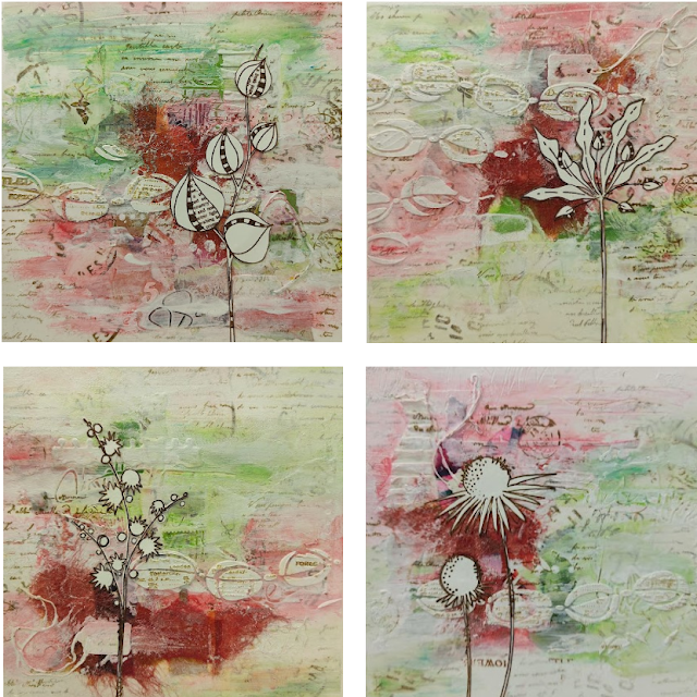
Now onto finishing the panels, where it all comes together! I used the beautiful flowers of JoFY14 and 97, stamped in the same brown ink and fussy-cut as my focal images.


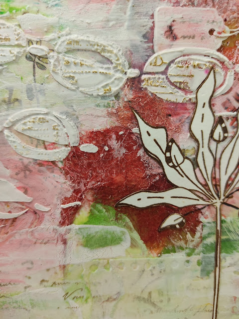
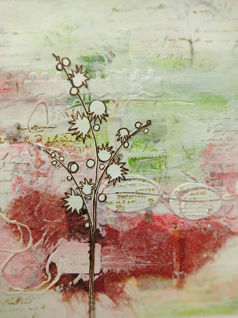
First panel, the one we have been following during this post. The stamp from JoFY97 really chimes well will the stenciled Grunge Paste.
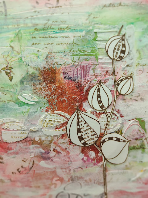
Here's a close up of the detail around the main image. I chose not to add any color to the focals to make them pop more. No secret here: this is my favourite panel of the four!
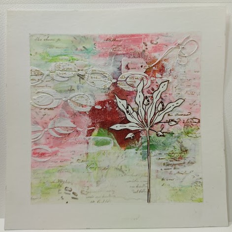
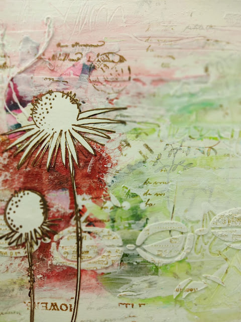
Second panel, also featuring a stamp from JoFY97... these images are just perfect.
I
am very happy with panel number two as well; it has nice contrasts and
beautiful details... Look at that tiny tag for instance!
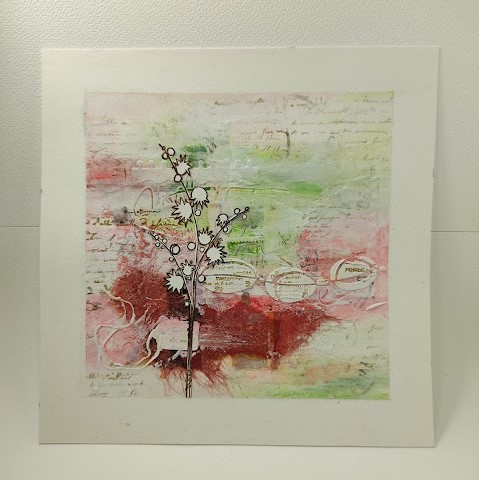
Third panel, featuring one of the stamps from JoFY14, a quite intricate design. Fussy
cutting this image was a bit tricky, but with a dose of patience it
worked out fine. Before gluing, I stamped it onto the panel as I did not
fussy cut a few tiny circles. I filled them up with a white acrylic
marker instead.
LOVE it too! The stamping in the Grunge Paste is so detailed!

Fourth panel, featuring another stamp from JoFY14, a beauty as well... As with panel three, I stamped the images onto the panel before adhering the main fussy cut image.
This
panel also has beautiful detail. In real life they all have a lot of
depth and texture from pretty much all the layers: the torn and punched
edges of the papers, the stamping, the scribbled gesso, the stamped
Grunge Paste. It contrast nicely with the clean JoFy images.
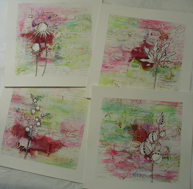
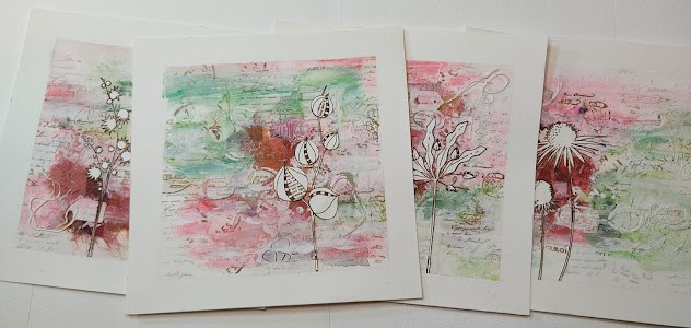
So, here they are, filled with happy colours and beautiful images. I have not yet decided what type or colour but these panels will be in a frame!

You might wonder: did I forget the theme, TINY PRINT? Of course not. I saved the close ups for last!


These
panels took quite some time to make, but these hours were happy ones
for me. It was rainy outside, so that was a good excuse to experiment
and play with colour. Starting with what I'm comfortable with then mixing in some new techniques is always a joy to me.
Would
I do anything different next time? Yes... sprinkle the Infusions
colours one by one. These crystals go where they please. Sometimes I was
applying gesso and discovered some crystals of the other colour had
sneaked in... and red and green make muddy colours! It forces me to
wipe off some areas and start again.
Take some time to be creative today, every day... happy creative play.


