Showing posts with label Canvas. Show all posts

Saturday, 9 December 2023

2023 Topic 12: Designer Focus: JoFY {by Autumn Clark}


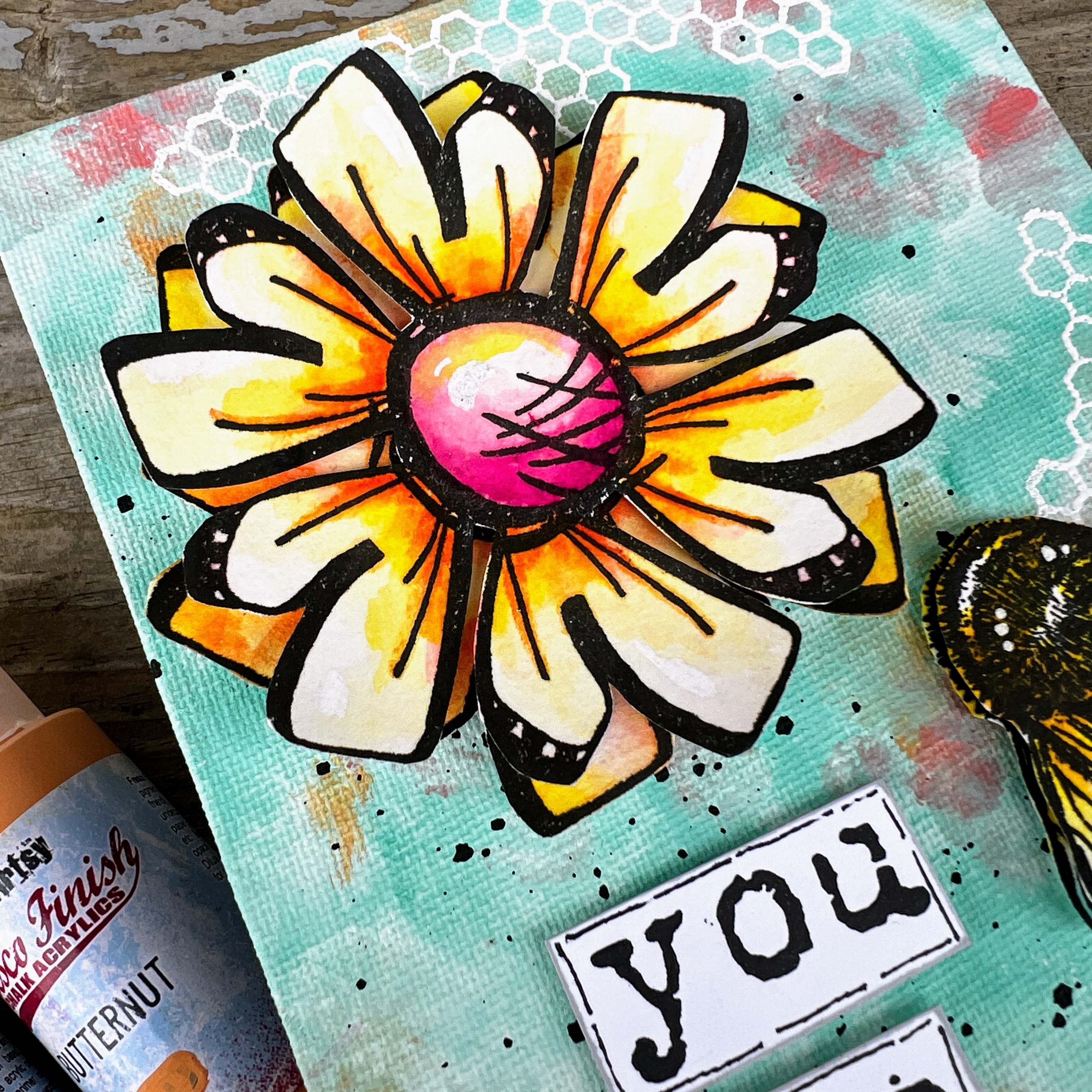
Hi everyone it's Autumn Clark from SewPaperPaint here with you today.  I've been enjoying some creative time lately, focusing on creating cards and gifts. This designer focus on Jofy had me thinking about building a stash of handmade birthday gifts. So I decided to alter some small canvases with Jo's beautiful stamps.  I hope you'll enjoy this simple process and get inspired to create some gifts of your own.


I really enjoyed experimenting with a new background painting technique using PaperArtsy Fresco Chalk Acrylics and mixing that with watercolor, a favorite of mine.  I hope it inspires you too!

What I loved most about these canvases is that they were as easy to make as a greeting card, but pack a bigger punch and can be displayed on a small easel throughout the year, long after one's birthday celebrations have ended.  


For this project, I didn't have much of a plan in mind, other than wanting to use some beautiful florals and ended up choosing my favorite  set, PaperArtsy stamp set 114 by Jo Firth Young (JOFY114).


I had picked up a small two pack of 5x7" canvases at our Dollar Tree store in the States, which ended up being cheaper than two sheets of 12x12" cardstock!  Score!  I was looking forward to mixing things up with these as substrates.


I scoured my collection and chose two stamp sets that would work together nicely from each designer.  First up was PaperArtsy stamp set 114 by Jo Firth Young (JOFY114).  I really enjoy coloring, but am lazy and cheat a bit - ha ha!  Here I've used cheap brush markers to add a variety of colors to the petals, then I simply used a water brush to blend the colors out.  It's easier than working in layers, but the result is beautifully variegated.  


Here are all of my happy little petals, colored and cut out nicely.  I wanted to create two different compositions with the flowers.


My second choice of stamps was PaperArtsy Eclectica stamp set 32 by Scrapcosy (ESC32).  I knew these darling bees would work beautifully with my blossoms.  I stamped two images and colored, then cut away the body of the second bee.  I curled the wings of the second images and used mounting tape to create 3D critters.
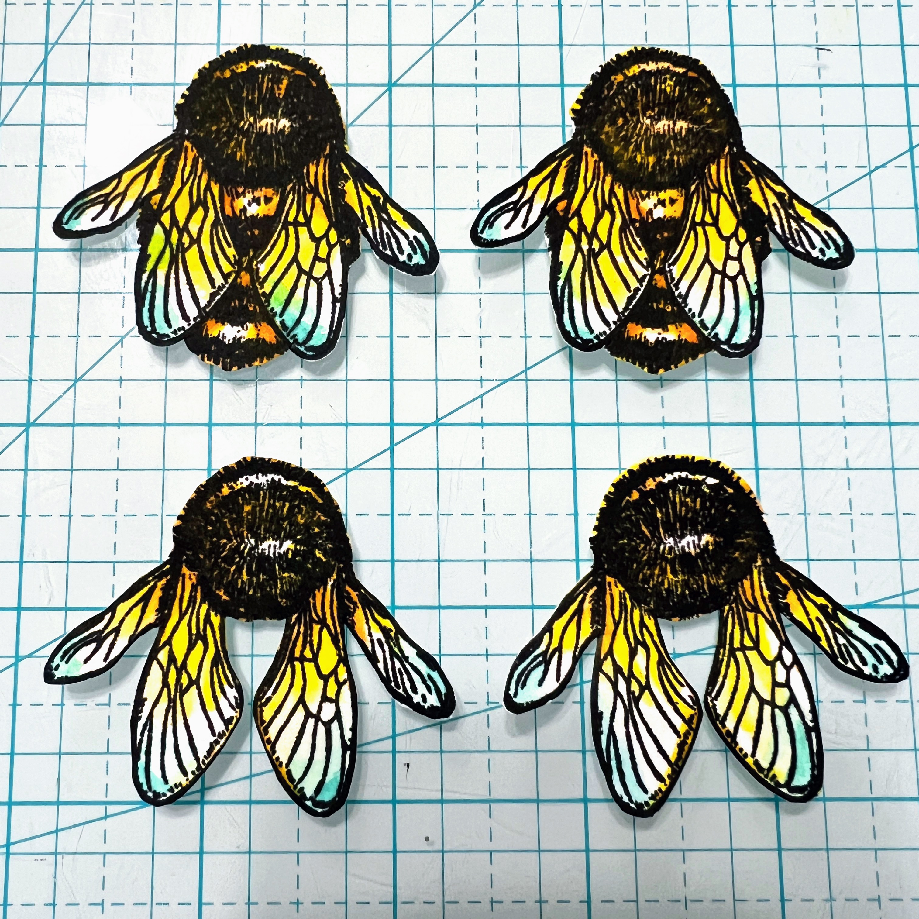


I just love how these bees turned out and the dimension they added to the canvases.  


I waited until I had colored my focal images before deciding upon paint colors.  I was really getting excited at this point and could see the project coming to life. I landed upon a beautiful combination of PaperArtsy Fresco Chalk Acrylics to include Butternut, Peach Nectar, Peppermint and Sargasso.  


I started by painting blobs of Sargasso and Peppermint onto the canvases, as shown.  


Next, I added smaller amounts of Butternut and Peach Nectar.  Once my painted layers were dry, I stamped the honeycomb from ESC32 with embossing ink and embossed in white on the panels.  
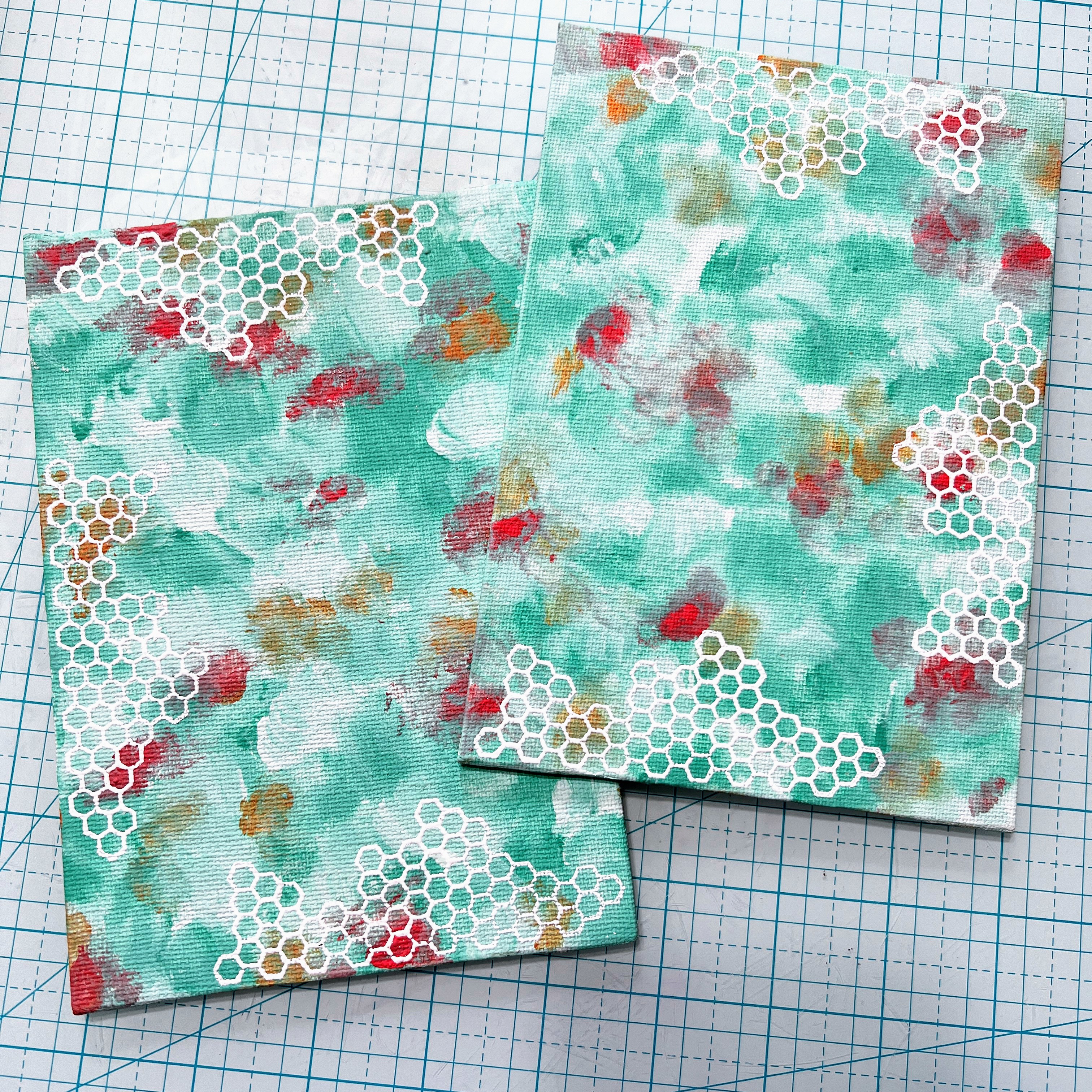


I started this project back in October because I was going to be away for a month.  When I finally came home at the end of November and was ready to photograph my canvases, the watercolor had sun bleached from laying on my art table in the open sun.  The trees in my front that normally shade my window had lost their leaves and the sun had been beaming in.  You can see how the color is altered in the pic below verses the coloring sample above.  To fix my pieces, I simply added more watercolor.  I actually like the more faded flowers in the end, though I was initially distraught!  Though, I'm going to look deeper into the lightfastness of my inks going forward...  I wish I had photographed them then and could do a side by side comparison.  


I decided to add some encouraging words to my gift panels and picked a very favorite stamp set, PaperArtsy Ink & the Dog Words 2 stamp set (W2) to spell out my chosen text.  


I cut apart each word and dabbed a grey ink pad along the edges, then drew in some black outlines.  
 
 
I really like the pop of white against the colorful backgrounds.  
 

I think the canvases are quite cheery and the colors work together very well. I'm so happy I was able to salvage the faded flowers with a fresh coat of color!


I think I'll search for some simple white frames for the panels or perhaps add some wire and bead hangers for the next set.  I'm also thinking of creating some of these canvases with Jo's fabulously fun snowmen stamps and giving them as Christmas gifts this year.  The possibilities are endless!  I truly hope these projects have made you smile and encouraged you to get stamping.  

xx, Autumn


YouTube: SewPaperPaint
Facebook: Autumn Clark
Instagram: @sewpaperpaint
Pinterest: SewPaperPaint

Thursday, 27 April 2023

2023 Topic 5 : Tinged Blue {by Autumn Clark} with Kay Carley stamps


Hi everyone it's Autumn Clark from SewPaperPaint here with you today.  I am such a fan of Kay Carley's stamps and am always delighted to get to share a creation using them.  


I'm equally excited about this color mixing topic.  These days its more practical than ever to explore color theory and mix up paint colors, thus stretching our art supplies further.  What better way to start than to explore "tints"  Mixing any color with white will create various 'tints' to lighten the core hue, in this case Surf's Up. 

As was explained in the Topic Introduction, Surf's Up is the color all bloggers will be using this topic so you can see how one color can be edited in many directions without compromising the hue. If you want to brush up on the idea of color tinting, then go brush up your understanding and read the topic introduction. It is packed with details of tints, shades, tone and saturation.
  
As I said, for this topic we are working primarily with PaperArtsy Fresco Finish Chalk Acrylic in Surf's Up.  I decided to create an impressionistic background to show off the various tints I created with the white, Cloud 9 and really enjoyed adding in some favorite Kay Carley stamps.  I hope it inspires you today to mix up some tints of your own and have a play!


I always purchase odd sized canvases when I come across them and have had a couple of long skinny canvases in my stash for some time, waiting for just the right project.  Quite often, I begin my projects by sketching out the finished design.  This helps me get from point A to point B without being distracted.


Once I had my design concept, I grabbed some color.  I have to say, my most beloved Fresco Finish Chalk Acrylic is Cloud 9.  It's the perfect shade of white for me and ends up in 90% of all that I do.  What a perfect mate it is for Surf's Up!


I pulled out my trusty, crusty paint palette and gradually added more and more Cloud 9 to a base amount of Surf's Up.  I spritzed the paint surface with water occasionally to keep the paints from drying out while I worked.  


I mixed my colors and and painted out the results on a scrap of paper.  


As you can see, the result is a beautiful ombre of color.  

I really wanted to add texture to my canvas by adding each color as a blob and building layer upon layer so that the top of the canvas would be lighter than the bottom.  This way, the tint was visible not only in the mixed colors themselves, but the tint would help create the illusion of depth in the finished project. 


You can see, I literally painted blobs of paint all over, what a fun, therapeutic way to create!  As a bonus, the paint dries with a great texture.
 

At this point, I was really excited and decided to get to stamping!  I started with PaperArtsy Eclectica³ stamp set 6 by Kay Carley (EKC06).  


I watercolored my images in varying depths of each color by adding different amounts of water. This would let the white backgrounds show and create various versions of the same color to allow for different levels of color saturation. You can see the variations within my colored images.


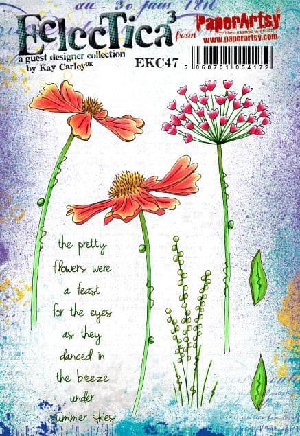
I only wanted to use the grasses from PaperArtsy Eclectica³ stamp set 47 by Kay Carley (EKC47), and gave them a light wash.  


I did a LOT of fussy cutting and carefully mounted all of my flowers onto my painted canvas BEFORE I had stamped my focal sentiment, also from EKC47.  And then I smudged it!  Imagine my horror!  Luckily, I had all of that beautiful paint mixed up and had continued to spritz it with water, so I was able to make some gel prints from the leftover paint.  That saved my project!  I stamped the sentiment onto a gel print and cut it out to cover my mistake, whew!


Everyone makes mistakes when crafting and it can be very frustrating, but there is always a way to save something, even if not in the originally intended way.  I actually like how the words pop off of the canvas after I cooled down for a few days, ha ha!  All of the paint layers and mounted flowers come together to create really nice texture.  

I love giving my finished pieces a splash of black or white and this time added splashes of watered down Cloud 9.  


I was really pleased with how the flowers grow up to frame the sentiment.


You can see that I used the darker tinted flowers closer to the bottom of my canvas.  


I enjoyed this particular color mix and think it will work beautifully with any of Kay's stamps in any other color, besides purple.  I really liked making the impressionistic background and think I will explore the idea further by making some ATC backgrounds with different primary shades.  I'm looking forward to seeing what the other bloggers share during this topic and hope you are too!


YouTube: SewPaperPaint
Facebook: Autumn Clark
Instagram: @sewpaperpaint
Pinterest: SewPaperPaint