Showing posts with label Mouse ears. Show all posts

Thursday, 4 August 2022

2022 Topic 11: Stamp Mash-up {by Laurie Case} with Tracy Scott, Nicci Battilana and Scrapcosy stamps


Hello and welcome!! It's Laurie with you today to share a project full of twists, turns and ups and downs! When creating, sometimes things don't go exactly as planned and that's okay! At the end of this process, I learned a lot, ended up with THREE finished designs and most importantly, had so much fun "Mashing Up" three different designers!!


Recently I came across the technique of altering playing cards. I've done a couple of standard sized cards which were fun and quite simple due to their size. However, while perusing Amazon one night, I discovered large playing cards, 5X7 inch cards!! I thought, how fun! I must alter these!!!


These are the supplies I initially gathered. You'll find as I go on, I've either added product or not used it at all! This was a highly evolving project!!


I want to start by showing you the first card I created. I didn't end up using this card on my feature project because there were a few things I didn't like about it.


I love the colours and the collage! Downside Number 1: my Copper paint seems to have settled a little bit, so when I mixed it with Grunge Paste, it gave this gorgeous pink colour but this was not the look I was going for. Downside Number 2:  I felt that I covered too much of the card. I really wanted people to know that this was a large playing card, not just a piece of cardstock or card board!

So it was back to the drawing board!!

 

I pulled another card from the deck and chose a different area of the Printed Tissue. This area was less densely packed with images. I used gel medium to adhere.
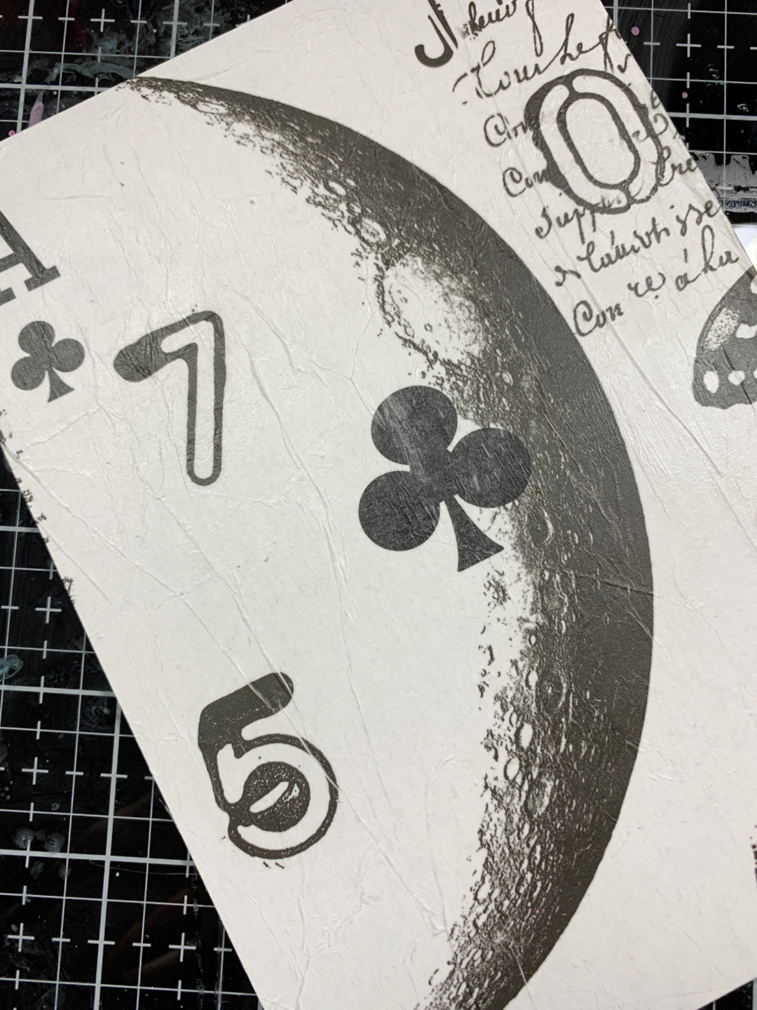

I love that you can clearly see that this is a large playing card! I also love the images I was able to get from the tissue!


This is a regular sized card. I thought it would be fun to create some layers using the exact same card and suit.


I place the regular playing card in the centre of the large card, trying to match the centre club as best as I could. I laid the PS290 stencil over the top and applied Grunge Paste in a diagonal from top left to bottom right.


Now, this is where I thought I'd try something new. I sprinkled some embossing powder over the top of the Grunge Paste. I've seen this technique done before but in this case, it came out with mixed results, haha! Some of the powder flaked off the paste, some stayed on...at this point, I just went with it!!


I added some Mouse Ears and Bubble Gum Fresco Finish Paints. I used A LOT of water to get that splotchy look!


After the paint was applied and dry, I added a thin layer of white gesso to dull the colour slightly. I rubbed away whatever embossing powder that wasn't set into the Grunge Paste. This actually gave a very nice, matte look.


You can see some subtle stamping on the background. This comes from the AMAZING new set by Scrapcosy (ESC33). This stamp set is a must have!!

It was finally time to add the "wow" factor to this project!  I stamped a few images from TS043 and ESC33 onto some white cardstock. I heat embossed the large frame using the same embossing powder I used on the background. I didn't end up using most of these but it never hurts to have extras!!


I used alcohol markers to colour everything in but chose to use only the floral images. I fussy cut around the large flower. I also coloured two of these!


I placed a small circle die, cutting side up, with tape already on it over the Club on the large card. I lined the regulation sized card up with the stencilled Grunge Paste and pressed down, making sure the die adhered. I ran this through my die cut machine. It's not perfectly centred but close enough!  I thought this looked super cool!


Before adhering everything together, I added some finishing touches with a white paint marker. I love the look of stitching! I really must try it with a sewing machine one day, hahah!
To make each layer stand out, I added some black ink around the edges. Now let's put this together...


I used A LOT of foam adhesive on this! I wanted each layer to pop from one another. The small card, the frame and the flowers all have dimension!  You can also see that I stamped a small quote in the middle of the circle. This comes from the ESC33 set and was gold heat embossed.



This project turned out nothing like what I had in my mind. I started, then started again then started AGAIN!! I made 4 of these playing card backgrounds! This is the one I just happen to like the most. Never fear, I did keep the other backgrounds and actually finished them.


I always have to remind myself that the idea I start out with isn't always what I'll end up with. In the end, I wound up with 3 beautiful, altered playing cards and an extra one to play with! 

Thank you so very much for spending some time with me today!


Laurie



Blog:  https://itsallcutanddie.blogspot.com/
Instagram: crazycardlady


Saturday, 28 August 2021

2021 Topic 10: My Favourite Colour with ESN {by Sara Naumann}

  2021 Topic 10: My Favourite Colour


This is the cutest little pocket niche, and what a great tip to fold before adding colour and stamping so you can get the right details on the front facing sections! Love that clear embossing too! It really looks cool on those old papers to introduce a transparent layer!
~ Leandra

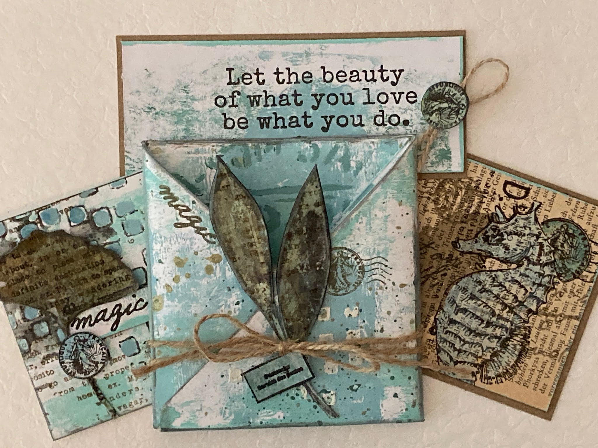
Hi everyone, it's Sara Naumann with you today, and I'm here to share an easy little pocket-style book. I have a thing for these simple folded booklets—I love how it makes a fun presentation for tag art, notes, little treasures, and could easily be adapted to any style or favourite colours. 

Speaking of favourite colours...(or "favorite colors" for my fellow Americans!), I was hard pressed indeed to choose as I tend to love them all! But blues and greens have always been my go-to colors and honestly, when I feel down or find myself crafting for therapeutic reasons (we've all been there, right?) then I tend to reach for those shades. 

Blue often represents sea, sky and open spaces, as well as freedom and imagination. Greens, of course, relate to the earth, renewal and hope. Blue and green go well together not only in terms of their colours, but also because of these feelings. In coordination with the nature theme, I've chosen a new and an older set of stamps: Eclectica ESN47 has those large leaves and inspiring quotes, and Eclectica ESN54 has our "magic" and seahorse. When I'm designing a stamp set, I always try to make sure it will coordinate with other, older stamps you already have so you can get the most mileage out of your stash!


This folded pocket book is a classic, and one that's easy to do in an afternoon if you're looking for a project that enables you to either go clean and simple or break out allll the stuff. Plus you can fill the pockets with all kinds of stamped, stenciled, and painty things.
 

First, you'll need an A4 sheet of cardstock—nothing too heavyweight, Smoothy 240 is perfect—and some paints and your brayer. When working with multiple colours, I find it's easiest to choose one dominant colour (Fresco Finish Marbles), then a secondary colour that I'll use less of (here,  Fresco Finish Aqua Duck Egg). Then, I pick a few more contrasting colours to use in smaller amounts as accents. I'm splattering with Fresco Finish Gold, then Fresco Finish Mouse Ears, and edging and reverse-stenciling with Fresco Finish Slate.


You can either fold your paper first, or paint first. I'm going to fold this one first. 
 

First, fold it into six even sections. 


Then, fold in each corner as shown. A bone folder really helps, you want those folds to be crisp!


Fold the piece in half the long way.


Position the piece with the long edge closest to you, then fold in each side as shown.


Tuck one corner into the other.

 
Then I unfolded the piece to paint it. This means I can plan my painting, stenciling and edging on which section will be in the front, and what will be on the back. When I brayer-paint my background, I'll put a little dollop on my craft mat, run the brayer through the paint and then across the cardstock. I like to leave some white showing for contrast. I brayered with Fresco Finish Marbles first, then let it dry and brayered a bit of Fresco Finish Aqua Duck Egg.  

 
I love some Grunge Paste texture! Here I'm using the PS272 stencil, which is a great one for abstract patterns. 


Scrummelling some Grunge Paste through your stencil gives interest and dimension—of course you can tint the Grunge Paste with paint but I'm a big fan of the natural bone colour that adds just the right amount of contrast to a painted background.


Bring on the gold! Splatters of watery Fresco Finish Gold paint give some metallic shine and more contrast. Let it go over the Grunge Paste-stenciled design too.


Then repeat the procedure with another colour of paint, like the adorably-named Mouse Ears. This is a darker, leafier green and you only need a touch to create some really gorgeous contrast. It seems to have blue tones as well as green, which makes it perfect in combination with Marbles and Aqua Duck Egg.

When the paint is dry, then just fold up your pocket. You can then have a look at what portions of the booklet you want to accent with more splattering or stenciling. I decided to pull out PS204 and stipple a bit of Mouse Ears on the inside back of the pocket.


Glue the bottom together—I use a bit of white glue on a toothpick.

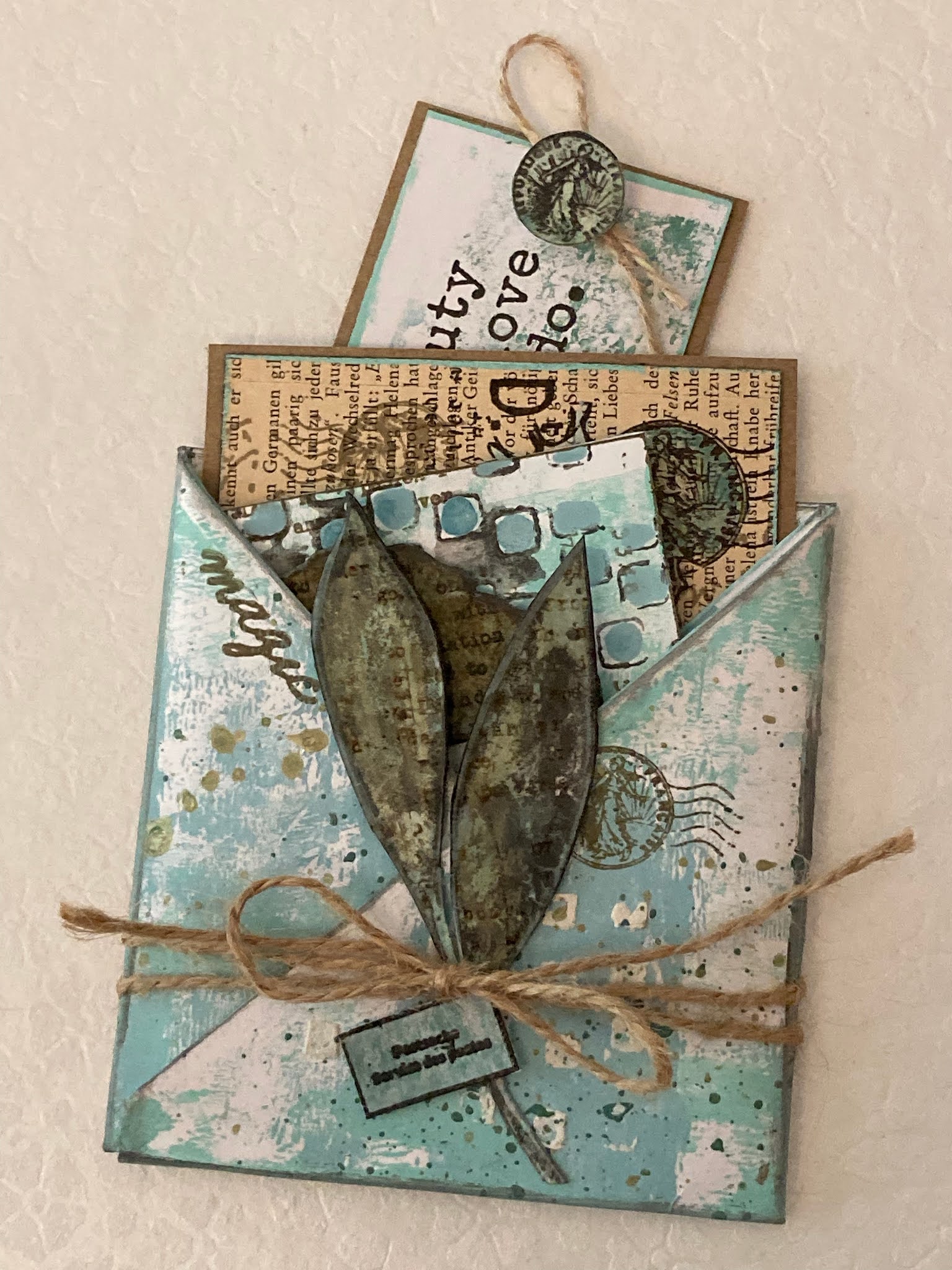
Now it's time to fill up your book!


Each fold will create a little pocket, so you have space for all kinds of things.


So what to put in your pocket book? Well, I love little paper treasures and notes, personally... but you could also tuck in a gift card, a special recipe, a thoughtful note or small gift item.
  

This is a layered combination I really love—the ginkgo leaf from Eclectica ESN47 with the seahorse from ESN54 heat-embossed on top and painted with Marbles and Mouse Ears.


Here's the gingko leaf again, clear-embossed, cut out and layered on top of a reverse-stenciled background done with Fresco Finish Slate and the PS272 stencil. The text stamping is from Eclectica ESN54, and is the dictionary definition for "wanderlust".


This is a favourite quote and one that works nicely as a bookmark-style piece. The postmark "button" at the top is from ESN54.


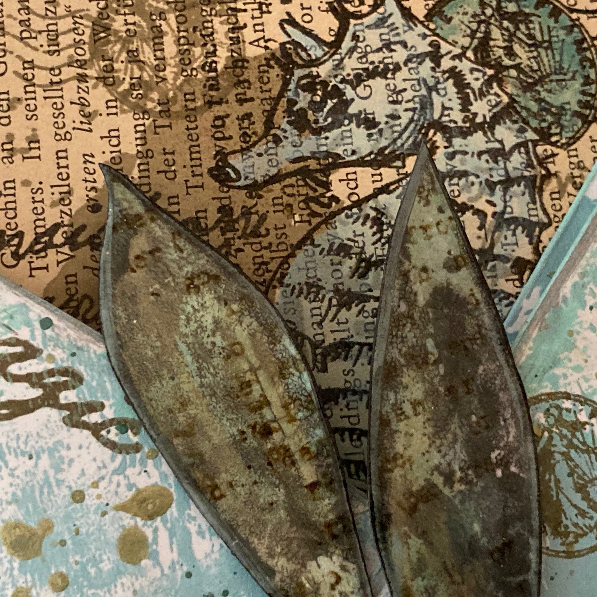
The leaves here are from Eclectica ESN47. I stamped them with a blend of the blue and green paints, added some Gold and then clear-embossed on top to give some durability before cutting them out and placing them on the front of the pocket.


Then, just tuck your treasures inside the various pockets!


After everything is folded and assembled, you can add any finishing touches... more stamping, a bit more stenciling or splattering, some edging, twine or ribbon. And while I've only made one of these little pocket books, it occurred to me that you could make several and bind them together to be a larger book of pockets!

I hope you enjoyed the read today and the colour inspiration too!

Blog: Sara Naumann