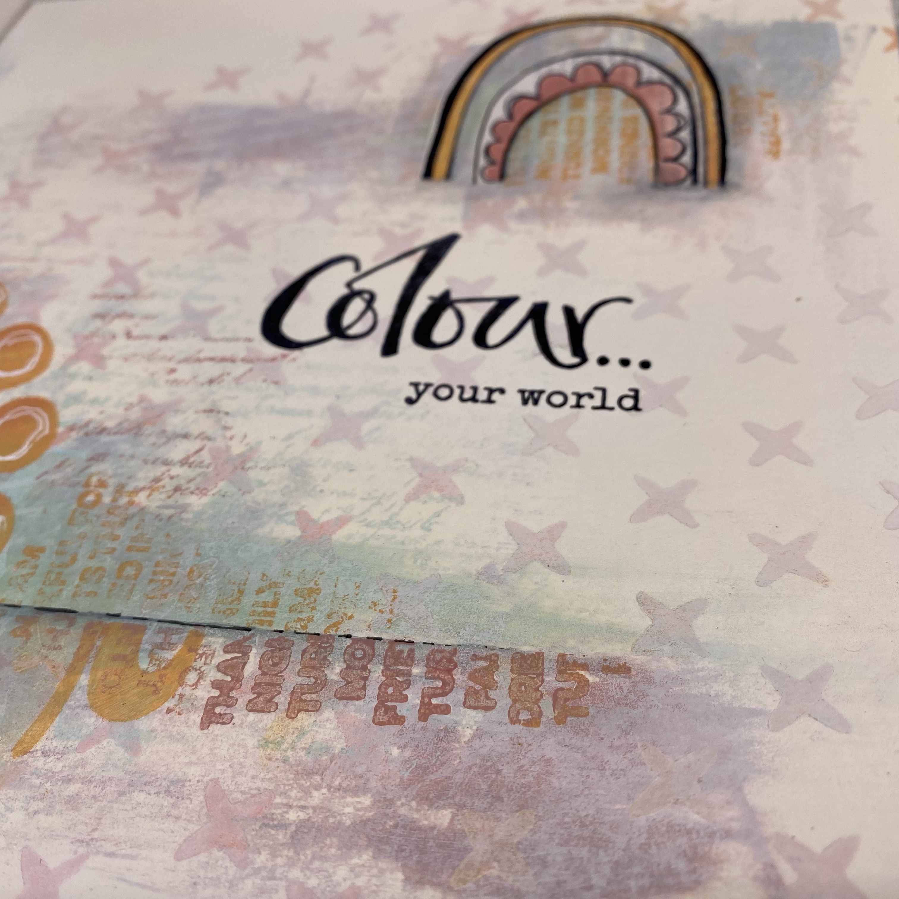
Hi everyone, it's Leandra with you today, and I'm here to share with you a journal page using the happy rainbow stamps by Jo Firth-Young.
I, possibly like others of you, haven't heavily relied on a colour wheel to inform my colour choices when being arty-farty. I have always followed my instinct, chosen colours I like, and then tend to see what happens. You end up with your go to colour combos, but the rebel in me wants to be able to use all the colours of the rainbow !
I have a few principles that I have found tend to work for me, but there are certain combinations or colour-worlds that I cannot enter comfortably, and those I tend to have less success with, maybe that is because my knowledge about colour theory has some weak spots!
I have loved making lots of colour wheels this year using the template we have created for you at the start of the year. I am very partial to using weird options as my 'primaries' and quite often all 3 starting colours are not primaries, if they are, I often choose non-traditional primaries.
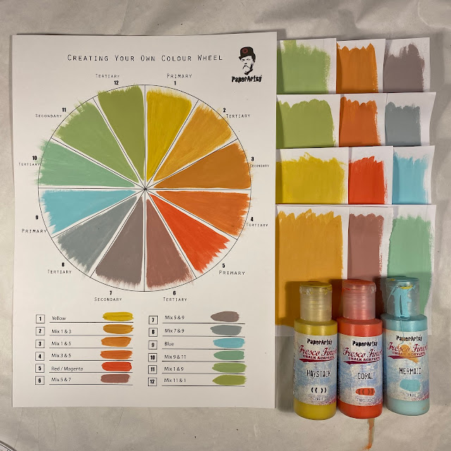
Here is the colour-wheel for this project. As the topic is Triads, I was only allowed to use 3 evenly spaced colours. Haystack is one of my go-to yellows because it is opaque, and that means when mixed with anything else you will get a softer, creamy colour. YUM! Mermaid is one of our most popular blues, and it has a bit of brightness to it so that is a tick for me, and my third was lovely Coral, a pretty pinky-orange. So yes, I admit they are all kind of close to primary shades.
The wheel above is what you get when you create a colour-wheel from those 3 shades, and the wheel below is the 3 starting Fresco Finish Chalk Paint colours isolated as a TRIAD.
TIP #1 - SEGMENT BLOCKER
a. I find it much easier to see the possibilities when I have 'windows' through which colour combinations appear. Use a second colour wheel printed on card to 'block' the rest of the wheel. Use a craft knife to cut out the segments. You can then spin the wheel to isolate each of the triad combinations. You can also see the 4 possible triads for this wheel on the swatches to the right.
TIP #2: SWATCHING
As you mix you colour wheel...
a. create swatches on paper squares as you work. (see mine to the right above) These swatches allow you to isolate colours from your wheel, perhaps take them to your paper or embellishment stash to pick out some co-ordinating ribbon, cardstock, fabric etc.
b. you can also use them to find new colour combos ... maybe from other wheels
c. if you are working across several days with this palette, and you need to re-mix more wet paint, it is easier to colour match to a larger swatch than the colour wheel.
For my project today I decided to go for this triad below.
The blue-heavy yellow made minty green, The Yellow heavy Coral made tangerine, and the Coral heavy blue made a dusky pink.
Actually, I went a little bit further to use a 'TRIAD PLUS' combo .... in for a penny, in for a pound right !? But I only used the tiniest bit of Mermaid with the Plum (made from Coral and Mermaid) in my journal background. Sneaky huh!
I strictly kept to the 3 Triad colours for my focal elements on top of the background though.
Check out my reel for this post on Instagram and you will see all the above in less than 90 seconds and it will all make a lot more sense!
This page started life as a spread faffing around with colour. I was trying to put a little of every colour of the wheel onto the background, and then see what happened.
It soon got a bit overwhelming the more colours I had on there. I realised swatches would really help me to figure out where to go next, and perhaps I should choose one of the triads. So I started recreating the paints, chose my triad, and used the new batch of paint hide a lot of what was already on the page from the cool side of my colour wheel. Hence why I ended up with Triad PLUS, as the touches of Plum and Blue were still visible. But I wasn't too worried, by the time I finished, I knew those would not be as dominant.
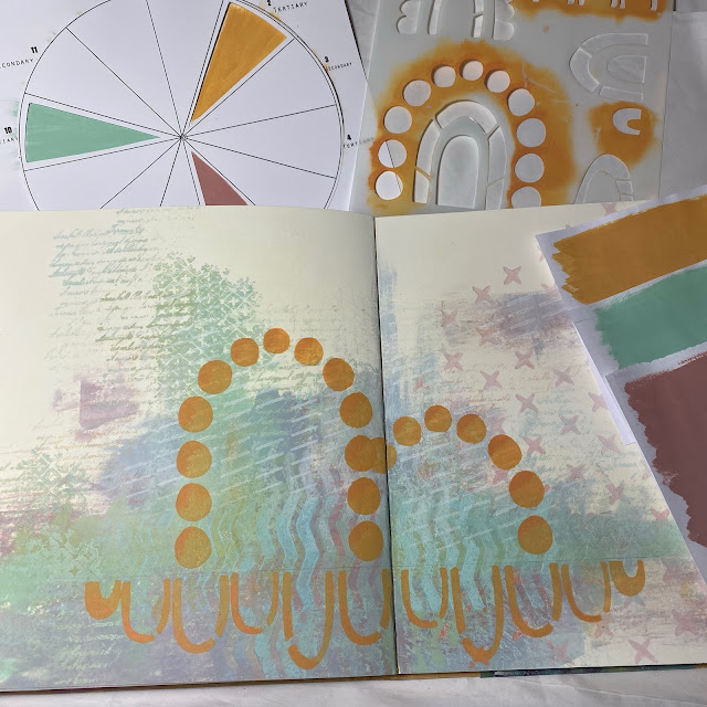
I realised that what it was lacking was the 3rd colour; I had nothing from the warm side of the triad at all, so I hit the tangerine with PS308 (the JoFY rainbow stencil), adding a bit of depth with colour 3, the Orange made from Haystack and Coral.
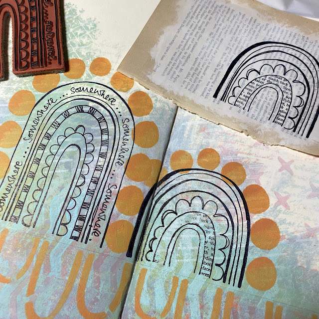
Rainbows...I stamped them on white regular smoothy, on off white painted book paper, and then just stamped directly onto the background. Not an issue for this page...but the facing one...
...hmmm .. not so good. But I did manage to fill the gaps, although it was very tempting to just stick the book page version on top.

Next step was adding colour. Now I must admit, normally I would just start adding colour without thinking much, but I had to be careful to keep this triad balanced, so I thunk a lot harder than normal! I couldn't add orange to the top semi circle, as there were orange spots there already. To contrast left the choices as nothing (page background), minty green or dusky rose, or book page....or white maybe??
So first decision was easy, use the stamped book page to complete the 'missing' book page segment of the little rainbow. To help the orange pop I put some Chantilly paint (a warm white) under the Tangerine for a bit more oomph. If I put the orange on the blue background, it would have ended up looking a bit more brown than I wanted. The mint went in 2 places, and just one strip of Dusty Rose, as it it ended up quite a bold colour.
To finish some white dots and I mixed some Steel Grey with Matte glaze to create a soft shadow.
The rainbows come from this JOFY stamp (JOFY110), and onto the little background zone top right I made a third rainbow from some of the leftover bits stamped on the book page.
White circles were added onto the orange dots as erratically as was possible ...
And I decided a grey shadow line might be a good idea too....although I still feel the lower section may end up with some further tweaking. I am not sure about the orange reflection rainbows at all ... I have 3 different ideas for that area, and not sure yet which route to go....
These are happy stamps, everyone loves a rainbow!

I added the colour quote to the right hand page, when I need something to be straight, I use a clear ruler with grid lines as my acrylic block!
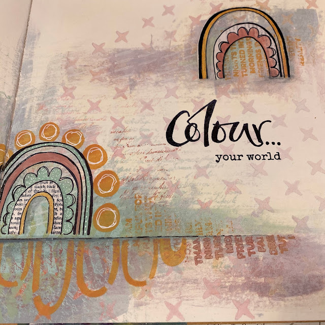
I had also added a bit more blocky type stamping from Mini 109 (MN109) releases last week, and you might also spot Mini 124, (MN124) another newbie, that script is just too delicious not to use everywhere.
Same logic was applied to the left side of the spread.
I really like how the minty green background wafts off to the upper left side of the page. Oops that is another new mini too MN122, and the chevron is MN121.
So there you have it, a fairly simple spread, but NOT in colours I would ever normally choose to use together, and getting the balance right really did take more thought than I would normally need!